This article is Part II of a quick reference on color theory for digital displays. It is the second in a series of articles about the use of color in application program user interfaces and on Web sites.
Contrast Effects
Our perception of hues, values, and chroma levels depends upon their interaction with adjacent hues, values, and chromas, which can result in color-contrast, value-contrast, and chroma-contrast effects, respectively.
While you can achieve good design by using any color-contrast, value-contrast, or chroma-contrast effect, unintentional effects caused by the interaction of contrasting colors can be visually distracting and can even diminish the readability of the text in a user interface or on a Web page.
Champion Advertisement
Continue Reading…
Color-Contrast Effects
The interaction of hues results in the following color-contrast effects, which affect our perception of hue, depth, and transparency:
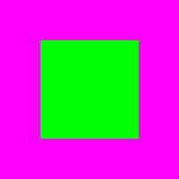
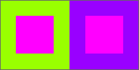
simultaneous contrast—When complementary colors are immediately adjacent to one another, they visually influence each other and their chroma levels appear dramatically intensified. See Figure 22 for an example
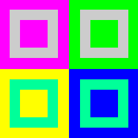
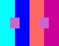
successive contrast—When surrounded by an intense hue, a weaker hue takes on the hue of the surrounding hue’s complement, as shown in Figures 23–25.
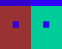
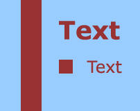
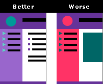
interaction with the background color—The colors of visual elements interact with their background colors. The degree to which they do so depends on the size of the elements, as you can see in Figure 26.
interaction with surrounding colors—The colors of visual elements interact with their surrounding colors. Again, the degree to which they do so depends on the relative sizes of the elements, as you can see in Figure 27.
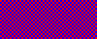
a Bezold effect—When distributed evenly, strong colors mix optically, as Figures 28 and 29 show.
area and the visual impact of color—A large area of a dark or very bright color can visually overpower a light-colored area of about the same size, as Figure 30 shows.
an illusion of depth—Warm, intense, or light hues appear to advance, while cool, neutralized, or dark hues appear to recede. Therefore, cool hues, with low levels of chroma and value can suggest spatial depth, as Figures 31 and 32 demonstrate.
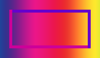
a transparency effect—Overlapping areas can appear to be transparent if their colors are mixtures of equal parts of the colors that overlap, as shown in Figure 33.
Figure 22—A simultaneous contrast effect
The simultaneous-contrast effect occurs between two adjacent complementary colors—for example, magenta (#FF00FF) and green (#00FF00)—because each color takes on the hue of its complement and both colors appear to vibrate.
You can diminish the simultaneous-contrast effect by separating areas of complementary colors with black, gray, or white outlines.
Figure 23—A successive contrast effect
When surrounded by magenta, silver (#CCCCCC) appears greenish; when surrounded by green, pinkish. Chrysoprase green (#00FF99) appears cool, or bluish, when surrounded by yellow (#FFFF00); warm, or yellowish, when surrounded by blue (#0000FF).
Figure 24—Another successive contrast effect
Two small rectangles of lilac (#CC66CC) surrounded by different colors appear to be different hues. The colors to the left and right of the rectangle on the left are cyan (#00FFFF) and blue (#0000FF); the rectangle on the right, coral (#FF6666) and bright cobalt violet (#CC0099). The rectangle on the left has an orange cast; that on the right, a blue-green cast.
Figure 25—Another example of the successive contrast effect
On the same principle, two different hues can appear to be the same, depending on their background colors. In this example, two different blues—deep lapis lazuli blue (#3300CC) on a background of Persian rose (#993333) and lapis lazuli blue (#3300FF) on a background of deep thalo green (#00CC99)—appear to be the same hue.
Figure 26—Interaction with the hue of the background color
On a background of pale Wedgwood blue (#99CCFF), elements of various sizes in Persian rose (#993333) appear to vary in their hue, value, and chroma. The elements with larger areas exhibit less influence from the background color and appear both darker and brighter. The smallest text appears washed out. The smaller an element is, the higher its contrast with its background must be to avoid this effect.
Figure 27—Interaction with surrounding colors
On consistent background colors, the hues of the two vertical bars—bright cobalt violet (#CC0099) and deep violet (#6600CC)—remain visually constant. However, in the horizontal bars, the same hues appear to change as their background colors change.
Figure 28—A Bezold effect
Two-pixel squares of red (#FF0000) and blue (#0000FF) influence one another, so the red takes on a bluish cast and the blue takes on a reddish cast. This creates a very strong simultaneous-contrast effect.
Figure 29—Another Bezold effect
Hot pink (#FF0099) looks darker on a black background than on a light background, and also exhibits a simultaneous-contrast effect.
Figure 30—Area and the visual impact of color
An area with the background color Kashmir green (#003300) overpowers the white (#FFFFFF) area.
Figure 31—Hue creates an illusion of depth
The magenta (#FF00FF) square on the bright violet (#9900FF) background appears to advance, while the magenta square on the light chartreuse (#99FF00) background appears to recede.
Figure 32—Another illusion of depth
Hues with lower chroma levels become more neutralized and darker and, therefore, appear to recede, creating a 3-D effect.
Figure 33—A transparency effect
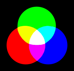
The overlapping areas appear to be transparent, because cyan (#00FFFF) is a mixture of blue (#0000FF) and green (#00FF00); yellow (#FFFF00), of green and red (#FF0000); and magenta (#FF00FF), of red and blue.
Value-Contrast Effects
The interaction of values results in the following value-contrast effects, which affect our perception of value, depth, and size:
interaction with the values of background colors—The values of background colors affect our perception of a color’s value. A color looks lighter on a dark background; darker on a light background, as Figures 34–36 show.
illusion of depth—High-value, light colors, such as white, appear to advance, while low-value, dark colors, such as black, appear to recede. Therefore, low levels of value can suggest spatial depth. Figure 37 illustrates this illusion.
perception of size—The size of an area of color appears to change, depending on its value contrast with its background color, as Figures 38 and 39 show.
Figure 34—The effect of interaction with the value of the background color
The same dark gray (#666666) square looks lighter and larger against a black background than against a white background and appears to recede against the white background.
Figure 35—An example of interaction with the value of the background color
The bright thalo green (#00FFCC) bar looks lighter against a black background than against a white background.
Figure 36—Another example of interaction with the value of the background color
Though the bounding rectangles in this image are of a uniform medium gray (#999999), their value appears to change, depending on the value of the background. The same gray appears lighter on the left; darker on the right. Though their borders have uniform dimensions, the widths of the vertical bars appear progressively narrower from left to right, because of their apparent differences in value.
Figure 37—Value and the illusion of depth
The white square on the black background appears to advance, while the black square on the white background appears to recede.
Figure 38—Value and the perception of size
On a black background, a carnation pink (#FF99CC) square appears larger than on a white background. The black margin around the carnation pink square also appears narrower than the white margin.
Figure 39—Another example of value and the perception of size
If dark areas and light areas are of the same size, the dark areas appear smaller. Though the dimensions of all areas in the two grids are identical, they appear to vary greatly in size. The apparent difference in size of the black and white margins at the center of the grid is particularly marked, but their widths are the same.
Chroma-Contrast Effects
The interaction of the chroma levels of adjacent colors results in the following chroma-contrast effects, which affect our perception of hue and chroma:
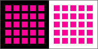
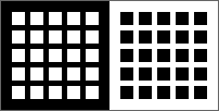
interaction with the chroma levels of background colors—One hue appears to be two different hues on different high-chroma background colors, as Figure 40 shows.
interaction with the values and chromas of background colors—The values and chromas of background colors affect our perception of a color’s value and chroma. A color looks brighter on a neutral background; duller on a brilliant background.
Figure 40—Interaction with the chroma levels of the background colors
Two grids of coral pink (#FF6699) appear to be different hues, because of the influence of the background colors crimson (#FF3366) and Siberian amethyst (#660099). The grid on the left appears lighter and duller, while that on the right appears darker and more brilliant.
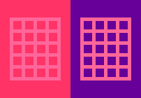
Figure 41—Interaction with the values and chroma levels of the background colors
The same carnation pink (#FF99CC) square looks brighter and slightly darker against a medium gray (#999999) background; duller and lighter against a pink (#FF66CC) background.
Color Dominance
In any visual composition, the dominant areas of color are those with attributes that may include a combination of the greatest contrast in hue, value, or chroma with surrounding areas of color; the largest area; and the most prominent placement, as follows:
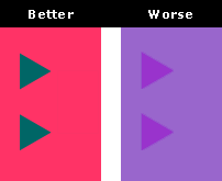
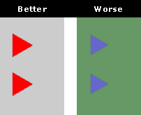
areas with the greatest contrast in hue—Areas of strongly contrasting hues are visually dominant, regardless of their size and placement, as Figure 42 shows.
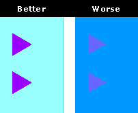
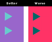
areas with the greatest contrast in value—Areas with strongly contrasting values appear dominant, regardless of their size and placement. Where the background is a shade, a tint draws one’s attention; where a tint, a shade is the accent color. Figure 43 shows how contrast in value creates color dominance.
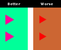
areas with the greatest contrast in chroma—Areas with strongly contrasting chroma levels demand visual attention, regardless of their size and placement, as Figure 44 shows.
the largest area—The color that occupies the largest area is visually dominant, as Figure 45 shows.
the most prominently placed area—The area of color with the most prominent placement appears dominant. Placing an area of color at or near the center of a composition draws attention to it; as does placing one in a composition’s upper-left corner, because in the Western world, people tend to look there first. Figure 46 shows how prominent placement creates color dominance.
All of the attributes that contribute to the dominance of an area of color interact with one another.
Figure 42—Color dominance from contrast in hue
In a composition that consists primarily of cool hues, the area in the warm hue crimson (#FF3366) dominates overall and, in the central area, small squares of the same hue on a cool background of north-light blue (#CCCCFF) provide an accent color.
Figure 43—Color dominance from contrast in value
On a background of the shade light slate (#666699), small triangles in the tint pale aqua (#99FFFF) stand out, while on a background of the tint ice blue (#CCFFFF), small squares in the shade purple (#990099) provide an accent color.
Figure 44—Color dominance from contrast in chroma level
In a composition that consists primarily of achromatic colors, the high-chroma accent color red (#FF0000) stands out.
Figure 45—Color dominance of the largest area
Often the background color has the largest area and is, therefore, dominant—in this case, white (#FFFFFF).
Figure 46—Color dominance from prominent placement
In this composition, the teal (#006666) rectangle at the center and the crimson (#FF3366) circle in the upper-left corner are dominant within their respective areas.
Color Balance
To achieve balance in a visual composition, you can adjust the levels of contrast between the hues, values, and chromas of its various areas of color. You can also adjust the size and placement of areas of color to achieve balance among them. When trying to create balance in a color scheme, consider the following:
contrast between figure and ground—High-contrast visual elements stand out against their background colors, while low-contrast visual elements fade into their backgrounds. You can use high contrast to call attention to important elements; low contrast to make less important elements less noticeable. Figure 47 shows adequate and inadequate contrast between figure and ground.
hue contrast—Complementary colors provide good contrast between figure and ground, while monochromatic and analogous colors do not. In a visual composition that includes both warm and cool hues, warm hues appear to advance and are, therefore, best for figures, while cool hues appear to recede, so are best for backgrounds. Figure 48 shows adequate and inadequate hue contrast.
value contrast—This is the most important dimension of color contrast between figures and their backgrounds. Light hues on a black or very dark background or dark hues on a white or very light background provide excellent contrast between figure and ground, while colors with mid-range values do not. In a visual composition that includes both light and dark values, light colors appear to advance, while dark colors appear to recede. However, dark colors—either chromatic or achromatic—are generally best for text and figures, while light colors are best for backgrounds. Figure 49 shows adequate and inadequate value contrast.
chroma contrast—High-contrast chroma levels provide excellent contrast between figure and ground, while mid-range chroma levels do not. In a visual composition that includes both high-chroma and low-chroma colors, brilliant or deep colors appear to advance and are, therefore, best for figures, while neutral or achromatic colors appear to recede, so are best for backgrounds. Figure 50 shows adequate and inadequate contrast in chroma levels.
value and small shapes—Depending on the values of small shapes, you may need to adjust their size slightly to ensure that they are both sufficiently visible and easily recognizable. Shapes in lighter colors should be slightly larger than the same shapes in darker colors. Figure 51 illustrates how adjusting the size of a small shape can compensate for low value contrast.
value and large areas—A large area of a dark color appears very dominant, while a large area of a light color appears less dominant. Areas of lighter colors tend to appear subordinate to areas of darker colors. Figures 52 and 53 illustrate how value affects the dominance of large areas.
contrast effects and proportion—The proportions of adjacent areas of contrasting colors play a role in determining how the colors interact with one another and, therefore, determine the impact of contrast effects. Figure 54 shows how proportion affects contrast effects.
Figure 47—Contrast between figure and ground
High-contrast triangles in teal (#006666) stand out against their complementary crimson (#FF3366) background, while in a monochromatic color scheme, the low-contrast triangles in deep orchid (#9933CC) fade into their dusky red-violet (#9966CC) background.
Figure 48—Hue contrast
Warm, brilliant hot pink (#FF0099) triangles stand out against their cool, complementary chrysoprase green (#00FF99) background, while in an analogous color scheme, there is insufficient contrast between red (#FF0000) triangles and their warm tan (#CC6633) background.
Figure 49—Value contrast
Dark Siberian amethyst (#660099) triangles stand out against their pale aqua (#99FFFF) background, but there is insufficient contrast between deep blue-violet (#6666CC) triangles and their azure blue (#0099FF) background, both of which have mid-range values.
Figure 50—Chroma contrast
Brilliant red (#FF0000) triangles stand out against their neutral silver (#CCCCCC) background, but there is insufficient contrast between deep blue-violet (#6666CC) triangles and their verdigris (#669966) background, both of which have mid-range chroma levels.
Figure 51—Value and small shapes
The lightness of the turquoise (#66CCCC) triangles on the left necessitates their being slightly larger than the darker teal (#006666) triangles on the right.
Figure 52—Value and large areas
Areas in the dark colors red ochre (#663333) and slate (#333366) dominate areas of the same size in the lighter colors dusky rose (#CC9999) and deep blue-violet (#6666CC).
Figure 53—Another example of value and large areas
The light ice blue (#CCFFFF) area appears subordinate to the darker light slate (#666699) area.
Figure 54—Proportion and contrast effects
Contrast effects are noticeable in both the turquoise (#66CCCC) and the teal (#006666) triangles, but not in their larger background areas. Because of a successive-contrast effect, the turquoise triangles appear slightly greener against their dusky red-violet (#9966CC) background. Also, both the turquoise and the teal triangles suffer from a simultaneous-contrast effect, though the effect is greater in the teal triangles because of their complementary relationship to their crimson (#FF3366) background. The turquoise triangles have a weaker tetradic complementary relationship to their background color.
Read more:
For information about additive color synthesis and its colors, color temperature, color properties, color harmony, and color contrast, see “Color Theory for Digital Displays: A Quick Reference: Part I.”
Founder, Publisher, and Editor in Chief of UXmatters
Silicon Valley, California, USA
With more than 20 years working in User Experience at companies such as Google, Cisco, WebEx, Apple, and many startups, Pabini now provides UX strategy and design consulting services through her Silicon Valley company, Strategic UX. Her past UX leadership roles include Head of UX for Sales & Marketing IT at Intel, Senior Director of UX and Design at Apttus, Principal UX Architect at BMC Software, VP of User Experience at scanR, and Manager of User Experience at WebEx. Pabini has led UX strategy, design, and user research for Web, mobile, and desktop applications for consumers, small businesses, and enterprises, in diverse product domains. Working collaboratively with business executives, multidisciplinary product teams, and UX teams, she has envisioned and realized holistic UX design solutions for innovative, award-winning products that delighted users, achieved success in the marketplace, and delivered business value. As a UX leader, she has facilitated conceptual modeling and ideation sessions; written user stories; prioritized product and usability requirements; established corporate design frameworks, standards, and guidelines; and integrated lean UX activities into agile development processes. Pabini is a strategic thinker, and the diversity of her experience enables her to synthesize innovative solutions for challenging strategy and design problems. She is passionate about creating great user experiences that meet users’ needs and get business results. A thought leader in the UX community, Pabini was a Founding Director of the Interaction Design Association (IxDA). Read More