Many articles have been written on what is probably the single most ubiquitous interface element within Web applications today: the form. Forms justifiably get a lot of attention because their design is critical to successfully gathering input from users. Registration forms are the gatekeepers to community membership. Checkout forms are how eCommerce vendors close deals. But what goes in must eventually come out, and the information users provide to Web applications often makes its way back to users in the form of tabular data.
After forms, data tables are likely the next most ubiquitous interface element designers create when constructing Web applications. Users often need to add, edit, delete, search for, and browse through lists of people, places, or things within Web applications. As a result, the design of tables plays a crucial role in such an application’s overall usefulness and usability. But just like the design of forms, there’s more than one way to design tabular data.
In a previous Communication Design column, “So the Necessary May Speak,” I discussed how to reduce the number of both visual design and content elements within a table to the absolute minimum necessary for effective communication. So, I won’t repeat myself here. Instead, I’ll focus on interface design solutions that enable users to find their way through large data sets.
Champion Advertisement
Continue Reading…
Maximum Exposure
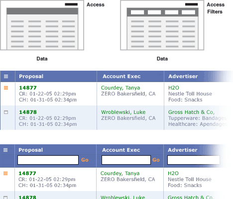
When tables are chock full of information, it’s quite likely that people will need to filter out information that isn’t relevant to their queries. In such cases, exposing a complete list of data filters is an effective way of quickly communicating what refinement options are available.
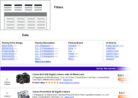
Figure 1 shows data filters in use on Shopping.com. In this example, a complete list of available filters is always present above each set of product search results. Filter categories group the filters—for example, price, brand, size, category, etcetera—and help users get an immediate sense of how much data will be left after refining the search results by a specific attribute. With an above-the-grid design, vertical space is at a premium, because you don’t want to obscure the actual data in the table. As a result, the display of filters in each category is often truncated after a predetermined number of items, with a link to see the remaining options.
Figure 1—Data filters above a table
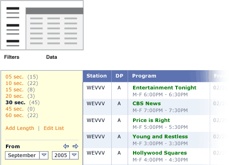
Alternatively, you can place a complete list of data filters to the right or left of tabular data, as shown in Figure 2. Though this design provides more vertical screen real estate for each category of filters, some filters may be less visible, because they appear further down the page.
Figure 2—Data filters to the left of tabular data
In cases where a limited number of filters is available or frequently used, presenting just a few filters might do the trick. As shown in Figure 3, a simple set of tabs, links, or drop-down menus can provide a few high-priority ways of quickly slicing through a large set of data.
Figure 3—Selecting options to refine tabular data
Consistent Availability
When there are too many possible filters to expose them all at once or refining a data set is a secondary use case—for example, the purpose of a tabular grid may be to get an overview of all the data rather than find a specific value or set of values—keeping data filtering options accessible, but not constantly visible may be a better solution.
For example, a user might expand a collapsed group of filters by clicking a link labeled something like Search Options, thereby displaying the filters only when the user needs them to refine the search results. In the example shown in Figure 4, a set of filters dynamically appears overlaying the top of a table when a user clicks Search Options. By default, the three most popular queries determined the first three filtering options that appeared. However, users had the option of choosing a different set of filters or adding more filters before executing a search.
Figure 4—Filters that require a user action to become available
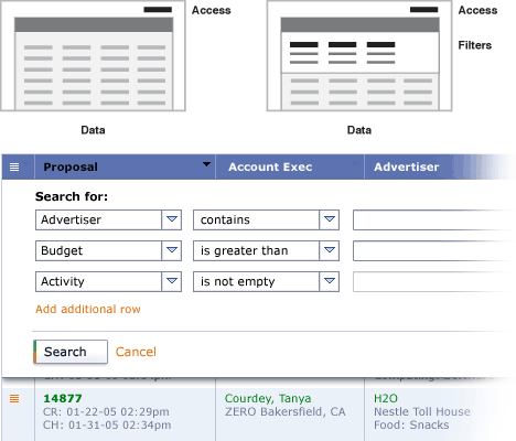
Occasionally, the best way to find what you’re looking for in a table is to search for a specific attribute value. In such a case, you can provide a means of specifying a query for each attribute by adding input controls to every column in the data grid, as shown in Figure 5. Of course, this design presents problems when column labels and values consist of small amounts of text or numbers, because the addition of input fields can dramatically increase the overall width of a table.
Figure 5—Refining a search on individual attributes
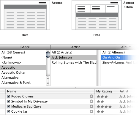
When an explicit relationship exists between the filtering options in a set, it may be preferable to expose that relationship within the filtering controls. In Figure 6, the data has a strong hierarchical relationship that the user interface expresses and enforces.
Figure 6—Representing a hierarchical relationship between filters
The examples in Figures 4–6 highlight the use of expandable groups of options for filtering the data in a table, as follows:
adding filters to and removing them from a list, as in Figure 4
providing input fields for each attribute column to let users search each column of a table, as in Figure 5
using a hierarchical filtering control whose content changes, depending on a user’s selections, as in Figure 6
Certainly, there’s no reason these solutions couldn’t always be present on a screen like the options we looked at earlier—and vice versa.
Sorting It Out
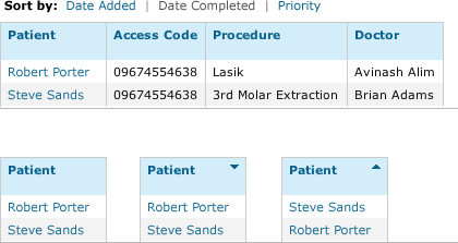
In each of the options I’ve discussed, the ability to sort a table remains a useful way of drilling down to specific content. Sorting, of course, can occur either when a user clicks a table header to sort a specific column, which corresponds to a specific data attribute, or uses a dedicated sorting control, as shown in Figure 7.
Figure 7—Two common ways of sorting a table of data
While we’ve looked at a number of design solutions for filtering large sets of tabular data, this isn’t an exhaustive list. So, if you’ve encountered other ways of getting through a large set of tabular data, I’d love to hear about them from you.
We’ve explored a few different filtering and sorting options on search results and other data tables and tested them with 1-to-1 user evaluations.
We found using glyphs to indicate sorting capability was a bit lost on novice users; although moderately experienced users liked the control of sorting in two directions—acsending, descending. We tried coupling the glyphs with an underline on the column heading or sort label to reinforce it was clickable, but this was still too subtle or an unfamiliar approach for novice users.
Using text links to sort (first example in Figure 7) had mixed results when there were only 2 sort options. In this scenario, it was not immediately clear to users what sort option had been applied. They had to think, “Well, if I can click this one, it must be sorted by the other one.” This was a surprising result—we thought it was dead obvious—but led us down the path of offering the sorting options in a drop-down menu, where it was immediately clear what the default sort order was and what the other options were. We also saw this as a good approach as it is scalable when you have restricted space: simply add items to the drop-down menu.
The range of filtering options you’ve supplied is great, Luke. Great to have this nice a design arsenal at hand.
Interesting article. I like the thorough description of solutions available to designers. I completely agree that tabular data display is one of the most popular ways to work with information our days.
And the reason for that probably is the way that information is stored and organized.
Databases are one of the ways of organizing information. And it’s really popular due to the specifics of computers. Computers work great with numbers. Slicing data into small parts, organizing it, and indexing is what computers do great and fast.
People, though, don’t organize information that way in their heads. Associations between objects are too complex and differ from one person to another. Modern computers are not able to reproduce that.
Computers complement people’s abilities to store and sort information and are great tools for finding and analyzing data.
But I think if we can build better bridges connecting the ways computers and humans organize information, we can build a better user experience.
When working with tabular data, people have two main goals—finding information and analyzing it.
I’m proposing adding two additional ways to help find information—tagging and visual presentation of data.
Tagging is getting more popular, just because that’s one way to organize information into groups that computers are not able to do on their own.
If you can filter information and give tags to filtered results you can work with data on a new level. For example, on some Web sites, like shopping.com, you can filter stores that have free shipping policies and tag them freeshipping. Then you can filter digital cameras of some brand with some specifications and tag it as mycamera and use this tag with the freeshipping tag. There are millions of possibilities. And data sets are more meaningful and very custom for every user.
Another way to present data in more consumable way to our brains is imagery.
If we use graphics to analyze data, why don’t we use them to find data. Having diagrams where you can select blocks of data helps a lot to navigate through data and helps analyze it while searching. This is used to some extent in Google’s analytics. But I definitely would like to see more of this. I think that technology, at this point, allows us to do more things with displaying, filtering, and analyzing data. We just need designers to take advantage of technology and help build great user experiences.
Great article, Luke. Often tables are treated like a technical aspect—how to get the data out of the database onto the page—while only getting a bit of painting with one or two colors. But as your examples show, there’s a lot more to it than that.
Do you think the same principles that you described above can be applied for tables that have calls to action? For example, once you get the desired sort of the table, you want to do a mass edit to the first 10 rows of data in the table. How would you clearly delineate that the call to action is acting only upon a subset of the data? Also where would you place something like a set of actions on the table that go beyond data sorting?
Good post. An additional issue I would explore—one that Web interaction designers are facing with increasing frequency—is the range of possible interactions between the tools to manipulate the table and the table itself. Or, in other words, when is an action button such as Filter needed, and when is the filter itself the action button.
I would imagine that the medium/technology being used to process, manipulate, and display the data would invariably determine the interaction model. How does that play out on the Web (Web 2.0, Ajax)?
Hi all, Thanks for all the comments.
Re: Sorting
I didn’t dive into the nuances of sorting controls, but generally, using a link color or underline in conjunction with the toggle indicator helps communicate that column headers are sortable. In tests, I’ve seen many people instinctively look to see if column titles are sorting controls. Emphasizing that with actionable links and sort indicators helps confirm their theories. And yes, drop-downs lists help expose the sorting controls even more; though, if you have a short list, you might consider text links (Figure 7) instead, so all the options are out in the open.
Re: Visualizations
I think this is an interesting topic to explore. Our visual processing power is huge and mostly under-utilized by modern user interface designs. As we continue to increase the amounts of data we need to weed through, interactive visualizations will only become more important.
Re: Actions in tables and taking action on all or a subset of the data (batch actions) is a topic for another article!
Actions in tables and taking action on all or a subset of the data—batch actions—is a topic for another article!
Any chance you’ll have time to tackle that article soon? I am running into this exact problem, where I have huge amounts of data and each row could have several actions—and not every row necessarily has the same actions!
Andrey Smagin wrote: Another way to present data in a more consumable way to our brains is imagery. If we use graphics to analyze data, why don’t we use them to find data. Having diagrams where you can select blocks of data helps a lot to navigate through data and helps analyze it while searching.
There’s a lot of data out there on this. Ben Schneiderman has a good amount of research.
The Association of Computing machinery has a lot on the subject.
We have a very sticky problem with a query results table. Our users are long-tenure with the client company and are going to have to migrate from 3270 Unix—yes, believe it or not—terminals to point and click mouse. Many have worked at the company for over 20 years and have a lot invested in the current system. Point and click Web applications have been built, but they won’t use them, saying that the old system is “faster”.
Our requirements for the search results are as follows:
User must be able to perform all actions from the keyboard in addition to point and click. This is not negotiable.
Table columns must be sortable—no big deal.
User must be able to copy/paste new rows—think Excel—from existing rows.
User must be able to insert a new blank row—again, think Excel.
User must be able to select single or multiple rows from the query results in order to perform updates on specific column items in those rows.
User must be able to view details of the items in the list without opening a modal popup or new window.
User must be able to make changes to both single and multiple items in a specific column or columns; if multiple, they want to be able to change multiple line items at one time.
User must be able to view the changed items and the original items in the same table.
User must be able to create a grouping of the items and create a “batch”, then submit it to a queue.
User must be able to print the table.
User must be able to download the table in order to save it.
Client is fairly inflexible and wants to deliver all this in thin-client and run it on IE6.
Any ideas on a COTS data table product that is both user friendly and meets these requirements? I have seen reviewed COTS products, but our architecture team has already reviewed them, and none meets all the critical requirements—hands-on keyboard, copy/paste/insert new, and update multiple items—and critical technical requirements—no downloads onto client machines—that is, applets—must run in IE6, etcetera. Any help is appreciated.
Thanks!
Margaret, I think Web applications, in general, are often slower than expert use of command-line tools. It’s a perfectly normal thing to hear back from users.
The benefit of a GUI is in learning and discoverability, but it certainly does suffer in terms of speed.
If your application can utilise lots of keyboard shortcuts, then maybe you can retain some of that speed though.
Great article. Provides insight into how to present data in more meaningful and accessible ways. The idea is to reach the desired information with a minimum of effort. The less time it takes for the user to reach the desired information, the better it is.
Any ideas on a COTS data table product that is both user friendly and meets these requirements?
I recently helped on the roll-out of a fairly complex internal corporate Web application for the banking industry, and we came across several of the problems mentioned in this excellent article. The approach we ended up using was:
no user-input fields in the tables—It was simply too tricky working out all the various browser inconsistencies with regard to tables, while still maintaining decent usability standards in keeping with employment laws—had to be screen-reader friendly.
That means all user input comes from plain-Jane form fields that people are already comfortable using. The tables are selectable, however, and populate the form fields with additional information that wouldn’t fit in the tables—a contacts table might contain a first and last name and phone number, while the forms below would also have fields for address, middle name, and so on.
sortabilityThe ability to sort by column wasn’t even a question. We ended up using glyphs, although I like the approach of Figure 4 and might end up using that if we do an update. (You can fit more filtering elements that might not have a column.)
filteringThe filtering feature was a late addition to the mix, because it’s fairly complicated to get the type conversion right. We ended up having a row of filtering drop-down menus, so each column has its own filter. Some filtering drop-down menus might be populated with with values supplied from the database, another filter might be for dates—we allow date ranges—yet another filter might be numerical—so, greater than or less than.
a template-driven layout for the cells’ content—This was the most difficult part and the part I’m most proud of. One of the biggest problems I’ve seen with the grid products on the market is that the content of each cell is tied directly to a single property. So, one column is for your ZIP code, another column is for only your last name. Well, that’s not terribly useful. We use a template system so the column could be Company, and the cell contents might be “Company - 123”—where 123 is the Company Number in our system. Or it could be a link to another page, with the link text as the Company Name, and the link URL contains the Company ID.
I haven’t seen anyone else consider that the content of tabular data needn’t directly correlate with the column heading. We still tie the column’s sortability to a single property, but anywhere in the table body is fair game. Who wants to see “49239.2342” when they could see “$49,239.23”?
As to your question: Frankly, I don’t know of anyone who’s implemented a pure-Web Excel replacement, though many are pretty close—Google, for example. There are a lot of libraries and a lot of code jockeys that would probably try and convince you that they could do it, but cross browser and bug free? I don’t think so. If you scaled your grand vision down a bit, you’d have much better luck. For instance, does it have to play nice with Internet Explorer? Coding for that beast is a royal PITA.
The trickier part will be tying the fun JavaScript parts to the back end, and that’s where I think most of these turn-key solutions fail. Does the code play well with .NET or Java? Or will you have to hand code each and every page’s queries? How does the whole “editing on the page makes commits to the database” thing work, exactly? Does the database lock the entire table until a user’s finished? How does the Ajax library know to recommit transactions in cases of locks or contentions that wind up on the short end of an optimistic lock?
If you can simplify the requirements of your system, you’ll have much better luck answering these kinds of questions.
Before joining Google, Luke was CEO and cofounder of Polar and Chief Product Officer and cofounder of Bagcheck. He is the author of three popular Web-design books—Mobile First, Web Form Design, and Site-Seeing: A Visual Approach to Web Usability—in addition to many articles about digital-product design and strategy. He was also the founder of LukeW Ideation & Design, a product strategy and design consultancy. Luke is a top-rated speaker at conferences and companies around the world, and was a cofounder and former board member of the Interaction Design Association (IxDA). Read More