Top

The Complexity of Simplicity

Communication Design

Musings from the merger of medium and message

A column by Luke Wroblewski
December 4, 2006

Though many business strategies and publications continue to trumpet the power of simplicity in the design of digital products, for lots of companies and product teams, simplicity doesn’t come easy.

“Making the simple complicated is commonplace; making the complicated simple, awesomely simple, that’s creativity.”—Charles Mingus

While there are many reasons why keeping things simple is difficult, I’ve encountered the following three causes quite frequently:

  • Perceived simplicity can often conflict with actual simplicity of usage.
  • Actions that provide real value—and drive revenue—often have formidable learning curves.
  • Gradual engagement, the most frequently cited solution for managing complexity, is actually quite difficult to design and build.

Champion Advertisement
Continue Reading…

Perceived Versus Actual Simplicity

Many of us carry a few preconceived notions about simplicity. We assume things that are easy to use don’t have a lot of options and, as a result, shouldn’t appear cluttered when we first encounter them. In the world of product design, this means plenty of whitespace, clear calls to action, and an overall reduction of content—in the form of visual elements such as type, images, lines, colors, shapes, and so on. When a product has these attributes, we are more likely to assume it is easy to use. It’s quite possible that it might not be, but the perception of simplicity is there.

Conversely, a perception of complexity can turn customers, clients, or business stakeholders off before they ever actually use a product. In a worst-case scenario, an evaluation based on an opinion that “this looks cluttered; therefore, it must be difficult to use” can prevent customers from ever even trying a product out. But as Don Norman recently suggested, an initial impression of complexity might actually be an artifact of a product’s simplicity. In “The Truth About Google’s So-called ‘Simplicity’,” he wrote:

“Why are Yahoo! and MSN such complex-looking places? Because their systems are easier to use. Not because they are complex, but because they simplify the life of their users by letting them see their choices on the home page: news, alternative searches, other items of interest.”

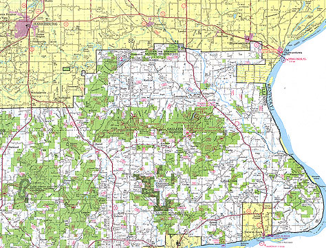
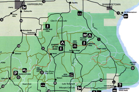
Edward Tufte, guru of information design, would likely agree with Norman. Tufte is known for his own criteria for measuring ease of use. He simply counts the number of links on a Web page. The more links, the better the design. His perception of simplicity is based on information density—how much screen real estate is devoted to useful information—in this case links—versus “chart junk”. In Figure 1, you can see this type of rich information in the first of two maps that represent the same geographical area with different levels of complexity. Though the second map, shown in Figure 2, conveys much less information, people are likely to consider it easier to use, because of its visual simplicity.

Figure 1—A detailed map provides rich information
Complex map
Figure 2—A visually simple map of the same geographical area conveys less information
Simple map

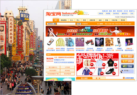
Cultural context can also sway people’s perceptions of simplicity. In many Asian countries, for example, congested spaces are quite common, and the benefits of collectivism, or integration with strong, cohesive groups, may outweigh those of individualism, or loose cultural ties. In this context, a lot of whitespace or an overall reduction in visual activity may be warning flags that a product lacks substance and thus requires significant investment with little payoff. In these cultures, information density is an indicator of activity and, therefore, an incentive for use. So dense visual information, like that shown in Figure 3, may be more attractive than the sparse layouts that invite exploration in the Western world, because of their perceived simplicity.

Figure 3—Visual density in physical and cyber space
Visual density in physical and cyber space

Regardless of the specific biases of individuals, notions of perceived complexity can prevent potential users from discovering the simplicity of a product’s actual use.

Creating Value

Prior to its being purchased by Google, YouTube counted 100 million downloads and 65,000 uploads per day. According to the Guardian, that’s “a creator to consumer ratio” of just 0.5%. The Guardian also noted that just 1.8% of all users write more than 70% of all Wikipedia articles. Similarly, the top 100 of digg’s 20 million users are responsible for 56% of the stories on the site’s home page. These statistics provide further verification of the Consumer/Synthesizer/Creator ratio that Yahoo!’s Bradley Horowitz outlined, in which 1-10% of a Web community’s members are responsible for a huge amount of its value.

The fact that less than 10% of a company’s customers are their primary content creators is particularly important when those users are creating revenue. Consider the case of eBay power sellers, who—though a small percentage of the company’s 200 million users—are responsible for a large part of corporate earnings. Some estimates even indicate that eBay does not monetize 90% of their users.

As any designer familiar with accommodating the needs of power users can attest, it is quite likely that the customers who create the most value both require additional features to support their high levels of use and are the most vocal about their needs. In situations where power participants create the majority of a service’s revenues, or value, companies are wise to listen and address their needs.

On YouTube, many of the features and content on the player page, shown in Figure 4, primarily benefit power participants rather than the majority of users who just want to watch videos.

Figure 4—YouTube player page
YouTube

Unfortunately the features and information that help power participants meet their goals can quickly complicate things for the average user. Of course, one could hide or gradually reveal advanced features, but at the cost of discouraging new users from adopting the behaviors that create the most value for the company.

Simplifying a product for the average user may penalize power participants—who are arguably a company’s most valuable customers—because the tools they need to successfully complete their tasks are out of direct sight or behind several layers of interaction.

Gradual Engagement Is Hard

The most common solution for accommodating the needs of both average and power users without negatively impacting the effectiveness of either group is to gradually reveal complexity as users let you know they are ready for it. Though clearly a noble pursuit, gradual engagement of this sort is often quite difficult to design and implement effectively, as it is likely to require complex behind-the-scenes considerations for a product development team.

In order to present the right user interface to the right user at the right time, designers must track multiple types of users and their various states, then map those contexts to an appropriate presentation of features and content. This, of course, is a non-trivial challenge and, as a result, is often done poorly. If the logic is not thought through completely, some users end up with too many options, while others feel they have too few.

As an example, consider the way Microsoft Office 2003 menus display only the items users use most frequently while hiding the others, as shown in Figure 5. This gradual engagement feature often makes it seem like the option you need—and are sure you have used before—is unavailable, when actually it is temporarily hidden on the very menu you are looking at.

Figure 5—Menus in Microsoft Office 2003
Office menus

An example where gradual engagement arguably works better is the search experience on Google. Though often cited as an example of a simple design, Google search was actually built for expert users. According to Product VP Marissa Mayer:

“Novice users will enter ‘tell me when it will snow in NY today’ and get no valuable results. Soon thereafter, they will end up typing ‘weather new york’ and see that the results are more valuable. Voila! An expert user. The learning curve in search is steep, but quick.”

Enabling this experience, however, requires all the computational power that an engineering powerhouse like Google can muster. Not all companies have such capabilities.

A much easier and, therefore, more common design and development solution is to simply expose all possible options to all users and have them select what is most appropriate for their particular needs. In this case, the design team doesn’t make decisions for users that may not be appropriate to certain contexts. This approach, however, doesn’t do much to simplify a product’s design. In fact, it probably has the opposite effect.

Despite all of this, we should not think of the problem of perceived versus actual simplicity, the need to enable power participants to create value, or the difficulty of implementing effective gradual engagement as reasons to give up on the pursuit of simplicity. Being aware of these considerations is actually likely to make our jobs simpler. 

Product Director at Google

Speaker and Author at LukeW Ideation & Design

Silicon Valley, California, USA

Luke WroblewskiBefore joining Google, Luke was CEO and cofounder of Polar and Chief Product Officer and cofounder of Bagcheck. He is the author of three popular Web-design books—Mobile First, Web Form Design, and Site-Seeing: A Visual Approach to Web Usability—in addition to many articles about digital-product design and strategy. He was also the founder of LukeW Ideation & Design, a product strategy and design consultancy. Luke is a top-rated speaker at conferences and companies around the world, and was a cofounder and former board member of the Interaction Design Association (IxDA).  Read More

Other Columns by Luke Wroblewski

Other Articles on Interaction Design

New on UXmatters