Actively influencing a person’s emotional state throughout an experience—in particular, his or her sense of anticipation, involvement, and desire for a certain outcome—is still an evolving concept in the realm of user interface design. However, this is very familiar territory for makers of music, film, television, and video games. While UX designers may not be storytellers, we can create more engaging product user experiences by learning from their examples.
Many UX designers—myself included—approach projects from a combination of information architecture, information design, interaction design, and visual design perspectives. These disciplines and their methods are fundamentally different from those people use to construct the continuous linear narratives we see and hear in film, video, and music. However, as the technologies for creating interactive user experiences become more robust—especially in the realm of Rich Internet Applications (RIAs)—we have an opportunity to draw upon a much wider visual vocabulary. This will also make narrative elements such as timing, pacing, and rhythm increasingly important. Using such design elements may enable us to move users from mere understanding to engagement and, ultimately, to immersion in our digital products and services.
Champion Advertisement
Continue Reading…
The Pause That Refreshes
The concept of a pause is lacking in many user interface designs. I’m not referring to an option to halt playback in midstream—as in an audio or video system—or the kind of delay users experience as a microprocessor churns through its calculations, but to a brief rest before the next step in a task. There is nothing more inorganic and unnatural than a system that has no state of rest.
Without question, the influence of the information age has decreased our attention span. We jump from link to link, from screen to screen. As UX designers, we may have a picture in our minds of the users of a Web site or application—people who are harried and busy and just trying to get their tasks done. And it may be for such a person that we design user interfaces. At some point in their tasks, though, users must pause to take a breath.
When used appropriately, a pause can create anticipation, clear the decks, and remove the clutter that competes for a user’s attention, enabling a user to more effectively focus on what comes next. The pause contributes to the effective pacing or flow of the user experience.
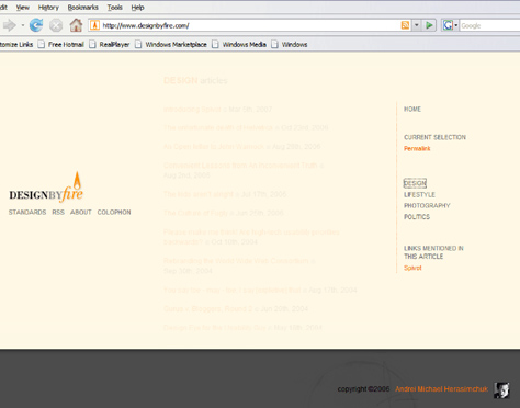
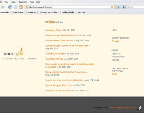
A great example of pacing at Design by Fire, the blog of Andrei Michael Herasimchuk, uses a well-timed fade out/fade in transition between content selections (shown in Figures 1 and 2). Once a user clicks a menu item, the current content fades out, then the new content fades in. The transition provides a pause in the action.
Figure 1—The current content fades outFigure 2—The selected content fades in
In most, if not all forms of human communication, we use a pause to indicate passage from one state to another. In writing, we have paragraph breaks; in graphic design, whitespace; in oratory, silence; and in user interface design, we have animated transitions.
Consistency and Continuity
In the September 2004 article “Interfaces for Staying in the Flow,” from the Association for Computing Machinery magazine Ubiquity, Benjamin B. Bederson, an associate professor at the Computer Science Department and past director of the Human-Computer Interaction Lab at the University of Maryland, writes:
“Another approach that can potentially be used to reduce users’ sense of interruption is to use animation between screen states. While animation in general can be used in ways that are very disruptive, we have found that animation can be helpful if used to help users understand how the interface changes. The potential for this kind of animated transition is that it can reduce the cognitive overhead of understanding of the relationship between two screen states, thus enabling users to stay focused on the task.”
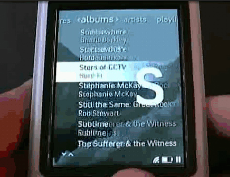
The Zune™ user interface provides an elegant example of an animated transition connecting screen states. The scrolling transition in Zune makes it easy for users to know where they are in its song list. As a user scrolls through an impossibly long alphabetical listing of songs on a device, the list becomes a blur. To keep users oriented to their location in the list as they scroll, the user interface provides continuous feedback, flashing the appropriate letter of the alphabet as the names starting with that letter pass by.
Figure 3—The scrolling transition in Zune
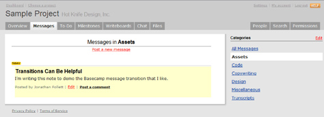
37signals popular project management Web application Basecamp™ offers another example of an animated transition that acts as a connector. When a user posts a new message, a yellow box initially highlights the message text, then fades out over time. The yellow highlighting effectively transitions the user from the input screen on which he posted his comment to the message board itself.
Animated transitions can add a level of consistency to a user interface. Without smooth transitions, the jumps from state to state can be jarring to users, forcing them to reorient themselves to each new screen state.
Riding the Transition
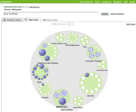
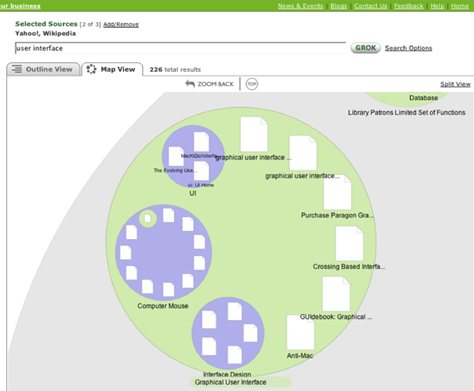
It’s even possible for an animated transition to be an integral part of a digital product’s user experience. The online visual search application Grokker lets users view search results as an interactive diagram—a topical information map—and provides a great example of using transitions as a key component of a navigational system.
Grokker search results appear within a large circle, containing smaller circles within its circumference. Each of these smaller circles represents a subtopic related to the search, and in turn, can contain a group of nested subtopics within its boundaries, and so on. To explore the search results, a user selects a subtopic, then drills down into the information, both figuratively and literally, as the user interface zooms in on the selected circle.
Not only does the zoom transition help keep the user oriented within the visual representation of the information space, it also enhances the search experience, providing an engaging visual metaphor for exploring results. Thus, the Grokker zoom transition is vital to the user experience of exploring search results.
Figure 6—Search results grouped within circles in GrokkerFigure 7—The Grokker zoom transition
About animated transitions, Jenifer Tidwell, author of Designing Interfaces, writes:
“... when the shift from one state to another is continuous, it’s not so bad. In other words, you can animate the transition between states so it looks smooth, not discontinuous. This helps keep the user oriented. We can guess that it works because it more closely resembles physical reality—when was the last time you instantaneously jumped from the ground to 20 feet in the air? Less fancifully, an animated transition gives the user’s eyes a chance to track a location while the view changes, rather than try to find the location again after an abrupt change.”
The Rules of Engagement
There is a school of thought that says all animated transitions are bad. And, admittedly, there are innumerable pitfalls that one must avoid when transitions are poorly executed. Slow or overly elaborate transitions can ruin a user interface’s response time, derail a task flow, and cause a user to wonder, “Is this thing broken?”
Once the creator of music or a film engages an audience, he can bring them along wherever he wants to take them. But user interface design is not storytelling, and our audience of users is self-directed. It’s unlikely that most of the multidisciplinary practitioners who are responsible for information, interaction, and visual design will soon abandon wireframes and prototypes for scripts and storyboards. However, if UX designers can take advantage of the transition states between interactions and use animated transitions to introduce pacing to user interface design, we can help our audience connect more fully to their digital product user experiences.
It seems to me that effective use of animation in transitions is where it shows the relations among the old and new states, something that Grokker, does but Design by Fire does not. The former provides useful hints to the users. The latter does nothing, but make users wait, whether they need to or not.
Personally, I get plenty of enforced pauses from slow Web servers and my rapidly becoming obsolete DSL connection, so I don’t appreciate additional pauses mandated by the app. Among other problems, the feedback is less clear on whether I’ve successfully clicked the link. It also becomes really frustrating when clicking through a series of links looking for something specific. Rather than building a delay into our apps, maybe it’s better to signal the user to pause where appropriate by breaking up our content and using whitespace.
The animation in Design by Fire might be acceptable if it showed the new content emerging from the link (relation between link and content), if it were faster (~200-500 ms) and if it were interruptible—for example, by clicking another link. Animation can make for a clearer interface but it shouldn’t take control away from the user.
I recently had a similar issue with pauses in UX. I was asked to evaluate a virtual avatar—an animated chatbot, essentially, that was configured to provide business information in response to natural language requests.
The first thing that I found jarring was the speed of response. I was getting a couple of paragraphs of text returned almost immediately when I asked a question. Normally this would be a great thing, but it completely shattered the illusion that I was chatting to a human-like character.
I’ve suggested enforcing a 2-3 second pause between the question submission and the answer—possibly have the avatar look like it’s thinking. I hope that it will improve the user experience, testing will tell…
Excellent discussion all. I agree that smooth transitions definitely make for a nicer user experience and also work toward the branding of your site. It’s also worth mentioning that, if your competitors also are doing these kinds of transitions, it is imperative that you too address these concerns, as you will probably have similar or competing users visiting both sites.
The one place where I would say smooth transitions like this are not necessary is in banking or time critical information systems. I would rather have a quick transaction screen that confirms my time sensitive information has been added/updated as quickly as I would have expected. I think a smooth transition, as mentioned above, would make the transaction seem wishy washy—like it may not have happened.
This article was a great read. In my work as an interaction designer, I’ve recently been exploring ways of making the user grasp the interactions with an interface through the use of animated transitions. The rapid shift from action to result sometimes leaves the user confused, searching for clues in the screen to devise what happened. I’ve found Yahoo! design patterns an inspiration. Maybe you can find additional examples there.
The factors that make a transition a success or failure in a design include, among others, both context and content. As Jeff pointed out, for time- or mission-critical information systems, users may want an immediate response, no matter how abrupt the state change may be. That being said, we’ve only begun to implement transitions into our digital designs. So, I wouldn’t be surprised if there were possibilities yet to be discovered for transitions that will enhance time-sensitive applications and make them more usable.
All in all, if we focus on making users more comfortable in the digital world, our designs will be successful. I believe that judicious use of transition states can do just that.
It discusses two major issues I had to tackle with my Web site (www.bitsoflove.net): pauses and animation speed.
The Web site presents a big cork board with photos and poems hanging on it. I wanted to create a very realistic experience, something that brings the real world into the digital one. Every element in the Web site, user interface (UI), and content, originated from a photograph.
When a photo or poem is clicked, a zooming-in transition animation takes place. I found the transitions to be crucial, without them users felt confused when the larger image appeared, even when a fade transition was used. The enlarged image is then blurry while the hi-res version is being loaded and is then fade-focused.
I had to decide: How fast should the zooming in be? How fast should the focusing be? How long should the site pause before it pushes new information to the user—like a flying note directing the user to another part of the site? I found myself constantly shifting between wanting to give the user rest and the need to satisfy the short attention span that, as you pointed out, most viewers have. It’s never clear cut. I want to keep my audience with me, but I don’t want to tire them; to overload them with information and details. I want to keep a real-life-object feeling with a simple UI, but don’t want to bore the viewer while I’m at it. It takes a lot of usability testing with different types of users to fine-tune the timing and speed.
No matter the interactivity or complexity of an application or service, from a user perspective, any encounter with the system is always a linear experience.
This is what I always try to keep in mind and tell my students: That insights from other linear media such as storytelling, music, game playing, and so on might give you insights and provide inspiration while designing an interactive system.
At GoInvo, a healthcare design and innovation firm, Jon leads the company’s emerging technologies practice, working with clients such as Partners HealthCare, the Personal Genome Project, and Walgreens. Articles in The Atlantic, Forbes, The Huffington Post, and WIRED have featured his work. Jon has written or contributed to half a dozen non-fiction books on design, technology, and popular culture. He was the editor for O’Reilly Media’s Designing for Emerging Technologies, which came out in 2014. One of the first UX books of its kind, the work offers a glimpse into what future interactions and user experiences may be for rapidly developing technologies such as genomics, nano printers, or workforce robotics. Jon’s articles on UX and information design have been translated into Russian, Chinese, Spanish, Polish, and Portuguese. Jon has also coauthored a series of alt-culture books on UFOs and millennial madness and coauthored a science-fiction novel for young readers with New York Times bestselling author Matthew Holm, Marvin and the Moths, which Scholastic published in 2016. Jon holds a Bachelor’s degree in Advertising, with an English Minor, from Boston University. Read More