Since the information on a page or within a UI component on a page depends on the available information, rarely does all of the information that might appear within a component appear in that component at once. So, when we describe state, we have to identify both the information that is available for display and the conditions under which to display it. Said another way, as a user interacts with a UI component, what information should appear in that UI component?
So, how do we document both the state-to-state interactions on a page or in a component, as well as the types of interactions that modify their states? Designers have proposed various ways of bridging this gap—particularly storyboards and prototypes. Both of these techniques have their strengths.
Storyboards—much like scenarios—let you communicate the intent of a page’s functionality. However, unless its functionality is simple, documenting all of its conditions and their resulting states can be cumbersome.
Prototypes let you demonstrate functionality to stakeholders and engineers, but prototypes are difficult to use as documentation. For example, if you design ten states for a UI component, how does an engineer know the conditions under which each of the ten states appears? You could annotate each condition, but doesn’t that defeat the purpose of the prototype?
What’s more, there are no simple prototyping tools that let designers effortlessly design state behavior. Most prototyping tools document page-to-page behaviors, not state-to-state behaviors. Unless a designer knows Flash or HTML, CSS, and JavaScript—it’s necessary to assign a production development resource to create the prototype, which means the interaction designer still needs a way to communicate the design.
While both storyboards and prototypes can be helpful in some cases, neither technique provides the kind of robust language an interaction designer needs for communicating state-to-state interactions.
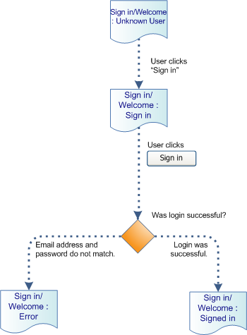
Even some traditional documentation techniques that provide a language for designing interactions come up a bit short when it comes to documenting RIAs. In task flows, as they currently exist, there is no clear indication when a site should
- transition to the next page or
- simply reload a single component on the same page
With wireframes, it’s impossible to identify all the conditions under which specific information should appear, in a manner that a development team can easily understand. However, if we add a few new symbols to the language of wireframes and task flows, we can overcome this shortcoming.
Wireframes
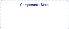
I’ll start with wireframes. We need to add a symbol to our visual vocabulary: the region. Figure 1 shows a region.

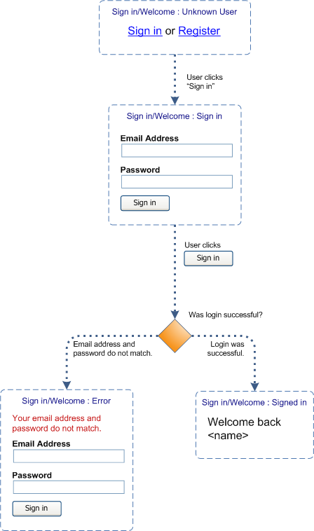
A region symbol blocks out an area of a wireframe in which a UI component—in its various states—always appears. For example, in the wireframe of a page header shown in Figure 2, the Sign in / Welcome region might contain different information, depending on what is known about a user.

To help people better understand a page layout, always include each component in some state as an example. You should name each region, making it easier for stakeholders and engineers to locate additional information about a region.


