Top

Motorcycle UX: Riding in the Fast Lane

January 7, 2008

As a UX designer, understanding what contributes to a great user experience, how to define who users are, what their mental models consist of, and what kinds of interactions encourage them to succeed—all of these things make me happy. But the thing that makes me the happiest is spending time riding my Moto Guzzi Breva 1100—a rare, handmade Italian motorcycle. For me, it’s the ultimate user experience.

Riding my motorcycle lets me experience the world through many senses: the fecund smell of Virginia farmland in June; the ripply heat of the Arkansas Delta region in the middle of a heat wave; the sound of a thunderstorm as I race to beat it, heading for shelter from the storm; and the feel of the road, the bike, and the wind as I ride wherever it is I’m going.

The ride is the thing about the experience, though. Yes, there’s also the hair-in-the-wind, live-to-ride, ride-to-live thing. However, one key element of motorcycling is its inherent dangerousness.

Champion Advertisement
Continue Reading…

That’s why signals and information about status, situation, and progress are so important and need to be readily and easily discernible. Indeed, motorcyclists must perform so many actions and be aware of so many stimuli, they need to be able to think less and act more readily. As Melissa Holbrook Pierson writes, “People tell me I think too much, but I don’t see how such a thing is possible, unless of course it is either in the middle of sex or at the apex of a high-speed turn.”

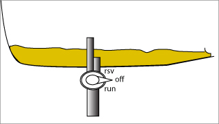
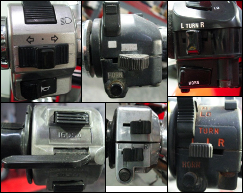
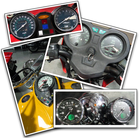
Historically, bikes have presented indicators, controls, and other elements of information in analog displays like those shown in Figure 1. For example, such indicators display measures of speed, how hard the engine’s working, and perhaps state alerts like a light that indicates the transmission is in neutral or a light that flashes to indicate a turn signal is on. Informational elements have tended to be sparse. On some bikes, a geared odometer shows how far you’ve traveled to date—and perhaps, on more upscale bikes, there’s a mechanical tripometer that a rider can reset by turning a small knob on the speedometer housing.

Figure 1—Analog motorcycle dashboards
Analog motorcycle dashboards

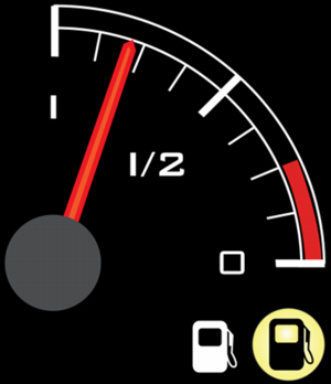
Visual perception is key to safe motorcycling. A dashboard that fully takes advantage of people’s visual perception both enhances the user experience and can, in fact, save lives and preserve equipment. If a rider knows he is going too fast, he knows he’s taking on higher risk. A rider who sees an alert indicating a low-fuel condition knows he should find a gas station soon—or risk testing just how good his roadside assistance program really is.

Such indicators must be functional, basic, and conventional. Indeed, one of my bikes was a 2002 Royal Enfield Bullet 500 Deluxe, whose 50-year-old design retained a basic approach to rider information and feedback. While its top speed was 60 mph going downhill with a strong tailwind, and it rattled my teeth enough to make my dentist wince, it did re-engage me with motorcycling—after I’d been off a bike for 25 years.

Now with their marriage of microprocessors, LEDs, and computer programming, modern motorcycles enable more rider feedback. Thus, the opportunity arises for enhanced experiences.

Stephen Few has defined business dashboards as “Visual display of the most information needed to achieve one or more objectives which fits entirely on a single computer screen, so it can be monitored at a glance.” With the same end in mind, the source for the metaphor—the motorcycle dashboard—pretty much conforms to this definition, but in place of “single computer screen” I might say “primary focal plane.”

Dan Saffer’s recent blog entry, “It’s Not Just a Container, It’s Not Just a Screen,” touches on the need for coherence between interaction design and industrial design. The modern motorcycle dashboard cries out for exactly that. So I appreciate the enhancement a well-designed motorcycle dashboard offers my biking experience.

The Moto Guzzi Breva 1100 User Experience

The Moto Guzzi Breva 1100’s controls exhibit some great design elements, as well as a few usability problems. Key informational elements include the

  • speedometer—which indicates my current speed
  • tachometer—which shows my engine’s revolutions per minute (RPM)
  • odometer—which indicates the number of miles traveled on the bike
  • status and alarms—such as those for turn signals, neutral gear, and warning and danger lights and messages

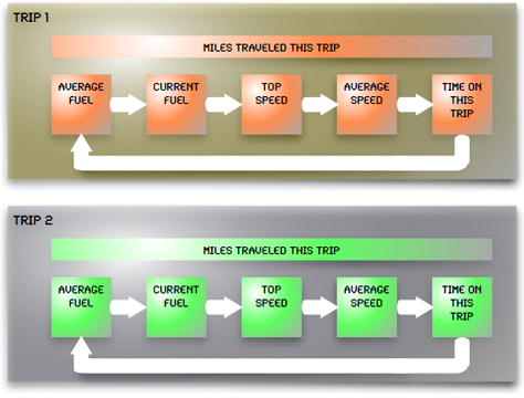
Along with these primary, time-honored dashboard elements, there are some other informational displays:

  • two tripometers
  • a chronometer
  • advanced menus

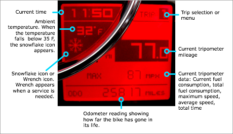
Once you turn the motorcycle key on the Breva, you’ll notice a sweep of needles on its dashboard and a flash of all its lights, as shown in Figure 2, then all lights and needles return to their ready state. This feedback not only provides a momentary flash of delight, it also serves a useful purpose. It tells the rider whether all circuits are functioning, needles are working, and the bike’s initially ready for operation. In addition, if there are any error or warning codes, they appear immediately after the power-up sequence.

Figure 2—Breva turning on
Breva turning on

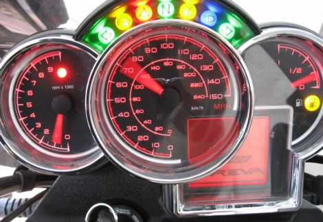
During operation, feedback on the bike’s state is critical as well—if the oil pressure drops too low or critical service is necessary, two feedback elements appear: a red warning triangle lights up on the arc of warning lights above the speedometer and an icon or message appears in place of the main display, in the lower right of the square area shown in Figure 2. Receiving this sort of feedback helps prevent damage to the engine or worse—a seized-up engine at 85 mph can really wreck a rider’s day.

Fueling the Ride

On a bike, the fuel gauge gives several key feedback signals. Its design should maximize information exchange and minimize the amount of time it takes to read the information.

First, having a fuel gauge is a recent motorcycle development, though cars have had them since 1922. Before there were fuel-injected engines, motorcycles used a petcock approach to fuel delivery. A petcock valve has three positions: Off, Run, and Reserve. Figure 3 illustrates a typical petcock.

Figure 3—Typical motorcycle gas petcock
Typical motorcycle gas  petcock

Following normal operating procedures, a rider first puts the petcock’s valve on Run. Then, when the fuel level drops below that in the taller tube to which the Run setting provides access, the bike begins to stutter as it runs out of fuel. The rider must reach down with his left hand to move the petcock from Run to Reserve—and do so before the bike quits altogether.

Sadly, this gymnastic shuffle not only increases the rider’s danger quotient, it often leads to frustration—either the rider accidentally moves the petcock to Off, killing the engine, or the rider discovers that, indeed, he’s already been riding on Reserve and, consequently, has no more fuel.

Enter the fuel gauge. By design, fuel-injected engines don’t have petcocks, but instead, use a computer to regulate the fuel and air mixture. Bikes without a fuel gauge often have a so-called idiot light, which is usually an amber light that indicates a low fuel state.

The Breva’s fuel gauge provides several points of information to riders, as Figure 4 shows. This information helps riders manage fuel, travel distance, and pit stops.

Figure 4—Breva fuel gauge
Breva fuel gauge

I really like this gauge from a UX standpoint. Here’s why:

  • The red needle provides good contrast on the gauge’s black background and lights up in low-light conditions.
  • Not only does a tick mark indicate the last quarter of the tank capacity, but an easily recognizable red arc highlights the quarter tank in the fuel gauge.
  • Once the fuel level drops below one eighth of a tank, an amber fuel light illuminates. The universal fuel-pump icon reinforces just what the light means.

In addition, if the fuel level drops critically low, the odometer changes from total miles traveled to miles traveled in a low-fuel condition. Getting this information quickly is critical, especially when riding on a lonely stretch of unfamiliar country road at dusk.

Knowing How Far You’ve Gone

On the Breva, the rider uses a toggle button called the SET Button on the left grip both to move through menus and to select an item. Located at a natural position under the rider’s left forefinger, this button lets the rider see details on the two tripometers, as well as lap timers and the battery voltage. When the bike is not running, the lap timer menu lets the rider edit settings such as date, time, mph or km, and other customization features. It also allows access to the advanced features such as diagnosis and code reset. Figure 5 shows this multifunctional display.

Figure 5—Multifunctional display
Multifunctional display

The architecture of the tripometers provides two viewing areas for each tripometer: total miles traveled on this trip, along with specific data, so while you can’t toggle the number-of-miles display, you can toggle the other information, as shown in Figure 6.

Figure 6—Breva tripometer architecture
Breva tripometer architecture

So, while riding, motorcyclists can monitor distance, fuel, speed, and time. The tripometer’s information design also constrains its usage: The display of miles traveled is larger than that of other details and appears in a light-on-dark design, forcing riders to stop in order to view and analyze the other information. Doing otherwise would require riders to change their locus of attention from the road to the smaller display, and the design’s intent was to constrain them from doing that. By making the trip data smaller, the designers hoped to increase road safety, assuming riders would view trip information while stopped.

However, that’s not how riders ride. Almost always, they want to keep going. And while on the move, they expect to view the information that’s available. Often they’ll take their eyes off the road to focus on the current fuel consumption—for example, to see how throttle management affects miles or kilometers per gallon or liter.

Another interface anomaly exists on the Breva’s left-grip controls. By convention, as  shown in Figure 7, motorcycles incorporate their turn-signal controls in the middle of the grip. Underneath them, there’s usually a horn button. Often, at the top of the control, there’s a headlight-flashing button.

Figure 7—Conventional arrangement of controls on the left grip
Conventional arrangement of controls on the left grip

Moto Guzzi decided to do something different. In their design, the horn button is in the middle of the grip, while the turn signals are below, as Figure 8 shows.

Figure 8—Breva horn and turn signals
Breva horn and turn signals

Unfortunately, this design approach not only violates a recognized motorcycle convention, but can lead to a dangerous situation. Almost all Guzzisti started riding on other bikes, and many own several different brands. When they ride a modern Guzzi, however, they run into this anomaly. I’ve read several anecdotes of folks who’ve tried to honk their horns at someone pulling out in front of them, only to activate a turn signal. Others write about scaring drivers or pedestrians when all the rider wanted to do was activate a turn signal, but instead hit the horn.

Because the horn is a safety device whose use usually occurs in moments of great stress, perhaps even some panic, and often criticality, its location should be as close as possible to the rider’s left thumb. However, the Breva and other newer Guzzis violate Fitts’s law by having the horn in the middle of their left-hand grip controls. Riders must move their thumbs more than twice as far to press the horn as to press the turn signals, as Figure 9 indicates.

Figure 9—Left grip position
Left grip position

So Does Guzzi Get UX?

To a large degree, absolutely. From the standpoints of both design and feedback, they achieve high marks. Moto Guzzi’s devotion to visual and visceral design enhances brand loyalty among its small number of fiercely loyal riders.

However, some of their interaction models seem to result from unfortunate compromises between the interaction designer and the industrial designer. For example, the SET button not only lets riders scroll through tripometers and menus, it also clears the tripometer. Hold the button down just a little bit too long and your data for the past 200 miles resets to zero. Also, when riders are using the menus, the SET button both moves through the menus and chooses a highlighted item. This kind of approach to multimodal functionality not only can create frustration—as it has when I’ve accidentally zeroed out my miles traveled on a tank of gas—it can cause confusion as well.

There’s a danger of regression in motorcycle design, too. The 2008 dashboards eliminate the red paint that indicates the last quarter tank of fuel, making motorcyclists rely on more cognitive processing to know that fuel’s low. They’ve also eliminated the red mark at the top end of the tachometer, relying instead on a flashing red light that indicates the engine is beyond its recommended operating limits.

Also, instead of greeting the rider with the bike’s model name—Breva, Griso, Norge, or Breva Sport—Guzzi now provides just the generic Moto Guzzi and its eagle logo on the startup screen. While this is just a small issue, it does degrade brand identification to a degree.

All in all, though, the design decisions that both industrial designers and interaction designers have made on the Breva provide an enhanced experience for the rider—that is, for me, as you can see in Figure 10. 

Figure 10—Riding my Breva 1100 on the Blue Ridge Parkway
Riding my Breva 1100

References

Few, Stephen. Information Dashboard Design: The Effective Visual Communication of Data. O’Reilly Media, Inc.: Sebastopol, CA, 2006.

Pierson, Melissa Holbrook. The Perfect Vehicle: What it Is About Motorcycles. W.W. Norton & Company, Inc: New York, 1997.

Saffer, Dan. “It’s Not Just a Container, It’s Not Just a Screen.” Adaptive Path Blog. Retrieved on January 1, 2008.

Senior UX Designer at LiquidHub

UX Architect & Principal at Regular Joe Consulting, LLC

Richmond, Virginia, USA

Joe SokohlJoe has more than 15 years of experience in user experience-related fields. He has concentrated on crafting excellent user experiences, using information architecture, interaction design, writing, and user research. At Keane, Joe acts as an advocate for user experience consulting: information architecture, user research, interaction design, and usability evaluation, along with visual design and Web design. He manages the careers and education of 35, mostly offshore, information architects, visual designers, technical writers, and Web developers, mentoring them in skills competency, along with general business consulting practices. He also evangelizes best practices in UX among both internal and external clients. Previously, Joe held UX positions in Hamburg, Germany; Richmond, VA; Chicago, IL; and Durham, NC. Once upon a time, he’s also been a soldier, a cook, a radio DJ, a road manager, a teacher, and a reporter.  Read More

Other Articles on Software User Experiences

New on UXmatters