Top

Winning Considerations for Interactive Content

More Than Words

Content that communicates

A column by Colleen Jones
August 4, 2008

User interface designers have more interactive options than ever for presenting content. So, we can make meaningful strides toward offering users the right content in the right place, at the right time, in the right amount. However, these rich options for interactively presenting content also come with a challenge.

Remember, years ago, when the new world of desktop publishing features opened up to us? People often succumbed to the temptation to use all of those features in one document, resulting in indulgences such as five clashing fonts on a single page. Such excessive formatting made the content harder to read, less usable, and potentially, less credible. Likewise, today, we need to think carefully about when and how we present content. This column offers my thoughts on some winning considerations for interactively presenting content—from both usability and persuasion perspectives.

Champion Advertisement
Continue Reading…

Usability Considerations

With our expanding palette of options for interactively presenting content, ensuring people can use our content remains critical. When considering the overall usability of your content, think about the impact of hiding and displaying content as well as the content’s offline uses. In describing specific usability considerations, I’ll evaluate a few specific examples of interactivity in content presentation.

Are You Using Too Much Interactivity?

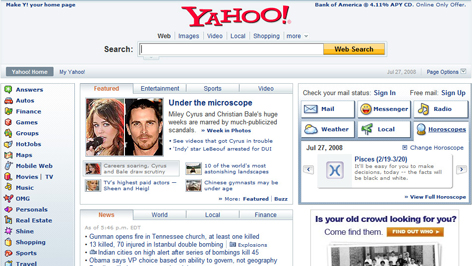
RIAs (Rich Internet Applications) let users access additional content without waiting for an entire page to reload in their Web browsers. For instance, the Yahoo! home page lets me access my horoscope without going to a new page, as Figure 1 shows.

Figure 1—Interactivity that works on the Yahoo! home page
Yahoo!

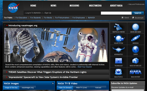
However, if interactive options make a Web page seem overly complex, the benefits of interactivity are lost. For example, the NASA home page, shown in Figure 2, offers access to an abundance of content without a user’s having to load a new page. Yet the number and variety of interactive options—expanding features, tabs, drop-down menus, and more—might be overwhelming to a user.

Figure 2—Too much interactivity on the NASA home page
NASA

Are You Making It Hard to Refer to Content?

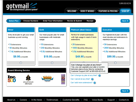
The interactive display of content can make it harder to refer to content, provide links to it, bookmark it, or share it with others. With current technology, we can provide access to content without displaying a new Web page. For instance, clicking a tab could display more content without loading a new page. In such as case, if users returned to the page, they might have to remember to click a particular tab to see the content on the tab. If the need to link to or bookmark the content were low for most users or situations, this might be fine.

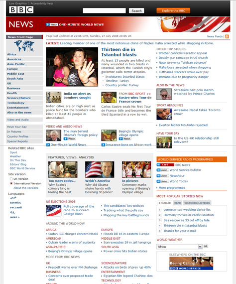
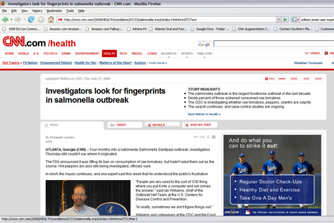
However, if the need to link to or bookmark the content were high, it would be essential to provide access to the information in a way that supports linking or bookmarking. As Figure 3 shows, CNN.com provides distinct Web addresses for its tabs, even though the entire page does not reload when displaying each tab. A user could easily bookmark or share the content on any tab—and users are likely to do so with news content.

Figure 3—Easy-to-bookmark tabs on CNN.com
CNN.com

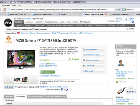
Dell.com does not have distinct Web addresses for its tabs, as Figure 4 shows. So, a customer might have some difficulty referring to the content on a specific tab or sharing it with other people who are involved in a decision to buy.

Figure 4—Hard-to-bookmark tabs on Dell.com
Dell.com

Contextual FAQs are another common example. Placing FAQs within the context of a topic or task is extremely helpful to users in the moment of performing a task. However, users who want to find the information in the FAQ later might have trouble. FAQs need to be available both in context and in a separate, easy-to-bookmark section.

Are You Making It Hard to Search for Content?

I am far from an SEO (Search Engine Optimization) expert, but I know interactively displaying content impacts search engine optimization. A page that is overwhelmingly crowded with content might fare better in search rankings than an interactive content experience, so you might want to consult an SEO expert or information resources on SEO. I suspect SEO is one factor in the current trend toward marathon-length product pages such as those on Amazon.com.

Are You Forgetting About Printing?

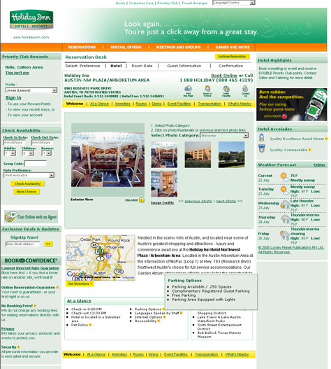
Consider whether users would want to print the content you are presenting interactively. For instance, the hotel details shown in Figure 5 offer some key facts about the hotel—Internet options, their pet policy, and more—that appear only when a user points to an icon. This feature lets users get more information without loading a new page. However, the information is not printable. When specifying the interactive presentation of content, we should also specify how to incorporate the content that we present interactively into a print version of a Web page.

Figure 5—Important hotel information is available only on rollover, so not printable
Interactive presentation

Persuasion Considerations

The persuasiveness of content is as important as its usability, as I noted in a previous column “Turn Usable Content into Winning Content.” I am very enthusiastic about the potential for the latest interactive techniques to enhance our content’s influence on users. To encourage discussion of persuasion considerations for interactive content, I’ll describe a few examples.

Are You Weakening the Impact of Long Lists?

A long list of examples, facts, or reasons is persuasive. In fact, the lengthier the list, the more persuasive it is. Seeing the sheer number of items in a list can elicit a slight visceral reaction before a user even reads a single word—“Wow, that company has a lot of customers!” Interactively displaying parts of such a list in the wrong way might undermine its influence, because the full list is not visible.

For instance, the Endeca Web site shown in Figure 6 presents its customer list using a filter that displays only a partial list. Only highlighted customers appear on the page by default. If a user notices the drop-down menu and changes the filter to a particular industry, the user might see other customers. However, the user cannot see the full customer list. This filtered list is useful—in that potential customers can easily find out about the company’s experience with clients in the same industry. But this filtered list will not influence users in the same way as letting users see the entire customer list at a glance would. A better solution would initially show the full list of customers and make the list of industries more visually prominent—along the lines of the tabbed approach on the Tealeaf Customers page.

Figure 6—Diluted customer list on the Endeca Web site
Endeca

Are You Hiding Your Value Proposition?

For some Web sites, their breadth and depth of content is their value proposition. Obscuring the scope of the content too much in the name of simple page design could hide a site’s merit. I found this consideration critical when redesigning the CDC home page. We attempted to make the page less overwhelming, as the book Measuring the User Experience describes. We also sought to showcase the Web site’s richness through using techniques such as showing samples and rotating features. In a similar vein, the BBC News Web site emphasizes its hallmark international range by showing many content samples, as Figure 7 shows.

Figure 7—Breadth and depth of content on the BBC News Web site
BBC News

Are You Missing the Opportune Moment?

Using progressive disclosure in displaying content can help us take advantage of the opportune moment, or what rhetoricians refer to as kairos. A key opportune moment is a user’s decision to buy, subscribe, or commit—a decision to act. We can use progressive disclosure to let users get answers to their last-minute questions without taking them away from the call to action. For instance, as Figure 8 shows, the subscription offer page on Gotvmail.com offers answers to relevant FAQs through rollovers.

Figure 8—FAQs on Gotvmail.com
FAQs on Gotvmail.com

Summary

For people like me, who care about content, it’s an exciting time. We now have more and better interactive options for presenting the right content, in the right place, in the right amount, at the right time. Interactive content can indeed be winning content. The trick is to display content wisely by thinking through the impacts of interactive display on usability and persuasion. 

President at Content Science

Atlanta, Georgia, USA

Colleen JonesA pioneer of content strategy, Colleen is author of The Content Advantage: The Science of Succeeding at Digital Business Through Effective Content and founder of Content Science, an end-to-end content company that turns content insights into impact. She has advised and trained hundreds of leading brands and organizations to help them close the content gap in achieving their digital transformation. A passionate entrepreneur, Colleen has led Content Science in developiing the content-intelligence software ContentWRX, publishing the online magazine Content Science Review, and offering certifications through their online Content Science Academy. She has earned recognition as a top instructor on LinkedIn Learning and as a Content Change Agent by Society of Technical Communication’s Intercom Magazine. She is also one of the Top 50 Most Influential Women in Content Marketing and one of the Top 50 Most Influential Content Strategists. Colleen holds a B.A. in English and Technical Writing and an M.A. in Technical Communication from James Madison University.  Read More

Other Columns by Colleen Jones

Other Articles on Interaction Design

New on UXmatters