Recently, I had the opportunity to reflect on common misconceptions about the role of visual design that are still prominent in the beliefs of executives, product leaders, engineering managers, and marketing professionals. Is there anything team members can do to illustrate certain beliefs are wrong? What could they do to demonstrate the truth about visual design to coworkers and stakeholders?
Though visual designers might face different hurdles in particular product domains and at different points in their careers, there are three common misconceptions that surface quite frequently:
Visual design is about making things look pretty.
Making things pop more can improve visual design.
It’s possible to evaluate visual design in pieces.
Champion Advertisement
Continue Reading…
Visual Design Is About Making Things Look Pretty
While few people literally ask a design team to make things look pretty, there is a long-standing assumption that visual design is the icing on the cake. That it’s the last step that puts a bow on the product and makes it look attractive.
Perhaps this belief stems from the general public’s introduction to design during the industrial age. Back then, products began to be styled in ways that had not been possible before, and industrial designers like Raymond Lowey got immense fanfare for their aesthetic approach to designing previously dull products.
While visual design clearly has the capacity to refine a product’s aesthetics, its potential to communicate with people goes beyond good looks. Through the visual organization of elements, designers can communicate core messages to people that answer key questions:
What is this?
How do I use it?
Why should I care?
Answering these questions is a crucial component of both utility and usability, especially in interactive products. Perhaps the best way to illustrate this is through an example.
Figures 1 through 3 depict the same basic set of features for a Web application, using the same fonts, colors, gradients, and images. The main difference between the three designs is the visual organization of the elements on the screen. This distinction illuminates three possible different primary uses of the application.
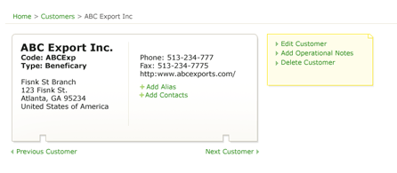
Figure 1—Sample Web application design
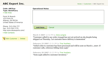
In Figure 1, the application’s presentation layer makes it clear its primary function is looking up customer contact information. Secondarily, a user can edit, delete, or supplement this information with notes. In Figure 2, the emphasis is on the communication between the customer and the company. Secondarily, a user can view, edit, and delete contact information.
Figure 2—Same Web application with a different visual organization
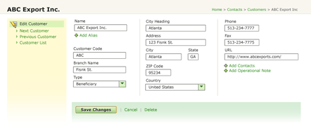
Lastly, Figure 3 puts the focus on the ability to edit customer information. Viewing contact information and tracking ongoing conversations are de-emphasized.
Figure 3—Yet another approach to the same Web application
These three variations of the application’s visual organization provide unique primary actions: looking up contact information, managing ongoing customer communication, and maintaining customer records. In each case, the more visceral aspects of the visual design have remained the same: colors, fonts, gradients, and images.
Clearly, the visual design is doing more than making this application look pretty. It is communicating the application’s core function—What is it?—and how to make use of that functionality—How do I use it?—while also making the application aesthetically pleasing.
Can You Make This Pop More?
As evidenced by the popularity of sites like make my logo bigger, stakeholders often ask visual designers to give more emphasis to certain elements in their layouts. While these kinds of comments can sometimes help us to determine what the most important elements in a design are, they often illustrate another common misconception about visual design: To improve a Web site’s visual design, you need to be make some things bigger, bolder, red, or in some cases all three!
However, the relative importance of any element in a layout ultimately depends on what surrounds it. Place a big red circle on a white page, and it will get a lot of attention. Place it next to ten pink circles, and it won’t. Therefore, emphasizing important elements is a process of managing a holistic design. It’s not about changing the treatment of any single element. Giving individual elements additional visual weight can throw off a layout’s balance and muddy important relationships between related elements, primary actions, and more.
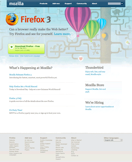
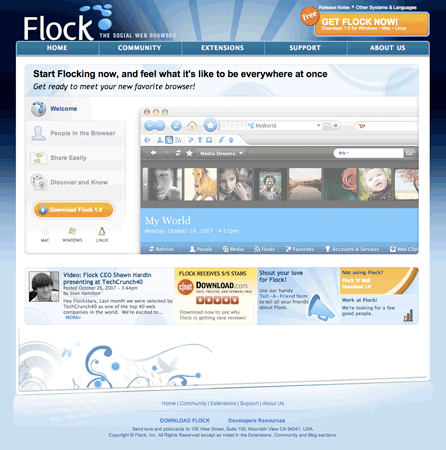
If you complied with every stakeholder request for a feature to pop more, chances are you’d end up with a layout in which every element was vying for customers’ attention—and, as a result, none of them would get it. Consider the difference between the two designs for a Web browser download page shown in Figures 4 and 5. The Firefox page has a prominent call to action for downloading the browser, and the other elements on the page—for Thunderbird, the Mozilla store, and what’s new—are not interfering.
Figure 4—Firefox download page
The Flock download page, shown in Figure 5, emphasizes so many different elements that the team decided to include four calls to action for downloading the browser—in the upper-right corner, at the bottom of the menu on the left, at the upper right in the horizontal panel of news, and in the footer. If there wasn’t so much emphasis on other elements on this page, Flock could probably get away with having just one download button like Firefox does.
Figure 5—Flock download page
It’s Possible to Evaluate Visual Design in Pieces
The factors that make it challenging to emphasize individual elements in a design without looking at things holistically also make isolated changes difficult. Yet most feedback to visual designers focuses on elements in isolation: Can you make the logo bigger? Can you change the color of this headline? Can we try a different image here?
While such comments do help designers understand what clients and stakeholders are hoping to achieve, they don’t consider the holistic approach that’s necessary for good design. Changing a color might require rethinking the entire palette, which the designer has tuned to ensure contrasting colors highlight key actions. Changing an image might mean shifting other elements around, because the focal point the original image created may no longer exist. And so on.
A product’s overall visual design results from a deliberate balancing of elements—to communicate key messages about the utility, usability, and desirability of the product. So, when a designer adjusts one element, she needs to refactor the overall composition to restore balance. Design decisions made in isolation tend not to add up to a coherent whole.
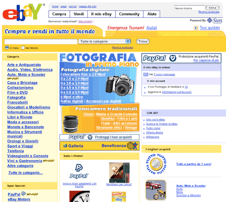
Web-based products are especially vulnerable to evaluation in isolation. Because it’s possible to test individual components independently, a product team often integrates things that performed well on their own, with the assumption that they’ll work well together. Figure 6 shows a possible consequence of isolated decision-making.
While it is probable that the header on this eBay page performed well in bucket testing, the PayPal protection logo got good marks in focus groups, and the photography promotion got decent click-through, combining these three elements on one page does not create an effective design. In fact, many of the elements on this page seem to compete with each other.
Figure 6—eBay Italy home page
Hopefully, these examples have demonstrated truths that belie some common misconceptions about the role of visual design. But convincing coworkers and stakeholders that visual design is about more than just styling, making things pop, or making isolated decisions may ultimately require a personal experience that gives them a first-hand view into the potential of visual design.
If you’ve encountered any misconceptions about the role of visual design in your professional lives—or if you’ve had good experiences that demonstrate the truth about visual design, share them in the comments below!
Thanks, Luke, for a great post. The examples are really helpful. It provides a different perspective on visual design. But I feel the design decisions regarding placement of various controls and allocation of screen real estate are more interaction design decisions than visual design decisions and would happen at the wireframing stage. It would be interesting to see how different visual treatment scan be given to the same set of wireframes to achieve the desired outcome.—Shrikant
Thanks for the reference. Let me just go out in public saying that, to me, the opportunity to see you at work over at Marktplaats.nl years ago was a complete eye opener. So, thank you for that!
What that did not do is make me a UX expert, unfortunately. However, it did open up my eyes to this specific problem area, and I’ve been interested in it ever since—motivated to make things a little bit better wherever I can!
Hope we work together again somewhere in the future!
Great article! I totally agree with your points, and the last one certainly hits home. Not taking a holistic approach to the visual design kills any sense of consistency.
I’ve found that people want to feel comfortable using a product or site, and when you’re throwing in new colors, new functionality, different copy that is supposed to mean the same thing here and there, it throws off their comfort level. Consistency is key. Again, great article!
Who could argue that Mozilla doesn’t have a great design sense?
But the second I looked at the thumbnail of the Firefox download page, I wondered what the hot-air balloons were doing there—besides looking good—and what the stylized tree, cat, and bird were adding to the call to action.
Is your opinion that these decorative elements add to or distract from the message’s persuasiveness?—Terri
Good post. Very true, although how do you go about convincing the client?!
My latest post considers prioritizing the importance of individual blocks of information before designing them, to help draw attention to the more essential elements and aid visual flow.
This is a fantastic explanation of the common misconceptions of design in general, but specifically visual design. Being published in this manner is great to articulate the ideas among other designers, but I struggle with how to make this clear to my non-design colleagues who suffer from these same misconceptions. Any ideas or suggestions?
Interesting and under-discussed topic, Luke. Well stated, as always!
We’re talking about how we communicate with our colleagues and supervisors here, right? Well, that’s the design element they don’t teach in design courses, normally.
What worries me is, if you still have this problem, I probably always will!
I’ve found it’s all about relationships. We have to establish some basis in trust. Best, also, is to measure results and maneuver or just make time to access the data. Then use the data to prove your point next time around. Generally, I’ve tried to steer away from contests of personal opinion, which never work. Best, when possible, to get empirical about things. If you can’t get the statistics to work in your favor, it might be worth reconsidering one’s own point of view. Lastly, practice communication aikido. Aikido means, roughly, “the way of harmony.” Pose thoughts as questions. Re-contextualize. Smile, speak softly, yet make it known that what you’re being asked to do contradicts your design training and experience. Talk results. Find out what they want and need, and sell what they need as what they want. Big topic.
Lastly, the lesson I keep learning, except for the part about exactly how to do it predictably: get better clients. Good clients are just as important to doing our best work as our best skills are. No level of craft skill can overcome stubborn ignorance in a position of authority.
As always, a great article I plan to pass on to others. If I had a dime every time someone told me “time to make things pretty,” I would be rich. Perhaps I should have a copy of this article on hand.
I am guilty of falling into the stereotypes of project managers when doing visual design. It can be easy to perpetuate these misconceptions, and it is important to remind everyone how the design and interface of a program can define how it’s used as well as its effectiveness.
Luke—Awesome article, man. However, I disagree with you on the first example you have given—the one with ABC exports and three different visual layouts. I think that is more of a wireframing scenario and deals more with the hierarchy of information. Therefore, I would call it an information design issue—or maybe an interaction design issue—and not a visual design issue.
I also think visual design plays an important part in drawing parallels, as well as in making the overall design cohesive. :)
All—Thanks for the insightful comments.Shrikant—Determining and prioritizing what content and actions are needed when and where within an application is certainly an interaction design effort. Manipulating visual relationships to illustrate that is something best done by people with visual communication skills. If that’s someone who calls him/herself an interaction designer, that’s great!
Jilles—Likewise!
Terri—There’s still a place for looking good and creating an appropriate personality for a site or product. This visceral aspect of visual design is what makes things desirable—if done well—and not just useful and usable.
Nathan and Michael—How to make this clear to clients and other designers? Use the kind of examples I have included here. Because people parse this kind of stuff visually, clear examples that illustrate these concepts go a long way.
uxdesign—Good points. I’ve written up some similar thoughts on my blog: “Influencing Strategy with Design: 3 Take Aways.” (See the topic further explored in links at the end of the article.)
Fritz—Great rallying call. If we all didn’t perpetuate these misconceptions, they wouldn’t be there. Easier said than done, but… :)
First, I am going to disagree with Shrikant. When someone asks someone to make something “bigger, bolder, red, or in some cases, all three”, the person doing the asking is usually talking to the Web designer or design artist, not to the interaction designer—assuming the powers that be have actually hired an interaction designer to work on their project. Emphasis is more the domain of the visual designer than the IxD guru.
Having said that, Shrikant’s argument makes a good argument for the absolute necessity of highly collaborative and communicative teams to create beautiful, usable software. If a visual designer is approached to add more emphasis to a particular element of the design, that designer should consult the interaction designer on site—if there is one—about the effect of that emphasis on the interaction design. Furthermore, when the interaction designer and the visual designer both tell the stakeholder about the detriment of making the logo bigger or making it pop more, they make a stronger case together than they would apart.
Thanks to Luke for writing this and sharing some of the headaches of the visual designer with the rest of the world.
Great article. Articulates some points that have bugged me for a while.
A couple of other interesting points some people find hard to understand:
shortest-point designing—Where buttons and controls are placed multiple times across a layout, so a user only ever needs to move the mouse a really short distance. Personally, I find this creates busy and cluttered page layouts; also, that it breaks giving the user a consistent experience—Which Save button do I have to click?
one-click designing—Reducing the number of clicks to achieve a task does not automatically make it easier for the user to achieve it. When your user has little knowledge of your system, being guided through a series of steps is much better than dumping a page on the user loaded with every possible option in you application.
In your arguments, you seem to take the role of the visual designer and minimize it to just making wireframes pretty. I think both of you are playing into the underlying issue in experience design that Luke seems to be alluding to—ownership of the design. There seems to be this notion out there that no new ideas or insights can come during the visual design phase. The design process shouldn’t be a perpetual loop back to wireframes and interaction design. At some point, don’t you have to solve problems and make things better in their final concepts? If wireframing is where all design happens, why isn’t it made pretty? If experience teams are ultimately going to come together with insightful and confident visual designers, there has to be some middle ground.
I like how you point out that graphic design can change the entire purpose and context of the Web page or Web application.
I have found that I create the wireframes and make sure I have placed all the elements in the correct place, but then, when the graphic designer comes over—with a different mindset—they are able to change the context of the application, even though the page element remains in the same place.
I’ve found it’s very important to work together with the designer, so he knows the purpose and context of my work.
Eric—Robert, Srikant, and Gaurav have a valid point. Having said that, so do you.
Both have valid points reflective of different UX team structures and processes that exist within an organization. So there is really no point in trying to simply invalidate the argument of the other in the way you seem to be doing—unless you think your organization’s UX team structure and processes are the same ones followed by every other organization. Let’s all be a little more mature here.
Great article again, Luke. Always a pleasure to read. Loved your book!
My job is primarily visual design, usability, and branding development, so I am familiar with the client’s misconceptions of visual design as well as my coworkers. Thank you for this excellent article.
Before joining Google, Luke was CEO and cofounder of Polar and Chief Product Officer and cofounder of Bagcheck. He is the author of three popular Web-design books—Mobile First, Web Form Design, and Site-Seeing: A Visual Approach to Web Usability—in addition to many articles about digital-product design and strategy. He was also the founder of LukeW Ideation & Design, a product strategy and design consultancy. Luke is a top-rated speaker at conferences and companies around the world, and was a cofounder and former board member of the Interaction Design Association (IxDA). Read More
