Top

The Mystery of Filtering by Sorting

Search Matters

Creating the ultimate finding experience

A column by Greg Nudelman
July 6, 2009

What is the difference between filtering and sorting for a search query? Any SQL developer would be happy to tell you that a sort translates to a SQL ORDER BY statement, while a SQL WHERE clause performs a filter. However, for most users of consumer-facing ecommerce applications, the difference between a sort and a filter presents a mystery they understand dimly, if at all. The distinction between sorting and filtering blurs, because of a phenomenon I’ve called filtering by sorting, which leads to all sorts of interesting search user interface implications.

Champion Advertisement
Continue Reading…

Filtering by Sorting: It Was Colonel Mustard in the Study

During one particularly memorable usability study involving filtering and sorting, my first participant—who I immediately dubbed Colonel Mustard, because of his resemblance to the character in the Milton Brothers’ Classic Game of Clue—kept referring to the sort control as a filter. During the think-aloud portion of the usability test, he repeatedly said, “I am filtering by price,” while manipulating a drop-down list we’d clearly labeled Sort By: Price: Low to High. Despite his confusion about terms, this participant was getting exactly what he was expecting—that is, lower-priced items—using the Sort By control, so sorting was working fine in helping him reach the task’s goal. At the time, I attributed this confusion about filtering and sorting to the participant’s lack of technical vocabulary and dismissed the finding as inconsequential.

But, much to my surprise, many of the participants who followed Colonel Mustard in subsequent test sessions—many of whom had different professions and levels of education and site familiarity—also said, “I am filtering by price,” while manipulating that same Sort By control. After observing this phenomenon numerous times, it became clear to me that this was not merely a matter of a simple confusion of terms between filtering and sorting. Instead, it revealed a strong mental model of filtering by sorting that blurred the difference between these two modes of search results’ refinement.

The Mental Model of Filtering by Sorting

As children, we learned to understand sorting by ordering small numbers of items. As adults, we now often sort search results that include hundreds of thousands or even millions of items. At first glance, we might not see any difference between the two tasks. Regardless of the sample size, we think our childhood training should apply perfectly well to sorting 100,000 items by price—even without our understanding what’s going on technically. Why then this strange confusion between filtering and sorting?

To understand this phenomenon, we have to take into account how people look at those 100,000 items once they are sorted. Research clearly demonstrates that—despite there being a virtual cornucopia of data—people usually see only a very small number of items in each search result set. As Jakob Nielsen wrote in Prioritizing Web Usability:

“Obviously all users saw the first screenful (the one above the fold). But viewing frequency dropped off rapidly after that. More than half the users didn’t scroll at all, so only 42% of users saw any information on the second screenful. Only the most persistent one percent of users viewed more than seven screens worth of information.”

While it’s generally hard to measure how much people scroll, my own experience studying pagination on ecommerce sites supports this finding. For a result set of 100 items per page, most people do not view even the second page of results, and almost nobody goes past the third page of results. Thus, from a customer’s point of view, for a result set of 100,000 items, sorting by price actually filters the result set, selecting at most 300 items with the lowest prices and effectively removing the remaining 99,700 higher-priced items from consideration. This is what Colonel Mustard and other participants referred to as “filtering by lowest price” when changing the sort order. Thus, I decided to call this phenomenon filtering by sorting.

There Are No Secrets of Usability

Dan Norman famously said, “There are no secrets of usability, no more than there are secrets of astronomy.” Anyone using the correct usability testing methodology could observe the same behavior in their own studies. The catch is using the right methodology. Most companies build prototypes for testing their software in a lab. Prototypes are expensive to build and populate with data, so most usability test tasks include as few preset items as possible—usually on the order of a couple of hundred—to test the discoverability and usability of various filtering and sorting controls. For my study, I lucked out and got a large test database, which let me observe this filter by sorting mental model. This example demonstrates the importance of doing frequent field studies, observing real systems, so we can decipher people’s search behaviors and mental models.

Once we accept the mental model of filtering by sorting, we can see all kinds of interesting implications for search user interfaces. Next, I’ll debunk some myths about sorting that Web development professionals have long accepted as truths. I hope our looking at these myths will inspire you to think about a few of your own sacred search user-interface cows, in the interest of improving the search experience on your site.

Myth #1: Sort Should Be Visually Separate from Search Filters

Typically, sorting controls are outcasts among search controls. Not wanting users to confuse sorts with filters, most designers place sorting options in a drop-down list that is as far removed as possible from the search box, as well as any filters—which are often on the left. Their outcast placement results in users not using sorting controls as much, because it sends a clear signal that these controls are not as important as the others.

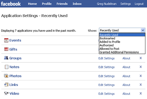
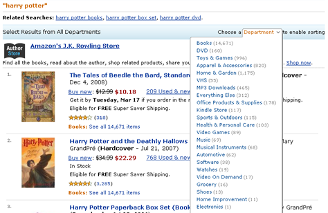
On one project, I had a marketing lead whose quick study of sorting-control usage metrics caused him to say, “No one uses sort! Why do we even need it? Can’t we put an ad there instead?” In some cases, such comments might cause designers to de-emphasize sorting controls still further—perpetuating a vicious cycle of de-emphasis of sorting controls and further decreases in their frequency of use. The end result is that potentially very useful sorting controls, which might actually have contributed significantly to increased rates of success for certain finding tasks, have all but disappeared. As Figure 1 shows, on Amazon.com, sorting is not even available until a customer chooses a category.

Figure 1—Amazon makes customers choose a category before sorting
Amazon requires choosing a category before sorting

The ostensible need to visually separate sort controls from filtering controls is a myth. As I mentioned earlier, most users do not have a clear understanding of the difference between sorting and filtering. Thus, for most consumer-facing applications, articulating what such controls do in general terms is enough. Understanding how sort is different from filtering is not critical to users’ accomplishing their finding objectives and usually makes no difference for most people. There is simply no value in placing sorting controls far away from filtering controls.

In his book Don’t Make Me Think, Steve Krug proposed that we should lay out search controls in such a way that users can read their settings as an English sentence. This, in my opinion, provides a perfect way of positioning sorting controls. In Figure 2, you can see my proposed redesign of a typical ecommerce user interface, using an English sentence structure for an improved placement of the sort controls.

Figure 2—Incorporating filtering and sorting controls in a sentence
Proposed sentence structure for controls

While, at first glance, the search user interface I’ve proposed appears to be slightly more complex than the Amazon user interface shown in Figure 1, this redesign ensures that the sort by control is in a more noticeable position and would be considerably easier for most users to understand and use. This is important, because according to my field and lab study observations, sorting can be much more successful than filtering in some cases.

Myth #2: Sorting Is Less Successful Than Filtering in Helping Customers Find Content

Anyone who’s ever observed a usability study that involved filtering search results by setting a price range can readily attest to this simple truth: People chronically over-constrain their queries. A good example would be a task like finding a digital camera that fits in your pocket and costs around $100. Most users respond to this simple task by setting the price range to—you guessed it—Price: from $100 to $100. A typical search user interface would invariably respond to this query by returning no results. This outcome is the result of a basic mismatch between a human’s understanding of what around $100 means and the machine logic that delivers precisely what the user asked for—no more, no less.

As it turned out, in the study in which we asked participants to shop for a digital camera, there were about 50 camera models for sale under $99.99 and about the same number for sale over $100.99. The mean price for cameras on the site happened to be $100, so this price should have been a perfect starting point for exploring the site’s inventory. Instead, the nature of the search user interface caused users to manipulate the filters in a way that was detrimental to their success in finding a camera.

As Neal Stephenson wrote in his book, In the Beginning… Was the Command Line:

“Giving clear instructions, to anyone or anything, is difficult. We cannot do it without thinking, and depending on the complexity of the situation, we may have to think hard about abstract things and consider any number of ramifications, in order to do a good job of it. For most of us, this is hard work. We want things to be easier.”—Neal Stephenson

To use filtering controls effectively in setting a range, users need to think in order to give instructions to the system that are sufficiently precise—but not too precise. For this reason, most filtering controls that ask users to type a range from a number to another number are simply not very successful in producing a good set of search results. The same goes for price sliders that don’t show the price range for the available inventory and make it too easy to over-constrain the query to a single price point or to too small a range.

Still, while most people would not care whether they spent $99 or $109 on a camera, those same people would care deeply about spending $99,000 versus $109,000 for a house. In the latter case, rather than a price range, the upper limit of a user’s price range would be a more appropriate filter for a query. However, most ecommerce applications, at best, let users set price only using such vague settings as around $100.

Additionally, I found that most people do not have a clear idea of a price they would expect to pay for most items and are easily swayed by other factors such as features, brand recognition, ratings, and social pressures. I will cover the design of effective search filters in a future column. Here, I just want to make the point that, for all of the reasons I’ve mentioned, a well-placed Sort by price control is often much more successful than a filtering control in producing a useful set of search results.

In contrast to filtering controls, sorting controls never produce zero search results. So, they eliminate many of the common search misunderstandings that people encounter with filtering and help people to be more successful, while applying considerably less thought to their finding tasks. Sorting displays the result set in the right configuration for efficient exploration. If, when sorting by price, a user chooses lowest first, budget models appear first, allowing customers to reach their right price point via scrolling. If a user chooses highest first, the search results present a nice entry point to the higher-end models. For finding midrange cameras, the most appropriate interaction model would a combination of sort and filter. We’ll get to that in a moment. For now, let’s just say that, in many cases, sort offers a great way of enticing our customers to explore our inventories, so they’ll find something interesting. Search success leads to more satisfied customers who come back more often.

Based on my research for consumer applications, I can state with confidence that sorting by price—high-to-low and low-to-high—is quite intuitive and quickly understood by diverse audiences. So, unless we are talking about the larger sums of money customers might spend on cars, real estate, or political donations, a simple bidirectional Sort by Price control is sufficient, even without using a price filter.

Myth #3: Sort Should Be Hidden in a Drop-Down List

As I mentioned earlier, various sorting options offer superb starting points for browsing the inventory on an ecommerce site, so there is no reason to hide them in a drop-down list. The Apple iPhone App Store shown in Figure 3 provides a great example of an alternative sorting user interface. The two buttons at the top of the screen and all of the tabs at the bottom are actually—you guessed it—examples of sort-by controls that have been liberated from a drop-down list.

Figure 3—The iPhone App Store’s sort-by controls facilitate browsing
Sorting on iPhone App Store

What makes this user interface successful? For this screen, a typical use case might be something like this: Find a new to-do list application for your iPhone that is easy to use. The best way to accomplish this task is actually through browsing, because searching by keywords like to do easy to use is not very likely to be productive. As we all know, these days, most manufacturers tout their applications as easy to use when they are nothing of the sort, and an application’s name is unlikely to match its function closely. Therefore, a better finding strategy might be to browse Productivity Apps, sorting by most popular or highest rated. The strength of using a tabs-based sorting mechanism as the App Store’s primary navigation is its ability to offer their entire inventory in a format that is optimized for a specific entry point, forming a series of parallel views of their inventory. These tabs-based sorting controls are extremely usable, intuitive, and readily contribute to customers’ success.

Myth #4: Sorting and Filtering Cannot Be Combined in One Control

As the amount of information being retrieved increases, sorting search results becomes less and less about reordering the results and more about providing a convenient way to massage the results into a manageable form that more closely matches a user’s goals. This is especially important for user interfaces with limited screen real estate—like the iPhone and other mobile platforms. However, even on the Web, the demarcation between filtering and sorting is not necessarily a rigid one. For example, as Figure 4 shows, the Facebook application inventory screen conveniently combines sorting and filtering in the same drop-down list.

Figure 4—Facebook combines sorting and filtering options in one drop-down list
Facebook combines sorting and filtering

For example, the Recently Used setting sorts the entire application inventory by date of use, while Bookmarked or Authorized are basically filtering controls that are based on flags.

Of course, there are some disadvantages to simply throwing a bunch of sorting and filtering options into the same drop-down list. For example, in the case of the Bookmarked or Authorized filters, the order in which items in the inventory will appear is not clear. In the case of Facebook applications, filtering by bookmarked apps may be the primary intent and sort order might not matter much. However, in some cases, we can apply the principle of filtering by sorting to combination sorting and filtering controls to create a more graceful user interface. For example, the Sort by drop-down list in Hotmail, shown in Figure 5, combines various sort-by options—including Date, From, Subject, and Size—with just a single filtering option—Show only messages with attachments.

Figure 5—Hotmail combines many sorting options with a single filtering option
Hotmail combine sorting and filtering

While there is nothing wrong with combining sorting and filtering, in this case, the filtering task is the odd one out in the set. It is separated visually from the sorting options, and it appears that the text of the filtering option wraps. We are left wondering how email messages with attachments would be sorted. In this case, their sort order is not a trivial matter. Will messages be sorted by date or by attachment size? If by attachment size, in what order—ascending or descending? How does this differ from the Sort by Size option?

If we use the filtering-by-sorting paradigm, we can avoid all of this confusion by adding a fifth sorting option, Sort by Size of Attachment. In this case, messages without attachments would follow those with attachments. (Logically, messages without an attachment have an attachment size of zero.) As Figure 6 shows, by adding this sorting option, we can avoid splitting options in the drop-down list into two groups, and it creates a much more minimalist and graceful user interface. This option even conforms to the existing paradigm that allows two-way sorting by attachment size—ascending and descending.

Figure 6—Proposed use of the filtering-by-sorting paradigm in Hotmail
Proposed use of filtering by sorting

The best Web sites use a creative combination of sorting and filtering to help customers reach their goals faster and easier. For example, Netflix combines Top 50 and New Arrivals sorts with a Genres filter on the navigation bar under Watch Instantly, as Figure 7 shows.

Figure 7—Netflix navigation offers sorting and filtering controls for exploring their inventory
Netflix combines sorting and filtering

Clicking New Arrivals sorts the Netflix inventory by date of entry. In contrast, the Genres drop-down menu filters the inventory by category, sorted by relevance. These two controls coexist on the same navigation bar without causing any confusion and reflect the most efficient and popular ways of drilling down into the Netflix inventory.

Top 50 is interesting variation that combines a sort with a count filter that cuts off the list of results at 50 items. There is no technical reason for cutting off the popularity sort at 50 items. However, people who use such features might feel that a top-50 or top-100 list represents a manageable number of items they can explore effectively, while a list of 100,000 movie titles sorted by popularity could be quite intimidating.

In your own search user interfaces, look for opportunities to address your customers’ goals by providing appropriate combinations of controls. If it is appropriate for a task, do not hesitate to place sorting and filtering controls sort side by side—or even to combine them in creative ways that help people meet their goals.

In Closing

Sorting controls are powerful, intuitive tools that offer multiple entry points into a browsable list of search results, while never failing to produce some search results. Many mainstream search user interfaces place Sort By controls far away from filters. However, research shows that, in the minds of many people, sorting and filtering tools are just different ways of parsing search results, so there is no reason to separate these two types of controls. In fact, some successful user interfaces combine various sorting and filtering controls in innovative ways that best meet customers’ goals.

Look for creative ways to incorporate sorting into your own search user interfaces—for example, using Top 50 controls that combine sorting and filtering. Creativity becomes especially important when providing such controls in user interfaces with limited screen real estate, such as mobile user interfaces.

When it comes to sorting controls—as with any user interface widget—always be aware that an idea that may work well in one context, for a specific type of customer, might be useless or even harmful in a different context, for a different customer. Therefore, I cannot overemphasize the importance of doing rigorous, task-based usability testing to pinpoint usability issues, A/B testing to help demonstrate the business value particular features offer, and field studies to help you understand customers’ deep mental models and get better ideas for solutions.

When in doubt, focus on your customers’ goals, and test your search results user interfaces in the field, using realistic queries that are based on your Web site metrics. Never hesitate to innovate if your current search user interface—though based on established practices for sorting and filtering controls—fails to help your customers achieve a successful search experience. Field studies are your best bet for exploring the role of sorting controls in a search user interface, especially when participants are truly motivated to find items using the user interface you are there to observe. 

Head of UX Research / Senior Director of User Experience

Principal at DesignCaffeine Inc.

Pleasanton, California, USA

Greg NudelmanFounder of the San Francisco Bay Area UX design consultancy DesignCaffeine, Greg is widely recognized as an experience design and user research expert, specializing in search, social networking, business dashboards, and process redesign for mobile and Web platforms. Greg has published over 30 articles and speaks regularly to audiences around the world about how to design intuitive and elegant systems that improve the quality of people’s lives while creating abundant ROI. He has led design projects for Fortune 500 companies and creative startups.  Read More

Other Columns by Greg Nudelman

Other Articles on Mobile UX Design

New on UXmatters