With almost daily announcements about new AR applications, products, services, companies, and tools, the pace of innovation in augmented reality is torrid. CNN,![]() the Wall Street Journal,
the Wall Street Journal,![]() The Guardian,
The Guardian,![]() Venture Beat,
Venture Beat,![]() and The New York Times
and The New York Times![]() have recently reported on augmented reality. In fact, so much buzz has come so quickly, some journalists
have recently reported on augmented reality. In fact, so much buzz has come so quickly, some journalists![]() and industry analysts
and industry analysts![]() think augmented reality is over-hyped.
think augmented reality is over-hyped.
Reality Inside Out
Though we should expect this for any new, immature technology with such potential for widespread impact and adoption, augmented reality is clearly in the spotlight right now. Augmented reality deserves special attention in this column, because it is one of the most successful ambassadors for ubiquitous computing to date. As Vernor Vinge said in 2006, “Cyberspace has leaked into the real world. …what was inside the box in all eras up to ours …is outside.” [1] We can see this happening in smart-phone applications like Layar and Wikitude, which make the intangible and conceptually challenging phenomenon of everyware easily perceptible. They make it possible to experience the new world of ubiquitous computing by reifying the digital layer that permeates our inside-out world.
The role of experience design in regard to the inside-out world of augmented reality is critical, because, as Vinge also pointed out, “Reality can be whatever the software people choose to make it, and the people operating in the outside, real world choose it to be.” [1] The UX community needs to find ways to participate in and shape this design probe![]() into the experience of everyware. To UX designers of all stripes, this blizzard of AR products offers a collection of prototypes that can help us understand and refine the basic interaction models and experience concepts that will underlay future generations of everyware. UX professionals can offer an essential perspective—as well as substantial history and a critical set of methods and skills—for the creation of delightful, useful, and humane augmented experiences, expanding their relevance and value. This opportunity is upon us now and is ours to grasp—or miss!
into the experience of everyware. To UX designers of all stripes, this blizzard of AR products offers a collection of prototypes that can help us understand and refine the basic interaction models and experience concepts that will underlay future generations of everyware. UX professionals can offer an essential perspective—as well as substantial history and a critical set of methods and skills—for the creation of delightful, useful, and humane augmented experiences, expanding their relevance and value. This opportunity is upon us now and is ours to grasp—or miss!
Augmented Reality: A Thumbnail Sketch
While researcher Tom Caudell coined the term augmented reality in 1992, the functional and experiential concept originated with the head-up![]() instrument displays and targeting devices airplane manufacturers created for military pilots shortly after World War II. Since the 1970s and 1980s, many distinct, but complementary domains of academic computing research and commercial technological development have contributed to the evolution of augmented reality. In the 1990s, the first AR products addressed the needs of such specialties as medicine and engineering.
instrument displays and targeting devices airplane manufacturers created for military pilots shortly after World War II. Since the 1970s and 1980s, many distinct, but complementary domains of academic computing research and commercial technological development have contributed to the evolution of augmented reality. In the 1990s, the first AR products addressed the needs of such specialties as medicine and engineering.
The convergence of mobile computing and wearable computing with augmented reality is naturally of great interest to interaction designers who are interested in the rise of everyware. Throughout augmented reality’s evolution, continuous technology advancement has rapidly changed the range of possible interaction models and experience concepts. As recently as 2003, for example, the hardware for wearable AR experiences—like the game Human Pacman,![]() built in Singapore—was distressingly cumbersome, and the social, physical, and cognitive limitations it placed on interactions were quite stringent. Contrast the experience of wearing the heavy and unappealing equipment for Human Pacman with that of wearing the powerful video eyewear now available from Vuzix and other wearable
built in Singapore—was distressingly cumbersome, and the social, physical, and cognitive limitations it placed on interactions were quite stringent. Contrast the experience of wearing the heavy and unappealing equipment for Human Pacman with that of wearing the powerful video eyewear now available from Vuzix and other wearable![]() computing devices just five years later, and the rate of change is easy to see. (For more information and a historical review of mobile augmented reality, see this “History of Mobile Augmented Reality.”
computing devices just five years later, and the rate of change is easy to see. (For more information and a historical review of mobile augmented reality, see this “History of Mobile Augmented Reality.”![]() )
)
Current definitions of augmented reality vary. Wikipedia describes it as “a field of computer research [that] deals with the combination of real-world and computer-generated data (virtual reality), where computer graphics objects are blended into real footage in real time.” [2] Robert Rice, Chairman of the newly launched Augmented Reality Consortium![]() defines it more broadly, as follows:
defines it more broadly, as follows:
“When I talk about AR, I try to expand the definition a little bit. Usually, when you talk to someone about augmented reality, the first thing that comes to mind is overlaying 3D graphics on a video stream. I think though, that it should more properly be any media that is specific to your location and the context of what you are doing (or want to do) …augmenting or enhancing your specific reality.” [3]
The most important difference between these definitions is their frame of reference. Rice’s definition centers on the user experience, while the traditional definition centers on the elements that make up the medium of delivery. Rice’s definition also directly addresses locality and intentionality, two of the most important contextual aspects of any human experience. Locality and intentionality are critical factors in interaction design. I recommend UX practitioners use his broader definition when creating augmented experiences.
Remixing Reality
Much of augmented reality’s unique character comes from its combination of reified elements—usually bits of context that serve as the augmentation—with a traditional focus such as an object, place, person, or photo. Today’s augmented interactions often represent contextual elements within the augmented experience—for example, using icons to indicate direction and the distance to nearby points of interest—rather than being directly present—to continue the same example, by showing live video of points of interest. The presence of these representative reifications mixed in with reality is what makes augmented reality inside out.
Designers should bear in mind that mixed reality is not natural. Design always shapes a mixed-reality experience in some way. Mixed Reality is a constructed![]() experience, requiring AR creators to answer two very important questions when defining the particulars of any augmented experience. First, designers must decide, How inside out should this reality be? Second, How should this reality be inside out? The first question concerns degree; the second, form. I’ll begin by answering the first question.
experience, requiring AR creators to answer two very important questions when defining the particulars of any augmented experience. First, designers must decide, How inside out should this reality be? Second, How should this reality be inside out? The first question concerns degree; the second, form. I’ll begin by answering the first question.
Designers can better define and understand the possible combinations of real and virtual elements in user experiences within the context of Paul Milgram’s Virtuality Continuum,![]() depicted in Figure 1. As this model shows, augmented reality and augmented virtuality are forms of Mixed Reality,
depicted in Figure 1. As this model shows, augmented reality and augmented virtuality are forms of Mixed Reality,![]() which according to Paul Milgram and Fumio Kishino, blends the extreme points of fully real and fully virtual to some degree.
which according to Paul Milgram and Fumio Kishino, blends the extreme points of fully real and fully virtual to some degree.

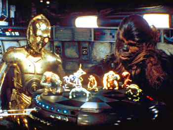
Augmented-reality experiences supplement the real world with the virtual world by connecting people to informational elements that are present, but not otherwise accessible—assuming you don’t wear a lead helmet to keep out those troubling transmissions. Augmented virtuality refers to predominantly virtual spaces that dynamically integrate physical elements such as objects or people into the virtual world, letting users interact with them in real-time. [4] The holodeck from the Star Trek universe is a classic science fiction example of augmented virtuality.
For designers, the most important thing to note about the Virtuality Continuum is the absence of any clear boundary between the real environment and the augmented reality. Now that reality is inside out, these boundaries become blurry in many ways. As author Charlie Stross noted when addressing the LOGIN conference:
“…we’re going to end up with the Internet smearing itself all over the world around us, visible at first in glimpses through enchanted windows, and then possibly through glasses, or contact lenses, with embedded projection displays.” [5]
Augmented reality is just such a glimpse through an enchanted window, and user experience creators are privileged to help make these windows available to the rest of the world. This brings us to the second question AR designers must answer: How should reality be inside out?
The User Experience of Augmented Reality
In its current experimental form, augmented reality inhabits the interzone![]() between the defined cultural categories of technology, art, commerce, utility, science, play, and entertainment. In time, this will change, as augmented reality moves from prototypes to finished concepts and reaches maturity in one or more of these cultural categories. For example, the geohacking William Gibson describes in his novel Spook Country shows augmented reality as it might progress toward a recognized art form.
between the defined cultural categories of technology, art, commerce, utility, science, play, and entertainment. In time, this will change, as augmented reality moves from prototypes to finished concepts and reaches maturity in one or more of these cultural categories. For example, the geohacking William Gibson describes in his novel Spook Country shows augmented reality as it might progress toward a recognized art form.
While we wait for cultural processes to sort out the long-term place of augmented reality, reviewing some impressions of current AR efforts is a good way to learn from the in-progress design probe.
First Impressions of AR Microsites from AD LAB
Two potential business applications for new AR technologies are marketing and advertising. In May, the AD LAB blog posted a summary of author Ilya Vedrashko’s reactions to several AR advertising efforts![]() current at that time. His five main points, which follow, accurately capture the problems with most of the augmented experiences for marketing, advertising, and communications concepts.
current at that time. His five main points, which follow, accurately capture the problems with most of the augmented experiences for marketing, advertising, and communications concepts.
- “The good news: the wow factor is undeniable. I had colleagues standing over my shoulder commenting on how cool it was.
- “The bad news: it’s jaw-dropping only the first time you see it. After that it quickly regresses from ‘neat’ to ‘meh’.
- “The usability of most implementations is pretty horrendous. You have to hold up a letter-size piece of paper in front of your Web cam just so or the whole animation goes away, and then you have to peek around it to see what’s happening on the screen. I suspect it works better with smaller objects (I want to try one of those Topps cards next), or with mobile devices.
- “Only Eminem’s AR animation was interactive beyond simple rotation—you have to spray graffiti over it with your mouse. Not very easy either.
- “The biggest question I had was why. For all the trouble they make you go through (download, print, and in case of Star Treck, install a plug-in), you’d expect a somehow more rewarding payoff. From the ‘useful, usable, desirable’ list, most implementations check off only ‘desirable’ for, like, the first two minutes.” [6]
Vedrashko’s assessment is that these experiences remain skin-deep at best, offering little, if any, sort of reason to pay attention beyond the initial moment of interest.
Common Problems with AR Applications
Robert Rice—long-term industry advocate and CEO of Neogence, a company building tools and other offerings in the AR technology space—identifies three problems common to early-stage, browser-style AR applications such as Layar and Wikitude, as follows:
“One is that they are all trying to get people to build new applications for their browsers, when they should be trying to get people to create content that they can share and browse.
“Second, someone using Layar is not going to see anything that is designed for Sekai or Wikitude.
“Third the experiences are generally for one user. While I love all of these guys and think each of the teams has some real talent on it, the model is flawed until someone using Wikitude can see the same thing that someone using Layar or Sekai camera is seeing (provided they are in the same physical location).” [7]
Rice is primarily concerned about questions of interoperability—on several levels—the predominance of single-person user experience and interaction models, and the focus on the interface to augmented reality rather than content. I agree with his assessment of the limitations of the browser class of AR experiences, as well as his concerns about misplaced focus, longer-term ecosystem growth, and the value of content.
As for the mainstream perspective on the myriad of AR experiences, CNN observes, “People don’t necessarily want to walk around the world holding cell-phone screens in front of their faces.” [8] CNN’s assessment is overly reductive for an immature class of experiences. But it’s also exactly the sort of summary judgment that identifies a critical area for improvement in the overall value proposition for AR offerings.
Painting with a Limited Palette: Interaction Design Patterns
Earlier, I observed that the answer to the second major question for AR designers—How should this reality be inside out?—primarily concerns form. In the same way that a design concept bridges two separate domains—the problem domain and the solution domain—a mixed-reality experience bridges the real and contextual domains. And just as a bridge’s form determines who and what can travel across it, the form an AR experience takes substantially determines the set of possible interactions with and within the mixed reality. The interactions built into and around a mixed reality set the stage for a complete user experience and thereby determine much of its potential value. The criticisms of current AR experiences show they offer little value beyond their material’s immediate novelty.
Many of the experiential problems AD LAB, Rice, and others identify have roots in the very small set of primary interaction patterns that provide the structure for a very large proportion of the recent wave of AR offerings—by my informal inventory, just four—or perhaps five. This means designers have a very limited set of options for framing the strategy, structure, interaction, user interface, and other design aspects of an AR or mixed-reality experience. To help designers better understand when to use these patterns, I’ll describe each pattern and provide examples. Then, I’ll suggest interactions the current set of patterns fails to address. Designers and AR creators should see these gaps as opportunities!
Head-Up Display
The Head-Up Display interaction pattern echoes the targeting and navigation displays in military and other aircraft like that shown in Figure 2. This is the oldest of the AR interaction patterns. Augmented experiences using the Head-Up Display pattern add information about the real objects in view into a complete mixed-reality experience that built-in AR tools and devices generate. While many AR experiences rely on external devices—that is, external to the body—those using the Head-Up Display pattern commonly depend on hardware that is integral to a vehicle or cockpit-like physical setting.
Another very important attribute of the Head-Up Display pattern is integration with a fixed point of view—typically the focus of the user’s visual field. This pattern also applies to wearable systems such as the helmet-mounted displays![]() modern infantries use.
modern infantries use.
The Terminator films and television franchise have used this interaction pattern to great effect to communicate the machinic state of mind of the cyborg Terminators.

Examples of the Head-Up interaction pattern in augmented reality include games—like ARhrrrr, shown in action in Figure 3, and Doom Resurrection for the iPhone—and navigation systems for BMW and other cars, shown in the videos in Figures 4 and 5.
Interaction designers considering the Head-Up Display interaction pattern should keep in mind the tremendous influence of kinesthetic awareness![]() and proprioception
and proprioception![]() on such AR experiences, as well as the social effects of directed gazes.
on such AR experiences, as well as the social effects of directed gazes.![]()


