Top

Best Practices for Designing Faceted Search Filters

Search Matters

Creating the ultimate finding experience

A column by Greg Nudelman
September 7, 2009

Recently, Office Depot redesigned their search user interface, adding attribute-based filtering and creating a more dynamic, interactive user experience. Unfortunately, Office Depot’s interaction design misses some key points, making their new search user interface less usable and, therefore, less effective. That’s the bad news. The good news is that the Office Depot site presents us with an excellent case study for demonstrating some of the important best practices for designing filters for faceted search results, as follows:

  1. Decide on your filter value-selection paradigm—either drill-down or parallel selection.
  2. Provide an obvious and consistent way to undo filter selection.
  3. Always make all filters easily available.
  4. At every step in the search workflow, display only filter values that correspond to the available items, or inventory.
  5. Provide filter values that encompass all items, or the complete inventory.

By following the attribute-based filtering design best practices this article describes, you can ensure your customers can take care of business without having to spend time struggling with your search user interface.

Champion Advertisement
Continue Reading…

1. Choose either drill-down or parallel selection.

There are two basic ways of selecting values for filters: drill-down and parallel selection. Ignoring the various modalities of the many derivative mechanisms for these primary modes of selection, the two basic ways of specifying a value for a filter essentially boil down to two choices: links and check boxes.

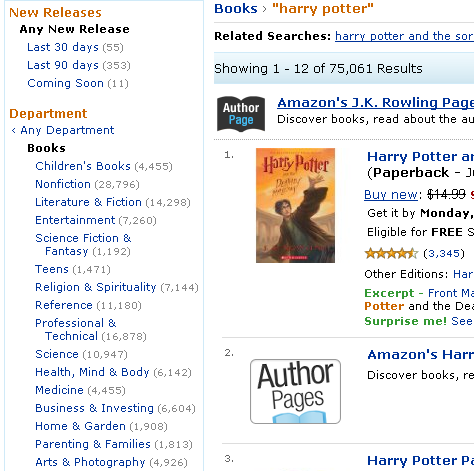
A link is the simplest mode of filter selection. By clicking a link, a customer can either select a single value for a specific filter or drill down a level in a taxonomy, like a category or department hierarchy. Amazon.com, shown in Figure 1, provides one of the best examples of a search results user interface that uses links to indicate filter value selections. Links usually indicate a straightforward equals condition—for example, I want to narrow my search results to Department = Books—as they do on Amazon.

Figure 1—On Amazon, links let customers indicate a single filter value
Link filters on Amazon

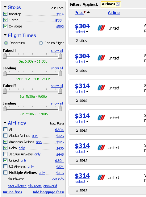
In contrast to links, which let customers indicate a single filter value, check boxes let customers indicate parallel selections of multiple filter values, limiting the scope of search results to those that match them. The Kayak.com search user interface, shown in Figure 2, uses check boxes to limit search results to specific airlines. As on Kayak, check boxes typically indicate an additive OR condition—for example, I want to narrow the search results to: Airline = American OR Delta OR United.

Figure 2—Kayak airline selector uses check boxes to select multiple values
Multiple filter values on Kayak

Links and check boxes complement one another very well. Links are great where customers need to display multiple levels in a hierarchy—for example, multilevel category drill-downs. Check boxes are great for selecting one or more options for attributes like brands or sizes. Unfortunately, not all Web sites use these two value-selection paradigms correctly.

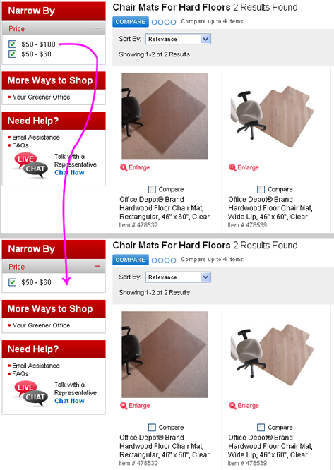
As shown in Figure 3, the Office Depot user interface uses check boxes for indicating value selections, leading customers to expect a parallel selection paradigm, in which they could indicate they want to search multiple price ranges by clicking several check boxes. For example, to find chair mats that are priced from $0 to $100, you might expect to be able to select the price filter’s first two check boxes. Thus, after clicking the $50-$100 check box, you would expect to retain the ability to select the $50 and below check box.

Figure 3—Office Depot mixes the drill-down and parallel selection paradigms
Office depot mixes selection paradigms

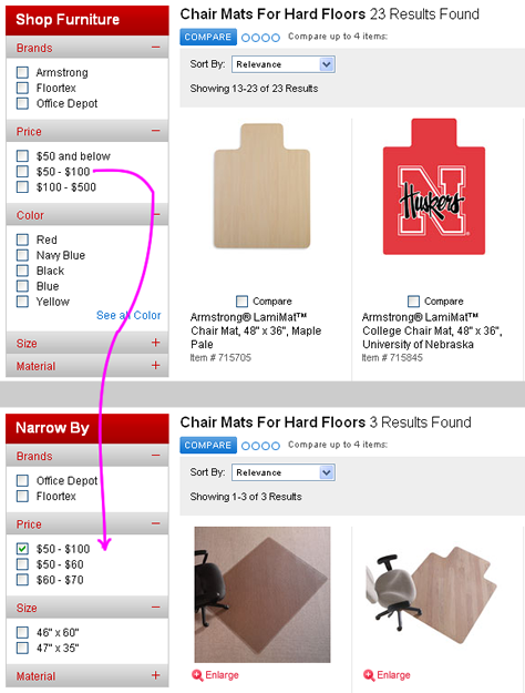
However, once a customer selects the $50-$100 check box, the Office Depot search user interface does something completely unexpected. It drills down into the $50-$100 price range and removes the $50 and below check box, breaking the affordance of a group of check boxes that should let customers select multiple, parallel OR values for a single filter. Instead, the user interface now displays $50-$60 and $60-$70 ranges, while still displaying the range of $50-$100 the customer originally selected as one of the available OR values. Mixing the drill-down and parallel selection paradigms results in a very confusing search user interface.

Another confusing thing about the Office Depot user interface is that it does not provide any obvious way to deselect filters and return them to their original, pre-filtered state. This brings us to the next best practice: providing an obvious undo mechanism.

2. Provide undo for filter selections.

Both Amazon and Kayak—pictured in Figures 1 and 2, respectively—provide a clear and consistent way to undo a filter value selection and go back to All or Any for a specific filter. For example, Amazon provides a link to Any Department. Notice that the link is offset to the left, and a less than (<) symbol helps customers understand that this particular link goes back.

Under Airlines in Figure 2, you can see that Kayak solves the undo problem by letting customers click an All check box to view flights from all of the available airlines. Note that the Kayak undo is slightly less clear than that in the Amazon user interface, primarily because the All check box is neither highlighted in any way nor separated from the rest of the check box options. Instead Kayak highlights the airline that offers the best price. While not standard, this is hardly something that would cause undue confusion.

On the other hand, the Office Depot user interface, shown in Figure 3, does not, at first glance, provide an obvious way of undoing the selection of the $50-$100 price filter. There is actually a mechanism that lets customers do this, but it is not at all obvious. The way for a customer to return to Any price is to deselect all filter selections. While this design may be completely valid from a computer’s standpoint, deselecting all check boxes does not effectively communicate the concept of All Prices to a person using the user interface. It would be much more effective to provide an All or Any option.

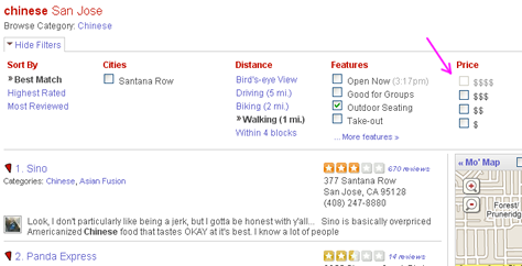
There are sites that use the deselect-to-undo paradigm successfully—one fine example is Yelp.com. However, sites that use deselect-to-undo typically take special steps to ensure consistency in the filter value options that do not change based on other filter selections. For example, instead of removing options, the Yelp user interface makes certain filter values unavailable to indicate lack of inventory availability. Items that are unavailable appear dimmed, as shown in Figure 4.

Figure 4—Yelp ensures consistency in its deselect-to-undo paradigm
Deselecting to undo on Yelp

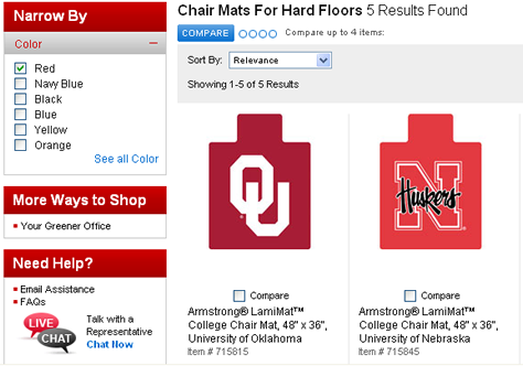
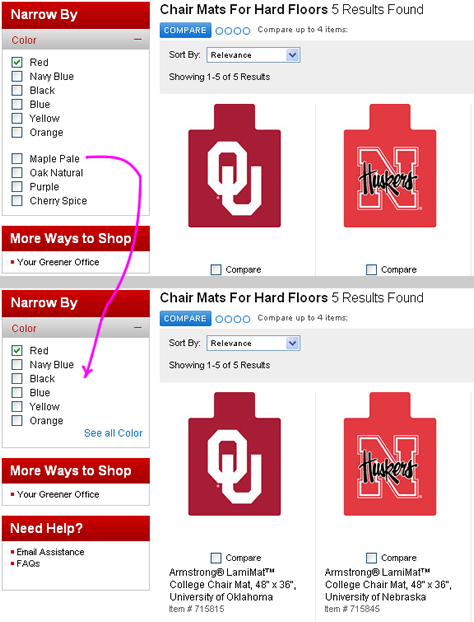
However, in cases where consistency is difficult to achieve, it is a far safer option to use Any or All to undo filter selections, particularly when a filter’s value options are dynamic. As shown in Figure 5, when a user deselects filters out of sequence on the Office Depot site, even more confusion results.

Figure 5—On Office Depot, the order in which filter options are deselected matters
Deselecting filters on Office Depot

The Office Depot user interface is particularly sensitive to the order in which a user deselects the check boxes for a single filter. For example, the price filter option $50-$100 simply disappears if a user deselects it before deselecting the $50-$60 filter option. A customer would have to click the browser’s Back button twice to undo both selections, because there is no other way to return to the default state. Typically, all of the available filters and options, plus the data that appears on a page can change after each click. The key is to avoid completely removing options in the same filter where a click took place.

3. Always make all filters easily available.

Please don’t misunderstand me. I am not saying all filters should be visible at the same time. It is perfectly acceptable to collapse filters to just a label, providing a single link like View All Filters, or to display previously selected filtering options in a unique way. However, if at different steps in the search workflow, filters start randomly disappearing from the search user interface with no way to bring them back, bad things start to happen very quickly.

Figure 6 shows what happens to the Office Depot search results when a user selects the option Red in the Color filter. As you can see, once a user selects a color, all of the other filters disappear entirely.

Figure 6—On Office Depot, filters disappear randomly
Filters disappear on Office Depot

Does this system behavior make any sense? Let’s say I want to buy a red chair mat. Under Color, I can select the Red check box and view a great variety of red chair mats. Is there really a compelling reason for me to do anything else with the color filter? Will I, as a true connoisseur of all things red, perhaps drill down into shades of red for my chair mat, such as Burgundy, Farmhouse Red, or Ripe Tomato? Not very likely—at least not for chair mats. Instead, I am much more likely to say, okay, these are all of the red chair mats. Great! Now, can I select a mat from a known brand? Or perhaps I would like a budget-priced mat, so I need to further constrain my search by price. Or maybe I am a stupendous fan of the Ohio Buckeyes and want to find a chair mat with my team logo, leaving fans of the Michigan Wolverines green with envy. Using other filters to continue massaging my red chair mats query is a far more likely scenario.

Alternatively, let’s consider a different use case: I just selected Red, and now I can see a bunch of red chair mats. Almost immediately, I realize these red chair mats are almost, but not quite, entirely unlike the mat I actually want to buy. So, I immediately attempt to seek out two things:

  1. a way to undo my most recent selection
  2. a way to review what other filtering options I might want to use

Unfortunately for both these use cases, when I selected a color, the Office Depot search user interface unhelpfully removed all other filters. This action would be tantamount to Kayak’s removing all other filters like departure and arrival times, number of stops, price, and class whenever a customer selected a particular airline. How helpful do you think that would be to someone trying to find a flight? Removing any filters completely can be detrimental to customer success and is, therefore, not recommended. If you really feel compelled, for some reason, to minimize the screen real estate you devote to filters, you can collapse individual filters or hide their options temporarily under a More Options link.

4. Display only filter values that apply to the available inventory.

I touched on the idea of showing only options and links that actually point someplace useful in my first UXmatters column, “Starting from Zero: Winning Strategies for No Search Results Pages.” At every step in the search workflow, any visible filtering options should reflect only the inventory that is available. This is dependent on a customer’s previous actions—both the keywords in the original query and the other filtering selections. As shown in Figure 7, the chair mat color selections expand to reveal tasty color choices like Maple Pale and Cherry Spice. Selecting Maple Pale and Red together should give us both red and Maple Pale chair mats. Unfortunately, the user interface does not seem capable of supplying Maple Pale chair mats, because, when the page reloads, it displays the same five red chair mats.

Figure 7—Office Depot shows color selections that are not applicable to a query
Office Depot shows options that aren't applicable

This idea seems really obvious, but quite a few otherwise first-rate sites seem to miss it. Often, the underlying issue is technical. On many sites with Ajax search user interfaces, pages retrieve and recompute all the summary data for all filter values in response to each change a customer makes, so speed becomes a primary concern. For many legacy systems, the demands of just-in-time data delivery are simply too much. At the end of their development cycle, developers are often frustrated to find that, despite their best efforts, their aging systems simply cannot deliver the speed necessary to retrieve all the filtering options, plus the items themselves, plus the data for pagination, in a single Ajax call. In such an event, rather than redesigning the system from scratch to address the root cause of this problem, developers often end up taking shortcuts—either

  • caching all of the filters or
  • providing a generic list of values that may or may not be applicable to the specific query at hand—like the color values on Office Depot

5. Provide filter options that encompass the complete inventory.

An equally important point is that we must always strive to design every filter to include a list of options that encompasses the entire available inventory. Let me give you an example. As you can see in Figure 7, the color filter in the Office Depot search user interface does not display the most common chair mat color, which is clear. Therefore, once a user clicks any of the color options, the site can display only a fraction of the available inventory—in this case, only 16 of 23 available items. The seven chair mats that are clear have no color attribute, so customers can never choose to view only those items using the Office Depot user interface. Instead, by specifying a color value, they unknowingly remove clear mats from consideration. This system behavior is clearly not beneficial to someone looking for a chair mat—especially if they are looking for the most common variety.

I am not sure what Office Depot’s reason for omitting clear from their color options might be, but it is reasonable to assume that the clear chair mats have the color attribute of empty, or null. Therefore, it is not possible to group these items under a valid color filter attribute. Fortunately, one fairly straightforward way to resolve any missing or inconsistent data is to include Other or All Others as a filter option. The SQL condition corresponding to Other should specifically include any items for which the color field is empty, or null, enabling customers always to view the entire inventory by using some combination of the available filter selections.

Often, there are more options for a given filter than you can show at once. Typically, best practice tells us to show 4 to 7 options for each of the filters. If there are too many options to display, it is often desirable to hide the rest of the options in a More Choices panel or popup. In this case, Other might be an option that shows up only once a customer is viewing the additional options. Specific queries dictate where to show each particular option. In our example, given the popularity of clear chair mats, I think Other should be at or very near the top. However, regardless of their order, it is critical to include all of the options that encompass the complete inventory. This is especially important in cases where there is no All or Any undo option—as in the Office Depot search user interface. Otherwise, we risk making some of the most popular items on a site unfindable.

In Conclusion

Faceted search user interfaces are fairly new, and potential design pitfalls abound. Fortunately, there are a few relatively simple and straightforward design best practices that should help designers to minimize cognitive friction and create search user interfaces that are easy to understand and use.

In this column, I’ve presented five best practices for designing filters for faceted search results. Of these, I think the first—choosing either drill-down or parallel selection—is the most important. If you choose your filter value-selection paradigm correctly, you are already half way there.

Whichever filtering paradigm you decide to implement, be sure to test your search results user interfaces thoroughly with both your potential and existing customers. I cannot overemphasize the importance of testing search user interfaces using realistic tasks. If your budget allows, it is best to avoid predefined search tasks. Instead, study how real people find items they are actually interested in—preferably in an environment where they would normally do the kind of searches you want to study. When designing search user interfaces, field studies are a crucial tool for continually making and validating design improvements—not just something you do as a formality at the end of a project. 

Head of UX Research / Senior Director of User Experience

Principal at DesignCaffeine Inc.

Pleasanton, California, USA

Greg NudelmanFounder of the San Francisco Bay Area UX design consultancy DesignCaffeine, Greg is widely recognized as an experience design and user research expert, specializing in search, social networking, business dashboards, and process redesign for mobile and Web platforms. Greg has published over 30 articles and speaks regularly to audiences around the world about how to design intuitive and elegant systems that improve the quality of people’s lives while creating abundant ROI. He has led design projects for Fortune 500 companies and creative startups.  Read More

Other Columns by Greg Nudelman

Other Articles on UX Design

New on UXmatters