Conflicting demands make many UX professionals think of ads as a necessary evil. Customers frequently go out of their way to say they hate ads, while marketers always seem to try their hardest to stuff as many of them as they can on each search results page on your site. This leaves many UX design professionals caught in the middle, trying to balance the ad equation—and frequently failing to fully satisfy either customers or marketers. For this 2-part column, I’ve teamed up with advertisement and eyetracking research guru Frank Guo to present real-world strategies for successfully integrating ads into your search results. The goal is making money without unduly turning off your customers.
Champion Advertisement
Continue Reading…
Don’t Kill Your Golden Goose
Internet ads have gone full circle—from the Ads are great! Now, we can make money on anything! mania of the early 1990s to the Ads are dead post-dot-com bust philosophy. Currently, the notion that ads are a legitimate way of boosting revenues on an ecommerce site seems to be making a comeback—in part, because this is a tough economy for many etailers. Every penny counts, and every stream of potential revenue demands careful consideration. However, research and experience show that, for an online business to succeed and thrive, it is important to temper any temptation to load up on ads and get a quick revenue boost this quarter with broader, long-term considerations—like user experience, customer loyalty, and brand attributes. If you are not careful, trying to squeeze out a few more eggs can easily kill your golden goose.
However, following a few simple guidelines—while listening carefully to your customers—can help your business make money with ads, without compromising either long-term customer loyalty or your brand image. Here are the best practices we’ll discuss in Part I of this column:
Integrate your ads’ appearance with the rest of your site.
Make sure customers can easily distinguish ads from content.
Keep ads relevant and appropriate.
Understand how your customers interact with ads.
Integrate Your Ads’ Appearance with the Rest of Your Site
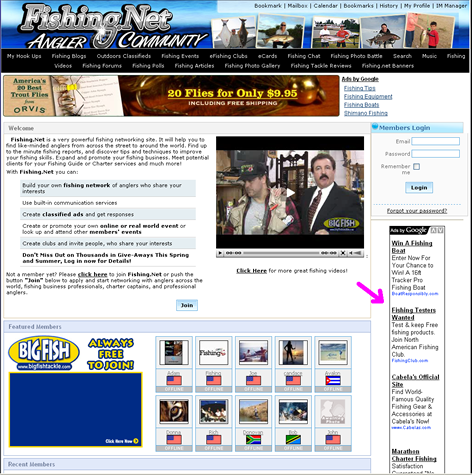
In recent years, Google has emerged as the industry-leading supplier of ads on the Web. Indeed, Google ads make it easy—and often profitable—for you to sign up and host ads on your Web site. Most of the time, the ad content is fairly well targeted, so many retailers, bloggers, and developers of social networking sites have taken advantage of the opportunity to host Google ads. Unfortunately, few have made the effort to customize the boxed ads to make them look like the rest of their site. Figure 1 shows the social networking site Fishing.net, which carries Google ads just as they come “out of the box,” without any customization.
Figure 1—On Fishing.net, Google ads have no customization.
Neglecting to customize third-party ads is, of course, easier, but there are consequences to this approach:
Customers frequently perceive your entire site as cluttered and disorganized.
Customers mostly ignore the ads, because they look different from the rest of your content.
This is a lose-lose situation. Your customers lose out, because their experience of your site is degraded. Your marketers lose out, because customers click their ads less often—if at all.
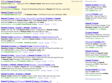
Experience shows that a small amount of visual design and programming effort that makes your ads look like the rest of your site can yield tremendously positive responses from your customers. They stop seeing ads as clutter and instead perceive them as content. Google, of course, provides a superb example of this strategy in practice, as shown in Figure 2.
Figure 2—Google.com sets the standard for ad placement and integration.
Google has carefully crafted their customer experience, paying strict attention to everything from page balance and spacing to tweaking even the smallest visual design elements. In a recent Q&A with G. Hotchkiss, Marissa Mayer, Google’s VP of Search Products & User Experience, described how replacing the box that used to contain ads on the right side of search results pages with a vertical line separator improved ad traffic, because of the ads’ closer integration with the content.
Make Sure Customers Can Easily Distinguish Ads from Content
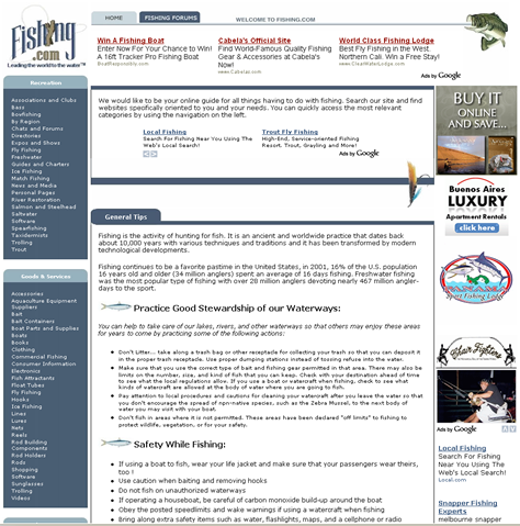
When taken to the extreme, the guideline to better integrate ads and content becomes a design antipattern. Customers’ being unable to distinguish ads from content becomes especially painful and disruptive when a Web site carries a large number of ads. For example, on Fishing.com, as pictured in Figure 3, there are so many closely integrated ads that they become virtually indistinguishable from the content—to the extent that it becomes difficult to understand what service the site actually provides.
Figure 3—Ads on Fishing.com are overwhelming and confusing.
However, even if the number of ads on your site is not overwhelming, customers can have difficulty distinguishing them from content. One very common problem is providing different types of search results—some of which stay on the same site, while others take customers elsewhere. (We should note that surprising customers about where links go is never a problem for Google or other Web search engines, because both their ads and their search results take searchers to other sites.)
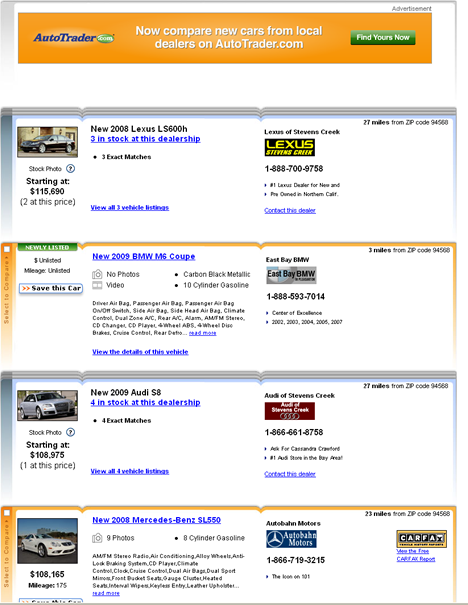
On the other hand, for destination sites that sell their own merchandise or provide a branded service, while also hosting third-party ads, it is important to positively differentiate between ads, legitimate content, and featured—that is, paid—results. Autotrader.com, which is pictured in Figure 4, mixes many different types of search results together, so it’s hard to tell what clicking each result might do. Orange results are actual, “organic” search results, while the slightly padded results in blue are really paid advertisements.
Figure 4—Autotrader.com mixes many different types of search results.
When clicking a search results link takes searchers somewhere surprising or, by mistake, they click a featured result, their reaction is often very negative. Yet, to the extent that a link satisfies a customer’s need, clicking it can be a very positive experience—finding exactly what the customer was looking for. The key to solving this problem is grouping the different kinds of content, while making it clear what are paid advertisements or featured results and clearly differentiating paid content from organic search results through subtle, but telling visual cues.
Colin Ware, in his book Information Visualization: Perception for Design describes so-called preattentive attributes, which involve the early stage of visual perception that occurs mostly below the level of conscious thought, at a very high speed. He distinguishes four categories of preattentive attributes: form, color, spatial position, and motion. We can apply the grouping strategies for all four categories of these attributes to ads, typically using line size, shape, hue, and enclosure to subtly differentiate ads from content. Motion applies mainly to animated ads, which can be an appropriate differentiation strategy, depending on their content. (We will discuss this further in Part 2.)
Google’s search results provide a great example of subtle preattentive differentiation. As shown in Figure 2, Google displays three kinds of results on search results pages:
ads at the top—Their subtle, yellow background hue differentiates them from the organic results.
organic search results in the middle—These are the actual content.
ads in the column on the right—Their placement and narrow column format differentiate them from the organic results, plus a vertical line sets them off.
Overall, the results on this page fit together and flow really well, while the ads’ formats subtly, but unequivocally differentiate them from the content.
Customers’ ability to effectively differentiate various types of content diminishes as the numbers of different types and sources of content appearing on a page increase—even when the content is grouped appropriately and visually integrated, using the site’s colors and fonts. At some point, a search results page simply reaches its point of saturation, and it becomes impossible for customers to tell the different types of search results apart. When doing usability studies for a major etailer that provided ten different types of search results, Greg found that most test participants could not distinguish one type of result from another when scrolling through search results pages. Thus, the experience became overwhelming for people using the site, who were often frustrated, because they never knew where they were about to go when they clicked a search result.
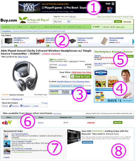
Buy.com, pictured in Figure 5, is another site that is oversaturated with different types of search results and ad content. There are at least 13 different formats for third-party ads on a single page! No surprise, the site rating service Internet RetailerPDF commented, “The site all but overwhelms its visitors with information and options.”
Figure 5—Buy.com’s different types of ads and third-party content are overwhelming.
For your search results pages to be effective, they must display only a limited number of different types of content and ad formats. Otherwise, with no clear guidance, your main content gets lost and customers become confused, because they are overwhelmed by the number of things competing for their attention. The key to integrating ads into your search results, without destroying the finding experience is becoming really clear about what generates the most site revenue. Is it the ads? Or the content? Does it depend on the query? Have you made the costly mistake of serving as many ads to your top customers as you do to window-shoppers and people who just happen to drop by? Once you’ve answered these key questions, you must remain disciplined and stay focused on your core earning potential. Though you can provide occasional, helpful third-party content on the side—particularly, if it helps a customer make a decision.
For example, can you tell whether Buy.com makes more money if people buy the headphones shown on the page—or instead investigate how to make their sandwiches moist and juicy with Best Foods Mayonnaise? Or maybe Buy.com really rolls in the dough when people buy their headphones from eBay or Dell instead? From their page content and layout, it is impossible to tell. One gets the impression that Buy.com may itself be somewhat confused about where the bulk of their revenue is coming from.
Keep Ads Relevant and Appropriate
While many people are, at best, only dimly aware of ads, some ads are so toxic that hosting them can damage your brand perception and destroy the entire user experience of your site. While everyone, no doubt, has his or her own list of the most annoying advertisements ever, one of Greg’s favorite examples is the infamous animated popup ads featuring the X10 spy cam that became popular in the early 2000s. The ad was, at once, so annoying and so ubiquitous, that X10 bears the dubious distinction of having been one of the first companies to get people to register on the company Web site just to opt out from seeing their ads for 30 days. Figure 6 shows one version of the X10 ad.
Figure 6—The infamous X10 popup ads were some of the most annoying ever.
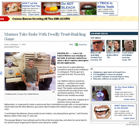
Even though ads may not be utterly obnoxious, they can nevertheless be completely inappropriate. Ad placement is often the key. FoxNews.com, which is pictured in Figure 7, shows just how insensitive and inappropriate some ads can be.
Figure 7—The insensitivity of inappropriate ads on FoxNews.com is striking.
The news story on the page describes the accidental death of a Marine, yet ads for yellow teeth litter the page. Putting politics aside, how do you think the dead person’s family felt when viewing this story? How about all the other families who have fathers, husbands, sons, or daughters serving overseas? Please, make sure your ads are appropriate to the content on a page. One way of doing that is to conduct user research and learn how your customers react to particular ads.
Understand How Your Customers Interact with Ads
Although usability studies and field research can give us important clues about how people interact with ads, eyetracking research can be especially helpful. Eyetracking studies help us to understand how customers perceive and interact with ads, then, depending on our objectives, design ads intelligently—to either catch or not catch their attention. Let’s look at an ad user experience that is different from the typical user experience. Customers definitely don’t come to a site just to look at ads, so they pay attention to them only in a spontaneous, but not intentional way. Thus, it’s hard to ask them about whether they paid attention to ads, because they probably won’t be 100% sure. Eyetracking can fill this gap in our knowledge.
By meticulously tracking all eye movement during a test, you can tell whether and how a participant pays attention to the ads on a Web page, what visual search pattern he uses, and how he either skips or focuses on particular information on the page. (Note—When running eyetracking studies, spontaneity is key. If you interrupt a participant, ask questions, or have a broken prototype that doesn’t let a participant interact with it naturally, your eyetracking data gets contaminated with all sorts of noise.)
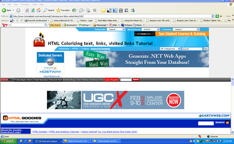
So, what does eyetracking methodology tell us about ads? First and foremost, we’ve observed the well-documented banner blindness—that is, customers typically ignore static banners—which are often located at the top of a Web page—even if they are of a ridiculously large size like those on Tutorialized.com, which are shown in Figure 8. Though research clearly shows people usually ignore banner ads, the banner ads on that site take up the entire area of the page above the fold, negatively impacting the user experience and forcing customers to scroll.
Figure 8—Banner ads on Tutorialized.com take up the entire window.
As Jakob Nielsen wrote in his August 20, 2007 Alertbox, “The most prominent result from the new eyetracking studies is not actually new. We simply confirmed for the umpteenth time that banner blindness is real.”
At this point, you may ask What makes a good advertisement? An excellent question we will answer—along with providing some other useful guidelines—in Part 2 of this column on UXmatters next month. Be sure to stay tuned for our thrilling conclusion!
Founder of the San Francisco Bay Area UX design consultancy DesignCaffeine, Greg is widely recognized as an experience design and user research expert, specializing in search, social networking, business dashboards, and process redesign for mobile and Web platforms. Greg has published over 30 articles and speaks regularly to audiences around the world about how to design intuitive and elegant systems that improve the quality of people’s lives while creating abundant ROI. He has led design projects for Fortune 500 companies and creative startups. Read More
A well-respected UX strategist and architect, Frank has co-authored a book chapter and published more than a dozen professional papers, covering such topics as advertising, Web promotion, eyetracking, persona development, product strategy, and search results. He has also developed a large body of user-research techniques and UI-design guidelines and trained many in applying them. Recently, at the Human-Computer Interaction International conference, Frank received a best-paper award for a paper that he co-authored. Frank is currently providing UX strategy and design consulting services through his firm, UX Strategized.He set up and led user research practice for Barclays’s iShares business and established foundational digital client insights for the firm. His work had a deep impact on iShares’s digital strategies and shaped the award-winning UI designs of iShares’s Web tools and iPhone app. Previously, Frank established eyetracking as a key research method at eBay. He led advertising research there and published a professional paper on best practices for online advertising. He also led design guidelines research that influenced eBay’s UI design best practices and full-cycle user research for the shipping and seller tools, influencing the tools’ overall redesigns. Prior to joining eBay, Frank conducted design-strategy research at Oracle, influencing the UI architecture of its enterprise software suite. Frank obtained a PhD in cognitive psychology from UCLA, where he conducted extensive scientific research on consumer psychology and taught advanced statistics. Read More