This column looks at a few of the more useful visual analysis and communication methods that user assistance writers and others can use to help them understand and communicate structure, relationship, and flow. For people who want to move beyond thinking and communicating in words, I’ll examine the following visual methods of communication:
- block diagrams
- flowcharts
- use case diagrams
- cross-functional diagrams, or swim lanes
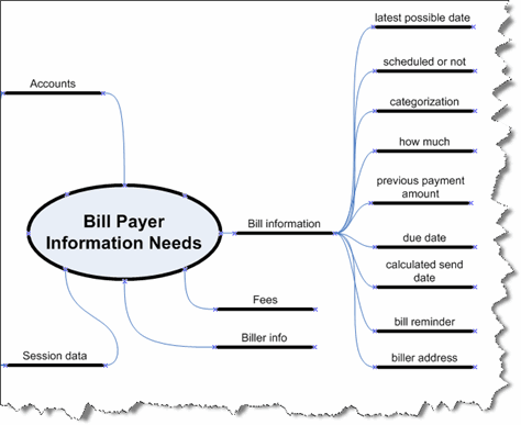
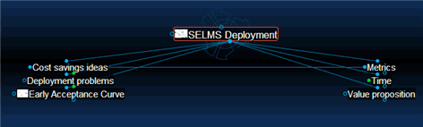
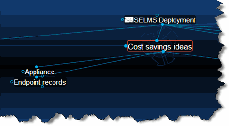
- mind maps
- wireframes
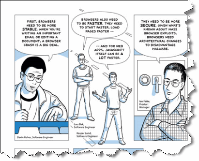
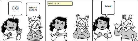
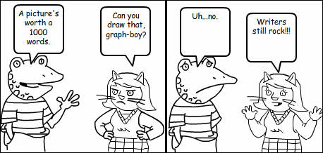
- comics
Block Diagrams
Block diagrams show structure and relationships. For example, site maps are block diagrams that Web designers can use to both plan a Web site and communicate its structure to users. Block diagrams can explain complex systems and show relationships among their components. The block diagram in Figure 2—which I created in Visio using the Block Diagram | Basic Blocks stencil—shows the configuration of a system’s components across three servers. The arrows show relationships, in this case which components exchange command data and in what direction.
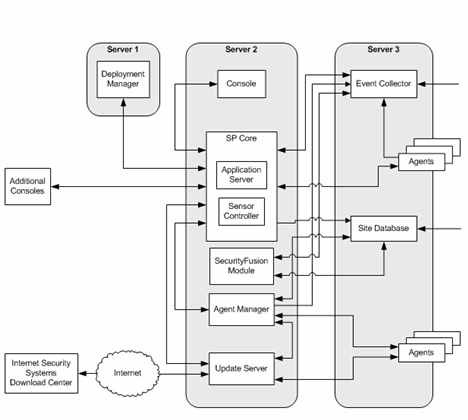
Block diagrams most effectively communicate the answer to the question What are the parts of a system and how do they interconnect?
Flowcharts
Flowcharts show sequences and branch logic within a process or procedure. They can also designate actors—who does what. The boxes in a flow chart typically represent steps in a procedure or procedures within a process; the arrows show sequence, or flow. In a flowchart, a decision diamond represents each logical branch, usually stated as a question, with exit paths representing different conditions. Figure 3—which I created in Visio using the Flowchart | Basic Flowchart Shapes stencil—illustrates a segment of a flowchart that shows the sequence of tasks performed by Information Developers (IDs), Information Architects (IAs), and an Editor.
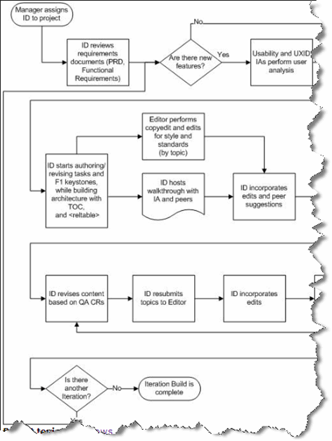
Flowcharts are the best means of communication when the questions are What happens first, then next, and what determines branches in the flow? They can also designate who does what, in what sequence.
Use Case Diagrams
Use case diagrams show actors, tasks, and the relationships of tasks to each other. Typical relationships include extend—when a task describes a special instance or exception to a task it extends—and uses—when a task calls on a subtask. Figure 4—which I created in Visio using the Software | UML Use Case stencil—shows a use case diagram for a reporting module.
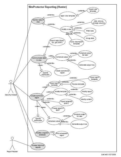
Use case diagrams are most useful at the start of a user or task analysis phase, when the high-level question is Who does what with the system?
Cross-Functional Diagrams, or Swim Lanes
Cross-functional diagrams show complex flows and logic that cross over functional boundaries. People often call them swim lanes, because they look like the lanes in a pool that’s set up for a swimming meet. Essentially, they are parallel flowcharts that show how the work flow and artifacts pass among different groups. Figure 5—which I created in Visio using the Flowchart | Cross Functional Flowchart stencil—illustrates a set of procedures that different groups perform.
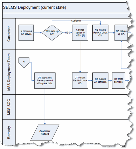
Use a swim lanes diagram when a process or work flow extends across multiple groups or actors—especially when there are interdependencies, for example when one group must finish a task before another can begin their work.