Top

Cameras, Music, and Mattresses: Designing Query Disambiguation Solutions for the Real World

Search Matters

Creating the ultimate finding experience

A column by Greg Nudelman
December 7, 2009

Our language is limited and imperfect. Typically, people type search queries quickly and with little forethought, so queries are definitely less than perfect. When a customer constructs a query that may have more than one meaning, a good search user interface provides tools to help the customer define the query in less ambiguous terms, so the search results more closely match the person’s intention. This process is known as disambiguation, and best practices for effectively supporting the disambiguation of search queries are the subject of this column.

Recently, I came across a new search engine—which shall remain nameless—that promised a combined search and browse approach to finding products. I was curious, so I put this new search application through its paces by typing the query Canon. In addition to results for cameras, the search engine displayed results including the company’s profile for investors, Pachebel’s Canon—a form of music—and, to my great surprise, a Canon mattress and a Canon ottoman, which the products section featured prominently.

Unfortunately, these search results represented a fairly typical situation that occurs when a search application does not correctly understand the meaning of a query. Especially frustrating was the fact that the user interface did not provide any tools to help people to refine their queries and, thus, improve the quality of their search results. The only way people could improve their search results was by typing more keywords into the search box, which takes both thought and work—two things any busy, distracted Internet user can do without.

Champion Advertisement
Continue Reading…

In her recent column on UXmatters, “First, Do No Harm,” Pabini Gabriel-Petit quoted Jef Raskin: “A computer shall not waste your time or require you to do more work than is strictly necessary.”

What can we do to remedy this situation? In this column, I’ll discuss three simple strategies designers of search applications often use to help people resolve ambiguous queries:

  1. Show related searches.
  2. Select a default category automatically.
  3. Prominently display a category selector.

Let’s look at the advantages and limitations of each approach.

Showing Related Searches

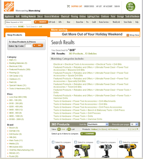
Related Searches is a fairly standard module on mainstream ecommerce sites and search engines. Figure 1 shows an example on Amazon.com.

Figure 1—Amazon’s Related Searches module in the search results for Canon
Amazon's Related Searches module

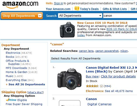
Most search applications track how people modify their original queries, then apply an algorithm to this tracking data to display the most common modifications to queries in a Related Searches module. As Figure 2 shows, people who typed Canon augmented their queries by typing Canon camera, Canon lens, or other more specific queries.

In her recent book, Search User Interfaces, Marti Hearst discusses the related searches algorithm in detail and quotes several impressive studies that document the effectiveness of this approach. Indeed, in my own user research, most people have found the alternatives a Related Searches module presents very relevant and clicked them to find what they wanted—mainly because of their very good information scent. Related searches often seem to present the keyword combinations people had unconsciously desired, but could not quite formulate themselves without more thought.

Essentially, a Related Searches module eliminates the effort and thought creating a good query requires, making a search user interface more intuitive and enjoyable, without using a great deal of precious screen real estate. The back-end algorithm for this module does require a fair bit of infrastructure to implement the query tracking. However, some APIs like Yahoo! BOSS are now available to make the job easier.

In my studies, I discovered people had a positive response to most suggestions revolving around modifications of their original queries, because of their very strong perception that the recommended queries represented the combined wisdom of crowds—as with tagging and folksonomies. However, many people I observed were highly suspicious of any orthogonal queries that recommended competing brands or products.

For example, in Figure 1, a related query that recommends Nikon in response to the query Canon would quickly cause people to become mistrustful and question the value of all suggestions in the Related Searches module. For this reason, I recommend that search user interfaces concentrate on showing only query modifications in their Related Searches modules. Show competing products and brands in a different module instead—for example, in a sidebar. You can easily limit search results to those that contain the original keywords with a simple grep command. Done properly, a Related Searches module is a very useful device for helping people disambiguate their queries and improving the quality of their search results—thus, creating a better finding experience.

Selecting a Default Category Automatically

Displaying only search results belonging to a specific category or topic by default is another very common strategy for disambiguation. An ecommerce system can determine what category or topic to display by default, using supply data, demand data, or some combination of the two. Supply data refers to the number of distinct product or content entries currently available in a site’s inventory that match a certain keyword query. In contrast, demand data refers to the number of people who selected products from a specific category after typing the same keyword query during a given period of time.

To automatically determine the default category using supply data, an ecommerce system might fairly easily measure the number of items currently in the inventory that match a specific keyword query. For example, if 70% of the items that match the query Canon belong to the Digital Gadgets category, the search algorithm might automatically display results in the Digital Gadgets category whenever a customer submits that query—omitting results in Music and other categories. A more sophisticated way of doing the same thing would be to use demand data to determine how many customers in the last week proceeded to view or buy items in the Digital Gadgets category after searching for Canon versus products in all other categories; then, if the number exceeds a certain threshold, to display the Digital Gadgets category of results by default.

What are some advantages of selecting a category of results by default? Automatically interpreting the query Canon as a request for Digital Gadgets, then showing a Canon brand product catalog lets Best Buy create a very compelling visual browsing experience, complete with custom subcategories and aspects, as shown in Figure 2.

Figure 2—Best Buy search results for Canon
Best Buy search results

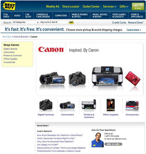
I’ll cover best practices for product catalogs in more detail in future columns, but for now, notice how extremely committed this category selection is in comparison to the Amazon search results for the same query, shown in Figure 1. Not only is the Canon brand selected, there is no trace of any results matching Canon for other types of products on the site. This provides a great user experience for someone looking for electronic gadgets, but it could be very confusing to someone looking for something in the category Music, for example.

A final word of caution: Automatically selecting a default category or topic is a very committed action, so communicating how to undo this action can be a challenge. Evidence shows that half-hearted measures for indicating the presence of other results on a Web site do not work particularly well.

Here is an example. When doing some user research for one of the top Web retailers, I tested a memorable user interface that automatically selected the category Shoes when a user typed the query Nike. However, unlike the Best Buy user interface shown in Figure 2, the user interface I was testing also provided a prominent link to let users undo the category selection—Not looking for Nike Shoes? The usability test task involved finding Nike bags. The study’s significant finding was that the vast majority of participants did not discover or click the link Not looking for Nike Shoes?

I theorized that this might have occurred, because the link did not contain any information scent for the category Bags for which participants were searching. Additionally, when people quickly scanned the page—as most people tend to do—mentally processing this negative statement was fairly difficult. Dynamically displayed links for other Nike categories that started with strong keyword scent words might have been much more successful—for example, Other Nike products: Bags, Shirts, Pants, Jackets, More….

The moral of this story? If you do commit to using a default topic or category as part of your disambiguation strategy, make sure it is for a good reason, based on metrics that help your company meet its business goals. Decrease your company’s risk by providing a clear way out of the default category, using links that start with prominent keywords and provide strong information scent for other popular categories or topics matching a keyword.

Prominently Displaying a Category Selector

In addition to a Related Searches module, most ecommerce sites also provide a category selector widget. Notice that, in Figure 1, Amazon presented its available categories in a navigation bar on the left. While this strategy is pretty standard and widely accepted, some sites go still further, emphasizing their categories as a strategy for disambiguation. For example, compare the Amazon search results shown in Figure 1 to The Home Depot search results for drill, in which the categories appear prominently above the search results, as shown in Figure 3.

Figure 3—Home Depot search result categories
Home Depot search result categories

There are many good reasons for emphasizing categories as part of your disambiguation strategy. Prominently displaying categories above search results clearly signals to customers that their queries may have more than one meaning on a site. Providing categories also lets customers correctly customize search results by selecting a category, then aspects or other finding tools matching a specific category. For example, the category Drills might feature the aspects Power Tool and Hand Tool, while the category Drill Bits might have the aspects Size and Hardness. Showing categories above the search results—as opposed to in a navigation bar on the left—also allows the display of longer category names without wrapping, providing improved information scent without compromising readability.

However, as we can see in Figure 3, showing categories above the search results can also lead to some pitfalls. If you look carefully at Figure 3, you’ll notice that The Home Depot search results actually feature two separate category selectors—one in the navigation bar on the left, the other above the search results—which could be pretty confusing. The two sets of categories are not the same, leading customers to wonder where they should click and why. The links in the navigation bar are sorted alphabetically—not in their order of popularity—which is suboptimal. It’s not clear how the categories above the search results were selected or sorted or why they appear in such a prominent location. As a result, the categories above the search results feel a bit like a Band-Aid—letting customers jump directly to popular areas of the site.

Providing additional information scent for the main categories on The Home Depot site would serve that function better. Customers might expect each of the subcategories to be a separate link—so, for example, clicking Power Tools would display a level-two subcategory—but this is not the case. Instead, each link constitutes an independent selection, forcing customers to navigate three or four levels deep into the site hierarchy and make committed category selections before they’ve had a chance to see the wider inventory. Since each link exposes just a subset of a very detailed hierarchy, these links force customers to learn the site’s category structure to be able to make informed decisions.

Last, but not least, hierarchical categories can introduce a huge readability problem if many categories start with the same keywords. For example, seven of The Home Depot’s categories start with the keywords Tools & Hardware > Power Tool…, making it hard to distinguish the Tools and Accessories categories from one another and make the right choice.

This page displays far too many categories—fourteen, in all—above the search results. Plus, despite the generous amount of screen real estate the page allots to categories, the category names are too long, so they wrap. Together, these two factors push the actual search results way down on the page, placing all products below the fold at many screen resolutions. My research has indicated that many customers might be confused by this. Instead of scrolling, they might feel the site is forcing them to click a category before they can see any actual search results.

A better choice would be to commit to showing the first-level categories just once, above the search results, while avoiding wrapping, and augmenting them with additional keywords—as space allows—to help customers make the right choices. As Daniel Tunkelang notes in his book Faceted Search, showing four to seven values for each aspect seems like the sweet spot. His finding is well supported by my own research. Sticking to Daniel’s recommendation, I would reduce the number categories on The Home Depot site at least by half. The resulting user interface might look something like that shown in Figure 4.

Figure 4—Redesigned Home Depot results, with an expanding category widget
Redesigned Home Depot results

Figure 4 demonstrates an Expanding Category Widget design pattern that is very similar to a search user interface I recently redesigned for an enterprise client. The original design had very long category names, forcing categories in the navigation bar on the left to wrap three or four times.

Placing categories above the search results solved the problem, effectively handling long category names and providing a great way of disambiguating complex queries. However, be aware that even this improved user interface distracts customers from shopping. Prominently displaying categories practically forces your customers to deal with the complexities of your user interface and the category hierarchy on your site rather than actually shopping.

For a less ambiguous query, a good middle ground might be to automatically collapse the wide category widget to its standard size in the navigation bar, allowing users to drag its handle if they want to expand the category hierarchy again, as shown at the bottom of Figure 4. Judicious use of a simple animation, showing an expand/collapse transition might be very helpful in improving the attractiveness and usability of this widget. The Expanding Category Widget is a useful design pattern that might be worth exploring when determining your category-driven disambiguation strategy.

Conclusion

It is a fact of life that ambiguous queries are fairly common. In a post-Google world, most people expect a very high degree of relevance for search results after typing just a single keyword. They are often surprised and dissatisfied when your search user interface does not deliver. In this column, I’ve covered a wide range of tools and design patterns that can help reduce the thought and effort necessary to convey the desired meaning of a customer’s ambiguous query.

Numerous variations on disambiguation strategies exist, from adding a fairly simple Related Searches module to completely redesigning your search results page, following the Expanding Category Widget pattern. However, this column has not provided an exhaustive list of design patterns for query disambiguation. It is my sincere hope that this installment of Search Matters will inspire you to seek more information and explore new ideas for query disambiguation. It is only through trying out new ideas and careful experimentation that you can find the optimal approach for your Web site and your customers. Your customers depend on you to help them find what they are looking for. Do not fail them.

In my next column, I’ll cover another powerful, but underused design pattern, More Like This, which—among its many uses—can also be very helpful in query disambiguation. 

Head of UX Research / Senior Director of User Experience

Principal at DesignCaffeine Inc.

Pleasanton, California, USA

Greg NudelmanFounder of the San Francisco Bay Area UX design consultancy DesignCaffeine, Greg is widely recognized as an experience design and user research expert, specializing in search, social networking, business dashboards, and process redesign for mobile and Web platforms. Greg has published over 30 articles and speaks regularly to audiences around the world about how to design intuitive and elegant systems that improve the quality of people’s lives while creating abundant ROI. He has led design projects for Fortune 500 companies and creative startups.  Read More

Other Columns by Greg Nudelman

Other Articles on UX Design

New on UXmatters