Top

Accessibility First—for a Better User Experience for All

Universal Usability

Putting people at the center of design

A column by Whitney Quesenbery
December 20, 2010

Over the past year or so, Luke Wroblewski has been talking about “mobile first” [1]—that is, designing for mobile before designing a Web application for a desktop browser. It’s an intriguing idea. The motivation that drives designing for mobile first is the explosion in the numbers of mobile devices and mobile users, as well as the competitive issues this has created. But the key benefit for users is simple, focused products, because the constraints of small screens force you to prioritize features and create “an experience focused on the key tasks users want to accomplish.” Focusing an application’s user experience on users’ key tasks is good advice for design on any platform. It’s also good advice for usable accessibility.

Pondering this made me wonder: what if design projects started by thinking about accessibility first? I don’t mean the basics like ALT text for graphics, following coding standards, and creating correctly structured information hierarchies. Building in accessibility at the code level is the only way to remove many of the barriers people with disabilities experience. But if our design thinking started with the idea of making a product that focuses on key tasks and is flexible, would that create a better user experience for everyone?

Champion Advertisement
Continue Reading…

Bringing Your Products into Focus

Let’s start with focus. Mobile devices impose the need for simplicity and focus. Their small screens mean there can be fewer elements on each screen—plus, buttons must be large enough for users to tap them easily. Each button, link, or piece of information has to earn its place, not just end up on the home page because someone might need it.

This streamlining would also help accessibility by solving the following problems:

  • complex screens—Screens that are complex are difficult to navigate with ZoomText, especially if it is hard to see the boundaries of each zone.
  • autorefreshing information—Screens or pages with a lot of automatically refreshed data or updating sections—even if its coding conforms well to ARIA standards—can be difficult or impossible to use effectively with a screen reader.
  • distracting elements—Cluttered screens often have distracting elements that make them harder to use for people with cognitive or learning disabilities.

All of these problems affect their general usability for people without disabilities, though not as severely. The more crowded or complex a screen, the harder it is to understand it and learn to use it effectively. Just as making hard decisions about priorities for a mobile user interface can pay off in a better Web version of an application, designing for better accessibility can make a product more usable for everyone.

Here’s an example. Using JAWS or other screen readers, users can get a list of all headings and jump directly to a particular part of a Web page. This feature is very useful on long pages that have several sections. If a page has the proper markup and its headings are well written, users can quickly scan the main topics on the page. Adapting this feature to benefit people using a Web site or application’s visual interface is easy: providing a set of On This Page links in a consistent location on its pages gives people a way to see what’s on a page without scrolling. In a recent usability test of a large site, many participants used such links to jump directly to the information they wanted. So did one scree- reader user. We noticed that he was finding information even faster than some of the sighted users. “Easy,” he said. “I figured out that if I hit H three times, I end up on this nice list of links.” Simple.

That sort of simplicity comes from carefully thinking through a design. As Giles Colborne says in his book Simple and Usable, achieving simplicity is not about randomly cutting down a design, but about thinking carefully about how to organize, hide, displace, and even remove features, so your product is clear and focused.

Making Flexibility Your Goal

The other key to accessibility is flexibility in meeting people’s needs, across multiple platforms. In our usability testing at the National Cancer Institute, we routinely ask participants about their online habits and see many of the same trends internationally. More and more often, people have multiple devices—a work computer, a smartphone or two, and a home computer. In addition to the obvious tactic of using the device that is most convenient at the moment, people often choose the device that works best for the content. They might read on a large screen, but look up local information or get quick details on their mobile phone. Creating a product that works on many platforms—a Web browser on a computer, iPhone, iPad, Android, and other devices—requires a flexible approach in its design.

It’s not a big leap from being flexible about the type of device on which your product runs—or the size of a device’s screen—to being flexible enough to allow users to interact with your product in their own way. People might use a keyboard instead of a pointing device, interact through voice commands, or need to use extra large text. Flexibility is critical for people who need to adjust the visual interface. Screen readers use the underlying code to reinterpret a page, but users with low vision are diverse and use a wide variety of tactics to make a page usable for them.

In their 2005 study, Ginny Redish and Mary Theofanos [2] found that, although following a set of guidelines works in achieving basic accessibility for screen readers, the range of issues for low-vision users makes it difficult to create a short list of design rules. They argued that the answer to this problem is for products to transform gracefully as users adjust them to their own preferences—for font size, line length, color, contrast, and the size of a window.

There’s a myth that no one reads online. Perhaps one reason this myth persists is that pages typically hold a lot of distractions—even pages presenting information their publishers intend people to read carefully.

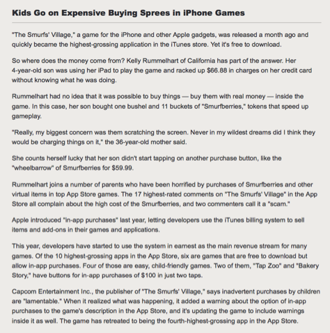
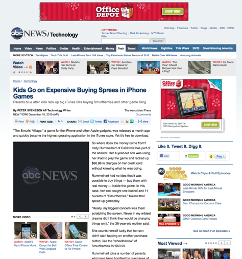
If your site doesn’t provide an uncluttered reading experience, you might find users turning to Readability. This experimental tool “makes reading on the Web more enjoyable by removing the clutter around what you’re reading.” It provides options for setting the type style, font size, and column width and transforms pages to display just the content of an article. For example, Figure 1 shows an ABC News page, while Figure 2 shows the same page after its transformation by Readability.

Figure 1—An ABC News page
An ABC News page
Figure 2—The same ABC News page in Readability
The same ABC News page in Readability

Once a product’s design can adapt gracefully to many different devices and user preferences, all that flexibility is also available for anyone to use. For example, reading on a train or in dim light might be easier with larger text. Or maybe it’s easier to use a Web page as a reference when it’s in a smaller window. Why not create a delightful, flexible—and accessible—user experience for your Web site or application and let users adjust it for their own reasons, to meet their own needs, and to match their own preferences.

Achieving Accessibility

To learn about accessibility, a good place to start is RGD Ontario’s Access-Ability: A Practical Handbook on Accessible Graphic Design.

“Accessibility needs to be part of the process. At the end [of many of our projects] people often say something like, “If I only knew then what I know now, I would do things completely differently.”—Derek Featherstone, from “It’s in the Design: Fundamentals of Web Accessibility.”

As important as good guidelines are, if you want to really understand how to design for accessibility, the place to start is with some user research. You can’t design for a user experience you don’t understand. Include participants with disabilities in your user research and usability testing—people who use screen readers, ZoomText, and other assistive technologies.

What you learn about making your Web site or application more accessible might just help you to make it a better user experience for everyone. 

Notes

[1] Wroblewski, Luke. “Mobile First.” Ideation + Design, November 3, 2009. Retrieved December 19, 2010.

[1] Wroblewski, Luke. “Mobile First, One Year Later.” Ideation + Design, November 30, 2010. Retrieved December 19, 2010.

[2] Theofanos, M. F., and Janice C. Redish. “Helping Low-Vision and Other Users with Web Sites That Meet Their Needs: Is One Site for All Feasible?”Technical Communication, Vol. 52, No. 1, February, 9–20, 2005.

Principal Researcher at WQusability

Co-founder of Center for Civic Design

New York, New York, USA

Whitney QuesenberyWhitney is an expert in user research, user experience, and usability, with a passion for clear communication. As Principal Consultant at Whitney Interactive Design, she works with large and small companies to develop usable Web sites and applications. She enjoys learning about people around the world and using those insights to design products where people matter. She also works on projects with the National Cancer Institute / National Institutes of Health, IEEE, The Open University, and others. Whitney has served as President of the Usability Professionals’ Association (UPA), on the Executive Council for UXnet, on the board of the Center for Plain Language,and as Director of the UPA Usability in Civic Life project. She has also served on two U.S. government advisory committees: Advisory Committee to the U.S. Access Board (TEITAC), updating the Section 508 regulations, and as Chair for Human Factors and Privacy on the Elections Assistance Commission Advisory Committee (TGDC), creating requirements for voting systems for US elections. Whitney is proud that one of her articles has won an STC Outstanding Journal Article award and that her chapter in Content and Complexity, “Dimensions of Usability,” appears on many course reading lists. She wrote about the use of stories in personas in the chapter “Storytelling and Narrative,” in The Personas Lifecycle, by Pruitt and Adlin. Recently, Rosenfeld Media published her book Storytelling in User Experience Design, which she coauthored with Kevin Brooks.  Read More

Other Columns by Whitney Quesenbery

Other Articles on Accessibility

New on UXmatters