Top

Designing for the Mobile Web: Special Considerations

Mobility

User experience on the move

A column by Shanshan Ma
January 17, 2011

There are several differences between designing a Web site for a computer and designing one for a smartphone. In his Alertbox post on “Mobile Usability,” Jakob Nielsen points out a number of constraints affecting Web site use on mobile devices: small screens, awkward input, delayed downloads, and poorly designed mobile Web sites. In comparing the design of mobile Web sites with the design of Web sites for computers, I realized that complex context is another important factor that differentiates the two platforms. For Nielsen’s report, controlled usability testing in a lab was one of the primary methods for studying mobile usability, so it’s understandable that his report didn’t consider context.

In addition to the four problems Nielsen wrote about, I’ll cover design for complex contexts of use in my discussion of constraints on mobile Web sites. In practice, being aware of these constraints lets us approach these problems with caution and come up with better design solutions for mobile devices. Based on my analysis of more than 20 mobile Web sites, I’ll point out some ways of working within these constraints.

Champion Advertisement
Continue Reading…

Small Screens

Some ways of coping with small screens include

  • prioritizing features and content
  • reducing levels of hierarchy for content
  • communicating workflows

Prioritizing Features and Content

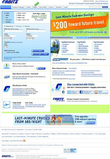
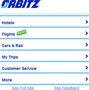
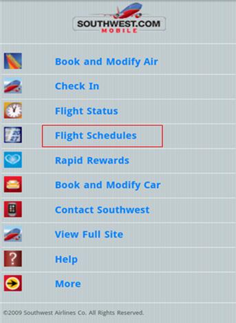
Current Web design best practices and guidelines assume a 1024x768 screen resolution. For smartphones, the most popular screen resolution is 320x480. Therefore, it’s usually necessary to sacrifice some of a Web site’s features and content when designing a mobile version of the site, so users can easily find the ones they really need. You must give priority to the tasks and content users are most likely to use on a mobile device.

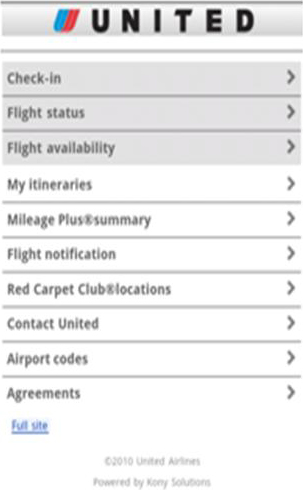
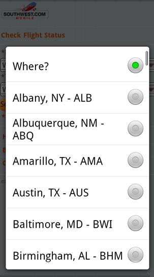
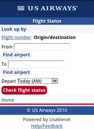
Let’s look at some examples of the differences between mobile Web sites and the corresponding sites on a computer. On the majority of the home pages for airlines’ mobile Web sites, there are fewer than ten features, or functions, available. The tasks they most frequently support are checking in for a flight and checking flight status, as Figures 1 and 2 show.

Figure 1—United mobile home page
United mobile home page
Figure 2—Lufthansa mobile home page
Lufthansa mobile home page

The Amazon mobile home page lists only four departments, as shown in Figure 3, rather than all of the departments on the Amazon Web site.

Figure 3—Amazon mobile home page
Amazon mobile home page

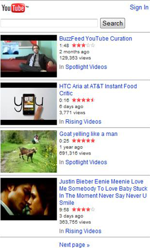
In Figure 4, the YouTube mobile Web site shows only four of the current day’s spotlight videos on its home page, unlike the home page on its Web site, which lists not only spotlight videos, but also videos people are watching now, featured videos, and the most popular videos.

Figure 4—YouTube mobile home page
YouTube mobile home page

Reducing Levels of Hierarchy for Content

In his discussion of complexity versus simplicity on UX Magazine, Francisco Inchauste talks about the difference between things being “adjacent in space” and “stacked in time.” Content that is adjacent in space appears adjacent on the same screen. Content that is stacked in time appears sequentially, when users click links to view different screens—that is, in a step-by-step manner. Inchauste says achieving balance between these two modes of information presentation is desirable when designing Web pages for computers, but especially so when designing for the small screens of mobile devices.

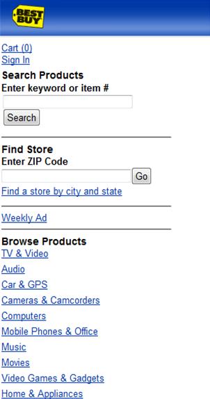
In comparison to designing a Web site’s structure, it’s necessary to flatten the structure of a mobile site and reduce its levels of hierarchy to ensure visitors don’t get lost. For example, on an ecommerce Web site, users might have to go through the following steps to view a product description: home page > products > product category > product description. In contrast, on a mobile ecommerce site, one way to reduce the levels of hierarchy is displaying important product categories on the home page. As Figure 5 shows, the Best Buy mobile Web site lists the most frequently visited product categories on its home page—for example, TV & Video, Audio, Car & GPS, Cameras & Camcorders, and Computers.

Figure 5—Product categories on the BestBuy mobile home page
Product categories on the BestBuy mobile home page

Communicating Workflows

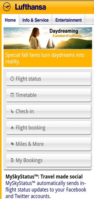
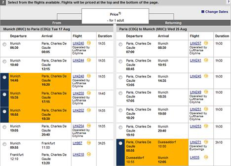
It’s always important to avoid confusing users by making them go through too many steps to accomplish what they want to do. But, on mobile devices, it’s sometimes more efficient to display additional information on a new screen instead of putting all of the information on the same screen. Take booking an airline ticket as an example. When users search for flights, they get a list of results from which they can select flights. Users usually need to select both a departing flight and a returning flight. On a Web site, selection of both legs of a trip can appear on the same page. Some airlines like Lufthansa, as shown in Figure 6, divide the search results page into two columns, with departing flights in the column on the left and returning flights in the column on the right. It’s clear to users that they need to select a flight in each column to book round-trip flights.

Figure 6—Search results on the Lufthansa Web site
Search results on the Lufthansa Web site

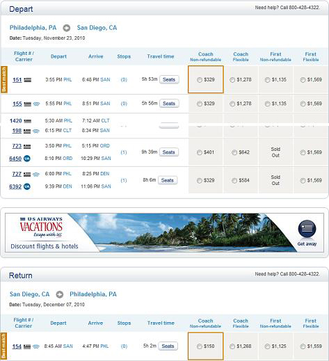
Other airlines, like US Airways and Southwest, instead display a long page of results, listing returning flights after departing flights. To remind users they should select an option from both groups, there is usually a clear separation between the two groups of flights, as shown in Figure 7. Both Lufthansa and US Airways display departing and returning flights in close proximity.

Figure 7—Search results on the US Airways Web site
Search results on the US Airways Web site

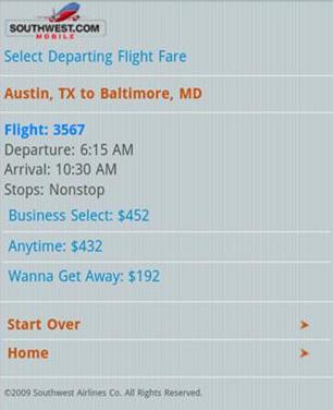
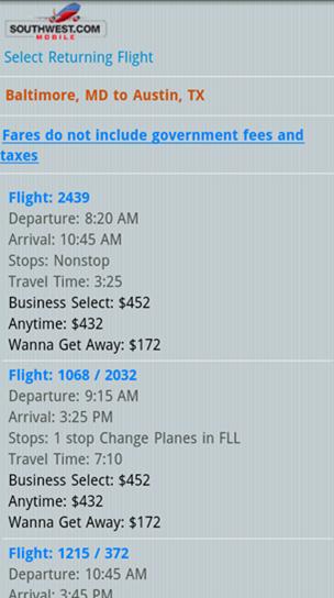
However, mobile Web pages would become extremely long if both legs of a trip were to appear one after another on the same page, and dividing a page into two columns is almost impossible. Therefore, most airlines have adopted this best practice: The two legs of a trip should appear on two separate screens—that is, stacked in time, as Figures 8 and 9 show. Once users finish selecting their departing flight, returning flights appear on a subsequent page.

One important thing to keep in mind is that users need to be given an explicit indication when they transit from the departing-flight page to the returning-flight page; otherwise, they might become confused when they see two pages that look very similar without knowing why. There are several ways to make this transition clear and explicit, so users realize they are now on a different page. For example, the Southwest mobile Web site prominently displays the headings Select Departing Flight Fare and Select Returning Flight. Displaying these headings in a bigger font size or a different color would make them even more prominent. Using a button or link with an explicit label, such as Select Return Flight, instead of an implicit label like Next would also be helpful.

Figure 8—Search results for departing flights on the Southwest mobile Web site
Search results for departing flights on the Southwest mobile Web site
Figure 9—Search results for returning flights on the Southwest mobile Web site
Search results for returning flights on the Southwest mobile Web site

Awkward Input

In comparison to doing data entry on computers, data entry on mobile devices is time consuming and error prone. But there are some ways of easing data entry on mobile Web sites when

  • typing
  • filling out forms

Typing on Mobile Devices

Some smartphones feature a full QWERTY keyboard, while others have only a soft keypad that appears when users display it on a touchscreen. Because of the small form factors of mobile devices, typing on them is more difficult, regardless of whether they have a full keyboard. Their keys are usually very small and too close to each other. Also, users are often in motion when using a mobile device—for example, on a moving train or sometimes even walking.

Designing to encourage selection instead of typing can greatly ease the pain of typing on a mobile device. Even when there is a long list of options, it’s still easier for users to select them, as shown in Figure 10, than to type them. For example, when users search for a flight departing from a certain city, it’s better to ask them to select a city from a list of cities, instead of asking them to type in the name of a city. Typos are much more likely to occur when typing with a small keypad on a mobile device, and it’s much more difficult to select an insertion point to correct them. Most mobile Web sites don’t suggest city names when typos or other errors occur. Users might have to make several tries before they get the city name right, which adds up to a negative user experience, as in Figure 11.

Figure 10—Selecting a city on the Southwest mobile Web site
Selecting a city on the Southwest mobile Web site
Figure 11—Trouble typing a city name on the Alaska Airlines mobile Web site
Trouble typing a city name on the Alaska Airlines mobile Web site

Filling Out Forms on Mobile Devices

Even on traditional Web sites for computers, long forms scare users away. On mobile Web sites, keep long forms to a minimum. If it’s absolutely necessary to include a form on a mobile Web site, there are several ways to work around data-input problems. First, break up forms and present them across multiple pages, so users can go through them one step at a time. Second, use a mobile phone’s personalization capability to auto-fill personal information. For an authorized user, auto-fill information such as the user’s name, addresses, and phone numbers, instead of asking users to type them. Third, smart default selections can help users a great deal when they’re in situations where time is limited. For example, when a user is checking in for a flight, set the date to today’s date by default, as on the US Airways mobile Web site, shown in Figure 12.

Figure 12—Checking in for a flight on the US Airways mobile Web site
Checking in for a flight on the US Airways mobile Web site

Buttons that enable users proceed to a next step should be prominent, easily operable, and big enough for users to activate them by touch. Certain Web form elements—such as radio buttons and hyperlinks comprising short text strings—are very small, so not easy to use on mobile devices. While radio buttons are useful in Web forms when users need to select only one option from a list of options on a computer, they’re a little hard to operate with fingers on a touchscreen. It’s too easy for users’ fingers to miss their target and select the wrong one by mistake. This is true of overly brief, text hyperlinks as well. For example, pagination that comprises single digits like 1  2  3 are easy to miss—in part, because of the small space between them.

Bigger objects such as buttons and bars are easier for users to select with their fingers. Buttons should be uniform in shape and color, and they should stand out from the rest of the content on a page. For example, in the flight reservation form shown in Figure 13, the Go button is in red to make it more prominent, but it’s smaller in size than the less important Start Over button. This makes it easier for users to make mistakes rather than successfully proceeding with their booking.

Figure 13—A too small Go button on a mobile form
A too small Go button on a mobile form

Delayed Downloads

Although network technology has advanced greatly, download speeds on mobile devices still don’t meet users’ expectations, in comparison to those on computers and even netbooks. Users quickly become impatient when it takes a while for a Web page to load on a mobile device. To compensate for slow page downloads and possible incompatibilities with mobile operating systems, you should do the following to improve the performance of mobile Web pages:

  • Reduce the amount of content a Web page contains in every way possible.
  • Avoid including a lot of graphic images.
  • Either remove or reduce the size of images that are for promotional or marketing purposes only.
  • Minimize the use of Web-page elements that add complexity and require more processing time—such as JavaScript and CSS.

A majority of the mobile Web sites I reviewed dealt with these constraints pretty well, including fewer graphic images and reducing the complexity of code to speed up page downloads on mobile devices. In Figures 14 and 15, you can see how Orbitz has reduced the complexity of its Web site’s home page to the bare essentials on its mobile Web site.

Figure 14—Orbitz home page on a computer
Orbitz home page on a computer
Figure 15—Orbitz mobile home page
Orbitz mobile home page

Complex Context

When designing a mobile Web site, it is important to keep the complexity of users’ contexts of use in mind. To ensure that you understand the complexity of mobile contexts and address mobile users’ needs, do the following:

  • Combine qualitative user research with the analysis of quantitative Web analytics data.
  • Provide access to an organization’s desktop Web site from its mobile site.

Combining Qualitative Research and Quantitative Analytics

Understanding your users’ specific needs, then providing a customized and personalized mobile user experience is the key to the design of effective mobile Web sites. Both qualitative user research and quantitative analytics data provide insights that are essential to your gaining a good understanding of mobile users’ needs.

You need to know which content and tasks are and are not relevant to users who are on the move. If a user is waiting in line and browsing her favorite store on her smartphone, what kinds of things would she like to see once the site’s home page downloads and what actions would she want to be able to take? If a user is riding on a train to the airport and opens an airline’s mobile Web site on his smartphone, what kinds of things would he need to do on the site? It is critical that you have a deep understanding of users’ needs in particular contexts and how mobile Web sites can address them. Duplicating all of your traditional Web site’s content on your mobile Web site makes little sense.

Providing Access to Desktop Web Sites from Mobile Sites

On the Southwest mobile site’s home page, only the following eight functions are available, as shown in Figure 16:

  • Book and Modify Air
  • Check In
  • Flight Status
  • Flight Schedule
  • Rapid Rewards
  • Book and Modify Car
  • Contact Southwest
  • Help
Figure 16—Southwest mobile home page
Southwest mobile home page

One important thing to note is the Flight Schedule menu item on their mobile home page. This is not plainly visible on their desktop Web site’s home page, but available only in a drop-down menu, so not visible in Figure 17. They’ve elevated an item from their desktop Web site’s secondary navigation to the primary navigation on the home page of their mobile site, because airline travelers are very likely to check for updates to flight schedules when they are on the way to the airport or looking for the gate from which their flight is leaving. Successful mobile sites like Southwest’s have invested in providing the support their mobile users need. They have identified what content is of greatest value to users on the go and prioritized its convenient placement on their mobile Web sites.

Figure 17—Southwest desktop home page
Southwest desktop home page

User research provides an in-depth understanding of representative use cases. Web analytics data gives you good idea of overall patterns of use. However, there are always special cases and unique needs that it’s possible to miss when making the migration from a desktop Web site to a mobile site. By allowing users to access your desktop Web site from a link on your mobile site, you ensure that users who don’t see content or features for which they are looking on your mobile site can still find them on your desktop Web site, with which they may already be familiar.

Summary

In this column, I’ve discussed, in depth, constraints on Web site design for mobile devices. Jakob Nielsen described most of these constraints in his study of mobile usability: small screens, awkward input, and delayed downloads, as well as the negative impacts of poorly designed mobile Web sites. In addition to those constraints, I’ve also discussed the importance of considering the complexity of users’ contexts of use when designing mobile Web sites.

From my competitive review and analysis of more than 20 mobile Web sites across multiple industries, I have identified some ways of overcoming these constraints to ensure a better mobile user experience. There are dramatic differences between the platforms on which we can visit Web sites, so a mobile Web experience can never be the same as the user experience of visiting a Web site on a computer. However, by understanding what is relevant and of value to your mobile users, you can achieve success by crafting a good user experience for them. 

Principal User Experience Designer at BD

San Diego, California, USA

Shanshan MaShanshan has extensive research experience in understanding how human beings organize and find information on the Web and in their own personal computing environment. Her expertise includes designing and conducting user research, handheld device and Web site usability, and user experience consulting. Shanshan received her PhD degree in the area of Human-Computer Interaction from Drexel University.  Read More

Other Columns by Shanshan Ma

Other Articles on Mobile UX Design

New on UXmatters