Top

Design Strategies for Brand Landing Pages on Mobile Devices

Search Matters

Creating the ultimate finding experience

A column by Greg Nudelman
February 21, 2011

On the desktop Web, ecommerce landing pages get a bum rap—sometimes well deserved. Laden with ads and gimmicks, pushing items with higher markups, and confusing customers with complicated information architectures, these marketing monstrosities typically strongly underperform the search results pages from a simple keyword search. However, passing a death sentence on all landing pages may be premature. On the small screens of mobile devices, well-designed landing pages can provide a much better experience than keyword search results. Currently, few mobile sites use landing pages, which makes them the next big mobile ecommerce opportunity.

Champion Advertisement
Continue Reading…

Introducing Landing Pages

Landing pages are simply pages a system serves up in place of search results pages—typically as a result of a keyword search query. Landing pages were originally Web developers’ response to the deep links search engines started delivering, causing customers to land deep within their sites when they clicked an ad or link in an external search engine’s results. Although many different types of landing pages exist, I find it useful to differentiate between the following six types—from the standpoints of both design and information architecture:

  • brand—brand name keywords, like Apple
  • product—specific product names, like iPhone
  • product family—broader keyword queries that cover more than one product, such as Mac
  • category—keywords that signify broad category navigation, like laptop
  • event—keywords that point to a specific event, such as Super Bowl
  • item—keywords that are specific enough to narrow search results down to a single product, like iPhone 4G 32GB

Each type of landing page has its own purpose and design considerations, and you should consider each type on its own merits. In this column, I’ll cover some UX design guidelines for brand landing pages on mobile devices, leaving other types of landing pages for future columns.

Defined loosely, you can create brand landing pages to cover a great diversity of subjects that enjoy instant name recognition:

  • major manufacturers—such as Canon and Nike
  • music bands—like The Beatles and Madonna
  • hero franchises—like Spiderman and Harry Potter
  • sports teams—such as the SF Giants and NY Yankees
  • cities—including San Francisco and New York
  • and many more categories of brands

Brand landing pages typically fulfill one of the following four goals:

  • disambiguate—When the same query could mean vastly different things—for example, Canon, which could mean either a Canon Camera or Pachebel’s Canon—a landing page can help customers convey a more precise meaning for their query.
  • narrow—Some brand-name keyword queries could cover a lot of different products. A landing page can help customers do some preliminary filtering by category or by suggesting additional search keywords.
  • introduce—Sometimes customers are really interested in just browsing the merchandise. A landing page can quickly show a variety of items from a particular brand, providing a brand catalog that shows the breadth of the available inventory and perhaps introducing some new or in-season products.
  • entertain—Many people have strong emotional connections to certain brands. Landing pages can provide themed graphics and social media elements—such as discussions, gossip, editorial, or Twitter feeds—to engage customers.

Be ruthless when it comes to introducing landing-page features. Remember, landing pages will almost certainly catch your customers’ attention, but the impression they make depends, in part, on how focused they are—and this is especially true on mobile devices. Determine your primary and secondary goals for a landing page, then choose the best user-interface devices to implement solutions that meet those goals. Consider removing anything that does not directly contribute to satisfying a landing page’s primary goals. Customers’ attention is a limited and precious resource. Use it wisely.

Design Guidelines for Brand Landing Pages on Mobile Devices

Currently, none of the mobile Web sites I’ve examined use brand landing pages that I can present as examples. This is unfortunate, because according to my research, well-designed landing pages can provide a better experience than a simple set of search results from a keyword query.

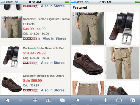
In fact, my data indicates that brand landing pages may well present today’s biggest sleeper opportunity for mobile ecommerce. People love to search by brand names. And brand names make up the lion’s share of the top 100 keyword searches on a typical ecommerce site. This is hardly surprising. The companies that build brands invest billions in advertising and promotion to ensure this is the case. Yet, on most mobile sites, simply entering a keyword query often results in a subpar experience. Figure 1 shows search results for the query Dockers on the JC Penny mobile Web site. This represents a typical example of a brand-centered shopping experience on the mobile Web.

Figure 1—Results for Dockers query on JC Penny mobile site
Results for Dockers query on JC Penny mobile site

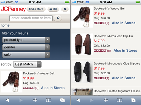
The site sorts the results by Best Match, which, in the case of a basic brand-name query, is pretty much meaningless, because anything Dockers makes is as good a match as any other Dockers product. The top results happen to be a woven belt and two micro-suede slippers of exactly the same model, but in different colors. It is telling that the customer would have to scroll down by two screenfuls to see the most popular Dockers item: the classic khaki pant.

The paginated search results continue over eight more pages, showing, among other items, over 30 different khaki Dockers brand pants JC Penny offers for sale. This is certainly a user experience that leaves a lot to be desired, yet it remains a fairly typical one for mobile ecommerce customers. It is easy to see how a customized Dockers brand landing page that specifically addresses the primary landing-page goal Narrow and the secondary goal Introduce, with a clean, visually appealing navigation scheme, would offer a much better experience and likely result in customers buying more Dockers products, as well as coming back to shop more often.

How should you go about designing such a brand landing page? Here is a set of general guidelines, which cover both things that do not work and things that do. I’ve based these guidelines, in part, on a triangulation of my findings from qualitative usability and field studies, with key performance indicators I have obtained from search metrics I‘ve collected over the past seven years. Unfortunately, I cannot discuss specific designs I’ve tested, because of their confidentiality. However, I can present some general design guidelines. Of course, these guidelines are limited somewhat by their lack of specificity that would tie them to a specific brand and use case. Please keep this in mind, and rather than taking the guidelines I provide here as gospel, use them to guide, inform, and inspire your own creative designs. Above all, test your brand landing page designs thoroughly against keyword search results to determine which perform better, according to your own key performance metrics—such as conversion, item views, time on site, and customer loyalty.

Don’t Make All Brands Sing the Same Tune

One of the most important guidelines for designing brand landing pages is to individualize them. That means using your information architecture, categories, layout, graphics, and the products themselves as tools that let you create a specific experience that is highly customized for the specific brand a customer is interested in.

Does this mean you can’t follow a “write code once, use everywhere” paradigm? Absolutely. I realize this goes against the conventional Web wisdom of building a single Web page template you can customize for different brands, but my data shows that making all brands sing the same tune is about the biggest mistake you can make. Invariably, when companies try this approach, a subpar and confusing experience always results, as shown in Figure 2.

Figure 2—Brands shouldn’t all sing the same tune
Brands shouldn’t all sing the same tune

On the other hand, simple customizations can go a long way—for example, using elements such as whitespace between items to create an upscale feel on a page for luxury brands. For your Star Wars fans, a brand landing page is where it’s appropriate to use a dark background with star clusters. However, customization should reach deeper than just graphics. You need to customize a brand’s information architecture as well.

Most brands have a natural organizational model that requires a different information architecture—that is what makes them unique. It is silly to try to fit a landing page for the Star Wars brand—which should probably be organized by episodes 1–6 in order of their storylines, not the years in which the movies came out, and includes a massive toys and merchandise section—into the same information architecture as The Beatles landing pagewhich likely centers around music albums or their #1 hits and might be organized on a historical timeline, covering the band’s body of work.

For Brand Landing Pages, Fewer Are More

Because brand landing pages require total customization, fewer are often more effective. Trying to create a landing page for each brand on your site is a mistake. Instead, a much more effective strategy is to analyze the top 100 brand keywords on your site, realistically assessing what brand keywords are the best candidates for landing pages.

Here is an example of how to use metrics to help you determine whether a particular brand (Brand X) is a good candidate for a landing page:

  • Brand X has more inventory, and the inventory is more variable than that of other brands.
  • People starting a search with the keyword brand X do more search refinements than average before starting to look at item details.
  • People starting a search with the keyword brand X view a greater than average number of pages.
  • Brand X has a lower conversion rate—as measured by searches per purchase or page views per purchase—for searches starting with the keyword brand X than other brands on the site.

Once you’ve determined which brands might benefit from having custom landing pages, pick one or two brands that are most familiar to your team and create a pilot landing page design, fitting each particular brand perfectly. Test your new design using A/B testing, initially letting only a small percentage of your customers view the landing page. Be sure to collect detailed metrics that let you determine whether the new design works better than a corresponding set of search results. If the landing page works better, you are in luck. Tackle the rest of the promising brands, one at a time, while continuously getting feedback from your customers, in the form of metrics and findings from field studies. It is important not to rush the process. Remember, when it comes to landing pages, fewer are more effective.

Make Your Information Architecture Simple and Easy to Grasp

Simple, straightforward page organizations are the key to brand landing page success. Remember, your customers are expecting to see a search results page. When, instead of getting search results, they find themselves on a brand landing page, you have approximately 3–5 seconds to communicate to them how the page is organized and enable them to use it effectively. If you’ve tried to make the page too clever, the effort it would take to understand the page would be too great, and people would become frustrated and leave your site.

Where should you start designing your information architecture? In his books Information Anxiety and Information Anxiety 2, Richard Saul Wurman wrote about LATCH, an acronym for five ways of organizing information. LATCH stands for:

  • Location
  • Alphabet
  • Time
  • Category
  • Hierarchy

Wurman had this to say in his IA Summit 2010 Keynote:

“I’ve always said … I thought there was a huge number of ways of organizing things. I was surprised that I could only come up with five. Let’s say there [are] no more than ten. I don’t care if there [are] five or six or seven, but, if after 20 some years, nobody has come up with a sixth, I feel safe to say there [are] no more than ten, and there [are] probably not more than five. And it works, because you can decide when you start a project how you get into it.”—Richard Saul Wurman

In designing your brand landing pages, LATCH is certainly a great place to start. Remember, the same information architecture will not fit every single brand. For example, for clothing brands, it would make sense to separate accessories like belts from articles of clothing such as pants and shirts—an example of a hierarchical organization. Doing this simple categorization would do wonders in improving the seemingly random results of the Dockers query on the JC Penny mobile site in Figure 1. However, the same organization would not work well for a Harry Potter brand. Instead, an information architecture based on simple categories like Books, Movies, Toys, and More might be a better fit.

Regardless of which information architecture you choose, it is important to make sure your page design communicates it effectively. Your customers are expecting to see search results, so naturally, they’ll expect the page that appears to be a long list of products with facet filters. Because of their strong existing mental model, you’ll be fighting an uphill battle in communicating your page design. If your landing page is organized differently from search results, make sure the page’s layout and visual design communicate this difference clearly. The sooner customers understand that they are looking at a special kind of page—a brand landing page, not a search results page—the faster they can start navigating the new information architecture and succeed in their primary goals.

Avoid Tag Clouds

Tag clouds are aggregations of keywords that have different font weights and sizes—usually based on popularity or inventory. I’ve already discussed the popularity versus inventory, or demand versus supply, disambiguation strategy in a previous UXmatters column, “Cameras, Music, and Mattresses: Designing Query Disambiguation Solutions for the Real World,” so I won’t repeat that information here.

Based on my research, the bottom line is that many people do not understand tag clouds, regardless of how they are organized on a landing page, and have trouble operating them effectively on mobile devices for several reasons.

First, a giant collection of keywords is simply not that useful for narrowing down a query. Second, many people do not understand the order of keywords in a tag cloud or the logic behind the font weights and sizes. This finding was a bit counterintuitive for me, because I am a fan of tag clouds and use them to show the breadth of topics I cover in my DesignCaffeine blog. Unfortunately, as Figure 3 shows, tag clouds leave a lot to be desired when narrowing down the results for a query, within the context of brand landing pages on mobile devices.

Figure 3—Mockup of a category tag cloud for the Dockers query on JC Penny
Mockup of a category tag cloud for the Dockers query on JC Penny

Tag clouds introduce additional issues on mobile devices. Because of the narrow screens on most mobile devices, links in tag clouds often wrap and every link runs into the next, making it difficult to separate one link from another when glancing at a tag cloud, while being bounced around in a bus or metro. As I described in a previous column on UXmatters,Designing Mobile Search: Turning Limitations into Opportunities,” people have trouble tapping links that are placed too close together. The phenomenon known as the fat-finger problem causes people to accidentally tap the wrong link in a tag cloud. This finding underscores the importance of testing. Remember, you are not your customer. It does not matter that you understand how something works on your site. It matters only that customers understand it and find it effective.

Use Popular Keyword Suggestions

In contrast to tag clouds, people find suggestions for popular search keywords very useful, particularly for query disambiguation, as I described in my column “Cameras, Music, and Mattresses: Designing Query Disambiguation Solutions for the Real World.” Search user interfaces on mobile devices often use auto-suggest to display suggestions for search keywords, as shown in Figure 4.

Figure 4—Amazon iPhone app’s suggestions for the query Harry Potter
Amazon iPhone app's suggestions for the query Harry Potter

Because of a mobile device’s limited screen real estate, auto-suggest is the most effective design solution. However, if an auto-suggest capability is not available, you can provide suggestions for popular keyword as links. These are most effective when they appear just below the search box.

Be Careful with Best Bets

Although Best Bets is a standard, well-developed UX design pattern that Peter Morville describes in his book Search Patterns, designers often use this pattern incorrectly on landing pages. While certain categories of Best Bets such as New Arrivals and On Sale usually work well, companies too often create nebulous categories like Featured Items instead. Unfortunately, customers’ perception of a Featured Items category is often that it is pushing a collection of items that are overstocked, badly made, or overpriced—and thus, that a Featured Items category is essentially a large advertisement that it is best to ignore, in favor of browsing other items that might offer better features and value.

Even if people do browse Featured Items, nothing can change the fact that a typical mobile landing page can display only a very small number of items, usually considerably fewer than the number of items that appear in keyword search results. The likelihood that a smaller number of random Featured Items on a landing page would outperform the larger number of items in search results that are optimized for scrolling is actually quite low. As shown in Figure 5, a random grab bag of Featured Items in a gallery view is almost always inferior to the same collection of items presented as search results.

Figure 5—A gallery page underperforms keyword search results
A gallery page underperforms keyword search results

The smaller number of items appearing in a gallery-page format almost always underperforms a similar collection of items in a search-results format. There are two reasons for this: First, it takes time and effort for the brain to adjust to an unfamiliar gallery layout. Second, on a mobile device, a gallery presents even less information and fewer items than keyword search results do.

Instead of hoping to hit it right with a random sampling of items, help people to navigate quickly and efficiently to the items they want by using the 2D More Like This pattern I described in my column “More Like This: A Design Pattern.” This pattern is very effective, and you can easily adapt it for use on mobile devices.

Let Your Interns Design Landing Pages

Look for people who are passionate about the brands for which you are designing landing pages. They can help you design brand landing pages that perform extremely well. One excellent strategy is to use customer input that you obtain during a participatory design exercise to elucidate important brand attributes and get ideas about how to express them using elements on a landing page.

Another effective strategy is to get ideas from mobile sites put together by the brands themselves. For example, Figure 6 shows the excellent home page on the mobile Web site for the Gap brand.

Figure 6—Gap mobile Web site’s home page
Gap mobile Web site's home page

Keep in mind that, for many young brands, your design team is unlikely to understand the brand and relate to it in the same way younger folks would. That means they are less likely to be able to create an inspired page design that would resonate with younger customers who are passionate about the brand.

In such cases, design interns may provide a perfect solution. They are also more likely to create inspired designs that skirt the very edges of the official design guidelines, while keeping the important elements of your site intact. Most important, interns are inexpensive to hire, are often very creative, and have everything to prove, ensuring you’ll get the best landing page design. Try splitting your interns into teams and letting each of the teams own one of the brand landing pages. Have them design and develop the individual landing pages, then set up a sort of friendly competition to learn which team’s page outperforms or outsells the keyword search results by the greatest amount.

Parting Words

In this column, I have presented some strategies for improving the user experience of your brand landing pages. Each brand is unique, so each brand landing page must be a unique reflection of a brand. Not every design strategy is appropriate or works for every brand. So, remember to use these design strategies only as guidelines. They are not absolutes, but merely starting points for exploration and experimentation. Good design often means coloring outside the lines. Set a primary goal for each brand landing page and stick to it, trying multiple creative solutions, if necessary. Creating custom landing pages is certainly one area where experimentation and testing trumps the application of any general guidelines. 

Announcement—If you are interested in learning more about ecommerce search, my forthcoming UXmatters Series book, Designing Search: UX Strategies for eCommerce Success is now available for pre-order from Wiley.

Head of UX Research / Senior Director of User Experience

Principal at DesignCaffeine Inc.

Pleasanton, California, USA

Greg NudelmanFounder of the San Francisco Bay Area UX design consultancy DesignCaffeine, Greg is widely recognized as an experience design and user research expert, specializing in search, social networking, business dashboards, and process redesign for mobile and Web platforms. Greg has published over 30 articles and speaks regularly to audiences around the world about how to design intuitive and elegant systems that improve the quality of people’s lives while creating abundant ROI. He has led design projects for Fortune 500 companies and creative startups.  Read More

Other Columns by Greg Nudelman

Other Articles on Mobile UX Design

New on UXmatters