Top

Designing an Office Space That Encourages Great Design

Ask UXmatters

Get expert answers

A column by Janet M. Six
February 21, 2011

In this edition of Ask UXmatters, our UX experts discuss how to design an office space to encourage great design.

A monthly column, Ask UXmatters provides a space where our panel of UX experts can answer our readers’ questions about a broad range of user experience matters. To get answers to your own questions about UX strategy, design, user research, or any other topic of interest to UX professionals in an upcoming edition of Ask UXmatters, please send your question to us at: [email protected].

Champion Advertisement
Continue Reading…

The following experts have contributed answers to this edition of Ask UXmatters:

  • Leo Frishberg—Principal Architect, User Experience, at Tektronix Inc.
  • Pabini Gabriel-Petit—Principal User Experience Architect at BMC Software; Founder, Publisher, and Editor in Chief of UXmatters; Founding Director of Interaction Design Association (IxDA); UXmatters columnist
  • Suzanne Ginsburg—Principal at Ginsburg Design
  • Tobias Komischke—Director of User Experience at Infragistics
  • Jim Nieters—Senior Director of User Experience for Travel Products at HP; UXmatters columnist
  • Jim Ross—Principal of Design Research at Electronic Ink; UXmatters columnist

Q: How do you design an office environment to encourage great design?—from a UXmatters reader

The Architecture of Collaborative Workplaces

Leo recommends your reading The Organization and Architecture of Innovation, by Thomas Allen and Gunter Henn.

“Multidisciplinary collaboration makes great UX design possible. Among all of the spaces in which I’ve ever worked, the physical environment that was most conducive to collaboration was built on what the architect called the pod concept,” replies Pabini. “Of course, the cultural environment in which we work is even more important. A great physical environment alone is not enough to ensure a collaborative workplace. That said, in the right culture, it’s a pleasure to work in a space an architect or designer has conceived with the intent of fostering collaboration.

“Within that workplace, each product team resided in a pod, comprising a large, open, central area for collaboration and play, with surrounding one- and two-person offices and conference rooms. This arrangement provided the perfect balance between collaboration spaces and quiet workspaces for concentrated, individual work. In the common area, there were comfortable, curving couches that let teams gather around a large whiteboard—one of the fancy variety that actually lets you save your content. Some team members built elaborate LEGO constructions there. Others gathered to make music. We had access to a terrace outside that provided a good place for private conversations or lunches—overlooking rolling hills dotted with oaks.

“Teamwork occurred within our very own space. We didn’t have to worry about being kicked out of conference rooms or having anyone disarrange our work artifacts or erase our whiteboards. But the most important aspect of this collaborative environment was that it brought our multidisciplinary product team together in a common workspace.”

“You need to have an office environment that encourages communication and collaboration, but also allows people to have peace and quiet when they need to focus on their work alone,” suggests Jim Ross. “An open floor plan, without the dreaded cubicles, allows people to see each other and have more informal communication. It encourages people to get up and talk to each other instead of communicating through email and instant messages. Some people worry that this type of environment might be distracting or noisy, but it’s surprisingly easy to tune out distractions when focusing on your work. Even so, it’s useful to have additional places where designers can go to work in a different setting.

“Seat people together who should be collaborating on design. Designers should be near each other to encourage them to work together, but it’s also helpful to bring people from various disciplines together. Locating designers, user researchers, business analysts, and developers near one another encourages them to work together and ask each other for advice. It also enables them to get to know one another on a personal and professional level.”

“At one point, I worked in a totally open-plan environment similar to the one Jim Ross has described,” counters Pabini. “I personally found the bustle and activity surrounding me in what was a very large, open space distracting. It was a very live room, and its acoustics magnified the sound of many informal conversations—in many cases, phone conversations. Having cultivated aural awareness for many years in music and dance, I couldn’t tune out the noise. And I need quiet to remain in flow for extended periods of time. Plus, that space was one of the least collaborative workspaces I’ve ever worked in. People retired to conference rooms when they needed to work in teams.

“While I think open plans can be effective in small, studio environments, I don’t think they translate well to large corporate settings. But I completely agree with Jim that working in a cubicle farm is something to be dreaded—and is absolutely the worst environment for collaboration. Rather than building collaboration spaces, many companies are content with merely achieving colocation of the members of a product team—housing all of them in the same building; or even just on the same campus—a fairly low bar. However, in this age of dispersed teams, many more companies do not aspire even to that goal. Instead, they scatter team members across far-flung places, in different time zones around the world.”
An Ideal Workplace

“After outgrowing our old workplace, my company built and moved into a new building that it owns,” recounts Tobias. “The previous place was leased. It was a typical, cookie-cutter building with offices on the outside, cubicles on the inside, and some meeting rooms—all but one without natural light.

“For the new building, we built a completely new interior architecture. The architects came to us and carried out exercises that totally reminded me of what we do with our clients in UX design. For example, they asked about experience attributes: ‘Describe what being in the new building would feel like.’ We built LEGO models in which each brick color represented different qualities of what we were looking for. They analyzed what teams interact with other teams to understand what the layout of the new building should be. One of our big wishes for our new building was to have more collaboration spaces, where teams could gather and work on design artifacts. We’ve been working in the new building for half a year now, and the experience has been very good. It’s impossible to describe every nice feature we have in the building, but I will describe some highlights of what I value most.

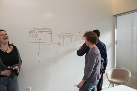
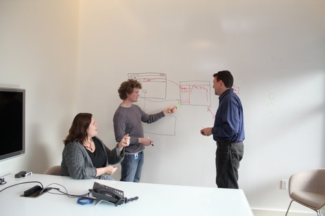
“I would describe the overall theme of our workplace as: the building is the canvas. What I mean is that you don’t have to hunt for a place where you can collaboratively sketch something. You can do that pretty much everywhere. All of the meeting rooms and offices have writable walls. Some have frosted glass walls to let in natural light, and you can write on the glass, too. There are also stationary and movable whiteboards.” See these writable walls in Figures 1 and 2.

Figure 1—Use of writable walls
Use of writable walls
Figure 2—Another view of the writable walls
Another view of the writable walls

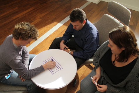
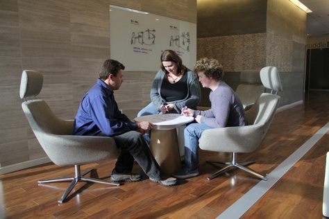
“We have little lounge areas with different setups throughout the building, where people can meet outside their normal work areas, sitting in comfortable chairs,” describes Tobias. “The lounges may have large LED screens—so you can plug in your notebook computer—movable whiteboards, or little tables with sheets of paper on them on which you can sketch and draw, then take the sheets of paper with you.” Figures 3 and 4 show these lounge areas.

Figure 3—Collaborative design takes place in a lounge area
Collaborative design takes place in a lounge area
Figure 4—Another view of the lounge area
Another view of the lounge area

“The layout of our new building is the reverse of our old one—in that now the offices are on the inside and the work islands—with four to six people on one island instead of in individual cubicles—are on the outside,” continues Tobias. “This provides natural light throughout the building, because the inside offices have glass fronts.

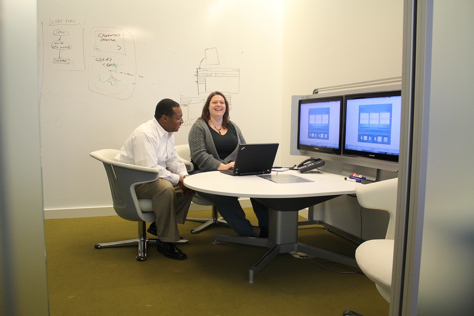
“In addition to our larger conference rooms, we have plenty of huddle rooms—small meeting rooms that are equipped differently with furniture and technology. There are some that have tables and chairs. Others have couches and coffee tables or armchairs. For equipment, some huddle rooms have a single LED screen. Others have two screens, which lets us show different things simultaneously. The different setups of these huddle rooms are what I like most. The effect of this has surprised me. I have my favorite rooms for different meeting types. For example, for client meetings where we share and discuss design assets through Web meetings, I find the relatively normal setup with a table and office chairs the most convenient. And again, whenever you want to write or draw something, you can just use the writable walls. For meetings that involve only discussion—for example, strategy meetings—I like the casual setup with the couch and the coffee table. You can lean back and talk comfortably, just as if you were at home in your own living room.” Figure 5 shows a huddle room.

Figure 5—A huddle room
Huddle room

“We also have great features outside our building, including open-air meeting spaces, a BBQ area, and an amphitheater,” enthuses Tobias. “In addition to this, we have nice features like a gym, a movie room, and a pool table. These recreational areas do more than just serve their functions of providing a means to exercise, watch a movie, or play pool. They help connect people who, because of their job roles, would not necessarily interact much with each other—like designers and accounting folks. It’s quite amazing to see how this can actually affect your work positively. Once you actually know someone from playing pool, instead of starting a lengthy email thread about something, you’re more likely to just walk up to the other person and solve the issue on the spot. This saves time that you can spend doing what you really want to do: design great experiences.”

Team Collaboration Spaces

“In my experience,” says Jim Nieters, “an office environment that encourages great design requires collaborative spaces that support active and energetic dialogue, music, and some level of horseplay. Spaces where you have to be quiet do not promote collaboration.”

“If you have enough meeting spaces, it’s helpful to allow a project team to take over a conference room for the duration of their project,” advises Jim Ross. “Instead of having to break down everything after each meeting, the team can leave their sketches and other work artifacts posted in their meeting space, then whenever they resume their work, they can more easily get started again, exactly where they left off.

“Provide meeting rooms and less formal collaboration spaces and equip them with whiteboards, flip charts, and Post-it notes. There should be enough meeting spaces so you don’t always have to book them in advance. This lets people spontaneously get together in a room to collaborate on a design.”

Designing a Space to Showcase Your Designs

“Although quarters may be tight in your company, try to lobby for a dedicated physical space for your designs, such as a conference room, a single large wall, or a corner in a common room,” suggests Suzanne. “In this space, you can post personas, competitive analyses, and designs in progress. Displaying these artifacts in an open space enables your team to step back and look at the designs together. Ideas flow more freely and collaboration becomes more organic. Even colleagues who are not directly involved in design can see your work as it develops.

“If you have remote team members, you can send them photos whenever you make significant changes and follow up with electronic versions of your artifacts to keep everyone on the same page.”

Jim Nieters recommends that you “display artifacts and physical, historic, and digital examples of transformative designs—even those that have failed. Share examples of physical experiences such as architecture by Buckminster Fuller or Frank Gehry or automobiles from Porsche, Toyota, or Audi—including some successful designs, as well as some that were not so successful.

“In terms of digital examples, print out pictures and post them around your workspace. Share magazine articles, pointers to YouTube videos—such as the one of the Piano Stairs in Stockholm—and posters that highlight the value of great design. You can also host events within your organization to showcase examples of transformative design.” 

Reference

Allen, Thomas J., and Gunter W. Henn. The Organization and Architecture of Innovation: Managing The Flow of Technology. Oxford: Elsevier, 2007.

Product Manager at Tom Sawyer Software

Dallas/Fort Worth, Texas, USA

Janet M. SixDr. Janet M. Six helps companies design easier-to-use products within their financial, time, and technical constraints. For her research in information visualization, Janet was awarded the University of Texas at Dallas Jonsson School of Engineering Computer Science Dissertation of the Year Award. She was also awarded the prestigious IEEE Dallas Section 2003 Outstanding Young Engineer Award. Her work has appeared in the Journal of Graph Algorithms and Applications and the Kluwer International Series in Engineering and Computer Science. The proceedings of conferences on Graph Drawing, Information Visualization, and Algorithm Engineering and Experiments have also included the results of her research.  Read More

Other Columns by Janet M. Six

Other Articles on Teamwork

New on UXmatters