Top

Effective Use of Typography in Applications for Children

Designing for Children

Early engagement in the digital world

June 7, 2011

In this installment of my column, I’ll take a look at one of the most important visual design elements for graphic user interfaces: typography. I’ll concentrate on general guidelines for the effective use of typography in the design of applications for children between 3 and 10 years of age. What considerations do we need to take into account when working with digital typography when children are its primary interpreters?

Champion Advertisement
Continue Reading…

Using Typography in User Interface Design for Children

It is essential to note that tolerance toward reading and understanding text varies greatly, depending on the age of children and whether they are pre-readers, beginning readers, or readers with middling skills. In most cases, your use of text should be moderate unless you are designing specific areas of an application that need to accommodate large amounts of text—for example, on community pages, forums, Help pages, or game discussion boards—for children who have experience reading.

That said, the guidelines that I’ll present in this column can direct UX designers when working with digital typography in applications for kids.

Choosing the Appropriate Typeface

Most children learn to read by going letter by letter until they are able to make sense of an entire word. [1] Therefore, it is important to choose a typeface with well-defined contours and generous space between letters, which gives a warm and inviting feeling.

Many Web sites and applications for children—such as Sesame Street’s Web site, shown in Figure 1, or PBS KIDS—use rounded, playful, sans serif typefaces for large headlines and interactive UI elements, while using simpler, more traditional fonts for the more adult links at the bottom of the page.

Figure 1—Fonts on the Sesame Street Web site
Fonts on Sesame Street Web site

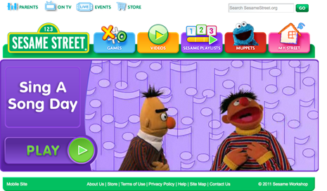
As Figure 1 demonstrates, a designer should have the liberty to choose fonts that have a very distinctive look and feel when creating applications for children. However, it is advisable to stay away from distorted, decorative, or cursive letterforms. Some fonts that offer optimized legibility, because they were designed specifically for kids, include the Sasoon font family and Gill Sans Schoolbook.

Types of Fonts

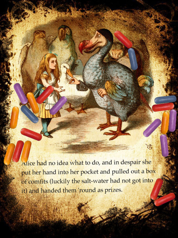
While research studies have expressed divergent findings about differences in children’s ability to read serif or sans serif typefaces, [2] [3] it is common practice to use sans serif fonts in applications for children, because of their fresh look and simplicity. However, some exceptions to this practice include applications that offer a reading experience that resembles reading a book—often with the help of a caregiver—in contrast to the more exploratory, quick nature of reading on the Web or in gaming experiences. Some examples include mobile applications like Alice for the iPad, shown in Figure 2, Toy Story Read-Along, and A Present for Milo.

Figure 2—Use of serif fonts in Alice for the iPad
Use of serif fonts in Alice for the iPad

The serif fonts Bembo Schoolbook and Plantin Schoolbook were designed specifically for easy readability and teaching language to kids.

Font Styling

It is important to differentiate elements that are interactive and make it clear to children when they can tap, click, or interact with something. Therefore, the text in links and labels for buttons is generally highly stylized, as are titles and headings.

While it is vital to establish a visual hierarchy in expressing interactivity and, at the same time, convey a playful look and feel, designers should be cautious when using extra bold or extra thin letterforms, as well as drop shadows, italics, underlining, caps, and color. Always test to ensure that the styling you are using supports the user experience rather than detracts from it—especially when working with preschoolers and beginning readers.

Many applications for children feature color, textured, patterned, or gradient backgrounds. Such backgrounds can easily decrease the legibility of letterforms—particularly when there is not enough contrast between text and its background. For this reason, it is essential to test the usability of an application with kids of different ages within your target age range and reading levels. If they experience any difficulties or spend considerable time reading and understanding your text, you should simplify the typographic styling, the background, or both.

This becomes even more critical when children from around the world or with different levels of language skills will use the product you are working on. Best practice is to provide various design alternatives for different languages. However, if this is not possible or the audience is very heterogeneous within one region, avoid using overly stylized typefaces, which can make it more difficult for kids to understand content or interact with an application.

Mattel’s Hot Wheels Web site, shown in Figure 3, provides an example of highly stylized typography. [13] Almost every link and headline is in all caps, bold italics, and in color, with drop shadows, gradients, and contour lines over textured backgrounds.

Figure 3—Typographic styling on Mattel’s Hot Wheels Web site
Typographic styling on Mattel’s Hot Wheels Web site

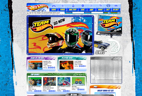
The look and feel of the typography on this site evokes dynamism, movement, and speed, which is in keeping with the Hot Wheels theme for boys. However, the page is difficult to scan, and it is hard to identify interactive elements at first glance. This might not be a problem for an application whose purpose is exploration and the expectation is that kids would use it for a longer period of time—which might be the case for Hot Wheels. But it is always important for designers to find the right balance by considering the audience for which they are designing an application and their reading and language skills.

Other Considerations to Keep in Mind

Follow basic principles of typography. Designs for children should follow the same basic principles of typography and visual communication design as any other design project. No matter how organic and playful the look of a user interface is, its layout should still have an underlying grid structure that displays information in the best way possible, carefully balancing all graphic elements.

Use consistent layouts. In trying to make pages visually attractive to children, many designers end up with layouts that are a hodgepodge, disrupting users’ visual flow. Always remember to use layout patterns that achieve a good balance between text, color, and graphics in all sections of your applications, and use the same fonts throughout. And even if you are working with a very colorful and vibrant layout, the use of negative space, or whitespace, is as critical as ever.

Strive for legibility. Keep in mind that most children are not going to read entire paragraphs of text unless it is critical to their experience with an application—as with game instructions or Help pages—it relates specifically to their areas of interest—for example, community pages—or text is the core content of an application—as with digital books. Furthermore, children below 6 years of age can cope with only individual words or very short sentences.

But even if you are not working with large blocks of text, it is imperative to observe the following guidelines to make sure any text content is as legible as possible:

  • alignment—As in any other design project, having consistent alignments between links, headlines, sentences, and paragraphs is key. It is also crucial to verify that the type of alignment you are using is not interfering with children’s ability to read text, which usually occurs when using centered, justified, or right-aligned text.

  • font size—Use font sizes that accord with children’s developmental stages. For example, preschoolers and beginning readers require a larger font size than is usual for experienced readers. This is especially important for links and button labels. At the same time, it is common practice to use outsized headlines and titles to capture children’s attention and divide content into sections using visual hierarchy. On this point, research studies focusing on online typography for children state: “Generally the larger, 14-point font (print) size is considered to be easier and quicker to read, as well as being more attractive and more desired….” [4]
  • line width—When you need to include paragraphs or long sentences, be sure to use a line width that is consistent with the span of a child’s focus on a screen, which can be shorter than that of an adult. You can determine what is appropriate according to the age of the child and the size of the screen—mobile phone, tablet, or desktop—as well as through usability testing. At the same time, be sure to use generous leading, line heights, and good separation between sections, so kids can easily identify different letterforms and chunks of content.

  • no extra work—Avoid making users do extra work to read text—as is the case with animated text, where children would need to read words while trying to follow their movement on the screen—or making children use scroll bars or other interactive elements to see all of the content.

Some Final Thoughts

In this column, I have discussed basic typographic principles you should take into consideration when designing applications for children between 3 and 10 years of age. You should conduct in-depth usability studies when embarking on specific design projects.

It is important to note that the majority of designs for children are highly graphical, and most of the time, graphics are the main elements that guide users in how to interact with an application—more than the typography. Consequently, in my next column, I’ll dive into the subject of the effective use of color and graphics in support of the user experience of interactive products for kids.

The key thing to appreciate about designing applications for children is that it offers the perfect chance for freedom of exploration in the use of digital typography, in combination with other visual and new media elements such as color, graphics, video, and animation. However, it is equally important to draw a distinction between this exploration and the user experience that we seek to provide. It is vital always to ensure, through user research and usability testing, that our visual design decisions support optimal usability and are in accordance with children’s developmental stages. 

Endnotes

[1] Strizver, Ilene. “Typography for Children.Upper and Lower Case Magazine, Online Issue 40.1.1. Retrieved May 31, 2011.

[2] Walker, Sue, Linda Reynolds, Nicola Robson, Nadja Guggi, et al. “Typefaces.” Typographic Design for Children. Retrieved May 31, 2011.

[3, 4] Bernard, Michael, Melissa Mills, Talissa Frank, and Jan McKown. “Which Fonts Do Children Prefer to Read Online? Software Usability Research Laboratory, Wichita State University. Usability News, January 2001, Volume 3, Issue 1. Retrieved May 31, 2011

Resources

Nielsen, Jakob. “Children’s Websites: Usability Issues in Designing for Kids.” Alertbox. September 13, 2010. Retrieved January 8, 2011.

Lynch, J. Patrick, and Sara Horton. Web Style Guide Online Edition, 2008–2009. Retrieved May 31, 2011.

Senior User Experience Researcher & Manager at Google

San Francisco, California, USA

Catalina Naranjo-BockA UX designer and researcher, Catalina specializes in the development of ideal experiences for children and young audiences for both tangible products and interactive applications. She has collaborated on children’s media and toy design with creative departments in numerous firms, in the US, Europe, and South America. In a variety of design-related contexts. Catalina has served as adjunct faculty, guest speaker, invited author, and international juror. Catalina holds a BFA in Industrial and Digital Design and an MFA in User Experience Design and Research from The Ohio State University.  Read More

Other Columns by Catalina Naranjo-Bock

Other Articles on Designing for Children

New on UXmatters