Top

Add to Cart: 5 Ways to Improve Shopping on the Mobile Web

Mobility

User experience on the move

A column by Shanshan Ma
August 23, 2011

Shopping at bricks-and-mortar stores and shopping online provide very different experiences. eCommerce sites have now evolved through multiple generations to ensure a high-quality online shopping experience. Some key elements of a good online shopping experience include allowing customers to check out without creating an account, informing customers where they are in the checkout process, and providing a clear confirmation that a customer has successfully completed an order. Amazon’s home page has gone through multiple generations, as shown in Figures 1 and 2.

Champion Advertisement
Continue Reading…
Figure 1—Amazon’s home page circa 1995
Amazon home page circa 1995
Figure 2—Amazon’s home page in 2010
Amazon home page in 2010

Today, shoppers are beginning to migrate from the Internet to the mobile Web. When people are away from their computer, they have their smartphone with them. The mobile Web is growing fast, and more and more sites are being developed specifically for mobile platforms.

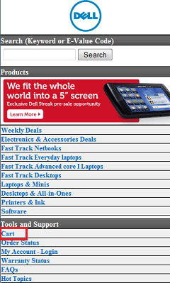
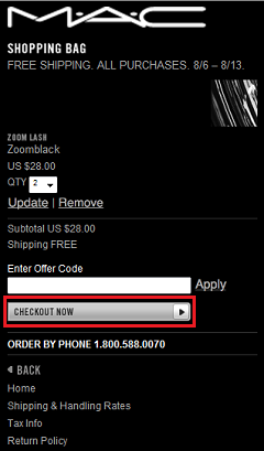
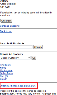
Some mobile ecommerce sites offer only simplified functionality—such as displaying a product catalog or helping customers locate a store—rather than offering full shopping and checkout capabilities. Mobile sites by Target, Buy.com, Walmart, and Ikea belong to this category. Shoppers can browse products, view pricing information, and even add products to their cart. However, tapping the Proceed to Checkout button redirects them to the full desktop Web site. On the other hand, several mobile sites, including Amazon, BestBuy, Dell, Urban Outfitters, and maccosmetics.com, offer complete checkout and payment functions. However, unlike most desktop shopping experiences, most mobile shopping experiences are still far from satisfactory.

This isn’t just about the quality of mobile sites though. When people shop using their mobile phones, they’re not necessarily shopping on mobile sites. Consider the following situation: A person is checking his email on his smartphone. He follows a link in an email message to purchase a product that is currently on sale on a company’s desktop Web site. Optimizing a Web site for mobile use is important to help users smoothly complete transactions without requiring them to wait until they have access to a computer. Shoppers who are willing to buy right here, right now can easily do this on their mobile devices. Such scenarios will become increasingly prevalent as more consumers become comfortable with mobile shopping.

It is critical for organizations to ensure that they are developing intuitive shopping experiences for mobile devices. If they don’t, customers will simply go to their competitors. Here are five things you can do to create a positive user experience for shoppers on your mobile site.

1. Make the Buy or Add to Cart button and any other calls to action prominent.

It might seem obvious, but simple design mistakes happen quite often. For instance, subscribers receive a deal from Groupon daily via email. Figure 3 shows a Daily Deal email message from Groupon. Ugly boxes remind users to click the Display images below link at the top. Once a user clicks this link, a big See Today’s Deal button appears, as shown in Figure 4, and the user can click it.

Figure 3—Daily deal email message from Groupon with no images
Daily deal email message from Groupon with no images
Figure 4—Groupon email message with images
Groupon email message with images

However, let’s take a look at Figure 5, which shows how the email message looks on a smartphone. Users can see the price and additional information about the deal, but can’t see where to take action. There is a similar Show images link hidden somewhere in a corner of the page that isn’t visible, but users viewing this message on a tiny screen can easily miss it. Since the page renders fine, without any ugly boxes to show users there are missing images, there’s nothing to remind users to look for that link. So, even if users are really interested in the deal, they may not be able to figure out what they can do to take advantage of it.

Figure 5—Groupon email message on a smartphone
Groupon email message on a smartphone

2. Make the shopping cart visible and accessible wherever users are on a mobile site.

When users are browsing and shopping on a mobile ecommerce site using a smartphone, it’s essential to keep them updated on how many items are in their shopping cart and what those items are. Because of the limited viewing space on a mobile phone, it’s much harder to always keep the shopping cart visible on a mobile Web page. Users may sometimes have to scroll up or down to find it.

However, we can at least place the shopping cart in a consistent location on every page on a mobile site, as on Dell’s mobile site, shown in Figure 6. Though always placing the shopping cart icon at the top of each page would dramatically increase its visibility, as on BestBuy’s site, shown in Figure 7. Users would be able to easily see and get access to their shopping cart when browsing different pages on the site.

Figure 6—Dell’s shopping cart, in an obscure location in a list of options
Dell’s shopping cart, in an obscure location in a list of options
Figure 7—BestBuy’s shopping cart, at the top of every page, gets updated instantly
BestBuy’s shopping cart, at the top of every page, gets updated instantly

But just making the shopping cart visible is not enough. A site should keep the number of items in its shopping cart updated, as BestBuy does, shown in Figure 7. Amazon’s mobile site, shown in Figure 8, makes its shopping cart prominent enough, displaying it in the upper-right corner of the page, but it doesn’t update the shopping cart immediately once a user adds an item to the cart. Even if there are several items in the cart, it still appears empty.

Figure 8—Amazon’s shopping cart is visible, but does not get updated
Amazon’s shopping cart is visible, but does not get updated

3. Make it easy to check out by tapping a prominent button.

On a mobile phone’s small screen, users might easily miss a Check Out button, especially when there are many other buttons on the same page that compete for their attention. On Dell’s mobile site, shown in Figure 9, there are multiple buttons, including Update Total, Remove Item, Apply Coupon, and Checkout, which all look very similar. Amazon makes its Proceed to Checkout button bigger than the Update button, as shown in Figure 10. They also repeat the button at the top and bottom of the page to make it easy for users to access it when they are viewing either part of the page. MAC uses a very different design for its Checkout Now button, shown in Figure 11, to make it stand out on the page, so users won’t miss it.

Figure 9—Dell’s Checkout button is one of many buttons
Dell’s Checkout button is one of many buttons
Figure 10—Amazon’s Proceed to Checkout button is bigger and at the top and bottom of pages
Amazon’s Proceed to Checkout button is bigger and at the top and bottom of pages
Figure 11—The different design of MAC’s Checkout Now button makes it stand out
The different design of MAC’s Checkout Now button makes it stand out

4. Provide options for ordering by phone and picking up products at a store.

Taking advantage of smartphones’ personal communications capabilities can make the mobile shopping experience more flexible and serve the needs of users on the go. In case anything unexpected happens—for example, losing connectivity—you can give users alternative ways of completing purchases. Phone numbers should be readily accessible and let users initiate a call with a minimum of effort. BestBuy’s mobile site, shown in Figure 12, provides a good example of making use of the phone function during the mobile shopping process. An Order By Phone link is available on every page on their site. Users can use the link to make a call.

Figure 12—BestBuy provides an Order By Phone link
BestBuy provides an Order By Phone link

5. Make mobile shopping social.

Mobile users often connect to social networks like Facebook, communicate with close friends through constant text messaging, and use their phones to call family members and coworkers. One reason Groupon has gained so much momentum is its smart use of social shopping. Your friends buy something and recommend it to you. Then, you buy it and want to recommend it to your other friends as well. For example, a circle of friends can share a deal for a cooking lesson, then have fun taking the lesson together. Making the shopping experience social not only facilitates lead generation, but also enhances the relationships of friends in real life. Mobile ecommerce sites can and should push this one step further. For example, eBay’s fashion app lets users take pictures of newly purchased outfits and share them instantly with their friends or family. Plus, shoppers might seek opinions about a potential purchase from their peers or ask for their parents’ approval to make a purchase.

Another good way of making mobile shopping social is bringing the virtual and physical worlds together by facilitating product reviews and sharing of feedback on mobile ecommerce sites. When customers are shopping in bricks-and-mortar stores, they should be able to read product reviews and user comments on their smartphone. Users could then shop with much more confidence than if they could read just an official product description in the store or on the store’s Web site. Even when customers complete purchases on their phone, positive user-generated comments on a mobile ecommerce site may prompt those purchases.

In Conclusion

There are many variables to consider when optimizing a shopping experience for a mobile platform. Plus, with new technologies and mobile devices such as the iPad coming to the market, consumers now have more opportunities to shop on the go. For this reason, creating intuitive mobile shopping experiences is becoming increasingly important to driving an ecommerce store’s revenue and improving its bottom line. 

Principal User Experience Designer at BD

San Diego, California, USA

Shanshan MaShanshan has extensive research experience in understanding how human beings organize and find information on the Web and in their own personal computing environment. Her expertise includes designing and conducting user research, handheld device and Web site usability, and user experience consulting. Shanshan received her PhD degree in the area of Human-Computer Interaction from Drexel University.  Read More

Other Columns by Shanshan Ma

Other Articles on Mobile UX Design

New on UXmatters