Top

The Lifecycle of a Mobile App, a User’s Perspective

October 17, 2011

The average user doesn’t open a mobile app more than twenty times, and people use only one third of the apps they download beyond 30 days. [1] As an app designer, I find this depressing. It means much of my hard work gets discarded. This got me thinking about the lifecycle of an app living on my phone.

There are specific milestones in my relationship with a mobile app. I believe understanding that lifecycle is important in designing an app to outlive those statistics. A user-centered design approach ensures we design with purpose, users’ desires are front and center, and users can easily complete their tasks. But what is sometimes lacking is a first-impression impact on users—and because of the nature of mobile apps, often there may be no opportunity for a second impression. Let’s take a closer look at the lifecycle of a mobile app in Figure 1.

Champion Advertisement
Continue Reading…
Figure 1—Mobile app lifecycle
Mobile app lifecycle

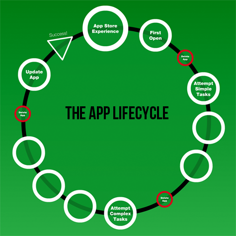
Stage One: The App Store Experience

Purchasing apps is very different from making most purchases. When shopping for a hammer, I can go into a physical store, pick up the hammer, examine its grip and head, and even swing it to get a feel for its balance. Shopping for an app involves a certain amount of blind faith. Neither the Apple App Store nor the Android Market provides any way of trying out an app before purchasing it. Amazon does allow Test Drives in a browser-based emulator for some apps, but an emulator experience is a far cry from the actual device experience. Building a great app experience may not result in a download, so it’s important that the app store experience be a designed experience.

An app is also very different from a Web site. Web sites are always out there and always available. Apps are available to users only once they have downloaded them to their device—which begs the philosophical question: does an app really exist if it’s not on my phone?

There are four key things to consider that impact a user’s decision to download an app: its price, description, screen captures or a video, and user ratings. Rarely, as designers, can we influence the price, but we can influence the other elements. An app’s description and screen captures can be very powerful. We should design and craft the way an app appears in a store just as we did the app itself.

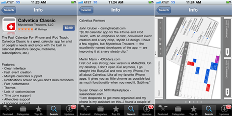
As a case study, let’s look at Calvetica Classic, [2] a simple calendar app. The screen captures in Figure 2 are from the Apple App Store. The short-and-sweet description of the app and the feature list both fit above the fold. It’s interesting that Calvetica includes some high-profile reviews in the description area. The selected reviewers are very relevant to target users; Merlin Mann is well known to fans of productivity tools. Calvetica uses the area for screen captures differently from most apps. They’ve pieced the screens together to illustrate a usage scenario. There is no doubt the app’s in-store experience is a designed experience.

Figure 2—Calvetica Classic
Calvetica Classic

Stage Two: The First-Open Experience

The first-open experience is crucial. It is likely that a user has been waiting for the download to complete and is anxious to open the app. Unfair as it may be, this first impression often determines whether the user ever opens the app again. Most likely, the user has no real task in mind. At this point, it is doubtful the user will get deep enough into the app to see how user-centered design has influenced the experience. Subtleties go unnoticed on this first open. That means your design needs to immediately differentiate your app from others in its category and engage users enough to convince them to return when they actually do have a task in mind.

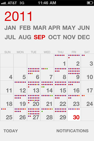
Note that Calvetica’s visual representation of the calendar, shown in Figure 3, is unique. When a user taps a different month, the numbers on the days animate and move to new positions—instead of a simple jump cut to a new screen. These are small things, but they made a positive impression that brought me back to the app again.

Figure 3—Calvetica’s calendar
Calvetica’s calendar

Stage Three: Attempting Simple Tasks

Once an app survives the first-open experience, users come back to the app in a time of need, with a specific task in mind. This is, hopefully, when users discover the app’s usability and thoughtful experience design. Relevance is key. Did you, the designer, correctly anticipate what the primary user tasks should be? If so, users can effortlessly and intuitively accomplish those tasks. If not, they’ll ignore the app, then discard it the moment they attempt to download a new app and discover they don’t have enough space.

In our case study app, Calvetica, it is fairly safe to assume the most common task would be to create an event on the calendar. In Calvetica, this guided task is very simple. The app is much smaller and simpler than most calendar apps. A user can create new events directly on the calendar screen, as shown in Figure 4, rather than on a separate screen. Because users can easily complete this task, they’re encouraged to expand on the task or try new ones.

Figure 4—Creating an event
Creating an event

Stage Four: Attempting Complex Tasks

Surviving stage three means your design and attention to the user’s needs have engaged the user. That’s great! However, now the app has created expectations in the user’s mind. The app has handled previous tasks well, so the user assumes it will handle secondary tasks and exception paths just as well. The user explores the alternative paths and options within a task to see whether they fit the user’s unique needs. If not, the user probably won’t immediately delete the app, but he may later decide it’s not worth updating.

Here is where Calvetica Classic stumbles a bit. But to be fair, an expanded version of the tool is available for an additional $2, with more robust features and functionality. I’ve personally decided to keep Calvetica Classic on my phone primarily as a browsing calendar, and use Apple’s Calendar for more complex scheduling.

Stage Five: Updating the App

If users update your app when you release new versions, congratulations! You have designed a great app! But don’t get too comfortable. While users will be excited to open the new version to see what new features and functionality you’ve added, the lifecycle continues, and your app has to get through all of the same challenges again.

Conclusion

Users consider most apps to be inexpensive and disposable. They have hundreds of thousands of apps from which to choose. As app designers and developers, we are asking users to download our apps to a very personal device that they often think of as an extension of themselves. It contains their personal photos, information, and files. Understanding your app’s users, their relationship with your app, and the app lifecycle should influence the design of your app. 

Endnotes

[1] I’ve borrowed these statistics from Josh Clark’s book, Tapworthy, which is definitely readworthy. In fact, his book inspired many of the thoughts in this article.

[2] I have no connection to the Calvetica app other than being a fan. It makes a great example because everyone has a basic understanding of calendar apps.

VP, User Experience, & Executive Creative Director at Bottle Rocket Apps

Dallas, Texas, USA

Michael GriffithAt Bottle Rocket, Michael builds digital brand experiences for mobile devices, balancing user-centered and marketing-centered design approaches. He’s been designing digital media for 21 years, and his strong understanding of information architecture, usability, accessibility, and compliance sets him apart from most creative directors. His mantra is simple: Work with cool people and build cool stuff. Michael’s broad experience includes designing mobile apps, iPad apps, Web sites, microsites, social media, digital media, email, computer-based training, marketing CDs, kiosks, and trade show media. His diverse industry experience spans consumer package goods, entertainment, travel and leisure, telecommunications, finance, over-the-counter pharmaceuticals, and B2B. Michael has taught the design and development of new media at the college level and speaks at professional organizations and conferences.  Read More

Other Articles on UX Strategy

New on UXmatters