Top

Designing the Spaces Between

June 4, 2012

We talk about good user experiences an awful lot these days, but when it comes to digital interactions, hardly anyone seems to know what that really means.

Business magazines and design blogs agree: the way to earn consumer loyalty and competitive advantage is to deliver the most satisfying experience. But they’re a lot less clear about what defines a good user experience. When we consider user interfaces, mobile apps, and Web sites, there are many factors that may contribute to the success of their user experience. Is it the way it looks? The density or sparseness of information? Or is it just that it functions the way users expect it to function?

Champion Advertisement
Continue Reading…

So It Works, Now What?

The problem with trying to define a good user experience is that the definition is incredibly context dependent. Back when search engines’ results were 90% useless, Google offered a better experience because of its superior ranking algorithm. When Apple released OS X, it delivered a better experience because it got rid of visual clutter and just worked—something Windows couldn’t match at the time.

But a lot of digital interactions work well these days. We’ve largely moved past the point where users blamed themselves for poor functionality or readability. We expect a user interface, mobile app, or Web site to perform its tasks adequately, provide intuitive operation, and have a reasonable level of visual elegance. This is encouraging: one of my greatest satisfactions as an interaction designer over the past decade has been watching people’s expectations evolve to the point where they see good user experience as a necessity, not a luxury. But it also raises the bar for achieving differentiation. When everything works correctly and looks right, what separates the experiences we love from those we merely tolerate? Most people would answer—though not very helpfully: the best digital experiences are the ones that feel right.

Where does the elusive feel of a product’s look and feel come from? The answer, I’d argue, is motion.

Why Motion Matters

Let’s look at the evolutionary history of digital interfaces. In 1999, a Web site was simple and static. Drawing on the metaphor of print publications, a site was literally a series of pages. The space between one page and the next was a no-man’s land of slow loading times and gradually populating tables and played no intentional part in a site’s identity or feel.

But as bandwidths increased, platforms got more powerful, and UX designers’ understanding of behavior improved, Web sites became something else. Along with mobile apps, they raised the bar for appearance and function in a good digital experience, but they ignored kinetic behavior almost completely. Kinetic behavior now matters and has business impacts, because motion provides the crucial opportunity for earning users’ emotional allegiance. Brands that can deliver satisfying transitions and well-integrated kinetics are the ones that delight their customers.

A poster sits still; a page turns exactly as a reader makes it turn. In traditional print media, there are no designed transitions or movements, so when they show up in digital experiences, they’re powerful. Applications or Web sites that move and shift in distinctive ways have the ability to step off the screen and into the real world of things that react. This makes the fourth dimension of motion and time far more powerful than the third dimension, depth. The transitions, to paraphrase Charles Eames, are not just the transitions—they make the experience.

The Tyranny of the Printed Page

To understand why kinetic design still lags behind functionality and visual design, you have to know something about the UX design process. Creating a digital experience ultimately means writing code—and that’s the domain of developers. However, deciding what experience that code will enable is the job of the UX designer.

The specifications that these two groups use to communicate are still written documents. They employ various tricks to get their ideas across: user stories that describe what should happen when a user encounters a certain function or state; individual page mockups that we create using Photoshop or Illustrator; wireframes that express layout, hierarchy, and connectedness. It’s all very print like.

For all their vividness, user stories, mockups, and wireframes are still static artifacts, and UX designers, like all creative professionals, tend to fall in love with their artifacts. The detail and fidelity of the spec book has gone way up in the past few years, but our ability to document the dynamic aspects of a product’s user interface still lags behind our ability to effectively communicate function and form. Why? Because it’s inherently difficult to describe something that is time based using a static tool. Squirrely things like the acceleration of a moving icon or the speed of a screen fade tend to drop down the list of priorities. Overworked developers have plenty of other things to worry about—like getting an application to function properly—and motion design becomes an afterthought despite everyone’s best efforts.

Compounding this issue is the foresight problem. A visual mockup of a screen looks almost exactly like a finished product, so it’s easy to predict how the final implementation will look, then compare it with the mockup. But UX designers typically describe rather than show a motion or transition, so we doesn’t know how it’s going to feel until the code is nearly complete. At this point, making changes is difficult and expensive, and the cost of failure is high. There’s a lot of pressure to leave good enough alone.

Choosing the Right Technology, Even If It’s Flash

So, why haven’t we incorporated the kinetic aspects of design more thoroughly into the development process? For one thing, legacy approaches to product development. The spec book is a central component of the waterfall approach to design and development: person A—a client or project director—creates a project brief and hands it off to person B—an interaction designer—who generates designs according to the brief and passes them along to person C—a visual designer—who produces high-fidelity mockups and, finally, hands off the designs to person D—a software developer. This may all seem natural and orderly, but in practice, what comes out the end may differ enormously from the original intent. Because the various players often do their work separately, it’s hard to know exactly where things have broken down. The final result may not feel right, but designers and developers are more likely to blame each other than suggest that the process itself is to blame.

Of course, there are tools available for communicating motion, but they suffer from their own unfortunate legacy. Flash has become something of a dirty word since the mid-2000’s, when its careless overuse inflicted an endless parade of slow, gimmicky Web sites on the public. Then, Apple—the ultimate arbiter of digital taste—started heaping public scorn on the platform, and even the uninitiated got the vague sense that it was fundamentally hokey.

That’s a pity, because Flash, along with several other animation tools that were similarly shunned, is actually very good at solving the problem of kinetic communication. We can use such tools to prototype motion, just as Photoshop lets us mock up the visual aspects of a page, and these prototypes give developers a far better reference point when they start coding.

Since the introduction of Flash in the late 90’s, organizations have used this tool to create some groundbreaking, consumer-oriented Web sites—along with a lot of crap—giving it a reputation as something that is better suited for entertainment than integration into user experiences. The backlash brought us the Web 2.0 aesthetic, with its static boxes, long vertical pages, and simple color palettes. Recently, we’ve even toyed with the idea of the “undesigned Web,” which holds a single column of stationary, unadorned text as the Platonic ideal. It’s a classic case of throwing the baby out with the bath water.

The fact is: motion is a tool, just like color, hierarchy, typography, and imagery. Motion helps to convey information and identity, and designs can use it poorly or well. Of course, it may not be necessary to use motion at all—just as not every Web site needs text, like Tumblr, and not every application needs images, like Instapaper. But like text and images, motion should be a part of most digital experiences today and can enhance an experience tremendously when we apply it in a deliberate, well-conceived way.

Using Motion: The Guerilla and the Queen

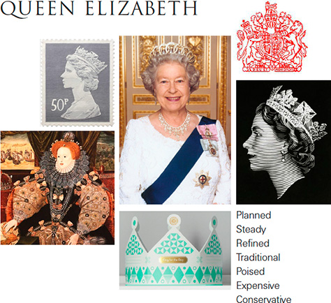
Here’s one example of the use of motion. Recently, at Ziba, we held a joint work session, asking two teams of Communications and UX Designers to design a mobile app that would help users make and follow their travel plans. As with nearly every design project at Ziba, we started by defining a target user: we asked the first team to design an app for Queen Elizabeth II; the second, for Che Guevara, shown in Figures 1 and 2, respectively.

Figure 1—Queen Elizabeth II
Queen Elizabeth II
Figure 2—Che Guevara
Che Guevara

It’s immediately obvious that the workflow, imagery, color palette, and tone of text should differ tremendously for these two users, and they do. What’s less obvious is that the motion design palettes must also be different. Figures 3 and 4 show two quick motion studies that demonstrate how each of these apps should behave kinetically. I’m not going to say which is which, but even with our rendering them using grey boxes and with no other visual cues, it should be easy to tell Che’s app from Queen Elizabeth’s.

Figure 3—Quick motion study 1

Figure 4—Quick motion study 2

Taking Responsibility for Kinetics

In digital experiences today, feel resides in kinetics, and the key player in getting kinetics right is the Kinetic Designer (KxD). While KxD is a recent designation, this is not really a new skillset. Designers have been crafting animations and designing motion for the Web since the late 90’s, but only recently have we started to truly integrate them into the UX design process.

At Ziba, KxDs work from the same brief and communicate with the same developers as the interaction designers and visual designers do, but express themselves primarily through motion studies and kinetic mockups that they create using Flash, Adobe After Effects, or real code—whether HTML5, Android, iOS, or Adobe Air.

Surprisingly, these motion studies and kinetic mockups?don’t add much time or effort to the design process. They create initial kinetic concepts during rapid-fire collaborative exercises, often expressing them in paper sketches that anyone on the UX Design team can expand on and develop. Refinement of these concepts in the hands of a talented KxD can be equally quick. Someone who is good with these tools can knock out a dozen alternatives for a transition in an afternoon.

With a video reference in front of the team, decision making is almost always faster than going through rounds of abstract debate and often exposes opportunities for streamlining the user experience. Nothing puts a designer or developer in users’ shoes like being made to watch passively as the experience they’re proposing unfolds before them.

However, realizing the full value of kinetics requires more than just motion graphics. A lot of designers create video mockups, but without implementing motion in reusable code, they’re just a lot of vaporware—evocative and accurate, but impossible to replicate. To be effective, a KxD sometimes has to play the role of front-end developer—to both understand the needs of the developers and give them a clearer picture of what satisfies the specifications. It’s one thing to know that a transition should take 0.3 seconds to complete, but something else entirely to see it unfold on the screen, then create code that developers can copy, paste, and modify.

Taking this approach doesn’t just speed up the process; it gets you closer to the essence of feel, an application’s soul: the dozens or even hundreds of tiny kinetic details that give a digital user experience its unique character. No amount of Photoshopping can communicate that. And as fuzzy as it may sound, soul is exactly what we’re creating here. Anyone who’s ever refreshed the screen of an iPhone app by dragging it down, then letting go knows that it’s a lot more than just a way to get rid of a button.

Just as we need to embed motion deep into a user experience, we need to embed motion designers into a UX Design team. KxDs at Ziba sit in the same room as the other designers, and while their tools of expression may differ, their ultimate goals are identical: a user experience that transcends the page and speaks to the heart. 

Global Head of UX at Logitech

San Francisco, California, USA

Curt CollinsworthCurt leads Ziba’s UX Design group, managing and meshing the expertise of interaction, visual, and kinetic designers together with the rest of Ziba’s cross-disciplinary studio to deliver consistently incredible user experiences. His team’s purview includes physical products, Web sites, applications, services, and more, addressing the needs of millions of users and a wide range of global Fortune 100 clients. Prior to joining Ziba, Curt was a creative director for Frog Design in Germany, focusing on user experience and software projects, and led interactive departments at Hornall Anderson and Publicis West, both in Seattle. He also ran his own creative firm in San Francisco during the dot-com boom. Curt holds a BFA in Intermedia Art from Arizona State University and has lived in Germany, Russia, Finland, and the USA. Curt makes his own wine—mostly Italian-style red varietals—and enjoys fixing up vintage cars, especially Volvos.  Read More

Other Articles on Interaction Design

New on UXmatters