Top

Demystifying UX Design: Common False Beliefs and Their Remedies: Part 1

Eliciting Desired Behavior

Designing for business success

A column by Frank Guo
October 8, 2012

There are many common beliefs about UX design that are, unfortunately, based on casual and inaccurate observation. However, through systematically planned and conducted user research, we can see that some of these could not be further from the truth. In this series, I’d like to single out a few such design beliefs that meet two conditions:

  1. Many product development professionals believe them.
  2. Little user data supports them.

Such ideas may not be completely wrong—just oversimplified. But, if UX designers applied them indiscriminately, adherence to them would undermine user engagement and task completion. While many experienced UX designers have already realized the problems that result from adhering to these ideas, many others still firmly believe in them. In debunking these UX design myths, I’ll show that they’re just half truths that don’t fully account for the complexity of user experience and that there are better alternatives for achieving your design objectives.

Champion Advertisement
Continue Reading…

There’s No Need to Worry About Long Pages

Many designers are overly concerned about page length, thinking that long pages impair information discovery. Much too often, I’ve heard, “The page is too long, users won’t scroll down.” This is not necessarily the case. Based on hundreds of user interviews that I’ve conducted, user expectations and contextual cues guide users’ behavior. You need not worry about long pages, as long as users know they should scroll down.

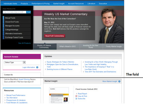
For example, if a user were on Amazon.com, reading user-generated product reviews, there could be a very long list of reviews. But the user would continue scrolling down despite the page’s length. Why? Because she expects to see more reviews as she scrolls down. She knows that there is more content below. On the other hand, if a user were on a Web page that provided no indication of what is below the fold, he would be less inclined to scroll down. Plus, if there were a large, horizontal block of content just above the fold, the user might think that was the end of the page, so wouldn’t scroll down any further. I’ve observed this kind of behavior repeatedly during many eyetracking studies that I’ve conducted on different types of Web pages.

Smart Visual Presentation Is Key to the Successful Design of Long Pages

You don’t need to worry about users not scrolling down on long pages if you do the following:

  • Set the right expectations so a user expects to see more content below the fold—for example, a long list of search results on a page
  • Manage visual cues wisely so they suggest that the content continues below the fold rather than stops at the bottom of the current screenful.

Here are a few visual design and content layout tips you can employ to encourage users to scroll down:

  • Avoid using strong, horizontal lines or blocks of information on long pages. Such a visual treatment would tend to stop users at that point and discourage them from scrolling down further.
  • Make the content below the fold similar—in terms of information design or visual design—to the content above the fold. The content should form a visual continuum, so users will scroll down the page.
  • Avoid any interruption or variation in the content—such as a box of content with a different background color. This could potentially take users off track and stop them from continuing to read down the page. An entire Web page should have a similar look and feel throughout.
  • Make sure that important keywords and headers are above the fold. On Amazon.com, while most user reviews are below the fold, users can see references and keywords relating to user reviews above the fold. Thus, they are already aware that there are user reviews somewhere on the page.

Finding Content Should Be Easy

To enable users to use a Web browser’s find function to search for a particular piece of information on a Web page, its better to place all of the information on one long page rather than displaying it on multiple short pages. With all of the information on the same page, a user can type a keyword and find it on that page. The longer a page, the more information it presents. Therefore, it is more likely that a user will find his keyword on the page.

Longer Pages Enhance Engagement

Displaying long pages of content rather than breaking it down into multiple short pages enhances readers’ engagement with the content. The more uninterrupted the reading experience, the more engaged a user becomes. When a user is reading content, the necessity of performing interactions such as repeatedly clicking a pagination link to go to the next page disrupts the user’s reading and undermines his interest in the information. Displaying more content on a single page gives users an uninterrupted reading experience.

When to Avoid Creating Long Pages

As I mentioned earlier, the keys to the successful design of long pages are making users believe that there is more content below the fold and presenting content of a similar nature when a user scrolls down.

However, what if a Web page would consist of various blocks of content that are very different from one another? In this case, avoid creating long pages, because users would not expect to see more content below the fold. For example, when viewing the page shown in Figure 1, users would not expect to discover interesting content below the fold; therefore, this long page is not effective.

Figure 1—A page on which don’t expect to see more content below the fold
A page on which don’t expect to see more content below the fold

On this page, the content below the fold does not appear to be a natural extension of the content above the fold. The page’s visual design presents quite a few blocks of content that are laid out one on top of another. This layout implies that there is nothing below the fold. Since users would not expect to see more content at the bottom of the page, they would be unlikely to scroll down and would ignore the content below the fold.

In this case, the solution to the problem would be either to create a short page on which all of the essential content is above the fold or to completely redesign the visual presentation and layout of the content to encourage users to scroll down.

There’s No Need to Worry About the Number of Clicks

Many designers are unnecessarily concerned about the number of clicks it takes for a user to get to the information he needs. I’ve even seen teams use the number of clicks as a measure of usability—assuming the more clicks, the worse the usability. Well, that’s not necessarily the case. It all depends on the context in which the clicks occur.

To determine an acceptable number of clicks, you should consider two things: the number of clicks and the mental effort each click involves. If a user must click many times, but each click involves little effort, the design is actually very easy to use. For example, this is the case with a wizard, in which a user need only click Next a few times, then click Submit. However, if there were just a few clicks, but each click required a lot of deliberation and decision making, this would likely result in high bounce rate, because it violates the principle: Don’t make me think, just get me to act. Between these two alternatives, the first would typically lead to better task-completion rates and shorter task-completion times, despite there being more clicks.

For example, in a typical software installation workflow, a user needs only to click a series of Yes buttons to complete the task. But the worst thing that can happen in such a case is for users to get stuck on one of the steps. So, if getting through a single step would require a lot of thinking, you should break it down into a number of easy steps.

Try not to over think your design, consolidating a complex process into too few clicks. While doing so might seem to create a simpler workflow when you judge it only by the number of clicks, it would be harder for users to complete the task because of the amount of deliberation that each click would require.

Of course, as in everything you do in user-interface design, you should also take into consideration the type of product you’re designing and its context of use. For example, if you were designing a user interface for a GPS (Global Positioning System), you should minimize both the number of clicks and the mental effort each click requires, because failing to do so would severely undermine driving safety. I’ve seen GPSs that required too many clicks—for example, clicking OK and Continue. While extra clicks might not matter when someone is using a computer, they become a safety hazard when a person is driving.

In Part 2 and Part 3 of this series, I’ll explore some other UX design myths. 

Founder of UX Strategized

San Bruno, California, USA

Frank GuoA well-respected UX strategist and architect, Frank has co-authored a book chapter and published more than a dozen professional papers, covering such topics as advertising, Web promotion, eyetracking, persona development, product strategy, and search results. He has also developed a large body of user-research techniques and UI-design guidelines and trained many in applying them. Recently, at the Human-Computer Interaction International conference, Frank received a best-paper award for a paper that he co-authored. Frank is currently providing UX strategy and design consulting services through his firm, UX Strategized.He set up and led user research practice for Barclays’s iShares business and established foundational digital client insights for the firm. His work had a deep impact on iShares’s digital strategies and shaped the award-winning UI designs of iShares’s Web tools and iPhone app. Previously, Frank established eyetracking as a key research method at eBay. He led advertising research there and published a professional paper on best practices for online advertising. He also led design guidelines research that influenced eBay’s UI design best practices and full-cycle user research for the shipping and seller tools, influencing the tools’ overall redesigns. Prior to joining eBay, Frank conducted design-strategy research at Oracle, influencing the UI architecture of its enterprise software suite. Frank obtained a PhD in cognitive psychology from UCLA, where he conducted extensive scientific research on consumer psychology and taught advanced statistics.  Read More

Other Columns by Frank Guo

Other Articles on UX Design

New on UXmatters