Top

Three Reasons We’ve Outgrown Mobile Context

June 3, 2013

It seems like it’s taken forever, but everyone is finally taking designing experiences for smaller screens seriously—whether they’re doing responsive design or designing stand-alone mobile Web sites. We’re seeing swarms of recently updated sites that are employing responsive design or more mobile-friendly layouts. This is a critical step in the development of the mobile Web, especially when you consider that accessing the Web from mobile devices is on track to surpass desktop usage in a just a year or two. (In fact, mobile Internet traffic surpassed desktop Internet usage in India just a few months ago.) Plus, companies such as Facebook know the importance of catering to mobile demand, because 80% of their traffic comes from mobile devices rather than desktop computers.

At this point, we all know why it’s important to create mobile-friendly Web sites. Thanks to the incredible mobile Web and responsive design communities that have sprouted up in the past few years, we also know how to ensure the best implementation for any browser viewport’s dimensions. However, where we seem to have become confused is about what we should be displaying—or not displaying—on mobile sites.

Champion Advertisement
Continue Reading…

In this article, I’ll offer a few reasons why we should think twice before we choose to provide less content and functionality for mobile Web users.

Designing for Mobile Context

When designing for the mobile Web, there has always been a strong emphasis on context—the idea of being sensitive to where users might be and what they might be doing at the same time that they’re browsing your site. Is a user in line at the grocery store or on the living-room couch? Is a user connected to the Internet via Wi-Fi access, with fast page loads, or an infuriatingly weak Internet connection? Are both of the user’s hands holding the device in landscape orientation, or is the user using only the right thumb to navigate the interface in portrait mode? We have to think about all of this in addition to the inherent challenges that are associated with mobile, such as signal strength.  

Being aware of best- and worst-case scenarios is always important when designing for mobile experiences. Unfortunately, along with all of the useful insights that our focus on mobile context has brought us, many have adopted some poorly founded theories have often resulted in the minification of mobile sites. Consequently, much of the content and functionality that you’d find on the desktop version of a Web site gets removed from the Web version, because of mythical assumption that they would require too much time, concentration, or data input to be useful on a mobile device.

Now, let’s look at three important reasons why we should not provide less content and functionality when designing for the mobile Web.

Reason 1: When Have We Not Designed with Short Attention Spans in Mind?

Context should always play an important role in mobile design. Of course, we need to factor in the user’s environment and the amount of time and attention the user can devote to using our Web site or application. But attention-span and focus issues aren’t specific to mobile. We’ve been thinking this way all along.

Perhaps without our realizing it, context is something that we pay attention to when designing all digital experiences. Let’s consider an example: When faced with designing a site that sells cars, we would never design with the assumption that a desktop user would have a large amount of uninterrupted time to focus on buying a car online—going through the process from start to finish. We realize that there are hundreds of outside factors that could stop or delay the completion of even such an important task. Perhaps the phone rings or the kids need help with homework, and the decision-making process gets disrupted. Or maybe, after lots of careful consideration, a user has chosen the right car, but by the time he figured out the best financing option and gotten financing approved, the car was already sold and the search starts all over again.

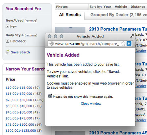
In consideration of such distractions and delays, we create features that let users save their search criteria or bookmark specific cars that they like, so they can view them at a later time. For example, as Figure 1 shows, cars.com lets users save searches and collect car listings in a personal list of Saved Vehicles for later reference.

Figure 1—Saving car listings on cars.com
Saving car listings on cars.com

Yet, despite all of the thousands of potential ways in which such a transaction could be interrupted, millions of cars get sold online every year. So why should we make the assumption that a user accessing the site on a phone or tablet would have a reduced attention span or more distractions, making the experience so different from that of desktop users that they wouldn’t want to buy a car online? We shouldn’t. Every 3 minutes in the UK, a vehicle gets purchased using the eBay mobile app; every 10 minutes in the US. There has been speculation that the benefits and delight that smartphones and tablets offer over the desktop experience will soon make mobile devices the dominant platform for the online shopping market. eBay’s researchPDF states that 56% of shoppers who own smartphones believe that their smartphone will make their shopping experience more enjoyable.

We’ll continue to find that users are more and more willing to perform time-consuming and complex tasks on any device they have in front of them, as this quote from Brad Frost shows:

“Repeat after me: mobile users will do anything and everything desktop users will do, provided it’s presented in a usable way.”

Reason 2: The 50 Shades of Mobile Mystery

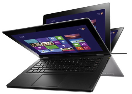
The problem with the term mobile is that, at best, its definition is outdated, and at worst, it’s indefinable. What does mobile mean exactly? Is a notebook computer not a mobile device when a person uses it at a desk, but a mobile device when someone carries it from meeting room to meeting room? How would you define context for the new 20-inch tablet, shown in Figure 2, which has a larger screen and is heaver than some standard notebook computers? The traditional definition of mobile, which has associated mobile devices—and therefore, mobile design guidelines—with smaller screen sizes is becoming more and more problematic as the lines between desktop, tablet, and phone screen sizes blur.

Figure 2—Panasonic’s new 20-inch Windows 8 tablet
Panasonic’s new 20-inch Windows 8 tablet

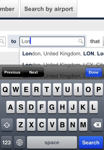
In addition to their having smaller screen sizes, we also traditionally define mobile devices as having no external keyboard, and thus, their not being people’s favorite devices for typing large amounts of text. But when you consider that consumers can now buy devices with optional keyboards that let them switch from tablet to notebook mode in seconds, it’s clear that the line between which devices are typing friendly is getting blurred even further. Shown in Figure 3, the Windows 8 surface tablet has a pressure-sensitive cover that doubles as a full keyboard.

Figure 3—Windows 8 surface tablet
Windows 8 surface tablet

Even typing on smaller touchscreens—and dare I mention the dreaded act of filling out forms— doesn’t carry such painful associations as it used to do. I’ve seen coworkers choose iPads over notebook computers to type notes in meetings at comparable speeds, and I’m probably not the only one who has marveled at how quickly some users can accurately crank out text messages on their touchscreen phones. Also, advances that make producing large amounts of text on mobile devices easier—such as external keyboards that plug into your phone or tablet, improvements in voice-recognition technology, and better swiping and autocorrecting functionality—require us to rethink our assumptions that typing is primarily the preserve of notebook computers and personal computers.

All of these ways in which the lines between mobile and non-mobile experiences are blurring together tell us that it is no longer acceptable for us to decide on behalf of users what they want to accomplish—simply because of their screen size or the lack of a traditional keyboard.

Reason 3: Not Mobile First, but Mobile Only

So far, I’ve talked about reasons not to remove content or functionality from mobile sites simply because mobile devices have smaller screen sizes and different ways of typing than a desktop computer—or because tasks are focus-intensive or complicated. However, debating what tasks users prefer to do on a personal computer versus a mobile device often misses a crucial point: A huge chunk of our users don’t even have a personal computer in the first place, so why are we removing content and functionality to which they’ll then never have access?

Here is some eye-opening data that demonstrates that we are part of a growing mobile-only world: There are an estimated six billion cell phones in the world and only 1.2 billion computers, and the numbers will only become more skewed as personal-computer sales continue to drop worldwide while tablet sales soar. Recent technical improvements like cloud computing have reduced both time and bandwidth for the usage of Web browsers. Combined with lower costs for smartphones and tablets, and the increased attention that the UX community is giving to smaller browser-viewport widths, mobile devices have become attractive alternatives to their non-mobile counterparts. Lastly, in huge populations of the world such as China, India, Indonesia, and Africa, mobile Internet is often the only easy way to access the Internet, because a fixed-line Internet infrastructure is either too expensive or doesn’t exist at all.

Mobile Design Is Growing Up

Early on in the mobile-design timeline, it was common to conclude that users wouldn’t want to perform more complicated or time-consuming tasks on mobile devices. Nielsen Norman Group stated in early 2009: “You should design different Web sites for each mobile device class—the smaller screen, the fewer features, and the more scaled back your design.” NN/g based this conclusion on the usability issues that are associated with testing desktop versions of Web sites on mobile devices, such as poor loading times and the reluctance of users to perform tasks like shopping. NN/g even saw, “a dark future for m-commerce until sites improve and earn users’ trust.”

Regardless of the validity of the NN/g recommendations in 2009, we’ve come a long way since those feature-chopping days. We can no longer afford to offer fewer features in the name of designing for small screens. Jeremy Keith, mobile thought leader and author of HTML5 for Designers said:

“More and more people are using mobile devices as a primary means of accessing the Web. The number is already huge and it’s increasing every day. I don’t think they’re all using their devices just to look up the opening times of restaurants. They are looking for the same breadth and richness of experience that they’ve come to expect from the Web on other devices.”

So what does all of this mean? That users don’t want a beautiful and minimalistic mobile site design that offers less content and functionality than its desktop counterpart. Nor do they want a mobile site that crowds a small screen with so much content and so many features that the site is a frustrating chore to use.

Start Thinking About the Web Holistically

It’s time to stop thinking about designing for the mobile Web and start thinking about designing for the Web. Here is some advice to help you successfully design for the Web—whether for mobile devices or the desktop.

1. Dust off your IA hat.

Try to recall your lessons from the early days of information architecture, especially its definition and goals:

“Information Architecture is a discipline and a set of methods that aim to identify and organize information in a purposeful and service-oriented way. The goal of Information Architecture is to improve information access, relevancy, and usefulness to a given audience.”

Strangely, we’re seeing people take a wild-west, all-rules-out-the-window approach to mobile design rather than adhering to the IA standards that we’ve been using our whole careers, which are as relevant as ever in mobile design. We should still organize content in structures that facilitate effective communication for the audience viewing the site. NN/g got some things right:  The smaller the screen, the more likely you’ll end up with a simpler design. But that doesn’t mean you should pitch out tasks and content. Instead, you should break content up into more digestible chunks, in a way that supports your IA goals. 

The WWF site, shown in Figure 4, is an example of an elegant site design that organizes its navigation and content based on the primary goals of the organization, as well as ensuring that important user tasks such as searching are accessible and appropriately grouped according to screen size. While the navigation and search are prominent on larger screens, they get broken up into a hierarchical structure for smaller screens, showing the most important navigation first, with the rest of the navigation links and the search box placed in an additional navigation view. 

The Web site is part responsive and part mobile design—depending on the section—and offers appealing imagery for every screen size. Even when interactions or layouts change based on the most appropriate interaction and content display for the screen size, the site never sacrifices any content or the delightfulness of the experience.

Figure 4—The WWF site
The WWF site

2. Always include a link to the full site.

We’ve come a long way, but the mobile Web universe is still full of a sufficient number of frustrating experiences to be perceived as untrustworthy. I’m of the opinion that, even if we offer all of the content and tasks that are on the desktop on mobile devices, we should always allow users to access the full desktop version of a site. Perhaps the layout on mobile devices has changed just enough for users to feel more comfortable finding content exactly where they remember it to have been on a larger screen. Or perhaps users are simply fed up with horrible mobile Web sites, so aren’t ready to give your site a chance on a smaller screen. Regardless of the reason, nothing is worse than users’ realizing that they have been denied the last-resort safety net of a full-site link.

Even though Delta’s mobile site, shown in Figure 5, leaves out some important tasks such as browsing for good vacation deals or virtually any personalized task, the site’s clean, easy-to-scan user interface makes it easy to spot the View Full Site link.

Figure 5—A View Full Site link on Delta’s site
A View Full Site link on Delta’s site

Only very recently have many airlines even offered a mobile version of their site rather than depending on users’ having previously downloaded the airline’s native application to perform basic tasks such as getting their flight’s status. However, British Airways still hasn’t jumped on that bandwagon, as you can see in Figures 6 and 7. If users don’t choose to or have time to download their app, but want to check their flight status from their phone, they’re in for a rough time.

Figure 6—British Airways doesn’t have a mobile-friendly Web site
British Airways doesn’t have a mobile-friendly Web site
Figure 7—Checking flight status on the British Airways site with an iPhone
Checking flight status on the British Airways site with an iPhone

3. Observe tried-and-true design practices.

Steven Hay, a Web design and development expert and thought leader, shares his thoughts on leaving out important elements on your mobile Web site:

“Alter the design as you will.  Visually, content order is most likely linear on phones, so you’ll account for that. Text size, link and button size, image (file) size…. There are plenty of things to consider. Of course you might not be able to have that Really Important Canvas Animation. Of course you’ll want to be able to use some device capabilities like your phone’s camera if that’s available. That’s logical and fine. But if something is essential content, functionality, or common sense on all platforms and you’re only providing it on some, you’re doing it wrong….”

There is a difference between the well-founded design principles that make a mobile site easy and delightful to use and relying on assumptions that may or may not be correct—assumptions about what users want to read, see, and do depending on the size of the screen on which they’re viewing your site.

As always, we should continue to talk to our users to learn about their needs and test our designs to help us determine what are the most important contextual implementations—so we can make more informed decisions. Maybe it might turn out that 99 out of 100 users aren’t interested in using a feature on their phones that they find important on the desktop. But at least you’ll be armed with valid research on which you can base your designs, not with outdated assumptions. Furthermore, if through user research you find that less functionality on small screens is fine with or even desired by your users, try taking another look at the large-screen version of your site. If there is something that users don’t need on some screens, perhaps simplifying your site for all screens would be a good idea.

In Conclusion

There is no formula for designing a user experience that is understandable, useful, and delightful. Neither responsive design nor separate, width-specific sites is always the answer. It’s up to us, as designers, to do our best to ensure that we’re making tasks as easy, features as usable, and sites as pleasant as possible to use on all screens—small and large, instead of using the fact that mobile devices have less screen real estate as an excuse to cut content and tasks. 

Senior UX Product Architect at ProtectWise

Denver, Colorado, USA

SuAnne HallAs a UX designer at EffectiveUI, SuAnne applies her skills to designing digital experiences for clients that include CenturyLink, 24/7 Media, FedEx Office, and CURE Magazine. In addition to holding a bachelor’s degree in political science and a master’s in Digital Media Studies from the University of Denver, she is an eternal student. Right now, her focus is on exploring the ever-changing space between digital standards and new trends and how to transform problems into user-centered design solutions that are both usable and delightful.  Read More

Other Articles on Mobile UX Design

New on UXmatters