Top

Redesigning a Knowledge Management System for Usability

December 9, 2013

Several years ago, I left a content-management position with a healthcare organization where I had been heavily involved in an intranet platform migration. This migration experience, coupled with my background in technical writing, usability, and information architecture, became important to me in my new job as a UX information architect on Deloitte’s Global Knowledge Services (GKS) portal team. As a member of this team, it was my responsibility to plan and conduct usability studies in helping the team to redesign the knowledge management system (KMS). By carefully planning and executing usability studies, evaluating the data that we extracted from the studies, and incorporating user feedback, we were able to provide the supportive data that was necessary to defend our proposed designs to stakeholders and implement a redesigned, usable knowledge management system.

Champion Advertisement
Continue Reading…

Scope

At Deloitte, the GKS Knowledge Exchange (KX) is global consulting’s KMS and comprises a collection of over 135,000 content artifacts and 45,000 case studies. The company was retiring the platform on which the KX had resided and migrating the KX to a new platform.

Consultants both contribute to these content artifacts and case studies and employ them in their research—reusing this information in an effort to sell and deliver their projects. While contributing content is not a key performance indicator (KPI) for consultants at Deloitte, there is an underlying culture that generates a high number of contributions to the KX. These contributions are typically sales and marketing-driven artifacts such as proposals, case studies, and thought-leadership or delivery-related artifacts such as deliverables, methods, and tools.

When discussing the redesign of the KX, we realized that the project’s scope would encompass much more than the site’s information architecture, navigation, and page-template designs. For example, there were design considerations for the asset management database that stores the artifacts and the search components that display documents when a user performs a query.

This article is about the steps that we followed in redesigning the KX user interface, as well as improving the usability and information architecture of the pages that consultants use in finding the documents that they need to do their jobs.

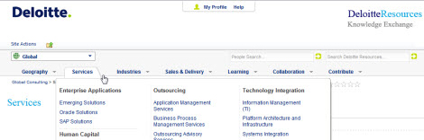
The migration effort for KX involved project planning, designing a new site structure and navigation, designing page templates, usability testing proof-of-concept designs, obtaining leadership approval, designing Web components and developing functionality, building the shell, migrating content, driving communications to keep stakeholders involved, designing eLearning Webinars to introduce users to a new and better KX, and creating a governance model for maintaining consistency across the seven channels, 71 sites, and over 900 pages that KX currently comprises.

Challenges

The Portal team works remotely and communicates via instant messaging, email, and phone. We are a lean, efficient team with four core Portal team members:

  • Portal team lead and manager—responsible for managing the overall effort and assisting in all areas
  • site collection administrator—responsible for managing and planning the project
  • lead developer—responsible for developing functionality and bringing Web-component designs to fruition
  • UX information architect—responsible for primary and secondary navigation, custom content, list templates, page and Web component designs, and usability testing

As the usability subject-matter expert on the team, it was my job to review the current state of KX, understand the limitations that we would encounter when migrating to a new platform where predefined page layouts offered a smaller area of page real estate, research what Web components others were using to display content, flesh out new page-template and navigation designs, create usability surveys, and test our designs to prove to leadership that we understood how our target audience found the information they needed to do their jobs.

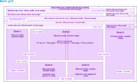
We were not part of the team that provisioned site collections or created predefined page layouts. This resulted in page layouts that were significantly smaller than the previous system’s page layouts—thereby creating problems when we tried to make the most of the new design structure. How could we fit everything that’s currently on a page when moving to the new page template? We had to work with what they gave us. The good news was that we now had the ability to create child pages, which child sites within the same parent site structure could share by way of the secondary navigation on the left. That meant we needed to architect channels for storing parent sites with child sites, and all of them had to be accessible from the secondary navigation. Plus, we needed to design the resource pages on which the content appeared.

The greatest challenge in all of this was persuading stakeholders that this new site structure was more usable than the previous structure, to which they’d grown accustomed over a number of years. People get used to less-than-optimal user experiences and can be resistant to change. They get used to the steps and clicks and scrolls that are necessary to find their content. They get used to believing that they aren’t going to find what they need. My role was to change the user experience, provide something new and better, and change people’s expectations.

Processes During Design

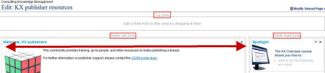
My goal was to redesign the information architecture and navigation for sites and pages, as well as other primary components such as search. This article is about a design solution that sits in front of a robust search engine and provides users with the right document at the right time, whether it comes from a saved search, a data table fed through a query, or a Web component that displays owner-selected, featured content.

A primary advantage of reevaluating and redesigning a knowledge management system is that it’s an excellent time to clean house—avoiding the garbage-in/garbage-out mentality. When you do this correctly, you can make serious progress by choosing to archive, not migrate pages that no longer carry content worth saving.

Research and Due Diligence

When we started our project, we relied on Web statistics tools that provided metrics that told the story of every page’s site traffic. This gave us a quick way of determining what content people were using and was worth migrating. We also used our site-management data to determine the latest site updates, check the dates of documents that were currently stored on pages, and determine whether archived documents appeared on pages

Sites experiencing low-to-little traffic or sites that hadn’t been updated in more than 18 months indicated little-to-no interest on either the users’ or the site owner’s part. This helped us to determine what sites we would not migrate and start our house-cleaning portion of the project.

By looking at the current page layout and information architecture holistically, we were able to create basic page redesigns that were based on the new page layout. We researched what Web components other sites were actively using, relying on UX and IA best practices to begin mapping content to the new pages. We employed style and content guidelines to help shape our redesigns and determine what Web components new pages should include, in what zones we would display those Web components, what content should go into what Web components, and what XSL designs and functionality worked best with our custom lists Web components.

Usability and Information Architecture

From the start of the project, we relied on this list of the essential UX design goals that would drive our navigation structure:

  • Manage navigation levels and complexity using mega drop-down menus, secondary navigation on the left, breadcrumbs, and sub-site titles, as well as the consistency of the information architecture across the site, as appropriate.
  • Test navigation options and page layouts with users to ensure that they can find important features and site areas and have a strong sense of where they are in Deloitte Resources.
  • Create a visual mechanism for drawing attention to and prioritizing top-level tools that need to be prominent and visible on every page—such as My Profile and My Links.
  • Ensure that the search functionality is easy to find and the search options a user needs in different areas of the site are immediately available. Make sure the search features are prominent and easy to use.

The new platform structure of our site collection let us determine what channels we should list in the primary navigation, then create common secondary navigation for service-area sites, giving users a consistent user experience when searching for information. Our navigation model displayed the primary, topic-based navigation at the top of the page, as shown in Figure 1; the secondary, task-based navigation at the left of the page, as shown in Figure 2. This provided a familiar user experience, as well as additional navigation for users searching for task-related items once on the site.

Figure 1—Primary topic-based navigation
Primary topic-based navigation
Figure 2—Secondary task-based navigation
Secondary task-based navigation

The 950-pixel width of the central zone of our previous design, shown in Figure 3, got reduced to the new Zone 2, with a width of 550 pixels, as shown in Figure 4. While our new page layout provided less room for displaying content, we were able to create resource pages—which were accessible from the secondary navigation and shared at the parent level for all child pages—as well as custom content types and list templates for storing information. The new page layouts used the list Web components and front-end XSL to dynamically display content.

Figure 3—Previous KX page layout
Previous KX page layout
Figure 4—New KX page layout for migrated pages
New KX page layout for migrated pages

We vetted the UX designs for our custom list templates that used XSL by conducting surveys through both email and a remote usability testing tool. These designs were favorably received by users, so we were able to defend our designs with data from our usability studies and were ready to present our new proof of concept to the leadership.

Usability Testing and Audience Analysis

Once we had populated our proof-of-concept navigation and sites with data in a staging area, we conducted a usability study to measure the KX’s current state and provide a baseline from which we could work. We conducted and recorded one-on-one interviews to measure user satisfaction and expectation levels when accessing the KX for knowledge.

Using the System Usability Scale (SUS), shown in Figure 5, we were able to obtain a global view of users’ subjective assessments of usability—from both qualitative and self-reported data.

Figure 5—System Usability Scale diagram
System Usability Scale diagram

The SUS score was 67.5/100, putting it in the marginally high range for usability measurements. We identified very few issues that would negatively impact user satisfaction, efficiency, or understanding of the tool. It was this data that helped us in our future UX design work.

We used card sorting, tree tests, and heatmapping tools to design our surveys for online usability testing and recorded our remote usability testing. The card-sorting and tree-testing tools provided information for our navigation design, and the heatmaps helped to provide the validation that we needed to defend the usability of the site and page structure. We received a 73% response rate to our email heatmap survey links and found that users were more responsive (90%) when we asked them to participate in a one-on-one interview.

Card sorting helped us to identify how well our global taxonomy resonated with users. The KX supports many professional disciplines, and there were many examples of labels that users might associate with any given item. The data that we extracted from these surveys helped us to revisit the labeling in the current navigation and further refine the language for our new navigational labeling.

Tree testing helped us to understand the logical order in which users would group together items, as well as to evaluate how our current navigational structure needed to change—both for users and for our new architecture. Because our new design made more pages accessible from the secondary navigation for sites, we needed to be consistent in our use of language and match our taxonomy, so users would know exactly what they would find on any given page.

During all usability studies, we were able to extract much information through both pre- and post-survey questionnaires. Pre-survey questionnaires helped us to identify participant demographics, while open-ended, post-survey questionnaires let participants further elaborate on their preferences for navigation and page designs. These questionnaires helped us to elicit much of the information about what users liked—or in more cases, didn’t like—about the current platform and what they hoped that we would fix in the new environment. It’s amazing what you can find out from people when you give them a chance to voice their opinions about a tool that you’re designing to help them to do their jobs.

Defending Your Designs

Once we were armed with the data and our analyses of the usability testing and best-practices research, we began our meetings with stakeholders. Anyone who has participated in a stakeholders meeting knows that everyone has opinions and thinks he or she understands good Web design and the tenets of usability.

While our navigation and page-layout designs went through several iterations before they became final, they stayed fairly true to the data that we’d elicited from our usability testing. Prior to going into stakeholder meetings, it’s important to be prepared to defend anything that you’re recommending in the way of navigation and page design. The data that you bring to the table is of the utmost importance. I’ve learned that people respond well to documented research on best practices that supports your usability analysis.

The Importance of Standards

Never underestimate the power of a well-written standards document, which you can use in defending your designs. Standards provide design guidance and show the reasons behind how you’ve derived a design. Most importantly, they demonstrate why you can’t and shouldn’t support designs that are inconsistent with standards.

Standards documents are relatively easy to create. I found myself keeping notes and making lists of the pixel widths of Web components, what Web components could go into what zones on a page, what information belonged in what Web components, what links belonged in the secondary navigation and the quick links Web component on the right side of pages, and whether a link to a page should open it in a new window if it isn’t part of the parent site. In retrospect, we had many long, opinion-fueled conversations to determine how to redesign the KX. The end goal and primary purpose of a standards document was to help us to maintain consistency and defend our designs—throughout the lifecycle of the KX and as long as the KX was providing a service to the users.

Conclusion

After roughly a year and a half of planning, designing, developing, and testing, we completed our migration of the redesigned KX to the new platform. As part of this project, we scheduled monthly Webinars for stakeholders to apprise them of the development effort and our timeline to go-live. We created and conducted training sessions for the offshore developers who would build and support the new designs. We held numerous review meetings with stakeholders to get their feedback on the new sites, then further refine the content that appeared on the pages. They received our new UX design favorably.

As technology changes the way we work, migrations to new and better platforms present prime opportunities to reevaluate the way we work and how we provide information to our users. Before embarking on a large-scale migration, it’s important to evaluate how users access information and whether the current design is adequate or needs improvement. Building on a new platform encourages such redesign efforts. Through careful planning, using the objective data that you obtain from testing new designs, and incorporating user feedback, you can create a redesigned knowledge management system that will win over clients while ultimately improving their user experience. 

Cross-Industry & Clients Knowledge Manager at Deloitte

Atlanta, Georgia, USA

Cheryl CarrollAs a usability advocate and the UX information architect for Deloitte’s Global Knowledge Services, Cheryl uses information architecture and information design to present content in usable layouts that let people find what they’re looking for faster. She has conducted usability reviews and applied her findings in designing site navigation, as well as in designing the layouts of page templates. Prior to joining Deloitte, Cheryl was part of the migration team at Children’s Healthcare of Atlanta where she designed the information architecture of the organization’s IT knowledge base and employee intranet. She also assisted with the redesign of their change management system. Cheryl spent 13 years as an adjunct professor at both Mercer University and Georgia Perimeter College, teaching English and communication courses while working full time as a senior technical writer. Her document management experience includes developing and managing technical and professional documentation. Cheryl holds a B.A. in Communication from Mercer University and an M.S. in Technical and Professional Communication from Southern Polytechnic State University.  Read More

Other Articles on Design Process

New on UXmatters