The field of user experience has, from its inception, championed the notion that meeting users’ needs is the path to success for digital products. Recently, however, it seems that user experience is increasingly playing a role in formulating designs that diametrically oppose users’ wants and needs for the sake of generating greater profits.
The Growth of User Experience
By the early 1990s, the term user friendly was in common use for describing software that was easy to use. Throughout the ’90s, as more companies recognized that useful, easy-to-use Web sites led to fewer customer-service issues and greater profits, the topic of usability gained prominence. Around the year 2000, the field of user experience blossomed as more and more designers recognized that the design of digital products should focus on users’ complete experience with a product rather than paying attention only to ease of use. At each new step in this progression, meeting the needs of users was the primary goal. Over the past few years, user experience has enjoyed explosive growth, as evidenced by UX-focused LinkedIn groups with more than 60,000 members and international conferences like UXPA and UX STRAT springing up to meet UX professionals’ growing need for professional development.
Champion Advertisement
Continue Reading…
Subverting Users’ Needs
With great growth has come increasing sophistication in the practice of user experience, as well as in the role that user experience plays in digital product design and development. Unfortunately, not all aspects of this sophistication are positive—at least not for users. Where once the goal of user experience was to increase user satisfaction, companies are increasingly leveraging user experience in a manner that is contrary to users’ needs and, in some cases, even causing users harm.
Not long ago, I raised this issue in the UX Strategy and Planning LinkedIn group that I manage. I received some passionate responses that confirmed my suspicion that some companies are using user experience to better understand users’ needs, but then deliberately thwarting rather than meeting those needs.
Many of the comments that I received in response to this topic of discussion described Web sites that had poor usability or violated UX design principles. However, such cases have been common for decades, and they are not the focus of this column. The remainder of the responses—as well as my own research into this topic—fall into three distinct categories:
Not allowing users to do what they want to do
Impeding key task paths with forced interruptions
Tricking or persuading users to do something they would’t normally do
1. Not Allowing Users to Do What They Want to Do
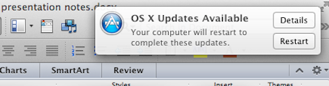
This is the issue that got me to thinking about writing this column in the first place. I was working on a UX Strategy workshop that I was to give at UXPA in Shanghai—deep in thought and under the gun to complete the final presentation deck before the deadline—when the OS X Updates Available window shown in Figure 1 appeared in the upper-right corner of my screen. Unlike 99% of the other annoying pop-up windows that someone thought were a good idea, this one did’t have a close box, button, or link—or any visible way of closing it. There were two options, neither of which I wanted: Details and Restart. I discovered that the fastest way to escape from this cognitive pothole was to click the Details button, then quickly click Command-Q—all the while, silently cursing Apple.
Figure 1—OS X Updates Available window
Don’t get me wrong. I love Apple products. I own several MacBook Pros, a couple of iPads, an iPod, and a new iPhone 5s. But their walled-garden approach to user experience has been a source of frustration to me for many years. Why can’t I simply delete songs from my iPod without connecting to a computer? Why can’t I cut and paste files? No, I have to copy, change directories, paste, then return to the previous directory to delete the file. Training wheels in the OS that users can’t bypass are the Apple way.
More recently, some UX person at Apple thought it would be a good idea to remove the venerable Save As command in Lion. So now I need to go through a long chain of commands to accomplish the same thing. And I think about that UX person every time I do it and hope he or she has been fired—but not really. Apple must have realized the problems that this so-called innovation caused for users, because they’be re-enabled Save As in Mountain Lion.
Another user experience that prompted me to write this column was LinkedIn. LinkedIn is awesome! They have accomplished something amazing. Nevertheless, I get very irritated when a capability that I’be relied on for some time unaccountably disappears. All of the information that is necessary to do what I had been doing is still there. They just took out their UX surgical knife and—snip, snip—goodbye useful feature!
The UX Strategy and Planning group that I manage on LinkedIn now has a little over 8,000 members. Over the past couple of years, LinkedIn has taken away several useful group-management capabilities—presumably to create its own walled garden, so it can charge a fee for features that make the network useful. While this obviously makes sense from a shareholder perspective, it may make LinkedIn susceptible to an upstart competitor that figures out how to suck the data out of LinkedIn and return the most useful features back to its members.
One capability that I found really helpful was filtering group members by geographical region. I could tell how many people were in New York or in Europe, and this helped me in planning events like my UX STRAT Masterclass series. This capability just disappeared one day.
Members used to be able to communicate with one another without having to pay to send In Mail. I found this feature very useful for community building. But LinkedIn removed this capability, presumably to drive members out of the free zone and into their paid services.
LinkedIn has also reduced the abilities of group managers to control how content appears on the group’s main page, thwarting managers like me who curate the content carefully. They used to provide very logical displays of most-recent and most-popular comments, with Manager’s Choice items appearing at the top of the page in a carousel. However, in recent months, LinkedIn has rejiggered the formula that determines how items appear on the group’s main page—and to be honest, even though I look at it several times a day, I still don’t have any idea how the new content arrangement works, especially the Manager’s Choice feature. I imagine that they did this to push advertising slots upward in the visual hierarchy of the page, but it seems to have made the group landing page more random and less useful for getting a quick view into what’s happening in the group. Less control, more advertising. Snip, snip.
2. Impeding Key Task Paths with Forced Interruptions
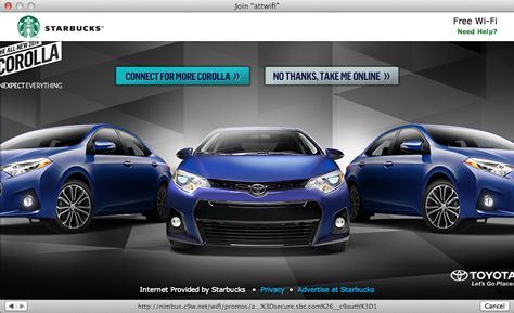
Recently, I was sitting in Starbucks with my 14-year old daughter Carina. We were having a father-daughter work day, and both of us had our notebook computers out. For some reason, we were having a hard time getting on the free wireless network that Starbucks offers—and that I’be been using for years. It turned out that Starbucks had changed the sign-in user experience for its wireless network—from clicking a checkbox to agree to terms to watching a full-length commercial with a choice at the end to either follow the ad path further or go online, as shown in Figure 2. I finally figured out that closing the window after the commercial did’t take me online. I had to watch the entire commercial over again, then click the option to go online. I explained this to my daughter once I’d figured it out. She laughed incredulously and asked, “You’re joking right?”
Figure 2—Barrier to using Starbucks’s free Wi-Fi network
Most of the comments that I received from UX Strategy and Planning group members when I asked for input for this column centered on such road blocks—that is, interstitial screens that interrupt users’ chosen path or content to display something they did’t select. Inserting advertising into the path of free content was one of the main complaints.
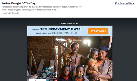
Lan Guo wrote, “YouTube! Those painful commercials you have to sit through before you can skip.” Chris Mockus described the barrage of advertising that appears when watching TV or movies online: “You can pretty much watch anything for free in a browser, but have to survive a gauntlet of anti-usability, trying to get you to click an advertisement.” Michael Boyer pointed out Forbes.com as an example of content companies that display full-screen interstitial ads like that shown in Figure 3 before presenting the content that a user has selected.
Figure 3—Intrusive ad on Forbes.com
Nick Choo noted a couple of ironies in the full-screen ads: “OpenRice HK forces users to look at advertisements that cover the entire landing screen. Users have to close the ads before they can use the app. Funny, but I can’t remember any of the ads. It’s quite annoying, but … I’m still using [the app].”
Some commenters defended advertisers. Gabriel Patru wrote, “People expect ads when browsing for content. Yes, ad blindness is a behavior that is characteristic of heavy users and, most of the time, goes hand in hand with non-relevant ads. But, guys, online ads are still working. If not, they would naturally disappear.”
Jared Spool disagreed: “It’s pretty clear, as someone who spends a lot of time watching people use Web sites, that ads are not working the vast majority of the time. The only people who don’t think that is true are the people embedded in the advertising world—either advertisers or publishers that have decided they can survive only with advertisers.” Jared also proposed a solution: “But the smart publishers are seeing the writing on the wall and are moving away from ads. One doesn’t have to go much farther than the new designs coming out of the NY Times—like The Jockey—to see how they are moving away from pages riddled with ads, decreasing their page views and click-through revenue. I expect we’ll see more of this in the future, as business-model alternatives like metered paywalls become more prevalent.?Just because we’be done it for years doesn’t mean that everyone wants it.”
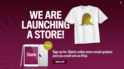
Danielle Cooley focused on other kinds of roadblocks: “I have seen a crazy rash of newsletter sign-up roadblocks lately and auto-playing videos that just has me going nuts. When did this become the new standard?” Danielle pointed out a recent roadblock with a surprisingly deceptive outcome: Clicking the close box took viewers to the promotion in the interstitial! Danielle explains, “One egregious [example] was the recent Slate debacle, where they put in a roadblock for their new online store (bad), then the X to close actually took the person to the store. Slate competitor salon.com [published] an article about it….” Figure 4 shows the offending roadblock.
Figure 4—Slate roadblock
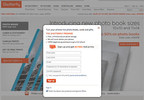
Danielle also pointed out companies that present full-page offers to current customers who are trying to complete a task. She wrote, “This overlay appeared when I went to shutterfly.com, where I am already a customer. A sign-up form [was] the last thing I wanted to see.” Figure 5 shows the overlay.
Figure 5—Shutterfly newsletter sign-up form
Ronnie Battista took a different tack from most of the people who responded to my question: “I’ll be the first to hammer those commerce companies that either use deceptive, dark patterns or just obfuscate the process to extract primary or additional revenue in whatever form. When I have chosen to enter into a business transaction with you, to give you my money for your product or service, I expect an experience that demonstratively convinces me that I’m the center of your universe. Or, at the very least, that you’re not trying to get one over on me.
“But when it comes to anything free, it’s a completely different ballgame. As the saying goes—I’be seen this attributed to Facebook most often—“If you’re not paying for something, you’re not the customer; you’re the product being sold.” I’d put it this way: The customer is king; the window-shopper is meat. Free is free. If you did’t pay for anything, you aren’t owed anything, including a good experience.”
3. Tricking or Persuading Users to Do Something They Would’t Normally Do
Many people who responded to my discussion thread were disturbed by UX designs that deliberately push or even trick users into make choices that benefit the company sponsoring the experience. These so-called dark patterns that are creeping into many Web sites and mobile apps have become so numerous that a Web site is now dedicated to them: Dark Patterns.
Gisella Famà, Senior UX Architect at Digitas Health, complained about the RyanAir flight booking process: “Every single page, tick box, and drop down is designed to make you pay more—and pay for things you did’t really want.” Gisella wrote that RyanAir’s site design is an "…example of UX completely designed on the client’s needs, without really considering the user experience and satisfaction at the end of the journey. User experience should be the best possible solution, considering both the client’s objectives and user needs.” Antonio Starnino concurred, “The Ryanair checkout process. Dark Patterns; dark patterns everywhere.”
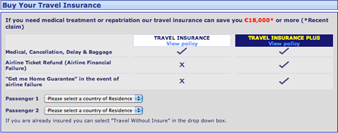
As an example, Gisella described the approach that RyanAir uses to offer travel insurance to its customers, shown in Figure 6: “The possibility of choosing to travel without insurance, [with] no added fee is [hidden] on purpose…. You have to scroll down in the countries options to find it.”
Figure 6—Travel insurance offer on RyanAir
But Is This Really Wrong?
Jessica Hall provided some concrete advice for combating requests to design dark patterns: “I’ve received a few questionable requests in the past. Luckily, most of the time, the client or stakeholder [didn’t] intend to be irresponsible; they just didn’t think it through. I have two ways of handling this that have worked for me.
Work the problem. Resist the urge to recoil in horror, and get the stakeholder [or] client to explain the problem they are trying to solve. Once you understand their problem, you will be able to present options and explain the risk of each option. Hopefully, you can find a way to solve the core problem that won’t hurt users.
Use a business frame. Frame the user problem as a business problem. Shady tactics may work in the short term, but they have disastrous consequences in the medium-to-long term. Does anyone have data on how dark patterns are hurting businesses?”
Josephine Giaimo wrote, “Of course, revenue needs to be generated. The question is how to do so effectively and as part of an overall design philosophy that does not diminish, but empowers the user.”
Doug Morrow suggested that the key is respect: “Good user experience is based on mutual trust and respect. If I go into a store and am harassed and demeaned by the staff, I will leave and not come back. If, however, staff engage me with respect and courtesy, I am not upset when they ask if I ‘want fries with that’ or offer me a credit card….” Mike Cunningham agreed with Doug, but adds: “The question that has to be answered is: long- or short-term relationship? The [long-term view] of this relationship is at stake.”
Paul McAleer notes that there are some concrete disincentives for changing the status quo of UX dark patterns: “Conjecture based on experience: These dark patterns bubble up because they have very clear perceived value—whether it’s … true or not—that is, people click banner ads [or do] not remove defaults in checkout. Coming up with other options that would cater more to a user’s needs may cost more—time, money—and that carries additional risk. Some people simply don’t have the stomach for that.”
Mateus Barreto thinks that the issue is not just our being asked to create one or two sites whose user experience works against users’ wants and needs, but rather, that it’s starting to appear in UX job descriptions. He wrote, “It’s really not just about ads. I’ve seen job descriptions from Web agencies in which UX was basically defined as conversion optimization. While a UX practitioner must take into account all stakeholders—including taking business strategy very seriously—that is an absurdly myopic vision of the profession and bodes poorly for the perception of value [that] our work brings to companies.”
Conclusion
I don’t want to do work that makes people buy things they can’t afford, don’t want, or don’t need. There’s plenty of opportunity for helping people to satisfy their needs and reach their goals using digital tools, and that’s where I’d rather spend my time. However, I don’t think it’s wrong for other UX professionals to devise clever designs that push users from free to paid services. It’s a risky business—in that as soon as there were an equivalent free version, people would likely to switch to that option. But it’s not wrong.
Advertising will always be with us because marketers lack the imagination to design user experiences that entertain, engage, and inform, while also building awareness of a product or service. That’s where we come in. I don’t want to design roadblocks to content, but it’s not wrong to advertise.
Deception is clearly wrong. If the intent of a design is to obscure the fact that a site is adding costly options to a purchase without a user’s making a deliberate choice to add them, I consider that an ethical breach in which UX designers should refuse to participate.
Good read, but the example of not being able to cut and paste in Mac OS is silly. Try just moving the file; no need to get the Clipboard involved. It goes by the name drag and drop. Why would you cut and paste in Windows anyway. Try moving like drag and drop.
That’s my only quip.
This trend to try to get us usability types to go over to the Dark Side first struck me about five years ago, during the Q&A after a great presentation by Dana Chisnell at a Boston UPA meeting. It was like the proverbial light bulb going on over my head. I remember thinking “Hey, wait. We’re user advocates!” I had a picture of us as frogs in the proverbial pot of water that’s slowly being heated to a boil without us noticing. (It wasn’t provoked by Dana, of course. It was something a questioner said.)
It’s been on my mind a lot lately because, in some writing I’ve been doing recently, I felt an obligation to tell usability newbies that ill-conceived—and ill-intended—persuasion doesn’t have to be part of our job. But you did a much better job covering it here than I did. Nice work.
It’s our job to convince stakeholders that annoying advertising placement hurts more than helps.
Great services that disappear because a company goes broke are just as unpleasant as great services that disappear under monetization efforts. Correct me if I’m wrong as I’ve only recently begun seeing my work as falling in part under UXD: finding ways to align business requirements with user requirements is the way to delight both users and stakeholders.
This is a great TELL US YOUR OPINION! post and I appreciate it. It’s timely and HOW ARE WE DOING? quite relevant. One other area that we need TAKE OUR SURVEY! to address are the pop-ups, modals, and other user-experience destroying interruptions that are supposedly designed to gather the user’s feedback on the user experience.
Make it stop, folks. They are wrong. And I wouldn’t trust the data they collect.
If you want to get feedback, do so passively. Ways to do that include
a receipt or confirmation page after the user has completed a task or requested help or support
an offer to do so in a follow-up email or receipt (I like how Home Depot, Taco Bell, and the rest include that on their receipts.)
a passive, but visible element on the Web page itself—but never on the home page since that’s the start, not the end
You may think of others, but WE VALUE YOUR OPINION!!! keep it passive. Let users choose it without its being thrown in their face or otherwise distracting them.
I have been in plenty of situations where KPIs are defined to measure business success and, a lot of times, they are all about conversion rate. It really becomes our responsibility to present the short-term gain versus long-term loss, so we can come up with design solutions to meet both business goals and user goals.
P.S. Thank you for the mention. I really like how you crowdsourced the data from our UX strategy group!
Ryanair is well known for its no-frills approach and getting the customer to part with money at every opportunity—an approach cemented by the CEO. Therefore, the way their online booking site works doesn’t surprise or bother me at all. In fact, I get a perverse sense of satisfaction at getting through the process without incurring any additional costs. The UX becomes a bit of a game!
However, if I were a new customer to Ryanair with no knowledge of their operation, I’m sure it’d hack me off!
Aditya and Stephen: Thanks for the tips, but I think you missed the point of the article. The fact that you need to instruct someone who has been using the Mac since 1984 on how to do a very basic system function proves my point. One could retort: “But you’re a stupid user.” And I’d say, “Exactly. Do some research on this and other intentional Apple idiosyncrasies to see how many other idiot users there are out there.”
Steve: Thanks for your comments. I don’t know how far this persuasion will go. For UX STRAT, it’s been suggested we cover neuromarketing, and I cringe.
C7210: It’s brute rude not to include a close box. And dragging it away only makes it pop up 5 minutes later.
Jotham: This is the core objective of the UX STRAT conference and masterclasses.
Joel: Couldn’t agree more. It would be comical if it weren’t so annoying. I’ve had a chance to read some of the response data from these surveys, and I don’t know how anyone could think this data is representative of their user population.
Lan: Thanks for contributing to the article. I hope to see you again at UX STRAT this year.
Chris: Ryanair is one of the few flights I’ve taken where the on-board coffee was a significant percentage of the overall trip expense. Your point is well taken. You expect consistency with the brand, even if that brand represents cheap—like Costco, for example. What I really find alarming is the degree to which UX is being used to thwart users’ intentions, because we can.
Ironically, this very article came to me through such an antipattern: Feedspot, the feed reader I use, has recently started shortening article displays with a “Click here or press ‘x’ to expand” message, in order to make the advertisements beneath the articles more prominent.
So, instead of just clicking an article in list view and reading it, I have to click the article title, then click within the area of the above text, taking care not to click the ad that’s, predictably, extremely close to this text—and I have to do this for every single article I wish to read. (Keyboard navigation has its own problems. Suffice it to say, it’s unusable.) Obviously, I’m jumping ship as soon as I realistically can, but there’s a kind of lock-in here. They’re the ones that know how much I’ve read in each of my feeds, so the ship-jumping will happen only when the annoyance of setting those details up in a new reader correctly is overtaken by the annoyance of dealing with such anti-user designs.
Such thresholds are one reason Web sites seem to be getting away with this kind of stuff. The site holds data that is tough to migrate, or perhaps more often nowadays, there’s a network of people on the site that isn’t yet there on the competitions’. What the designers ignore is that, with every single such forced interaction, they’re every day pushing people toward the threshold, and one day they might easily find themselves dealing with a mass emigration.
Dark Patterns has a large and growing list of examples of this kind of GUI.
I agree with other commenters that the Apple cut and paste issue is a poor one to use as an example. I actually prefer the Apple way as they’ve addressed the issue in such a way that you can decide at the end of the interaction whether you want a move or a copy. I have realized, in Windows, that I needed a copy not a cut and been quite irritated to have to go all the way back to the initial file to change the type of file interaction.
The Sony PS3 GUI has some great examples of walled-garden behavior where the marketers try and force you into a particular response via both trick questions and not allowing the kind of options you want. Blu-ray is my number one peeve in this area.
Your Blu-ray preferences with regard to whether Blu-rays are allowed to phone home when they launch are as follows: Confirm or Always. Note that there is no Never option.
Furthermore, by choosing Confirm, you are now presented with an irritating dialog box each time a Blu-ray starts. The default option is Allow, and the really tricky part is that Allow doesn’t just allow this single Blu-ray to phone home, but rather changes the system setting from Confirm to Always in your preferences. Unless you are sharp enough to notice that Blu-rays are not asking you any longer if they can connect to the Internet, you will never realize that you have enabled them to silently track you system-wide with that one click.
Paul organizes the UX STRAT conferences and workshops to help experienced UX, CX, Product, and Service Design professionals continue to grow their skills, networks, and careers. A UX strategist and researcher, he also consults with companies to help them evaluate and grow their UX Strategy capabilities. He began designing ecommerce Web sites in 1995, in Barcelona, Spain; then founded Retail UX in 2002. Paul’s consulting clients have included some of the most successful corporations in the world—such as The Home Depot, Coca-Cola, SAP, Delta Air Lines, Philips, Macy’s, Bloomingdale’s, Cox, and GE. Paul manages the UX / CX / Product / Strategy Group on LinkedIn. Read More