Top

Designing for Others

January 27, 2014

While I am reasonably aware of my own digital consumption, I have to design for people who use their increasingly diverse digital devices in ways that I cannot predict and that do not match my usage patterns in the slightest. Therefore, I consider it to be important to project scenarios of just how and why particular pages appear to the people who read them. What were they doing before they got there, and where are they trying to get next?

A while back, someone mentioned a simple anecdote to me about his typically having scores of tabs—perhaps over a hundred—open in his browser. In contrast, I am careful to keep the number of active tabs and windows that I have open at once low. I don’t like to keep too much in the background, just waiting, taking up space and memory. The performance of the computer on which the many-tabbed browser was running was definitely problematic, and the person referred to the annoying noise from the computer’s fan, whirring like a jet engine.

Champion Advertisement
Continue Reading…

Leaving lots of tabs open is a form of digital procrastination. It means you’re building up a stock of tasks you hope to get around to. But don’t you reach your saturation point rather quickly? How many sites have you visited that are now clamoring for attention behind a stack of other tabs that you’ve left behind on your road paved with good intentions?

What about people who are multitasking all the time—perhaps talking on the phone, watching the TV in the background, and in front of their computer, as shown in Figure 1.
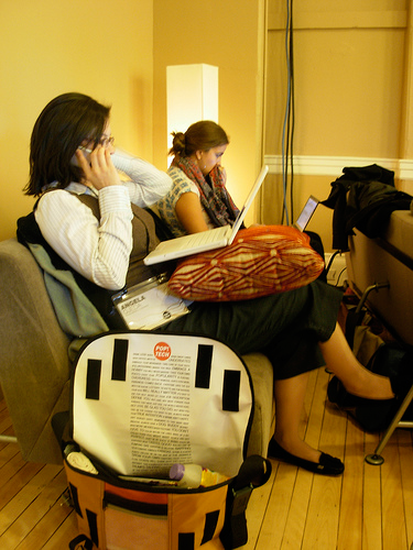
Figure 1—Multitasking
Multitasking

Photo by Michael Suffragans

Getting Stuck on That Great New Page Design

Spending an inordinate amount of time analyzing individual Web pages can be a fascinating pursuit. But as a UX designer, you must not lose track of the diverse reasons—perhaps even serendipitous reasons—that might lead someone to decide whether to consume your content or buy your product. Overemphasizing collective intuition has become an illness in many companies, where having too many people around the table makes it hard to get unanimous agreement. In such cases, it is important to drive the discussion back to imagining where the customer is trying to go and how to offer clear options that help make the next steps of a site visit become evident. Demonstrate, through modeling, how customers’ increasing engagement in a user journey becomes possible only by your providing simple steps rather than wasting hours on the minutiae of the hierarchy of multiple product placements on a single page.

Single pages rarely command people’s attention. Your site is an experience that should be greater than the sum of its parts. Minor usability issues on a single page will not deter users who have a purpose. Yet, if the page at the center of your scenario lacks clarity and focus, it may quickly become buried underneath many other interesting options. The reason to keep it simple: you can engage your users only over time—so each page that a user views adds only a small piece of the experience.

Your opinions of how you might react to the page you are designing, as you iterate on your design, may become increasingly detached from the reality of the myriad tasks the consumer will ultimately perform. I may make simplicity a goal for my digital desktop, but this does not reflect the hubbub that exists on my devices. Email messages arrive, Facebook and Twitter show new activity, the phone rings, and, when I’m at home, someone changes the television channel and my attention is diverted.

Keeping Just the Key Information

Poor salesmen may be poor listeners or may continue to follow a sales story that they are incapable of adapting in response to subtle cues that suggest they have lost a potential customer’s attention and interest. Web pages are no different. On Web pages, you can’t offer the equivalent of the old fast-food chain’s script, which required the person behind the counter to say, “Do you want fries with that?” to practically every customer. [1] A Web site listens and follows subtle cues, determining logical paths that visitors might take. (Often, some well-trodden paths stand out in analytics reports if you look for them.) You need to accompany your visitors along these paths, without suddenly calling their attention to other things or causing cognitive overloading with extraneous information.

It is wrong to overload a page with information that you cannot link together in a harmonious way. People don’t spend any more time on Web pages than they need to, in the hope that they might discover something useful. If you are selling something, it is worthwhile to offer upsell options or related products to increase the number of items people add to their shopping basket. Usually, you’ll be able to figure out a good time and place to do this, if you imagine the key task each page represents. Avoid polluting the stages of a process that involve cognitive tasks like checking product details or price totals, looking for the button to proceed, and especially form-filling pages, which require a much higher level of engagement. Present alternatives or upsells at stages when tasks or subtasks are complete, where you can present them without affecting your visitors’ concentration.

Clean navigation structures and clear page flows help your visitors to work out where they are and offer better routes to follow that will prolong a user’s visit. Avoid stacks of links and options, unless they really are related and would be likely to promote a user’s curiosity. A few related articles, images grouped in a way that makes sense, related products, a user’s search history, and recently viewed products are far better in this case than tenuously linked content. Displaying alternative options that are far removed from the original search route that brought a person to where he is, blocks of content that duplicate higher-level navigation options, and other filler widgets should all be avoided if you want to retain the Zen of a page—and avoid its getting relegated to the maybe I’ll read it later stack.

Interaction and Keeping Extra Information at Hand

Interactivity is a fantastic tool in aiding users’ understanding and can enrich a customer's journey by initially hiding things, but still allowing someone who needs the information to discover it without difficulty. (This is called progressive disclosure.) But you must make sure that the hidden information is discoverable. When the information is revealed, it must not break the user’s existing context.

The obvious problem with designing interactions is that you cannot print them on a page or project them on slides. This means you must build prototypes to present your interactions. If you cannot deliver a prototype to go with your mockups, the design debate will focus on visible content, and you may end up going down a blind alley because you have lots of content that you need to display in one place.

Product information can become exceptionally dense, and few succeed at presenting complex information in an intuitive fashion. Problems may sometimes occur because the data you must display has an inappropriate structure in the underlying database; because data entry has been done sloppily and lacks coherent categorization; or because the content is just too different from one product to the next. Product templates that can maintain a coherent structure from product to product are rare, and the data is usually the problem.

Google design principles implicitly include interaction through progressive disclosure:

“A well-designed Google product lets new users jump in, offers help when necessary, and ensures that users can make simple and intuitive use of the product’s most valuable features. Progressive disclosure of advanced features encourages people to expand their usage of the product.”—Google design principles

Professional UX designers read this kind of thing all the time. They’re immersed in such principles, because they’re always designing. They acquire a depth of knowledge on how sites work, who uses them, and where the complexity lies. Most design efforts start by sorting through the information that it is essential to display. Without content, you have no story to tell and no way to build context. The context has to make sense to the target audience, so you can start or continue a conversation with them.

A Recipe for Success

A recipe for success includes structured content among its ingredients. You can’t design complex pages with dummy text. To cover multiple contexts, you need to build awareness of the content elements that are central to the task at hand—for example, price, a short description, an image, a button to progress to the next step—versus those that are necessary only for the uninitiated or curious—such as additional images, a long description, or configuration options—or only for advanced users—such as the terms of a guarantee, advanced configuration options, or custom colors. [2]

You can create different levels of information for different users’ consumption, depending on their level of available cognition. The most valuable information must be easy to find and consume. You can’t design for a specific context because context is ever changing. We live in a world where mobile access has become almost ubiquitous, and people are daily consuming more and more online minutes away from the traditional desktop-browser paradigm.

All sorts of things disrupt our everyday lives and compete for our attention. This is why the simplicity of a Web site can be so powerful. Do not demand too much cognitive effort from your visitors. They may not be seeking the context that you expect. They certainly won’t sit in a room discussing each morsel of content on a page for an hour. They may even have many other tabs open in their browser, the television may be on, and their smartphone may continually signal the arrival of new messages. And things are only going to get worse. Simple experiences must be the rule for future online engagement.

A Multiscreen World

The great thing about the current multiple-device world is that we have escaped the pixel-perfect paradigm. Everything must adapt to multiple screens, whether you’re creating the CSS for a responsive Web page or using a CMS to feed multiple applications. Start with simplicity in your content structure. As Antoine de Saint Exupéry wrote almost a century ago, “In anything at all, perfection is finally attained not when there is no longer anything to add, but when there is no longer anything to take away.” It is more important than ever to strive for this simplicity, so customers can engage with your Web site and your content on any screen size.

So, when you’re designing Web pages, remember the distractions. Remember the mobile users. Remember Saint Exupéry. Boil your content down to only the essential stuff. Make sure you tell a story about how people are now watching TV, checking stuff on their smartphone, keeping their tablet close at hand, and perhaps checking with friends before making a final decision. You do not have all of your visitors’ attention—and what you have, you may be losing fast. Don’t let your message get lost on tab 87 of 102. 

Endnotes

[1] The younger among you may not remember this pitch, but the chain in question has now designed around this problem by offering “meal deals” all the time—and most customers order them. They now use a super-size mantra instead of the fries question. I hate that because they do not provide an obvious way of ordering that would allow you to unequivocally state that you want the regular size.

[2] Your mileage may vary. The nature of different products might mean that color options could be more important, as for clothing, while configuration options such as available lengths might be key choices for building materials.

Independent Consultant, UX Strategy & Delivery

Paris, France

Simon WhiteBorn and raised in the UK, Simon has worked, since 1998, in many areas of Internet infrastructure, including Webmastering, server administration, and CMS implementation. He saw the Internet bubble burst in Morocco, where he worked in a Web consultancy and evangelized Internet development, with missions in Tunisia, Malawi, and Haiti. Since 2003, Simon has done site management, user-centered design, UX evangelism, and multivariate testing in the French online travel market with brands like lastminute.com, voyages-sncf.com, and tgv-europe.com. He believes in strong management and a multidisciplinary approach to Web site management.  Read More

Other Articles on UX Design

New on UXmatters