Top

Making 17 Million Images Available to 6 Million Customers

February 11, 2014

How do you make it convenient for people to peruse over 17 million images and purchase the one they need? At Christmastime, our core UX design challenge is making images searchable and browsable, so users can find what they need. If content is not free, it had better be high quality and readily available.

To improve the user experience on Christmastime, we redesigned our search engine results page keeping three questions in mind:

  1. How can we use screen space more efficiently?
  2. How can we optimize search engine results pages (SERPs) for our stock photography business?
  3. How can we minimize the steps and distractions between arriving at the site and making a purchase?

In this article, I’ll describe how we answered those questions when redesigning Christmastime and share the key UX lessons that we learned from the experience.

Champion Advertisement
Continue Reading…

Loosen the Molecules

We use a bowl for eating ice cream and a glass for drinking milkshakes. The vessel that is appropriate for consuming each of these desserts is different. The same goes for Web content.

On Christmastime, we have two primary types of pages: those with images and those with text. To create a great user experience, our page layouts must take different types of content into account.

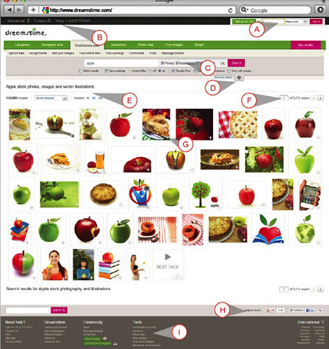
For our SERPs, we switched from a fixed-width layout to a liquid layout, as shown in Figure 1. This ensures that content is evenly distributed—regardless of screen resolution. In contrast to a fixed-width layout, a liquid layout optimizes the display of content for each particular user. Most monitors have a 16:9 aspect ratio, commonly with a 1366-pixel width, which leaves plenty of space to fill with high-quality images. In our business, displaying more and better-looking images leads to more downloads of our photographers’ images. By switching to a liquid layout, we put 40% more images in front of buyers.

Figure 1—Displaying high-quality images in a liquid layout
Displaying high-quality images in a liquid layout

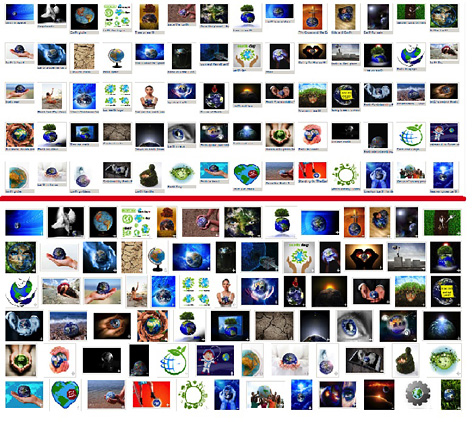
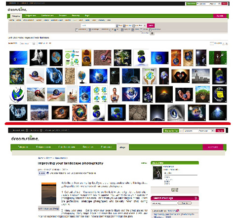
However, for pages with lots of copy, we stuck with a fixed-width layout for easier reading. Displaying blog pages, for instance, presents different UX design requirements from those of SERPs On pages that predominantly comprise text, the reader needs to keep focused on lines of text rather than distinguish among a plethora of images to identify the right one, as shown in Figure 2.

Figure 2—Contrasting a page comprising images with another comprising text
Contrasting a page comprising images with another comprising text

Let your content guide the creation of your page templates. The bare-bones structures of your Web site and your SERPs should help users to find and view whatever they need.

Cut the Fat

If you think everything on your SERPs is essential, you’ve likely become too attached to your design. Step back, get ruthless, and be prepared to take a knife to those pages—with the goal of creating a better user experience.

Once we determined the appropriate widths of the pages on Christmastime, our next order of business was reducing the need for scrolling. Very few users scroll to the bottom of a page, especially on screens with the ubiquitous 16:9 aspect ratio. Despite the fact that some of our customers browse literally thousands of pages daily—many won’t scroll beyond the first screen of content.

So, we placed the core information right in front of customers, above the fold. While this was easy for image pages, where the image thumbnails, sizes, and download options were the essential content, it was more difficult for the SERPs, since 200 thumbnails cannot easily fit on one page.

We removed the non-essential details below each image from our SERPs, while keeping the important information available on mouseover. We actually resized all 17 million images so each would have an equal height on SERPs In doing so, we removed 30 to 40% of the dead whitespace.

Simplify your layout, get back to basics, and see how clean your site can become. You can use a heat-mapping service to find out how much of your layout is actually useful.

Just because a change to your layout is simple, that does not mean it will be quick. Altering 17 million images was tedious, but if we had dragged our heels, having to change 25 million images later on would have been far worse. Once you identify a way to improve a product’s user experience, do not delay. It will not get any easier, and the hours you put in now will boost user satisfaction, as well as your sales for the next 5 to 10 years.

The Gory Details

If you were going to redesign your kitchen, you might as well replace the leaky faucet, the chipped countertop, and the squeaky cabinet door and install a new oven. Your kitchen might work just fine if you left them as they were, but why leave anything that’s sub par if you’re going to invest time and money in your kitchen?

The same goes for your user experience. We made our new SERPs easier on the eye and easier for the buyer. Here’s how we did it. You can follow along, matching the letters in Figure 3 with those in the following list.

Figure 3—Improving our search engine results pages
Improving our search engine results pages
  1. We improved our sign-in area with buttons that we prioritized by color and positioning. By integrating a lost-password field into the sign-in area, we saved space and optimized this area for frequent use.
  2. We used a higher contrast background and better visual content to make our language options and contact information easy to locate.
  3. We integrated search options for photos, illustrations, and vector, or RAW images directly into the search box, providing a reset button to return users to the default search options.
  4. We made advanced search more visible and easier to access. When users select advanced search, additional search options simply drop down below the standard search criteria.
  5. Search results appear in one spot with an easy-to-read title, the total number of results, search priorities, and the number of thumbnail images.
  6. The page layout is now more intuitive, allowing easier navigation to the desired page. Instead of a chain of boxes, the new arrow navigation cleans up the layout, takes up less space, and matches the arrow-key navigation that the site allows.
  7. The results are laid out horizontally or vertically and both layouts are justified. As I discussed earlier, we managed to increase the size of the thumbnails while also fitting more thumbnails on the page. The Add to Lightbox button is now a small plus sign rather than a noisy green box with text.
  8. We now include social media icons on every page, increasing users’ interaction with third-party platforms.
  9. Finally, our footer now contains more information, but it also has greater contrast and a cleaner organization. This makes the information easily available without distracting the user.

Easy to Buy

By implementing a liquid layout, cutting unnecessary information, resizing our images, and scrutinizing the value of each and every feature of our search results page, we optimized our SERPs for our core goal: selling stock photography images.

Most users choose images by performing a keyword-based search. Visual searches are available, but almost everyone searches for keywords. With 17 million images available on our site and 15,000 new ones being added daily, our search results page is our lifeblood. All 6 million users download the content they need from this page. We rely on high volumes of customers to generate revenue, so each step between reaching our page and making a purchase matters.

You do not have to own a very popular site to experience the benefits of ease of use. Sites with low traffic can increase their performance by optimizing their user experience. This benefits both the site visitors and the site owners. Though the benefit of an improved user experience might not become apparent right away, in the long run, a well-optimized user experience can double your sales. 

CEO and Co-owner of Dreamstime

Bucharest, Romania

Serban EnacheWith over 15 years of experience in design and new media, Serban has proven to be a skilled executive, successfully blending creative and executive abilities. He co-founded Archiweb in 1998, an award-winning leader among Web design companies in southeastern Europe, and envisioned his later stock agency in early 2000. As the Creative Director of Archiweb, he helped a multitude of companies to establish or improve their online presence—among them Xerox, Unilever, and Despec. Serban handles business development strategy for Dreamstime,and is deeply involved in the everyday operations of its Web site community. He is a skilled visionary who believes in disrupting business norms to explore new options. He lives in Bucharest, Romania, with his wife and two daughters.  Read More

Other Articles on Web Application Design

New on UXmatters