This is a sample chapter from the Second Edition of Jeff Johnson’s book, Designing with the Mind in Mind: Simple Guide to Understanding User Interface Design Guidelines. 2014 Morgan Kaufmann.
Chapter 11: Many Factors Affect Learning
Chapter 10 contrasted system one, the automatic processes our brain uses to carry out well-learned activities and make quick judgments, with system two, the conscious, highly monitored, controlled processes that we use to solve novel problems, make rational choices, and perform calculations. Automatic processes (system one) consume little or no short-term memory (attention) resources and can operate in parallel with each other, while controlled processes (system two) place high demands on short-term memory and operate one at a time (Schneider and Shiffrin, 1977; Kahneman, 2011; Eagleman, 2012).
Champion Advertisement
Continue Reading…
OUR BRAIN REWIRES ITSELF CONSTANTLY
How does the brain learn? Recent brain research has found that the brain adapts to new situations and environmental requirements constantly, mainly by rewiring itself: neurons that formerly fired independently become connected and fire in concert or in opposition, and neurons that formerly participated in one perception or behavior are reused for others. This is known as brain plasticity (Doidge, 2007).
It has been known for over 40 years that infants’ brains are highly plastic: within months of birth, somewhat random collections of neurons develop into highly organized neural networks. However, the degree to which brains remain plastic—that is, reorganizable—into adulthood was unknown until nuclear magnetic resonance imagery (NMRI) and similar brain observation methods became available.
One dramatic example of brain plasticity is the fact that blind people can be taught to “see” by connecting a video camera to an array of tactile stimulators resting on the person’s back. The stimulators touch the person’s back in patterns corresponding to images captured by the camera, vibrating for dark areas of the image but not for light areas. With training, participants in these studies can read, perceive scenes in three dimensions, and recognize objects. Initially, they perceive the stimulation as tactile patterns on their back, but after a while they report it as actually “seeing.”
Brain plasticity is also exemplified by a new approach to stroke rehabilitation. People who have strokes sometimes lose the use of an arm or leg on one side of their body. Recovering use of the limb has traditionally been difficult—often impossible—and stroke victims often learn to compensate by ignoring their bad limbs and relying on their good ones. However, some stroke doctors have recently started placing patients’ good limbs in casts to immobilize them, literally forcing patients to use their bad limbs. Results have been positive. Apparently, the brain reassigns different neurons to the bad arm—for example, allowing it to function again (Doidge, 2007).
The first time or even the first several times we perform an activity, we do it in a highly controlled and conscious manner, but with practice it becomes more automatic. Examples include peeling an apple, driving a car, juggling balls, riding a bicycle, reading, playing a musical instrument, and using an app on your mobile phone. Even an activity that might seem to require our attention, such as sorting good cherries from bad ones, can become automated to the point that we can do it as a background task, with plenty of cognitive resources left over for having a conversation, watching the news on television, etc.
This progression from controlled to automatic raises an obvious question for designers of interactive applications, online services, and electronic appliances: How can we design them so that using them becomes automatic within a reasonable amount of time?
This chapter explains and demonstrates factors that affect how quickly people can learn to use interactive systems. To preview the factors, we learn faster when:
Practice is frequent, regular, and precise.
Operation is task focused, simple, and consistent.
Vocabulary is task focused, familiar, and consistent.
Risk is low.
We Learn Faster When Practice Is Frequent, Regular, and Precise
Obviously, practice facilitates learning. Here are some details about practice.
Frequency of Practice
If people use an interactive system only rarely—for example, once every few weeks or less—it is hard for them to remember from one time to the next the details of how to use it. However, if they use an interactive system frequently, familiarity develops quickly. Most user-interface designers are well aware of this, and therefore design applications, appliances, and online service differently depending on whether people will use them casually and rarely or intensively and often.
For example, automated teller machines (ATMs) for banks are designed under the assumption that people will not remember much from one usage to the next. They are designed to be simple and to remind people what they do and how they work. ATMs present a short list of anticipated user goals—for example, withdraw cash, deposit funds, transfer funds—then guide users through the steps of the selected task. Airline and hotel booking Web sites are similarly task oriented: “Tell me your goal and I’ll guide you to it.” In contrast, document editing applications, electronic calendars, smartphone texting apps, air-traffic control systems, and online accounting services are designed with the understanding that people will be using them daily—perhaps even minute-by-minute—and will quickly learn and remember details about how to use them.
Regularity of Practice
How long does it take for an activity to become an automatic habit? Lally and her colleagues conducted a study to measure this (Lally et al., 2010). They asked about 100 volunteer participants to choose a new eating, drinking, or physical activity to do every day for at least two months. They monitored the participants and measured how long it took for the new behavior to become automatic—that is, to be executed without conscious thought or effort.
They found that forming automatic habits takes from 18 to 254 days, with more complex activities taking more time. They also found that habits formed faster if practiced regularly—for example, daily. Skipping a practice session now and then didn’t make much difference, but skipping a lot of practice sessions significantly slowed participants’ progress toward habit formation.
Bottom line: If you want the use of your software to become habitual and automatic for users, design it so as to encourage people to use it regularly.
Precision of Practice
Unorganized collections of neurons are noisy: they fire randomly; not in an organized way. When people practice an activity repeatedly, the brain organizes itself to support and control that activity: networks of
neurons get trained up to fire in concert. Their firing becomes more systematic and less noisy. This is true regardless of whether the activity is perceptual like identifying a word, motor like skiing, cognitive like counting numbers, or a combination like singing a song.
The more carefully and precisely a person practices an activity, the more systematic and predictable the activation of the corresponding neural network. If a person practices an activity carelessly and sloppily, the supporting neural networks remain somewhat disorganized—that is, noisy—and the execution of the activity will remain sloppy and imprecise (Doidge, 2007).
Stated simply: Practicing the same activity imprecisely just strengthens the imprecision, because the neural networks controlling it remain noisy. To train the neural networks to make the activity precise, one must practice precisely and carefully, even if that requires practicing slowly at first or breaking down the activity into parts.
If efficiency and precision are important for a task, design the supporting software and its documentation to (1) help people be precise—for example, by providing guides and grids—and (2) encourage people to use it purposefully and carefully rather than absentmindedly and sloppily. The following section explains how providing users with a clear conceptual model can support (2). Consistency of keystrokes and gestures, discussed later in this chapter, is also important.
We Learn Faster When Operation Is Task Focused, Simple, and Consistent
When we use a tool—whether it is computer based or not—to do a task, we have to translate what we want to do into the operations provided by the tool. Some examples:
You are an astronomer. You want to point your telescope at the star Alpha Centauri. Most telescopes don’t let you specify a star to observe. Instead, you have to translate that goal into how the telescope’s positioning controls operate: in terms of a vertical angle (azimuth) and a horizontal angle, or perhaps even the difference between where the telescope is pointing now and where you want it to point.
You want to call someone who isn’t in your phone’s contact list. To call this person, you have to translate the person into a telephone number and give that to the phone.
You want to create an organization chart for your company using a generic drawing program. To indicate organizations, suborganizations, and their managers, you have to draw boxes, label them with organization and manager names, and connect them with lines.
You want to make a two-sided copy of a two-sided document, but the copier only makes single-sided copies. To make your copy, you must first copy one side of each document sheet, take those copies and put them back into the copier’s paper tray upside down, and then copy the other side of each document sheet.
Cognitive psychologists call the gap between what a tool user wants and the operations the tool provides “the gulf of execution” (Norman and Draper, 1986). A person using a tool must expend cognitive effort to translate what he or she wants into a plan based on the tool’s available operations and vice versa. That cognitive effort pulls the person’s attention away from the task and refocuses it on the requirements of the tool. The smaller the gulf between the operations that a tool provides and what its users want to do, the less the users need to think about the tool and the more they can concentrate on their task. As a result, the tool becomes automatic more quickly.
The way to reduce the gulf is to design the tool to provide operations that match what users are trying to do. To build on the preceding examples:
A telescope’s control system could have a database of celestial objects, so users could simply indicate which object they want to observe, perhaps by pointing to it on a display.
Telephones with contact lists allow users to simply specify the person or organization they want to call, rather than having to translate that to a number first.
A special-purpose organization chart editing application would let users simply enter the names of organizations and managers, freeing users from having to create boxes and connect them.
A copier that can make double-sided copies allows users who want such copies to simply choose that option on the copier’s control panel.
To design software, services, and appliances to provide operations matching users’ goals and tasks, designers must thoroughly understand the user goals and tasks the tool is intended to support. Gaining that understanding requires three steps:
Perform a task analysis.
Design a task-focused conceptual model, consisting mainly of an objects/actions analysis.
Design a user interface based strictly on the task analysis and conceptual model.
Task Analysis
Describing in detail how to analyze users’ goals and tasks is beyond the scope of this book. Entire chapters—even whole books—have been written about it (Beyer and Holtzblatt, 1997; Hackos and Redish, 1998; Johnson, 2007). For now, it is enough to say that a good task analysis answers these questions:
What goals do users want to achieve by using the application?
What set of human tasks is the application intended to support?
Which tasks are common, and which ones are rare?
Which tasks are most important, and which ones are least important?
What are the steps of each task?
What are the result and output of each task?
Where does the information for each task come from?
How is the information that results from each task used?
Which people do which tasks?
What tools are used to do each task?
What problems do people have performing each task? What sorts of mistakes are common? What causes them? How damaging are mistakes?
What terminology do people who do these tasks use?
What communication with other people is required to do the tasks?
How are different tasks related?
Conceptual Model
Once these questions are answered—by observing and/or interviewing people who do the tasks that the tool supports—the next step is not to start sketching possible user interfaces. The next step is to design a conceptual model for the tool that focuses on the users’ tasks and goals (Johnson and Henderson, 2002, 2011, 2013).
A conceptual model of an application is the one that the designers want users to understand. By using the application, talking with other users, and reading the documentation, users build a model in their minds of how to use it. Hopefully, the model that users build in their minds is close to the one the designers intended. That is more likely when designers explicitly design a clear conceptual model as a key part of their development process.
A conceptual model describes abstractly what tasks a user can perform with the system and what concepts they must be aware of to complete them. The concepts should be those that came out of the task analysis, so the conceptual model is focused on the task domain. It should include few, if any, concepts for users to master that are not in the target task domain. The more direct the mapping between the application’s concepts and those of the tasks it is intended to support, the less translating users will have to do, and the easier the tool will be to learn.
In addition to being focused on users’ tasks, a conceptual model should be as simple as possible. Simpler means fewer concepts. The fewer concepts a model has for users to master, the better, as long as it provides the required functionality. Less is more, as long as what is there fits well with users’ goals and tasks.
For example:
In a to-do list application, do users need to be able to assign priorities of 1 to 10 to items, or are two priority levels, low and high, enough?
Does a Search function need to allow users to enter full Boolean expressions? If it allowed that, would a significant number of people use it? If not, leave it out.
Does a ticket machine in a train station need to be able to offer tickets for train routes other than the routes that this station is on?
In most development efforts, there is pressure to add extra functionality in case a user might want it. Resist such pressure unless there is considerable evidence that a significant number of potential customers and users really need the extra functionality. Why? Because every extra concept increases the complexity of the software. It is one more thing users have to learn. But actually it is not just one more thing. Each concept in an application interacts with most of the other concepts, and those interactions result in more complexity. Therefore, as concepts are added to an application, the application’s complexity grows not just linearly, but multiplicatively.
For a more comprehensive discussion of conceptual models, including some of the difficulties that arise in trying to keep them simple and task focused while providing the required functionality and flexibility, see Johnson and Henderson (2002, 2011, 2013).
After you have designed a conceptual model that is task focused, as simple as possible, and as consistent as possible, you can design a user interface for it that minimizes the time and experience required for using the application to become automatic.
EXCESS COMPLEXITY DUE TO SEPARATE CONCEPTS BEING TOO SIMILAR
Some software applications are too complex because they have concepts that overlap in meaning or functionality. For example, one company’s customer-support Web site presented four concepts that the developers considered quite different:
Membership—Whether a company had paid for the customer-support service.
Subscription—Whether a company had subscribed to a customer-support newsletter.
Access—Which areas of the customer-support Web site users in a company could access.
Entitlements—Services provided for each membership level.
Users confused these four concepts. The four concepts should have been collapsed into one, or at least fewer than four.
Another company developed a Web site for people seeking to buy a home. There were two ways to start looking for a home: (1) name the state, county, or town; and (2) point to a location on a map. The site called these two methods by location or by map, respectively, and required users to choose one. A usability test found that many users did not think of those as different ways of finding a home. To them, both methods were by location; they just differed in how the location was specified.
Consistency
The consistency of an interactive system strongly affects how quickly its users progress from controlled, consciously monitored, slow operation to automatic, unmonitored, faster operation (Schneider and Shiffrin, 1977). The more predictable the operation of a system’s different functions, the more consistent it is. In a highly consistent system, the operation of a particular function is predictable from its type, so people quickly learn how everything in the system works and its use quickly becomes habitual. In an inconsistent system, users cannot predict how its different functions work, so they must learn each one anew, which slows their learning of the overall system and keeps their use of it a controlled, attention-consuming process.
The designer’s goal is to devise a conceptual model that is task focused, as simple as possible, and as consistent as possible. From such a model, one can design a user interface for it that minimizes the time and experience required for using the application to become automatic.
Interactive systems can be consistent or inconsistent on at least two different levels: the conceptual level and keystroke level. Consistency at the conceptual level is determined by the mapping between the objects, actions, and attributes of the conceptual model (see earlier). Do most objects in the system have the same actions and attributes, or not? Consistency at the keystroke level is determined by the mapping between the conceptual actions and the physical movements required to execute them. Are all conceptual actions of a certain type initiated and controlled by the same physical movements, or not?
Keystroke Consistency
When a designer moves from conceptual design to actual user-interface design, keystroke-level consistency becomes important.
Keystroke-level consistency is at least as important as conceptual consistency in determining how quickly the operation of an interactive system becomes automatic. The goal is to foster the growth of what is often called muscle memory, meaning motor habits. A system that is inconsistent at the keystroke level does not let people quickly fall into muscle memory motor habits. Rather, it forces them to remain consciously aware of, and guess about, which keystrokes to use in each context, even when the gestures in different contexts differ only slightly. In addition, it makes it likely that people will make errors—that is, accidentally do something they did not intend.
Achieving keystroke-level consistency requires standardizing the physical actions for all activities of the same type. An example of a type of activity is editing text. Keystroke-level consistency for text editing requires the keystrokes, pointer movements, and gestures to be the same regardless of the context in which text is being edited—for example, documents, form fields, filenames, etc. Keystroke-level consistency is also desirable for other types of activity, such as opening documents, following links, choosing from a menu, choosing from a displayed set of options, and clicking buttons.
Consider three alternative designs for the keyboard shortcuts for Cut and Paste in a hypothetical multimedia document editor. The document editor supports the creation of documents containing text, sketches, tables, images, and videos. In design A, Cut and Paste have the same two keyboard shortcuts regardless of what type of content is being edited. In design B, the keyboard shortcuts for Cut and Paste are different for every type of content. In design C, all types of content except videos have the same Cut and Paste keyboard shortcuts (see Table 11.1).
Table 11.1—Which UI Design Will be Easiest/Hardest to Learn and Remember?
Document Editor Keyboard Shortcuts: Alternative Designs
Object
Design A
Design B
Design C
Cut
Paste
Cut
Paste
Cut
Paste
Text
CTRL-X
CTRL-V
CTRL-X
CTRL-V
CTRL-X
CTRL-V
Sketch
CTRL-X
CTRL-V
CTRL-C
CTRL-P
CTRL-X
CTRL-V
Table
CTRL-X
CTRL-V
CTRL-Z
CTRL-Y
CTRL-X
CTRL-V
Image
CTRL-X
CTRL-V
CTRL-M
CTRL-N
CTRL-X
CTRL-V
Video
CTRL-X
CTRL-V
CTRL-Q
CTRL-R
CTRL-E
CTRL-R
The first question is: Which of these designs is easiest to learn? It is fairly clear that design A is the easiest.
The second question is: Which design is hardest to learn? That is a tougher question. It is tempting to say design B because that one seems to be the least consistent of the three. However, the answer really depends on what we mean by “hardest to learn.” If we mean “the design for which users will require the most time to become productive,” that is certainly design B. It will take most users a long time to learn all the different Cut and Paste keyboard shortcuts for the different types of content. But people are remarkably adaptable if sufficiently motivated—they can learn amazingly arbitrary things if, say, using the software is required for their job. Eventually—maybe in a month—users would be comfortable and even quick with design B. In contrast, users of design C would begin to be productive in about the same short time as users of design A—probably a matter of minutes.
However, if we interpret “hardest to learn” as meaning “the design for which users will take the longest to be error-free,” that is design C. All the types of document content use the same shortcut keys for Cut and Paste except videos. Although users of design C will be productive quickly, they would continue to make the error of trying to use CTRL-X and CTRL-V with videos for at least several months—perhaps forever.
Consistency is extremely important for learning hand-eye coordination activities such as scrolling, panning, and zooming a display, especially on touch-controlled screens. If those actions require users to make different gestures in different contexts—for example, different apps—the corresponding neural networks in users’ brains will remain noisy, preventing the users from ever being able to pan and scroll automatically—that is, without conscious thought).
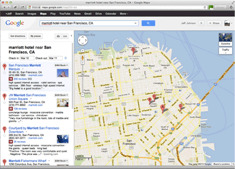
For example, on Apple Macintosh computers running Mac OS X,1 panning and scrolling is usually accomplished by dragging two fingers across the trackpad in the desired direction, and zooming is controlled by spreading or pinching two fingers. But what if a Mac user is using Google Maps? In the column on the left listing search results (see Figure 11.1), scrolling/panning the list uses the standard Mac OS X gesture: sliding two fingers up or down, and the text is zoomed by spreading or pinching two fingers. But over the map, oops, sorry: dragging two fingers there doesn’t pan it, it zooms it. Panning the map requires clicking the trackpad down with one finger and dragging it. And spreading or pinching two fingers over the map doesn’t zoom it, it zooms the entire contents of the browser window. Needless to say, such inconsistencies effectively block scrolling, panning, and zooming from becoming automatic for users.
Figure 11.1—Inconsistent gestures block scrolling, panning, and zooming from becoming automatic.
A common way that developers promote keystroke-level consistency is to follow look-and-feel standards. Such standards can be presented in style guides or they can be built into common user-interface construction tools and component sets. Style guides exist for the entire industry and they exist separately for desktop software (Apple Computer, 2009; Microsoft Corporation, 2009) and Web design (Koyani et al., 2006). Ideally, companies also have internal style guides that augment the industry style guides to define a look and feel for their own products.
However conventions are encapsulated, the goal is to stick to conventions at the keystroke level while perhaps innovating at the conceptual and task levels. We as designers really don’t want our software’s users to have to keep thinking about their keystroke-level actions as they work, and users don’t want to think about them either.
We Learn Faster When Vocabulary Is Task Focused, Familiar, and Consistent
Ensuring that an application, Web service, or appliance exposes a small, consistent, and task-appropriate set of concepts to its users is a big first step, but it is not enough to minimize the time it takes for people to learn an interactive system. You also have to make sure that the vocabulary—what concepts are called—fits the task, is familiar, and is consistent.
Terminology Should Be Task Focused
Just as the user-visible concepts in an interactive system should be task focused, so should the names for the concepts. Usually, task-focused terms for concepts emerge from the interviews and observations of users that designers conduct as part of the task analysis. Occasionally, software needs to expose a concept that is new to users; the challenge for a designer is keeping such concepts and their names focused on the task, not on the technology.
Some examples of interactive software systems using terminology that is not task focused are as follows:
A company developed a desktop software application for performing investment transactions. The application let users create and save templates for common transactions. It gave users the option of saving templates either on their own PC or on a network server. Templates stored on the PC were private; templates stored on the server were accessible to other people. The developers used database for templates on the server because they were kept in a database. They used local for templates on the users’ own PC because that is what local meant to them. Terms that would be more task focused are shared or public instead of database, and private instead of local.
iCasualties.org provides up-to-date tallies of the number of coalition military personnel killed or injured in the Iraq and Afghanistan wars. It starts by asking site visitors to select a “database.” However, visitors to this site don’t care or need to know that the Web site’s data is stored in multiple databases. Task-focused instructions would ask them to select a “country” in which there is an ongoing conflict, not a “database” (see Figure 11.2).
Figure 11.2—iCasualties.org uses language that is not task focused (“database”) in its instructions.
Terminology Should Be Familiar
To reduce the time it takes for people to master your application, Web site, or appliance, so that using it becomes automatic or nearly so, don’t force them to learn a whole new vocabulary. Chapter 4 explained that familiar words are easier to read and understand because they can be recognized automatically. Unfamiliar words cause people to use more conscious decoding methods, which consumes scarce short-term memory resources and thereby lowers comprehension.
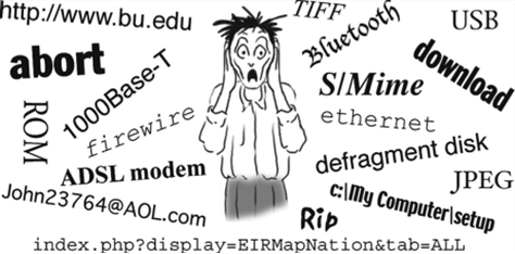
Unfortunately, many computer-based products and services present users with unfamiliar terms from computer engineering—often called geek speak—and require them to master those terms (see Figure 11.3). Why? Operating a stove doesn’t require us to master terminology about the pressure and chemical composition of natural gas, or terminology about the production and delivery of electricity. Why should shopping on the Web, sharing photographs, or checking email require us to learn geek speak such as USB, TIFF, or broadband? But in many cases, it does.
Some examples of interactive software systems using unfamiliar terminology are as follows:
A development team was designing a video-on-demand system for schoolteachers to use in classrooms. The purpose of the system was to allow teachers to find videos offered by their school district, download them, and show them in their classrooms. The developers’ initial plan was to organize the videos into a hierarchy of “categories” and “subcategories.” Interviews with teachers showed, however, that they use the terms subject and unit to organize instructional content, including videos. If the system had used the developers’ terminology, teachers who used it would have to learn that category meant subject and subcategory meant unit, making the system harder to master.
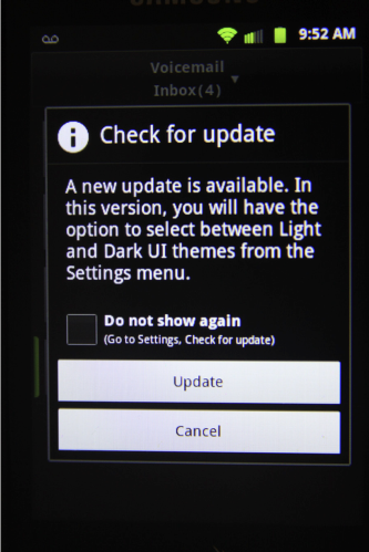
SPRINT, a mobile-phone service provider, sends announcements of software updates to customers’ phones. These announcements often indicate new features that the update includes. One SPRINT update announcement offered “the option to select between Light and Dark UI themes from the Settings menu” (see Figure 11.4). Most consumers won’t know what a user-interface theme is, as that is a technical term used mainly by software designers and developers.
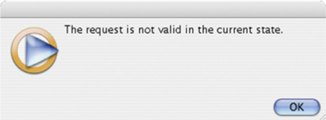
Windows Media Player sometimes displays error messages that use familiar terms in unfamiliar, “geeky” ways (see Figure 11.5). The error message in the figure is referring to the state of the software, but the average Media Player user is likely to interpret it as referring to the state in which he or she lives.
Figure 11.4—An update message from SPRINT mobile-phone service uses the computer jargon term “UI themes.” Figure 11.5—An error message in Windows Media Player uses a familiar term (“current state”) in an unfamiliar way.
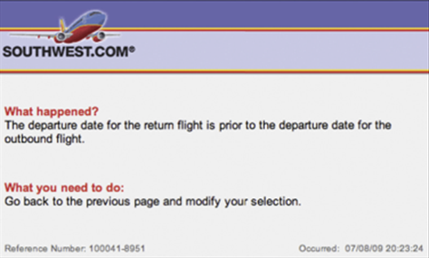
In contrast to these examples, Southwest Airlines’ Web site tries to prevent errors from occurring, but when they do occur, it explains the problem using task-focused, familiar language (see Figure 11.6).
Figure 11.6—Error messages at Southwest Airlines’ Web site are task focused and clear, fostering learning.
Terminology Should Be Consistent
People want to focus their cognitive resources on their own goals and tasks, not on the software they are using. They just want to accomplish their goal, whatever it is. They are not interested in the software. They interpret what the system presents only superficially and very literally. Their limited attentional resources are so focused on their goal that if they are looking for a Search function, but it is labeled Query on the current screen or page, they may miss it. Therefore, the terminology in an interactive system should be designed for maximum consistency.
The terminology used in an interactive system is consistent when each concept has one and only one name. Caroline Jarrett, an authority on user-interface and forms design, provides this rule:
Same name, same thing; different name, different thing—FormsThatWork.com
This means that terms and concepts should map strictly 1:1. Never use different terms for the same concept, or the same term for different concepts. Even terms that are ambiguous in the real world should mean only one thing in the system. Otherwise, the system will be harder to learn and remember.
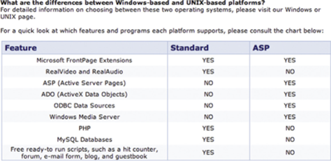
An example of different terms for the same concepts is provided by Earthlink’s frequently asked questions (FAQs) page in the Web-hosting section of its site (see Figure 11.7). In the question, the two available Web-hosting platforms are called “Windows-based” and “UNIX-based,” but in the table they are referred to as “Standard” and “ASP.” Customers have to stop and try to figure out which one is which. Do you know?
Figure 11.7—Earthlink’s Web-hosting FAQs use different terms for the same options in the question and in the table.
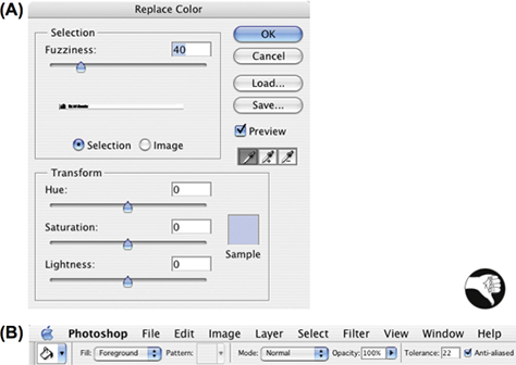
An example from Adobe Photoshop shows that inconsistent terminology can impede learning. Photoshop has two functions for replacing a target color in an image: Replace Color, which replaces the target color throughout an image with a new color, and Paint Bucket, which replaces the target color in an enclosed area with a new color. Both functions have a parameter that specifies how similar a color in the image must be to the target color before it will be replaced. The inconsistency is that the Replace Color function calls this parameter Fuzziness, but the Paint Bucket function calls it Tolerance (see Figure 11.8). Photoshop’s online Help documentation for Replace Color even says “Adjust the tolerance of the mask by dragging the Fuzziness slider or entering a value” [emphasis added]. If the parameter were simply called Tolerance in both color replacement functions, people who learned one function could quickly transfer that learning to the other. But it isn’t, so people have to learn the two functions separately.
Figure 11.8—Photoshop uses different names for the tolerance parameter in two color-replacement functions: (A) Fuzziness in Replace Color, and (B) Tolerance in Paint Bucket.
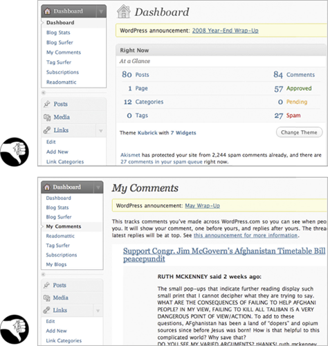
Finally, WordPress.com provides an example of the same term for different concepts—also called overloading a term. For administering a blog, WordPress.com provides each blogger with a Dashboard consisting of monitoring and administrative functions organized into several pages. The problem is that one of the administrative function pages in the Dashboard is also called the Dashboard, so the same name refers to both the whole Dashboard and one page of it (see Figure 11.9). Therefore, when new bloggers are learning to use WordPress.com, they have to discover and remember that sometimes Dashboard means the entire administrative area and sometimes it means the Dashboard page of the administrative area.
Figure 11.9—At WordPress.com, Dashboard means both a blog’s entire administrative area and a certain page in it.
Developing Task-focused, Familiar, Consistent Terminology Is Easier with a Good Conceptual Model
The good news is that when you perform a task analysis and develop a task-focused conceptual model, you also get the vocabulary your target user population uses to talk about the tasks. You don’t have to make up new terms for the user-visible concepts in your application—you can use the terms that people who do the task already use. In fact, you shouldn’t assign new names for those concepts, because any names you assign will likely be computer technology concepts, foreign to the task domain.
From the conceptual model, a software development team should create a product lexicon. The lexicon gives a name and definition for each object, action, and attribute that the product—including its documentation—exposes to users. The lexicon should map terms onto concepts 1:1. It should not assign multiple terms to a single concept, or a single term to multiple concepts.
Terms in the lexicon should come from the software’s supported tasks, not its implementation. Terms should fit well into the users’ normal task vocabulary, even if they are new. Typically, technical writers, user-interface designers, developers, managers, and users all help create the lexicon.
Certain concepts in GUIs have industry-standard names. These are the GUI equivalents of “reserved words” in programming languages. If you rename such concepts or assign new meanings to the standard names, you will confuse users. One such reserved term is select. It means clicking an object to highlight it, marking it as the object for future actions. The word select should not be used for any other purpose in a GUI—for example, adding an item to a list or a collection. Other reserved GUI terms are click, press, drag, button, and link.
Follow the product lexicon consistently throughout the software, user manuals, and marketing literature. Treat it as a living document: as the product evolves, the lexicon changes based on the basis of new design insights, changes in functionality, usability test results, and market feedback.
When Risk Is Low, We Explore More and Learn More
Imagine you are visiting a foreign city on business for a week or two. You have spare time after your work duties are finished in the evenings and on weekends. Compare two possible cities:
You have been told that this city is easy to get around in: it is laid out in a consistent grid of streets and avenues with clear street and subway signs written in a language you understand, and the residents and police speak your language and are friendly and eager to help tourists.
You have been warned that this city has a convoluted, confusing layout, with winding, poorly marked streets; the few street and subway signs are in a language you cannot read, and residents don’t speak your language and are generally contemptuous of tourists.
In which city are you more likely to go out exploring?
Most interactive systems—desktop software, Web services, electronic appliances—have far more functionality than most of their users ever try. Often people don’t even know about most of the functionality provided by software or gadgets they use every day. One reason for this is fear of being burned.
People make mistakes. Many interactive systems make it too easy for users to make mistakes, do not allow users to correct mistakes, or make it costly or time consuming to correct mistakes. People won’t be very productive in using such systems: they will waste too much time correcting or recovering from mistakes.
Even more important than the impact on time is the impact on practice and exploration. A high-risk system, in which mistakes are easy to make and costly, discourages both: people who are anxious and afraid of making mistakes will avoid using the system, and when they do use it, they will tend to stick to familiar, safe paths and functions.
Imagine a violin or trumpet that gave mild electric shocks to its players when they made a mistake. Musicians would avoiding practicing with it and would never use it to play new, unfamiliar tunes.
When practice and exploration are discouraged, learning suffers.3 In contrast, a low-risk system—in which mistakes are hard to make, low in cost, and easy to correct—reduces stress and encourages practice and exploration, and therefore supports learning. With such systems, users are more willing to try new paths: “Hmmm, I wonder what that does.” Creating a low-risk environment means doing the following:
Prevent errors where possible.
Deactivate invalid commands.
Make errors easy to detect by showing users clearly what they have done—for example, deleting a paragraph by mistake.
Allow users to undo, reverse, or correct errors easily.
Discount for UXmatters Readers—Buy the Second Edition of Designing with the Mind in Mind: Simple Guide to Understanding User Interface Design Guidelines and other Morgan Kaufmann titles on the Morgan Kaufmann site, using the discount code PBTY14, and save 25% off the retail price.
Assistant Professor, Computer Science Department, at University of San Francisco
San Francisco, California, USA
At Wiser Usability, Jeff focuses on usability for older users. He has previously worked as a user-interface designer, implementer, manager, usability tester, and researcher at Cromemco, Xerox, US West, Hewlett-Packard, and Sun Microsystems. In addition to Jeff’s current position as Assistant Professor of Computer Science at the University of San Francisco, he has also taught in the Computer Science Departments at Stanford University, Mills College, and the University of Canterbury, in Christchurch, New Zealand. After graduating from Yale University with a BA in Experimental Psychology, Jeff earned his PhD in Developmental and Experimental Psychology at Stanford University. He is a member of the ACM SIGCHI Academy and a recipient of SIGCHI’s Lifetime Achievement in Practice Award. Jeff has authored numerous articles on a variety of human-computer interaction topics, as well as the books Designing User Interfaces for an Aging Population, with Kate Finn (2017); Designing with the Mind in Mind: Simple Guide to Understanding User Interface Design Rules (1st edition, 2010; 2nd edition, 2014); Conceptual Models: Core to Good Design, with Austin Henderson (2011); GUI Bloopers 2.0: Common User Interface Design Don’ts and Dos (2007), Web Bloopers: 60 Common Design Mistakes and How to Avoid Them (2003), and GUI Bloopers: Don’ts and Dos for Software Developers and Web Designers (2000). Read More