Top

Mobile-First eCommerce: What Customers Expect and Value in Mobile Shopping Experiences

February 22, 2016

Increasing conversion rates from mobile devices such as smartphones and tablets is a key goal of every ecommerce company. In 2015, the shopping-cart abandonment rate reached an all-time high of 70%, and it’s climbing. Since Morgan Stanley’s research suggests that 91% percent of adults use smartphones, why are only 14% of those consumers buying products online using their mobile device?

Yes, people tend to browse on their mobile device, then move to their personal computer to shop online. But people tend to do this primarily because of poor usability and the lack of affordance on smaller devices. Shopping-cart abandonment can be reduced on smartphones and tablets. However, many companies struggle with delivering a seamless browse-to-buy experience on mobile devices.

Shopping-cart abandonment—the loss of a customer who was going through an ecommerce site’s check-out flow—is widespread. A Forrester study found that 89% of consumers had abandoned a shopping cart at least once. Researchers attributed that high rate of abandonment to user sophistication: as shoppers become more experienced with online shopping, they are more likely to compare brand experiences online.

Champion Advertisement
Continue Reading…

Interestingly, the most popular time for customers to purchase products online is on weekdays between 12 noon and 2pm and on Sunday evenings.

Black-Friday Mobile Insights

On Black Friday in 2015:

  • There was an increase in mobile traffic versus desktop traffic. In 2015, for the first time, mobile-device traffic hit 55%, overtaking desktop traffic. Traffic from smartphone devices was higher than from tablets, showing the importance of user experience for small, hand-held devices.
  • There was an increase in mobile conversions online. Orders that shoppers placed online using mobile devices contributed to 36.2% of online sales—up by 6.89% from the prior year. This shows that people are not just browsing, but increasingly, also buying products on a hand-held device.
  • Apple phones dominated mobile commerce. Forecasts show that shoppers will place 77.6% of all the orders they place on mobile devices on Apple devices. Etailers need to consider building iOS apps to keep consumers interested and increase online conversions.
  • There has been an increase in PayPal payments on mobile devices. There was a 56% increase in PayPal payments for online purchases in 2015. This shows that we need to prioritize the customer journey for PayPal payments on hand-held devices.

Design Best Practices for Conversions

Here are some design best practices for improving conversions on mobile devices and across channels.

Cross-Channel Consistency

Though guidelines recommend design consistency across devices, do smartphones and other mobile devices really need a mini-cart? The Web sites with the highest conversion rates take users directly from product details to the shopping cart. Your goal is to offer efficiency and enough information to make customers want to move forward. For example:

  • cross-device and cross-browser consistency—The shopping-cart user experience encompasses the user’s perceptions and feelings before, during, and after their interaction using a mobile device. A user who is signed in and has saved items to their shopping cart on one device should be able to see them on another device or in another browser. Unfortunately, on some Web sites, when customers add products to their cart after signing in, they do not appear in their cart across devices. It’s important to correct this problem because it potentially decreases online conversions. Surprisingly, more than 60% of the clients I have worked with did not transfer the contents of the cart across browsers and devices.
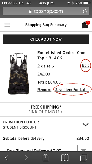
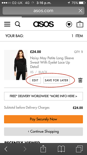
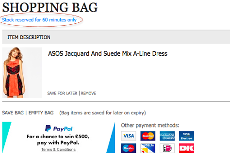
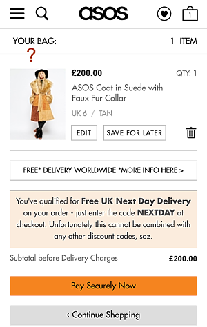
  • stock reservations—Mobile best practices indicate that etailers should inform users of the stock-reservation period for items in their cart or how much time remains before they must buy a product. This usually takes the form of a counter that informs users of the time remaining until checkout. As shown in Figure 1, ASOS fulfills this requirement for desktop browsers, but stock reservations do not persist across devices. As Figure 2 shows, ASOS does not provide this useful information on mobile devices.
Figure 1—Stock reservation on the ASOS desktop Web site
Stock reservation on the ASOS desktop Web site
Figure 2—The stock reservation does not appear on mobile devices
The stock reservation does not appear on mobile devices

Efficiency and Ease of Use

Efficiency and ease of use are key for a checkout experience on a mobile device. Best practices include the following:

  • minimizing the number of form fields—Usability tests show that having a single-page checkout flow versus a multiple-page flow doesn’t make a difference to conversions. However, reducing the number of fields in a form does increase conversions. A case study by Imaginary Landscape shows that, when they replaced an eleven-field version of a form with a four-field version, there was a 160% increase in the number of forms submitted and a 120% increase in conversions. Start by getting rid of all optional fields.
  • promotions within the shopping cart—Currently, about 32% of people browsing an ecommerce Web site abandon the shopping cart, failing to complete their purchase. Decluttering the shopping-cart page by reducing the amount of information on it can help solve this problem. For example, provide a Promotions text box only when a promotion is actually running. Guide users to the place where they can obtain their promotion code—whether an email message or an advertisement. The interactive promotions section on the shopping-cart page should be contextual, allowing users to interact with it only when a promotion is currently running. Unfortunately, most Web sites do not do this.
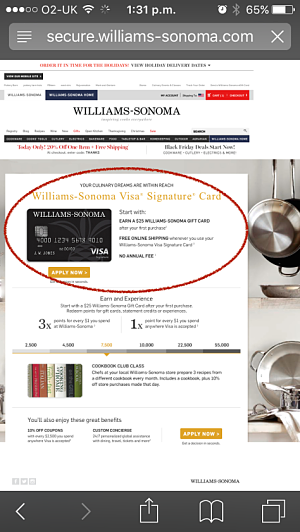
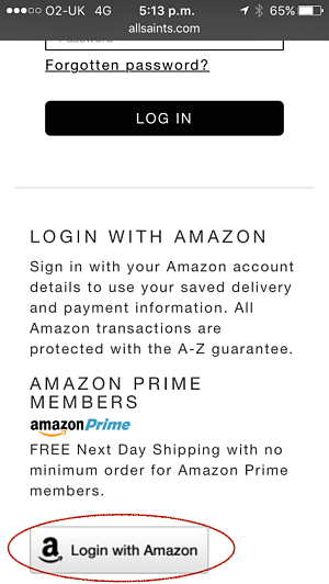
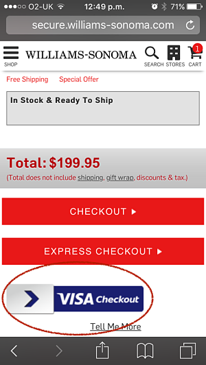
  • mobile behavior and Amazon checkout—Interestingly, 50% of people on a mobile device abandon their shopping cart, showing that the cart’s usability and interaction design need attention. About 46% of people on a mobile device proceed to sign in. One of my clients, AllSaints, have implemented Amazon Login, shown in Figure 3, which lets users check out using their Amazon account and payment details. This saves customers time and has increased the company’s conversion rate by 34%. On average, users are now able to buy a product online within 30 seconds—in comparison to 1.3 minutes prior to their implementing Amazon Login. Web sites should display plugins containing such primary actions above the fold on mobile devices. Williams Sonoma also provide a quick way to check out, using VISA Checkout, shown in Figure 4, which increases user efficiency and control. Customers create an account once, then, wherever they use VISA Checkout, they never have to re-enter their credit card or address information. Prospects and customers speed through checkout using a single sign-in.
Figure 3—Using Amazon to sign in and check out
Using Amazon to sign in and check out
Figure 4—Using Visa to check out
Using Visa to check out

Persuasion

Persuasion is a key factor in the shopping cart. Some related best practices include the following:

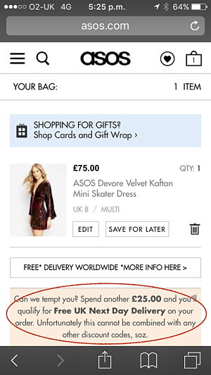
  • returns and delivery—Highlight your returns policy and free delivery offers to encourage users to check out. Some retailers provide an intelligent marketing message, encouraging visitors to consider spending a bit more to benefit from the free-delivery option, as shown in Figure 5.
  • account sign in—Promote signing in to returning customers. Some retailers display a small message, encouraging returning customers to sign in to their account. This is especially helpful when a site stores customers’ shopping-cart contents in their account rather than simply using a cookie.
Figure 5—Persuasive content that increases engagement online
Persuasive content that increases engagement online
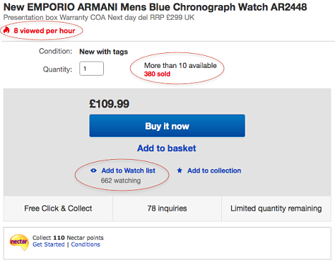
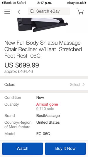
  • social proof—eBay informs users of the number of items already sold, as shown in Figure 6, increasing urgency and persuasion. Strangely, this experience is not consistent across devices. These enticers appear only on the desktop, not on the mobile device shown in Figure 7 or on a tablet. Seeing the number of purchases increases motivation because people tend to follow others’ lead, so social proof should appear across devices.
Figure 6—eBay’s desktop Web experience, showing social proof
eBay’s desktop Web experience, showing social proof
Figure 7—eBay’s mobile site lacks social proof
eBay’s mobile site lacks social proof

Security and Trust

Highlight security measures and the available payment options. This increases visitors’ confidence in proceeding to checkout, while strengthening their intent to complete their purchase. To build trust, follow these best practices:

  • primary calls to action—Duplicate the Secure Checkout call to action if the page content extends below the fold. Users are likely to abandon their cart if they do not see the Checkout call to action once they scroll down the page.
  • security seals—Baymard conducted a survey on site-security seals with a large sample size—2,510 responses—testing up-to-date versions of eight of the most popular site seals. The results showed that Norton is the seal that engenders the most trust in customers purchasing online.
  • trust—To build trust, use the label Secure Checkout or Pay Securely Now on call-to-action buttons. Also, place the checkout button both above and below the shopping-cart contents. Placing this button both above and below the fold encourages visitors to check out. One of my clients increased their mobile conversions by 1.38% by placing their Check Out button both above and below the fold on their shopping-cart page.

Transparency 

Before customers move into the checkout flow, the shopping cart should address issues of transparency around delivery details, methods, and costs, as follows:

  • costs—There should be no ambiguity about standard delivery costs. Visitors should not need to wait to know what the delivery costs are until they’re checking out. A lack of clarity about delivery costs continues to be one of the key reasons why visitors abandon the checkout process. A key challenge for most of my clients is the service tax, which a site can quote only after a customer has specified a delivery address—because the amount of the tax depends on that address. Some Web sites such as Selfridges do not provide the amounts of taxes on the shopping-cart page, but instead alert customers that the total is approximate until the customer provides delivery details, as shown in Figure 8. Some other Web sites—for example, Michael Kors, shown in Figure 9—do provide the tax charges on the shopping-cart page. If the taxes are going to change based on the shipping address that a customer provides within the checkout flow, a company should mention that the tax is an estimated amount. Otherwise, if the tax amount changes during checkout, this might be confusing to customers and damage trust.
Figure 8—No tax description before checkout on Selfridges
No tax description before checkout on Selfridges
Figure 9—Tax description before checkout on Michael Kors
Tax description before checkout on Michael Kors
  • delivery options—Allowing visitors to choose alternative delivery options from a drop-down list, as in the Michael Kors example shown in Figure 9, helps to encourage some visitors to consider upgrading to a what may be a more useful delivery option, which is potentially more profitable for the retailer.

Flexibility

Some ways in which you can provide flexibility to customers include the following:

  • shipping a single order to multiple locations—A customer should be able to ship parts of a single order to multiple locations. Williams Sonoma lets customers do this, providing users with flexibility and control.
  • wish lists—Give customers the flexibility to edit their shopping cart and save selected products for later purchase rather than making customers buy them immediately. Shoppers should be able to save products in their shopping cart or add products to a wish list. Many people use a shopping cart as a glorified wish list, saving things for later purchase. Optionally, let shoppers add products to a wish list for future purchase. Most ecommerce Web sites now provide this flexibility. Top Shop and ASOS do this particularly well, as shown in Figures 10 and 11.
Figure 10Save Item for Later on Top Shop
Save Item for Later on Top Shop
Figure 11Save for Later on ASOS
Save for Later on ASOS
  • premium account service—Retailers like Shop Your Way and Williams Sonoma have implemented premium services to improve efficiency and benefit customers by letting them quickly purchase products online and get speedy delivery service. For example, customers can use the Williams Sonoma Advantage Card to receive the VIP treatment when shopping, as shown in Figure 12.
Figure 12—Williams Sonoma’s Advantage Card
Williams Sonoma’s Advantage Card

Bridging Physical and Digital Shopping

Customers need a connected user experience across channels, bridging retail stores and the online-shopping world. Shoppers like to browse online, then shop at a store and vice versa. Here’s one way of doing this:

barcode scanning—An easy to use, business-to-business ecommerce app, Netalogue lets customers browse and purchase products using their mobile device or tablet. Shoppers can scan barcodes using their device’s camera, and the app identifies the product and lets them buy it. We need to see more retailers adopting this feature. Customers can compare prices and make purchases whether in a stores or at home. Shoppers simply point their device’s camera at an item, and the scanner overlays pricing, availability, reviews, media content, or other information directly on top of the item, and lets them immediately buy the product. Amazon leads the pack in product-image recognition and the ability to buy products using a mobile device while at a retail store.

Figure 13—Shopping with a mobile device while at a retail store
Shopping with a mobile device while at a retail store
Figure 14—Video showing the use of a mobile device to buy products while at a retail store

Conclusion

A site’s checkout experience should be transparent, providing the right imagery to build trust and persuade customers to move forward and complete their purchases online. In this article, I’ve recommended best practices that showcase how you can increase conversions on ecommerce sites and mobile apps. 

Senior Omni-Channel Commerce Consultant

London, UK

Afshan KirmaniWith over ten years of experience in customer experience, Afshan delivers ecommerce experiences based on omni-channel content and commerce solutions. She specializes in conversion-centric design, using behavioral psychology to persuade and drive conversions. Her projects focus on discovery and definition for content management and commerce platforms, and her design solutions have a proven track record of delivering growth in strategic accounts and revenue streams within global enterprises. Afshan has worked on Web sites and applications that take a mobile-first, responsive approach to produce designs that span hand-held devices, wearables, and retail kiosks. Her experience touches on social media, analytics, applications that leverage personalized content, and user experiences that optimize customer retention to increase sales.  Read More

Other Articles on Mobile UX Design

New on UXmatters