Tables have an undeserved reputation for being evil and wrong in the digital environment.
We’re now deeply into an era when developers code tabular data into Web pages using CSS tricks because the perceived overuse of tables for layout in Web 1.0 has resulted in a tables are bad mantra throughout the Web design and development world.
But we should display tabular data in tables. Using tables properly, for the display of data, is a good and necessary thing. However, small-screen tables are an entirely different matter. Tables generally take up lots of space, and mobile devices do not have big screens. For years, I have set aside most discussions of mobile screen size in favor of discussing their use in hand and on the go and the extra capabilities that sensors and connectivity provide. But the data table is one case where the size of a mobile screen is absolutely the biggest problem, and the other capabilities of a mobile device provide no clever workarounds.
Champion Advertisement
Continue Reading…
Using Responsive Tables Misses the Point
Making tables a design sin has led to our discussing them as little as possible, so there’s been far too little innovation or design inspiration. Members of the design community who even can bring themselves to discuss tables have settled on a few tactics, but they are all simply awful. That’s not to say that they are not pretty or clever or slick, but that they are not fit for their purpose. All of the tactics that designers commonly apply to tables fail to meet the needs of users who need to view, analyze, and interact with tabular data in one way or another.
Let’s consider a few of these basic methods.
Allow Horizontal Scrolling
Either users can scroll subsections of a page or they can click an image representing the table to go to a page where they can scroll the actual table in every direction. It is good that this approach satisfies the requirement to show a table, and it takes no particular effort to design. Of course, it is bad because it takes no design, and it forces an oversized element into a mobile screen. We know very well that dual-axis scrolling is confusing, and it is barely better even when there are fixed column headers and row headers to provide some sense of place.
Convert Tables to Images
Sometimes, designers discard tables entirely in favor of graphical representations of tabular data. Often this is good on the surface, but bad in its details. Data that users can consume at a glance is good in every circumstance. If an image of a table gets the point across better than an actual table, use it. But you must then use images everywhere. If the product team believes that a table is necessary, it is—for users. But what mobile device they use doesn’t matter, and you’d be following the decades-old, long-disproven approach of making mobile users second-class citizens.
Build Responsive Tables
Perhaps the most common solution I encounter in the wild and in today’s design systems is the responsive table, which turns a table into something that is not fundamentally a table. Each row becomes a sort of miniature two-column table, in which the table headers become the column on the left for each of the rows, and the data is in the column on the right. Figure 1 shows an example.
Figure 1—A responsive table
The Web-development community loves this approach—both because it is responsive and common enough that you can just say, “They do it. We’ll copy that.” Enough teams have done this that there is plenty of guidance on how to code it, and it works reliably. That is, it works in the sense of the code working. But it doesn’t work for people. Since it’s not a table, all table interactions become nonsense. The developers stuff reordering or batch operations in there—for multiple rows—but that doesn’t make any sense to users. Rows are often so tall that they take up essentially the whole viewport, so users can become lost in the page—in much the same way as with multiple accordion lists, but even more so. The entire point of tables, users’ being able to run down columns to find or compare figures, is moot.
I design lots of tables in my work, for deeply data-driven products, and have found all such responsive tables to be poor solutions. All of these approaches fail because their designers are contemptuous of the user’s need to view information in a tabular format.
Tables need to be tables, with rows and columns of information that the user can scan. In the rest of this column, I’ll discuss some of the design concepts and tactics I use to make tables work on mobile devices.
Showing Only What Users Really Need
It might seem really obvious that our designs should always show only what users really need, regardless of scale. But product owners often insist that we put way too much information on a page, and this always seems to be doubly true for organizations that want or need lots of tables.
Very large tables comprising many columns are always hard to use. Mobile just makes the problem more obvious because large tables won’t even fit on a mobile device’s screen. Users have difficulty following tables with more than half a dozen columns no matter how big the screen.
When designing for mobile, you have a really good reason to argue for fewer columns, less data per row, and information that’s easier to consume with more readable labels and values and icons. Let’s look at three basic design tactics that help solve this problem.
Leave Out Useless Data
The most obvious, but also the hardest thing to do is to remove information the user doesn’t need. To achieve this, you’ll need all of your soft skills. Most product teams love their data and think in terms of their process and jargon. You’ll need to talk with your colleagues to find out the purpose of each and every column in a table and what value it brings to users. If data offers little or no value, you’ll usually be able to remove it, but it’s still a struggle.
In the best case, you may end up with no table at all! On several occasions, I’ve found that there were only one or two important columns, so we just needed a simple list to display the data. That’s much better for your design and easier for your users to understand.
Abbreviate and Add Icons
Even though internal processes are typically full of jargon, tables seem to be abbreviation-free zones. Everything is spelled out and explained at length. In data tables and application programming interfaces (APIs), this can cause code bloat. In far too many tables, every cell is a string value rather than an integer, or actual numeric value. For example, in a product table that shows size, storing and displaying length as 22.5 inches is simply wrong. You cannot easily convert values that are spelled out to other units of measurement, which makes it hard to manipulate such data to make diagrams or charts. Plus, such values take lots of room we don’t have on mobile.
You could use icons to better display simple status information such as a product’s being in stock or having a particular feature or actions such as deleting an item—or at least use icons to support the text. I’m amazed by how often I find a product selector with Yes and No— or worse, long phrases such as Product in Stock—instead of green fills or checkmarks. Using simple design principles can result in shorter values and a lot more usable table.
Eliminate Repetition
Another problem with overly verbose tables is when they repeat information in every row. Not repeating information saves space, of course, but also makes it easier for users to scan the information. Expanding on the previous example, all too often an actual string might be Length: 22.5 inches—even though the data is in a column in the database that is labeled length. This repetition adds no value for anyone. Often, you can remove the repeated information and simply have it in the table header instead.
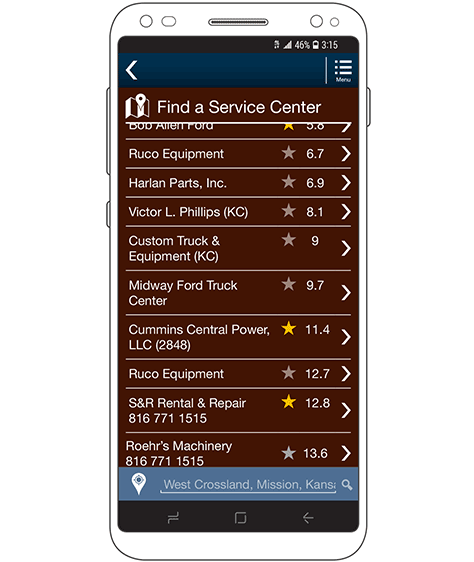
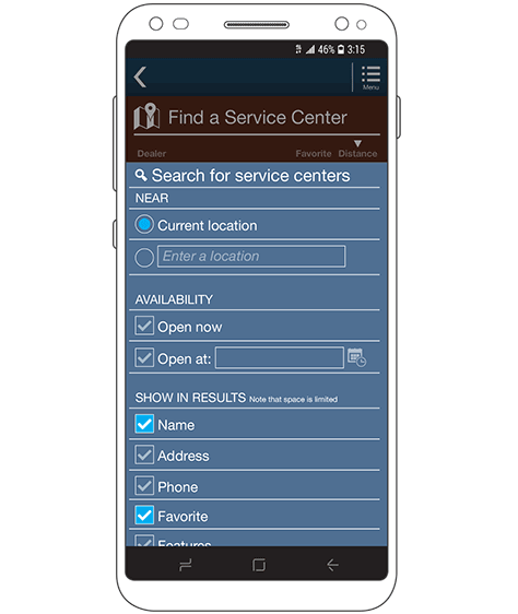
Figure 2 provides examples of all three of these tactics for making data more concise.
Figure 2—A mobile table with multiple columns and concise data
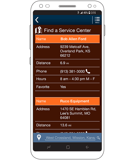
The original data includes the address, contact information, services performed, and more. But using our three guidelines, you can do the following:
Leave out useless data. The address, phone number, name of the manager, and many other details are not important in finding a service center, so you can simply leave them out.
Abbreviate and add icons. For example, rather than labeling the function Favorite, you can turn it into a simple icon using a star symbol. Plus, the icon is prominent enough that a user can find it by simply glancing at the list.
Eliminate repetition. Either don’t give the distances labels—or even any context indicating that values are in miles—or don’t show the table header, which would otherwise indicate what data is in the column.
Use Progressive Disclosure
It is also important that you think about processes holistically. Most of the time when I need to build a table, it presents information that the user can tap or click to display more data on a detail page. In such cases, there is no reason for everything to be in the table. The user just needs enough information to know which item to pick, then can get all of the details on the next page or in a popup or accordion.
Note that, in Figure 2, each row also includes an arrow at the right, indicating that users can select a row. All of the information that the designer has omitted from the table is instead on a detail page for the service center. Even if there is no direct requirement or obvious need for a subsidiary page, this is still a useful approach for minimizing the amount of information in the table.
As an alternative to simply loading a page, I like to use accordions within tables. While accordions can easily get out of hand and users can get lost inside very long ones, small accordions can work very well within tables.
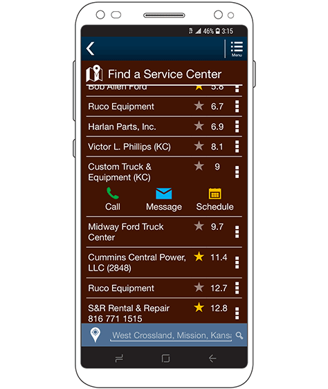
One common use of small areas within expanded accordions is for displaying actions. Imagine a desktop table with several actions on each row, in columns at the far right. Instead, you can show users that more actions are available—for example, by using a dot menu or an open accordion icon—then, when the user clicks a row, display the actions immediately below the data in that row, as shown in Figure 3.
Figure 3—Actions accordion expanded within a table
Designing Compact Tables
You can do a lot to make tables fit on a mobile screen and still be readable, using simple graphic-design techniques. While we call all of this UI design now in the digital era, for elements such as tables, these are exactly the same techniques print design has been using successfully for a few centuries.
Use Smaller Type
Your style guide or design system should provide a few sizes of text. Detailed content such as that in tables is one reason they exist. Using smaller text should actually make tables more readable because it provides enough room for the content to fit well.
Many try to get as much content into a table as possible, but if you use large text, you’ll have to take that space from margins and padding, which would reduce readability. Tables always comprise dense data, so users tend to peer into them, bringing their device closer to their eyes. Therefore, slightly smaller text sizes have less downside than you might think.
Emphasize the Important
With fairly few columns of data, tables often boil down to only a few key pieces of information. Try to find out what the most important information is, then emphasize it.
Fairly small values at the far right of a table are often the most important pieces of information, but because they are short strings and at the right, they are not naturally prominent. Adding emphasis, usually by making this data bold, helps users more readily find the information they need in the table. However, make as little data bold as possible. For example, if units follow values, bold only the value, not the units, as in this example: 12.5 cm. Date and time strings are another common example. Bold only the data itself, as in this example: June 21, 2020 at 11:42 pm.
Use Fewer Lines
When writing style guides and design systems, I often call tables list-tables because their visual arrangement consists of a mix of the two. A list view should have only horizontal lines separating rows—never vertical lines separating columns.
Adding vertical lines or greenbar—alternating colors for each row—adds visual clutter and encloses spaces between pieces of content. This sort of design traps the eye, preventing users from scanning across rows and down columns and making it more likely they’ll get lost in the content or misread a table.
Using consistent alignment of the content in a table lets users scan down columns to find the information they need. Thin horizontal rules help the eye to stay on and scan across each row to read the details.
Align Content
Consistency in the alignment of content within a table is critical. Each row must have the same alignment. What alignment? Ideally, I’d like to have some hard-and-fast rules for specific alignments for different types of data, but in practice that never seems to work.
For example, I love the idea of decimal-aligning all numbers. But most digital systems cannot do that, and hacks always have downsides. Also, this sometimes just looks weird.
So the best rules I have are as follows:
Left align the first item in the row, and any long text that might ever wrap.
Center almost everything in the middle columns, but especially short values and icons that represent functions and data.
Right align actions in the right column that apply to the entire row—such as reveal arrows and dot menus.
If a table is more like a list, with a single key value at the right, I often recommend right alignment for the right-most column as well.
Icons should have text labels, but where you should place them varies a lot, and I have no one way I always do this. Either center the label below the icon or left align the label to the right of the icon—making sure all icons align properly—so the labels can extend as far as necessary. Always use the same alignment for table headers as for the rows of content below them.
Use Vertical Alignment
Vertical alignment is one of my pet peeves because it’s so often wrong and the result is such poor usability. Always top align all data in rows. This allows long content to extend downward. Users scan across a row, looking at the first line of every column in turn, then might choose to continue reading the content in a particular column below a row.
Especially on mobile devices, where columns are very narrow, using vertically centered or bottom aligned text puts much of the content too far down on the page. In my experience, the text is often far enough down that it falls outside the foveal vision range and users literally do not see critical information at all.
But table headers are exactly the opposite and are always bottom aligned. For a basically complementary reason: to keep the headers adjacent to the content below. Top-aligned table headers would leave gaps between them and the content in the first row, which can be extremely confusing when column-spanning headers group the headers for several columns beneath them. Figure 4 shows an example of the effects of these vertical-alignment rules.
Figure 4—Spanning and multiline column headings in a table header
Although I haven’t investigated why this is so, controls such as arrows that indicate the user can tap or click a row or dot menus seem to work better when they’re vertically centered.
Let Users Scroll to See More
There is a common assumption that pagination of tables is the right UI design approach—but don’t do that. Tables, more than perhaps any other form of data, make very little sense when they’re broken up into pages. Often, tables are simply not long enough to warrant pagination, and presenting all of the data together takes no particular effort. If tables are or could be very long, use infinite-scrolling techniques to load additional table rows as the user scrolls down. If you think infinite scrolling is evil in some way, that’s just because you’ve encountered bad implementations. Pagination is always a much worse solution.
Create Adaptive Content
At its heart, responsive design, uses a single set of data, then either reformats or repurposes the data to fit different viewport sizes. Adaptive content informs the data store or server about the device on which the user is viewing the data, requests the data, and the server provides the most relevant content.
While responsive and adaptive design are actually Web technologies, the principles behind them can apply to any digital experience. Don’t assume that—just because the server provides some set of data today or the data for a desktop Web site—this is the data you must use or is all that is possible.
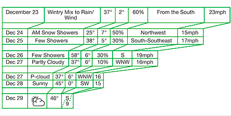
Likewise, if you design a good experience for which you’ve cut down the amount data for mobile phone, the tablet and computer versions don’t have to do the same. You can use adaptive principles to display more or fewer columns of data and more or less actual information in each column, depending on the space available. Figure 5 shows a chart explaining how to cut down data for smaller and smaller screens, for a weather app.
Figure 5—Adaptive table that displays weather information
This adaptive table makes the following adaptations:
removes descriptors—When there isn’t adequate space for the wind direction value, it removes from the from the string to save space.
abbreviates data—It uses abbreviations for wind direction, common terms, and even dates to save space.
removes information—When space is scarce, it can remove value-added features such as the percentage change of precipitation.
reduces information—When there ranges of data or other multiple-value data points, consider whether a single value could serve as a summary. This app shows only the high for the day.
combines fields—Concatenate closely coupled items of information such as wind direction and speed to save table-formatting space.
Some members of your project team might balk at this approach—or other suggestions in this column that involve removing or compressing content. Their argument will be that users need to see all of the data. But persuade everyone to think again about how users view content.
If there’s too much content, the text will wrap, making it is hard to read, or it necessitates the user’s scrolling from side-to-side so much that the user cannot see the data without scooting around. Or the table might turn into a responsive table that prevents the user from viewing much or any of the data at once. Regardless, you are choosing to reduce the user’s ability to view the data.
After designing hundreds of tables, I will always choose displaying less information, so I can present it in a more usable way.
Stack and Wrap Columns
One of my favorite tricks for designing mobile tables is adding more columns immediately below other columns. This is much easier to show than explain, so take a look at Figure 6, then read on.
Figure 6—Stacked columns
Notice that a rule, or line, still separates each row of the table, but there are two virtual rows of content within each table row.
Alignment is the critical trick here—even more than position. Note how, in the first column, all the Parameter Name labels are left aligned, but all the values are center aligned. They overlap and neither takes up a whole column of content, so this approach uses little or no extra width, but the alignment lets the user differentiate between them and scan down each column separately to find, compare, and read the two different virtual columns of data.
Even if the layout of the table data does not require it, I always use column headers to model the layout of the individual rows, in which the data share the same alignment and stacking as the headers.
Recognize that long content always wraps, and establish proper rules for this. Make sure that columns are wide enough, and set no-wrap rules to make sure that numerical values and other data that wouldn’t make sense on multiple lines stays on one line. You should usually allow longer values such as the parameter names in Figure 6 to wrap onto multiple lines, instead of truncating them and adding an ellipsis. Always left align wrapped text.
Label Only What You Must
So far, I have used table headers in my examples, but they are by no means required. Table headers add more complexity, can slow down users as they scan up and down a table, take up vertical space, and might scroll off the page.
You do not need to label obvious things—whether for context, format, or both. Your home address probably has a number attached to the outside of the building, near the front door. You know this is the street number—as does everyone. No building number ever has a Street number label just above it.
When space is at a premium, as in mobile tables, why label obvious fields? Refer again to Figure 2, which shows only name, a favorite star, and distance. These values are obvious because of their format and context, even without labels. Dates and times are other fields or columns that often do not need labels.
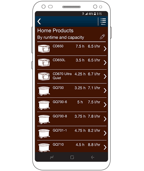
In tables, you can often get away with not labeling columns that, on their face, might not be so obvious, simply by adding a page title. Figure 7 shows a product-comparison chart. The columns at the right show values and units of measurement, but nothing else. There are no column headers because the page title, Home Products, and the subtitle, By runtime and capacity, suffice. For each product, the table shows its runtime and capacities—in units we assume the user would understand. Easy.
Figure 7—Title and subtitle obviate need for individual column headers
Allow Users to Customize Tables
This approach is hard to discuss because it applies to a situation in which one size absolutely does not fit all.
As a general rule, allowing users to customize user interfaces is pointless. For example, a tiny number of users would bother to drag and drop portlets to your dashboard. Similarly, users have a poor understanding of and rarely use sorting and filtering for tables.
However, depending on the data, your audience, and the way they would use table data, users sometimes demand sorting and filtering controls for tables. Your organization, subject-matter experts (SMEs), and product managers might all insist on more features. It’s up to you, as the designer, to remind everyone that adding more features increases complexity and risks making the basic information hard to understand.
If you decide to add customization controls, the key is to make them:
unobtrusive
optional
understandable
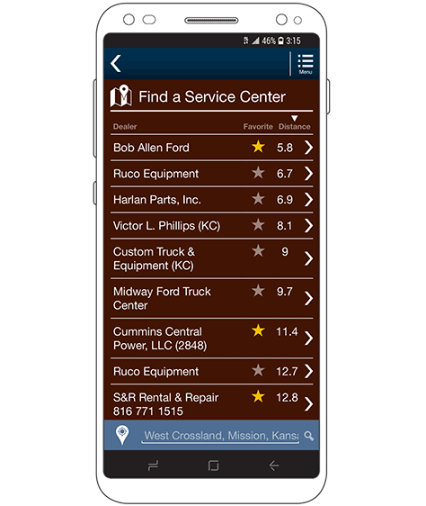
The table should work well in its default format, and you must present the table in a way that makes it clear what items the user can change. For example, in Figure 8, an arrow in the header indicates that the table is sorted by distance. The chyron at the bottom indicates that this is the distance from a specific location, and the fact that it is an input field implies that the user can change it.
Figure 8—A customizable table
The hardest idea for many teams to get their heads around is that the typical user does not understand the most basic jargon. I have encountered perhaps one test participant in my entire career who correctly understood what filter means. Hardly anyone—even on project teams—understands what a little funnel icon means. Never use that sort of stuff. But plain text is easy enough. I use the following two terms:
Show only—This label replaces Filter and the selectors for what filter to apply follow.
Show first—This label replaces Sort or Sort order and a sort-order selector follows.
Any number of other terms or phrases would be fine, as long as they communicate plainly and explain the function instead of using jargon or technical terms.
Make sure the control reads sensibly as a whole. The label and value Show first: A–Z would make no sense. You must write the label and selections to make sense together. For example, with the label Show, I have used the following options:
Lowest price first
Nearest locations first
A–Z
Z–A
Note that implicit labels such as these can cause issues if you do end up offering both sorting and filtering. Keep reviewing your proposed design to make sure no confusion arises as everyone offers their opinions on how to add features or label items.
Adding Controls
Assuming that you can reasonably justify adding more controls, they can provide good ways of solving the problems of complex tables.
We know that people can’t use more than a few columns at once. So one way of making complex tables work on small screens is to load only the minimum data that typical users need, then let them discover or add more information. For example, a drawer provides controls for customizing the display of the list in Figure 8. Expanding the drawer, as shown in Figure 9, provides many controls that would not easily fit within a table header.
Figure 9—Expanded table controls
When there are too many rows of data, this is an easy solution. Just provide search, sort, and filter functions to bubble the information users need to the top. Then use the drill-down functions I discussed earlier in this column to display more data in each row.
However, in some cases, users may really need more columns of data than can fit on a mobile screen, or there might be users with different data needs. Controls can also allow users to select which columns to display. Of course, it is important to keep the basics I discussed earlier in mind and limit the display of data to only those columns that fit on the screen. Do not let the user’s choice be your excuse for scrolling tables sideways. It is still wrong.
Conclusion
This is another of those columns in which I haven’t prescribed any one true way of solving design problems, but have given you options and guidelines. This is, in part, because needs and information can vary, but mostly because constraints do.
Most products have legacy data, and organizations often resist changing the data structure or APIs just to make a mobile Web site or app look better. Even startups have legacy data stores and—if they’re working well enough—can rarely justify spending effort changing them just for the user experience.
It takes a lot to persuade everyone that making any changes to the data is necessary, and you’ll likely lose those fights more often than not. Instead, you’ll have to try to write parsing rules to turn the data they give you into a useful presentation and format the information as best you can.
Remember that more people consume content on mobile devices than on desktop computers—across all locales and industries. Even when you need to display data in tables, mobile cannot be a second-class citizen.
Use your best design skills and the tips I have shared in this column to make sure users can always get the most accurate, complete picture of the information you are sharing with them.
Not sure that the infinite-scrolling is always better than the pagination.
Imagine a situation, when a user has to perform different actions with every single row of a table—for example, edit some information.
If there are a lot of rows, using infinite scroll, a user can’t simply return to the row where he stopped, then proceed. (The page can reload.) While, with pagination, the user would know the exact number of the page.
Thanks for your thoughts. My CEO is ‘Mobile first!’ even if it does not make sense, so does not want tables at all. We need to convince him that we need them for our business application.
For his entire 15-year design career, Steven has been documenting design process. He started designing for mobile full time in 2007 when he joined Little Springs Design. Steven’s publications include Designing by Drawing: A Practical Guide to Creating Usable Interactive Design, the O’Reilly book Designing Mobile Interfaces, and an extensive Web site providing mobile design resources to support his book. Steven has led projects on security, account management, content distribution, and communications services for numerous products, in domains ranging from construction supplies to hospital record-keeping. His mobile work has included the design of browsers, ereaders, search, Near Field Communication (NFC), mobile banking, data communications, location services, and operating system overlays. Steven spent eight years with the US mobile operator Sprint and has also worked with AT&T, Qualcomm, Samsung, Skyfire, Bitstream, VivoTech, The Weather Channel, Bank Midwest, IGLTA, Lowe’s, and Hallmark Cards. He runs his own interactive design studio at 4ourth Mobile. Read More
