Buy scanR Pro / Pricing for scanR Pro and Sign Up with scanR Pages User Experience Specification
Release: scanR 4.6
October 13, 2008
Author: Pabini Gabriel-Petit, VP,
User Experience
Copyright © 2007 scanR Inc. All rights reserved.
Revision History
| Date |
Author |
Contributors |
Description |
| 10/13/08 |
Pabini Gabriel-Petit |
— |
Revision 1, Version 1.0 |
1.0 Overview
This document specifies the user experience design for the Sign Up with scanR / Pricing for scanR Pro page for version 4.6 of the scanR Web application. The Sign Up with scanR / Pricing for scanR Pro page lets users sign up for a scanR account—or sign in to scanR, depending on whether they already have an account—find out about purchase plan options, and purchase scanR.
2.0 Definitions of Terms
- available
- (Adj.) Describes a button or option that does not appear dimmed. When a button or option appears available, the functionality is available, and a user can click or select it.
- dimmed
- (Adj.) Describes an unavailable feature or button that has a grayed out appearance. When a button or option appears dimmed, a user cannot click or select it.
- page title
- A text string that identifies the current page and appears on the page title bar on a Web page or a Web application page.
- page title bar
- A gradient bar beneath the header that displays the page title for a Web page.
- popup
- An Ajax popup that appears on top of a page within a browser window.
- progress message box
- An Ajax popup within a browser window that contains a progress bar.
- title
- A text string that appears on the browser window title bar and on any tab displaying a Web page in a browser window. The title for a specific Web page typically includes its page title—though there are exceptions—and may also include the company name or tagline.
- variable
- Conditional text that appears on a page and differs depending on state. Within specifications, variable text appears within brackets. For example, the text Remove [a photo/[#] photos]… represents the variable strings Remove a photo and Remove [#] photos, and the variable [#] represents a number of photos.
- wizard page title
- A text string that identifies the current wizard page and appears on the wizard page title bar on that wizard page.
- wizard page title bar
- A bar at the top of the main content area of a wizard page that displays the wizard page title for that wizard page.
3.0 Buy scanR Pro / Pricing for scanR Pro Page
The Buy scanR Pro / Pricing for scanR Pro page appears when a user clicks either of the following:
- Buy scanR Now button on the home page
- Pricing link on the footer linkbar on the home page, another marketing page, a blog page, the Sign In to scanR page, or another process-funnel page
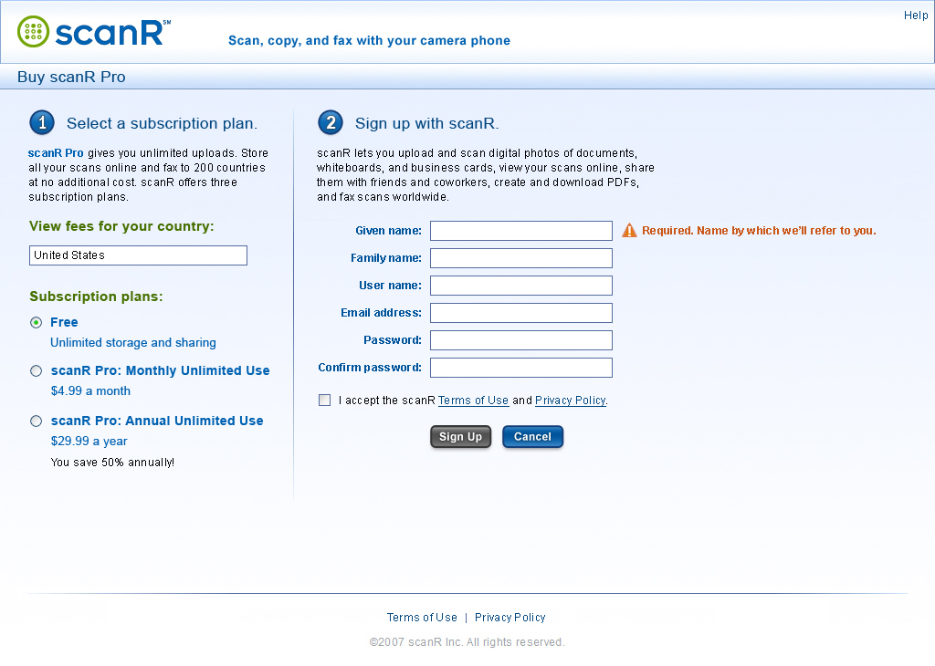
The Buy scanR Pro / Pricing for scanR Pro page, shown in Figure 3-1, lets users select a subscription plan and sign up for a scanR account, then if a user has selected a payment plan, purchase scanR Pro through Global Collect.
Figure 3-1—Buy scanR Pro page, default view

On both the browser title bar and the page title bar, the titles for the Buy scanR Pro / Pricing for scanR Pro page are conditional:
- If a user clicks the Buy scanR Now button on the home page to display this page:
- Title on the browser title bar: scanR :: Buy scanR Pro
- Title on the page title bar: Buy scanR Pro
- If a user clicks a Pricing link to display this page:
- Title on the browser title bar: scanR :: Pricing for scanR Pro :: Sign Up with scanR
- Title on the page title bar: Pricing for scanR Pro
The logo in the header is a link to the home page. By default, the header linkbar on the Buy scanR Pro / Pricing for scanR Pro page comprises only a Help link. Clicking this link displays the scanR Help page. If a user clicks Help and, therefore, navigates away from the Buy scanR Pro / Pricing for scanR Pro page after starting to fill out the subscription and signup forms, retain all of the information the user has provided and display it when the user navigates back to the Buy scanR Pro / Pricing for scanR Pro page.
Once a user has successfully signed up, the header linkbar on the Buy scanR Pro / Pricing for scanR Pro page comprises the following elements, separated by pipes:
- Welcome [Given Name]—This welcome text appears whenever a user is signed in. Given Name is a variable and displays the given name of the user who is signed in. This text is in bold.
- Sign Out—Clicking this link signs the user out, but the user remains on the same page.
- My Scans—Clicking this link displays the My Scans page.
- My Account—Clicking this link displays the My Account: Settings page.
- Language drop-down menu—Clicking this link, the green button to its right, or the space between them displays a menu comprising the following language options:
- English—On the US version of the site, this option is selected by default, so a check mark appears to its left.
- Japanese (in Japanese script)—On the Japanese version of the site, this option should be selected by default, so a check mark would appear to the left.
- Help—Clicking this link displays the scanR Help page.
By default, the footer linkbar on the Buy scanR Pro / Pricing for scanR Pro page comprises the following links, separated by pipes:
- Terms of Use—Clicking this link displays the scanR Terms of Use popup.
- Privacy Policy—Clicking this link displays the scanR Privacy Policy popup.
Once a user has successfully signed up, the footer linkbar comprises the following links, separated by pipes:
- Contact Us—Clicking this link displays the Contact scanR page.
- scanR Blog—Clicking this link displays the scanR Blog home page.
- About scanR—Clicking this link displays the About scanR page.
- Terms of Use—Clicking this link displays the scanR Terms of Use page.
- Privacy Policy—Clicking this link displays the scanR Privacy Policy page.
Note—The footer does not include a Pricing link, because the user is already on the Buy scanR Pro / Pricing for scanR Pro page.
On the Buy scanR Pro / Pricing for scanR Pro page, shown in Figure 3-1 in its default state:
- Purchasing scanR is a multi-step process:
- Step 1, on the left of the Buy scanR Pro / Pricing for scanR Pro page, lets a user select a subscription plan option.
- Step 2, on the right of the page, comprises a signup form.
- Once a user has completed
both of these steps, the user can click the Sign Up button to complete the signup process and, if the user has selected a payment plan, purchase scanR through Global Collect.
- By default, the Sign Up button appears dimmed.
- Once a user has completed
the form, the Sign Up button becomes available.
- Once a user clicks the Sign Up button, has successfully signed up, and is automatically signed in:
- If a user has selected the free subscription plan, do the following:
- Fade out the form in the main content area of the Buy scanR Pro / Pricing for scanR Pro page, then fade in the Signup successful! confirmation message, shown in Figure 5-1.
- Change the header and footer to their signed-in states.
- If a user has selected a payment plan, display the appropriate Global Collect ecommerce form for the selected payment plan.
- Once a user clicks the Sign Up button, if the signup is unsuccessful, fade out the form in the main content area of the Buy scanR Pro / Pricing for scanR Pro page, then fade in the Signup failed. error message page, shown in Figure 5-2.
- Once a user has completed the purchase process on Global Collect:
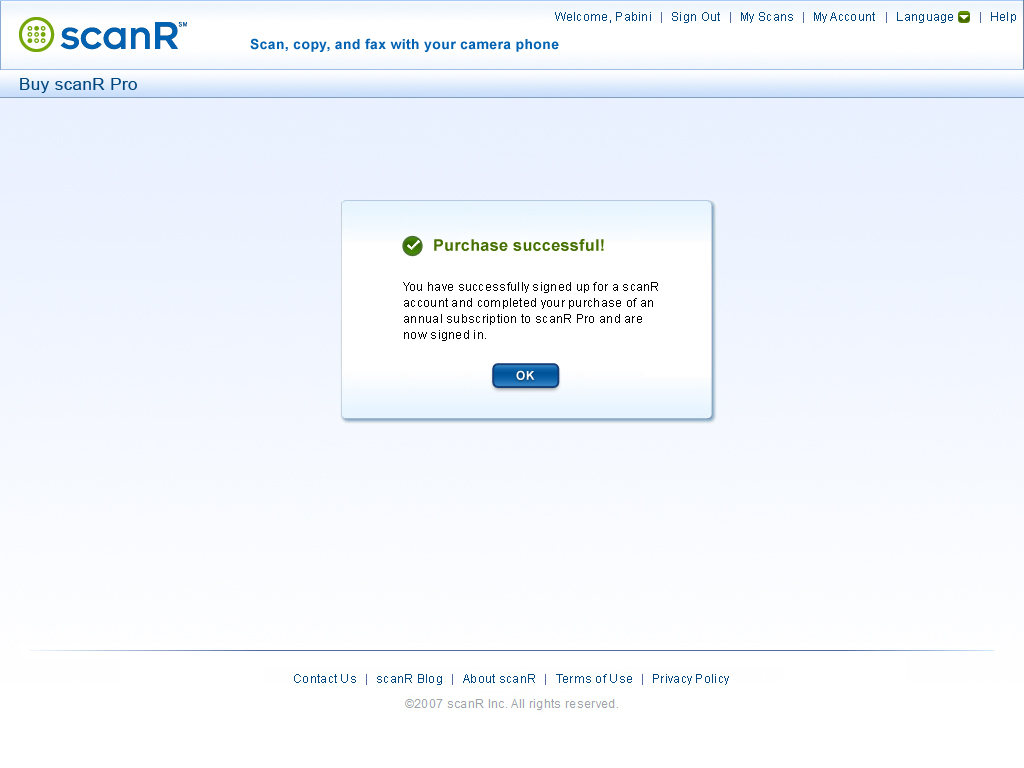
- If the user has successfully purchased scanR Pro, display the Purchase successful! confirmation message, which also indicates that the user has successfully signed up and is signed in.
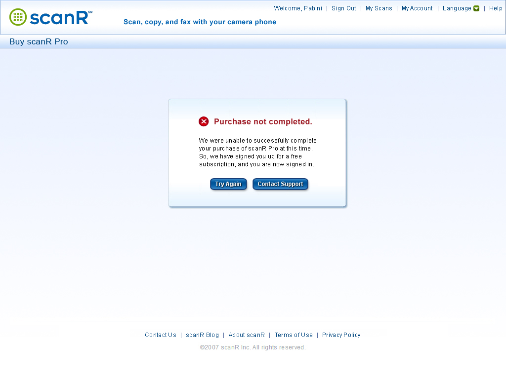
- If a user is unable to purchase scanR Pro successfully, the Purchase not completed. error message appears, which also indicates that the user has been signed up for a free subscription and is signed in.
3.1 Pricing for scanR Pro Group
The pricing information that appears on the Buy scanR Pro / Pricing for scanR Pro page comprises the following elements, as shown in Figure 3-1:
- Group label: 1 Select a subscription plan.
- Text: scanR Pro gives you unlimited uploads. Store all your scans online and fax to 200 countries at no additional cost. scanR offers three subscription plans.
- View fees for your country: autocompletion box: In this autocompletion box, display the country in which a user is currently located by default. If, for any reason, we are unable to detect the country in which the user is located, display the centered text —Type your country— by default. An alert icon and the user assistance text Required. appear beneath the box. The user assistance remains until the user selects a country. If a user clicks the View fees for your country autocompletion box, highlight the current country, or if no country is selected, select an insertion point, allowing the user to type another country name or abbreviation in the box. As the user types, interactively display a list of possible matches in a drop-down list beneath the box—that is, if the text the user types matches one or more country names, display each matching country name in the list. The most likely match appears at the top of the list and is highlighted by default. Matching text in each country name in the list should appear in bold, including text that matches abbreviations for country names such as US for United States, UK for United Kingdom, BVI for British Virgin Islands, CAR for Central African Republic, DPRK for North Korea, DRC or RDC for Democratic Republic of the Congo, KSA for Saudi Arabia, NKR for Nagorno-Karabakh Republic, RMI for Republic of the Marshall Islands, ROK for Republic of Korea, St. Barts for Saint Barthélemy, TRNC for Turkish Republic of Northern Cyprus, and UAE for United Arab Emirates. For example, if a user types US, select United States (US) in the drop-down list, with the abbreviation US in bold; if a user types USA, select United States (USA) in the drop-down list, with the abbreviation USA in bold; or if a user types DPRK, select North Korea (DPRK) in the drop-down list, with the abbreviation DPRK in bold. The user can press Down Arrow or Up Arrow to highlight a different item in the list. The user can press Tab or Enter to select the currently highlighted country. Alternatively, the user can click another country in the list to select it. Only the country name appears in the box, not any abbreviation.
- Subscription plans: group label—There are three subscription plan options—a free subscription plan and two payment plans. By default, display the fees for the two payment plans in the currency for the country in which a user is currently located. If we are unable to detect the country in which a user is located, display the fees in the default currency. If a user selects a different country in the View fees for your country autocompletion box, fade out the fees in the formerly selected currency, then fade in the fees in the currency for the country the user has selected. If a user does not type a known country, the fees should remain in the default currency. The fees in the payment plans derive from the database and are displayed dynamically.
- Free subscription plan option:
- Free option button—This option is selected by default.
- Unlimited storage and sharing
- Payment plan 1 option:
- scanR Pro: Monthly Unlimited Use option button
- $4.99 a month
- Payment plan
2 option:
- scanR Pro: Annual Unlimited Use option button
- $29.99 a year
- You save 50% annually!
3.2 Sign Up with scanR Form
The signup form on the Buy scanR Pro / Pricing for scanR Pro page, shown in Figure 3-1 in its default state, comprises the following elements, with user assistance appearing to the right of each field:
- Group label: 2 Sign up with scanR.
- Text: scanR lets you upload and scan digital photos of documents, whiteboards, and business cards, view your scans online, share them with friends and coworkers, create and download PDFs, and fax scans worldwide.
- Given name text box:
- By default, this field has the input focus, an insertion point appears in the Given name text box, and an alert icon and the user assistance text Required. Name by which we’ll refer to you. appear to the right of the box, as shown in Figure 3-1.
- Note—In the Japanese version, do not include the following UA text: Name by which we’ll refer to you. Instead, include the user assistance text Your full name identifies you to people with whom you share scans. Refer to a user by his or her full name—that is, family name followed by given name.
- In the English version of the form, a user can type 1 to 128 UTF-8 encoded Latin characters—without any restriction on case and with or without accents—spaces, hyphens, apostrophes, or periods.
- If a user presses Tab or clicks another field without typing a name, an error icon and the error message Type your given name. appear to the right of the box. The error message remains until the user types a name.
- If a user types more than 128 characters, an error icon and the error message Maximum length, 128 characters. appear to the right of the box.
- If a user types a name in the box, then presses Tab or clicks another field, a verification check mark appears to the right of the Given name text box.
- Family name text box:
- If a user moves the input focus to the Family name text box, an alert icon and the user assistance text Required appear to the right of the box.
- In the English version of the form, the user can type 1 to 128 UTF-8 encoded Latin characters—without any restriction on case and with or without accents—spaces, hyphens, apostrophes, or periods.
- If a user selects an insertion point in the box, then presses Tab or clicks another field without typing a name, an error icon and the error message Type your family name. appear to the right of the box. The error message remains until the user provides a name.
- If a user types more than 128 characters, an error icon and the error message Maximum length, 128 characters. appear to the right of the box.
- If a user types a name in the box, then presses Tab or clicks another field, a verification check mark appears to the right of the Family name text box.
- User name text box:
- A user can type 2 to 128 Unicode characters. A user name can include spaces, hyphens, apostrophes, or periods. This field is not case sensitive.
- If a user moves the input focus to the User name text box, an alert icon and the user assistance text Required. At least 2 characters. appear to the right of the box.
- If a user selects an insertion point in the box, then presses Tab or clicks another field without typing a valid user name, an error icon and the error message Type your user name. appear to the right of the box. The error message remains until the user provides a user name.
- If a user types only one character, then presses Tab or clicks another field, an error icon and the error message Minimum length, 2 characters. appear to the right of the box.
- If a user types more than 128 characters, an error icon and the error message Maximum length, 128 characters. appear to the right of the box.
- If a user types a name that is already is use, an error icon and the error message [Name] is not available. appear to the right of the box.
- Once a user types a name that is available, a verification check mark and the user assistance text [Name] is available. appear to the right of the box.
- If a user types a valid user name, then presses Tab or clicks another field, the verification check mark remains to the right of the User name text box.
- Email address text box:
- If a user moves the input focus to the Email address text box, an alert icon and the user assistance text Required. For notifications only. appear to the right of the box.
- If a user clicks a link in an email message that displays a page on the scanR Web site, retain the user’s email address throughout the current session, then, if the user navigates to the Buy scanR Pro / Pricing for scanR Pro page, prefill the Email address text box with it. For example, if a user clicks a link in an email message that displays the Sign In with scanR page, then navigates to the Buy scanR Pro / Pricing for scanR Pro page, prefill the Email address text box on the Buy scanR Pro / Pricing for scanR Pro page with the user’s email address.
- If a user selects an insertion point in the text box, then presses Tab or clicks another field without typing a valid email address, an error icon and the error message Type your email address. appear to the right of the box. The error message remains until the user provides an email address.
- Once a user starts typing an email address, an alert icon and the user assistance text Example: [email protected] appear to the right of the box.
- If a user types an invalid email address, an error icon and the error message Not a valid email address. appear to the right of the box.
- If a user types an invalid email address, then presses Tab or clicks another field, an error icon and the error message What’s your correct email address? appear to the right of the box. The error message remains until the user provides a valid email address.
- A valid email address is a string of up to 320 US-ASCII characters with values ranging from 1 through 127 and consists of the following:
- a local address, comprising up to 64 characters, case sensitive, and including any of the following:
- uppercase (ASCII values 65–90) and lowercase (ASCII values 97–122) letters
- digits 0 through 9 (ASCII values 48–57)
- ASCII characters ! (ASCII value 33), # (35), $ (36), % (37), * (42), / (47), ? (63), | (124), ^ (94), { (123), } (125), `(96), ~ (126), & (38), ' (39), + (43), - (45), = (61), or _ (95)
- dot characters (.) (ASCII value 46) that are not consecutive and are surrounded by other characters
- followed by the at-sign character (@) (ASCII value 64)
- followed by an Internet domain, comprising up to 255 characters
and including any of the following:
- uppercase and lowercase letters
- digits 0 through 9
- hyphens (ASCII value 45)
- dot characters (.) (ASCII value 46) that are not consecutive and are surrounded by other characters
- If a user types more than 320 characters, an error icon and the error message Maximum length, 320 characters. appear to the right of the box.
- Once a user types a valid email address, a verification check mark appears to the right of the box.
- If a user types a valid email address, then presses Tab or clicks another field, the verification check mark remains to the right of the Email address text box.
- Password text box:
- A password can comprise 6 to 128 characters.
- This field is case sensitive.
- If a user moves the input focus to the Password text box, an alert icon and the user assistance text Required. At least 6 characters. Case sensitive. appear to the right of the box.
- If a user selects an insertion point in the box, then presses Tab or clicks another field without typing a valid password, an error icon and the error message Type your password. appear to the right of the box. The error icon and message remain until the user provides a password.
- If a user types fewer than 6 characters, then presses Tab or clicks another field, an error icon and the error message Minimum length, 6 characters. appear to the right of the box.
- If a user types more than 128 characters, an error icon and the error message Maximum length, 128 characters. appear to the right of the box.
- Once a user types a valid password—that is, a password comprising between six and 128 characters—a verification check mark appears to the right of the Password text box.
- If a user types a valid password, then presses Tab or clicks another field, the verification check mark remains to the right of the Password text box.
- Confirm password text box:
- This field is case sensitive.
- If a user moves the input focus to the Confirm password text box, an alert icon and the user assistance text Type the same password. appear to the right of the box.
- If a user selects an insertion point in the box, then presses Tab or clicks another field without typing a password, an error icon and the error message Confirm your password. appear to the right of the box. The error message remains until the user confirms his password.
- If a user types fewer than 6 characters in the Password box, then, without providing a valid password, tabs to or clicks the Confirm password box, and types fewer than 6 characters, then presses Tab or clicks another field, an error icon and the error message Minimum length, 6 characters. appear to the right of the Confirm password box.
- A user must type the same password in this box. As a user types, if the user types a character that does not match the password the user typed in the Password text box, an error icon appears to the right of the box and the error message Passwords do not match. appears to the right of the label.
- If a user types a password that does not match the password the user typed in the Password text box, then presses Tab or clicks another field, an error icon and the error message Passwords do not match. remain to the right of the box.
- Once a user types a password that matches the password the user typed in the Password text box, a verification check mark appears to the right of the Confirm password text box.
- If a user types a password that matches the password the user typed in the Password text box, then presses Tab or clicks another field, the verification check mark remains to the right of the Confirm password text box.
- I accept the scanR Terms of Use and Privacy Policy. check box:
- Once a user confirms his password, an alert icon and the user assistance text Required appear to the right of this check box.
- If a user moves the input focus to the check box, an alert icon and the user assistance text Required appear to the right.
- If the user moves the input focus to the check box, then presses Tab or clicks another field without selecting the check box, an error icon and the error message Your acceptance is required. appear to the right. The error message remains until the user confirms selects the check box.
- If the user selects the check box, a verification check mark appears to the right.
- Sign Up button:
- This button appears dimmed until a user has successfully filled out the signup form.
- Clicking the Sign Up button submits the signup form.
- If signup is successful and the user has selected the free subscription plan:
- Create a user account with a free subscription plan.
- Fade out the signup form, then fade in the Signup successful! confirmation message, shown in Figure 5-1.
- Automatically sign in the user and change the linkbars in the page header and footer to their signed-in states, as shown in Figure 5-1.
- If signup is successful and the user has selected a payment plan:
- Create a user account with a free subscription plan.
- Display the appropriate Global Collect ecommerce form for the selected payment plan.
- Once the user has successfully purchased scanR Pro:
- Upgrade the user’s account to the selected payment plan.
- Display the Purchase successful! confirmation message, which also indicates that the user has successfully signed up and is signed in, as shown in Figure 5-3.
- Automatically sign in the user and change the linkbars in the page header and footer to their signed-in states, as shown in Figure 5-3.
- If a user is unable to purchase scanR Pro successfully:
- Display the Purchase not completed. error message, which also indicates that the user has been signed up for a free subscription and is signed in, as shown in Figure 5-4.
- Automatically sign in the user and change the linkbars in the page header and footer to their signed-in states, as shown in Figure 5-4.
- If the signup is not successful, fade out the signup form, then fade in the Signup failed. error message, shown in Figure 5-2.
- Cancel button—Clicking Cancel displays the home page.
If any of the user assistance text on the Buy scanR Pro / Pricing for scanR Pro page cannot appear in full, truncate it and display an ellipsis following the text. If a user points to truncated UA text, display a ToolTip containing the full text.
4.0 Sign Up with scanR Page
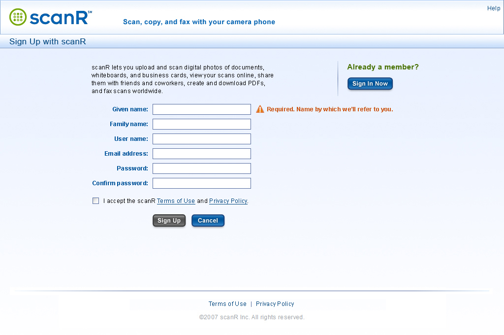
The Sign Up with scanR page appears when a user clicks the Sign Up link on the header linkbar. Shown in Figure 4-1, the Sign Up with scanR page lets a user sign up for a free scanR account—or, if he already has an account, but has not yet signed in, click a Sign In Now button to sign in to scanR on the Sign In to scanR page instead.
Figure 4-1—Sign Up with scanR page, default view

The title for this page, on both the browser title bar and on the page title bar, is Sign Up with scanR.
The logo in the header is a link to the home page. By default, the header linkbar on the Sign Up with scanR page comprises only a Help link. Clicking this link displays the scanR Help page. If a user clicks Help and, therefore, navigates away from the Sign Up with scanR page after starting to fill out the signup form, retain all of the information the user has provided and display it when the user navigates back to the Sign Up with scanR page.
Once a user has signed up and is signed in, the header linkbar comprises the following elements, separated by pipes:
- Welcome [Given Name]—This welcome text appears whenever a user is signed in. Given Name is a variable and displays the given name of the user who is signed in. This text is in bold.
- Sign Out—Clicking this link signs the user out, but the user remains on the same page.
- My Scans—Clicking this link displays the My Scans page.
- My Account—Clicking this link displays the My Account: Settings page.
- Language drop-down menu—Clicking this link, the green button to its right, or the space between them displays a menu comprising the following language options:
- English—On the US version of the site, this option is selected by default, so a check mark appears to its left.
- Japanese (in Japanese script)—On the Japanese version of the site, this option should be selected by default, so a check mark would appear to the left.
- Help—Clicking this link displays the scanR Help page.
By default, the footer linkbar on the Sign Up with scanR page comprises the following links, separated by pipes:
- Terms of Use—Clicking this link displays the scanR Terms of Use popup.
- Privacy Policy—Clicking this link displays the scanR Privacy Policy popup.
Once a user has signed up and is signed in, the footer linkbar comprises the following links, separated by pipes:
- Contact Us—Clicking this link displays the Contact scanR page.
- Pricing—Clicking this link displays the Buy scanR Pro / Pricing for scanR Pro page, which includes purchase plan options.
- scanR Blog—Clicking this link displays the scanR Blog home page.
- About scanR—Clicking this link displays the About scanR page.
- Terms of Use—Clicking this link displays the scanR Terms of Use page.
- Privacy Policy—Clicking this link displays the scanR Privacy Policy page.
On the Sign Up with scanR page, shown in Figure 4-1 in its default state:
- By default, the Sign Up button appears dimmed.
- Once a user has completed
the signup form, the Sign Up button becomes available.
- Once a user clicks the Sign Up button, has successfully signed up, and is automatically signed in:
- Display the Signup successful! confirmation message, shown in Figure 5-1.
- Change the header and footer to their signed-in states.
- Once a user clicks the Sign Up button, if the signup is unsuccessful, display the Signup failed. error message page, shown in Figure 5-2.
- If a user already has a scanR account, the user can click the Sign In Now button to sign in on the Sign In to scanR page instead. By default, the Sign In Now button is available. This button appears on the right.
- Once a user begins filling out the signup form, the Sign In Now button remains available. If a user clicks the Sign In Now button, retain any user name and/or password the user typed in the signup form and display them in the signin form on the Sign In to scanR page.
- Once a user begins filling out the signin form on the Sign In to scanR page, if a user clicks the Sign Up link, retain any user name and/or password the user typed in the signin form and display them in the signup form on the Sign Up with scanR page.
The Sign Up with scanR page, shown in Figure 4-1 in its default state, comprises the following elements, with user assistance appearing to the right of each field in the signup form:
- Text: scanR lets you upload and scan digital photos of whiteboards, documents, and business cards, view your scans online, share them with friends and coworkers, create and download PDFs, and fax scans worldwide.
- Sidebar box:
- Group label: Already a member?
- Sign In Now button: If a user already has a scanR account, the user can click the Sign In Now button to sign in on the Sign In to scanR page instead. The Sign In Now button is available by default. Clicking this button displays the Sign In to scanR page.
- Given name text box:
- By default, this field has the input focus, an insertion point appears in the Given name text box, and an alert icon and the user assistance text Required. Name by which we’ll refer to you. appear to the right of the box, as shown in Figure 4-1.
- Note—In the Japanese version, do not include the following UA text: Name by which we’ll refer to you. Instead, include the user assistance text Your full name identifies you to people with whom you share scans. Refer to a user by his or her full name—that is, family name followed by given name.
- In the English version of the form, a user can type 1 to 128 UTF-8 encoded Latin characters—without any restriction on case and with or without accents—spaces, hyphens, apostrophes, or periods.
- If a user presses Tab or clicks another field without typing a name, an error icon and the error message Type your given name. appear to the right of the box. The error message remains until the user types a name.
- If a user types more than 128 characters, an error icon and the error message Maximum length, 128 characters. appear to the right of the box.
- If a user types a name in the box, then presses Tab or clicks another field, a verification check mark appears to the right of the Given name text box.
- Family name text box:
- If a user moves the input focus to the Family name text box, an alert icon and the user assistance text Required appear to the right of the box.
- In the English version of the form, the user can type 1 to 128 UTF-8 encoded Latin characters—without any restriction on case and with or without accents—spaces, hyphens, apostrophes, or periods.
- If a user selects an insertion point in the box, then presses Tab or clicks another field without typing a name, an error icon and the error message Type your family name. appear to the right of the box. The error message remains until the user provides a name.
- If a user types more than 128 characters, an error icon and the error message Maximum length, 128 characters. appear to the right of the box.
- If a user types a name in the box, then presses Tab or clicks another field, a verification check mark appears to the right of the Family name text box.
- User name text box:
- In the English version of the form, a user can type 2 to 128 US-ASCII characters, spaces, hyphens, apostrophes, or periods. This field is not case sensitive.
- If a user moves the input focus to the User name text box, an alert icon and the user assistance text Required. At least 2 characters. appear to the right of the box.
- If a user selects an insertion point in the box, then presses Tab or clicks another field without typing a valid user name, an error icon and the error message Type your user name. appear to the right of the box. The error message remains until the user provides a user name.
- If a user types only one character, then presses Tab or clicks another field, an error icon and the error message Minimum length, 2 characters. appear to the right of the box.
- If a user types more than 128 characters, an error icon and the error message Maximum length, 128 characters. appear to the right of the box.
- If a user types a name that is already is use, an error icon and the error message [Name] is not available. appear to the right of the box.
- Once a user types a name that is available, a verification check mark and the user assistance text [Name] is available. appear to the right of the box.
- If a user types a valid user name, then presses Tab or clicks another field, the verification check mark remains to the right of the User name text box.
- Email address text box:
- If a user moves the input focus to the Email address text box, an alert icon and the user assistance text Required. For notifications only. appear to the right of the box.
- If a user clicks a link in an email message that displays a page on the scanR Web site, retain the user’s email address throughout the current session, then, if the user navigates to the Sign Up with scanR page, prefill the Email address text box with it. For example, if a user clicks a link in an email message that displays the Sign In with scanR page, then navigates to the Sign Up with scanR page, prefill the Email address text box on the Sign Up with scanR page with the user’s email address.
- If a user selects an insertion point in the text box, then presses Tab or clicks another field without typing a valid email address, an error icon and the error message Type your email address. appear to the right of the box. The error message remains until the user provides an email address.
- Once a user starts typing an email address, an alert icon and the user assistance text Example: [email protected] appear to the right of the box.
- If a user types an invalid email address, an error icon and the error message Not a valid email address. appear to the right of the box.
- If a user types an invalid email address, then presses Tab or clicks another field, an error icon and the error message What’s your correct email address? appear to the right of the box. The error message remains until the user provides a valid email address.
- A valid email address is a string of up to 320 US-ASCII characters with values ranging from 1 through 127 and consists of the following:
- a local address, comprising up to 64 characters, case sensitive, and including any of the following:
- uppercase (ASCII values 65–90) and lowercase (ASCII values 97–122) letters
- digits 0 through 9 (ASCII values 48–57)
- ASCII characters ! (ASCII value 33), # (35), $ (36), % (37), * (42), / (47), ? (63), | (124), ^ (94), { (123), } (125), `(96), ~ (126), & (38), ' (39), + (43), - (45), = (61), or _ (95)
- dot characters (.) (ASCII value 46) that are not consecutive and are surrounded by other characters
- followed by the at-sign character (@) (ASCII value 64)
- followed by an Internet domain, comprising up to 255 characters
and including any of the following:
- uppercase and lowercase letters
- digits 0 through 9
- hyphens (ASCII value 45)
- dot characters (.) (ASCII value 46) that are not consecutive and are surrounded by other characters
- If a user types more than 320 characters, an error icon and the error message Maximum length, 320 characters. appear to the right of the box.
- Once a user types a valid email address, a verification check mark appears to the right of the box.
- If a user types a valid email address, then presses Tab or clicks another field, the verification check mark remains to the right of the Email address text box.
- Password text box:
- A password can comprise 6 to 128 characters.
- This field is case sensitive.
- If a user moves the input focus to the Password text box, an alert icon and the user assistance text Required. At least 6 characters. Case sensitive. appear to the right of the box.
- If a user selects an insertion point in the box, then presses Tab or clicks another field without typing a valid password, an error icon and the error message Type your password. appear to the right of the box. The error icon and message remain until the user provides a password.
- If a user types fewer than 6 characters, then presses Tab or clicks another field, an error icon and the error message Minimum length, 6 characters. appear to the right of the box.
- If a user types more than 128 characters, an error icon and the error message Maximum length, 128 characters. appear to the right of the box.
- Once a user types a valid password—that is, a password comprising between six and 128 characters—a verification check mark appears to the right of the Password text box.
- If a user types a valid password, then presses Tab or clicks another field, the verification check mark remains to the right of the Password text box.
- Confirm password text box:
- This field is case sensitive.
- If a user moves the input focus to the Confirm password text box, an alert icon and the user assistance text Type the same password. appear to the right of the box.
- If a user selects an insertion point in the box, then presses Tab or clicks another field without typing a password, an error icon and the error message Confirm your password. appear to the right of the box. The error message remains until the user confirms his password.
- If a user types fewer than 6 characters in the Password box, then, without providing a valid password, tabs to or clicks the Confirm password box, and types fewer than 6 characters, then presses Tab or clicks another field, an error icon and the error message Minimum length, 6 characters. appear to the right of the Confirm password box.
- A user must type the same password in this box. As a user types, if the user types a character that does not match the password the user typed in the Password text box, an error icon appears to the right of the box and the error message Passwords do not match. appears to the right of the label.
- If a user types a password that does not match the password the user typed in the Password text box, then presses Tab or clicks another field, an error icon and the error message Passwords do not match. remain to the right of the box.
- Once a user types a password that matches the password the user typed in the Password text box, a verification check mark appears to the right of the Confirm password text box.
- If a user types a password that matches the password the user typed in the Password text box, then presses Tab or clicks another field, the verification check mark remains to the right of the Confirm password text box.
- I accept the scanR Terms of Use and Privacy Policy. check box:
- Once a user confirms his password, an alert icon and the user assistance text Required appear to the right of this check box.
- If a user moves the input focus to the check box, an alert icon and the user assistance text Required appear to the right.
- If the user moves the input focus to the check box, then presses Tab or clicks another field without selecting the check box, an error icon and the error message Your acceptance is required. appear to the right. The error message remains until the user confirms selects the check box.
- If the user selects the check box, a verification check mark appears to the right.
- Sign Up button:
- This button appears dimmed until a user has successfully filled out the signup form.
- Clicking the Sign Up button submits the signup form.
- If signup is successful:
- Create a user account with a free subscription plan.
- Fade out the signup form, then fade in the Signup successful! confirmation message, shown in Figure 5-1.
- Automatically sign in the user and change the linkbars in the page header and footer to their signed-in states, as shown in Figure 5-1.
- If the signup is not successful, fade out the signup form, then fade in the Signup failed. error message, shown in Figure 5-2.
- Cancel button—Clicking Cancel displays the home page.
If any of the user assistance text on the Sign Up with scanR page cannot appear in full, truncate it and display an ellipsis following the text. If a user points to truncated UA text, display a ToolTip containing the full text.
5.0 Messages
This section documents the confirmation and error messages that can appear on either the Buy scanR Pro / Pricing for scanR Pro page and/or the Sign Up with scanR page when a user signs up and/or purchases scanR Pro.
5.1 Signup Successful! Confirmation Message
Once a user clicks the Sign Up button—on either the Buy scanR Pro / Pricing for scanR Pro page or the Sign Up with scanR page—and has successfully signed up, if the user has selected the free subscription plan:
- Fade out the signup form.
- On the Buy scanR Pro / Pricing for scanR Pro page, also fade out the subscription plan options.
- On the Sign Up with scanR page, also fade out the Already a member? group.
- Then fade in the Signup successful! confirmation message, shown in Figure 5-1.
- Automatically sign in the user and change the linkbars in the page header and footer to their signed-in states, as shown in Figure 5-1.
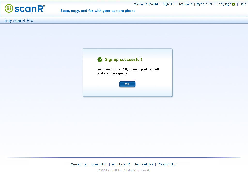
The Signup successful! confirmation message comprises the following elements:
- Message title and confirmation check mark icon: Signup successful!
- Message text: You have successfully signed up with scanR and are now signed in.
- OK button—Clicking OK displays the My Scans page.
Figure 5-1—Signup successful! confirmation message

5.2 Signup Failed Error Message
Once a user clicks the Sign Up button—on either the Buy scanR Pro / Pricing for scanR Pro page or the Sign Up with scanR page—if a user is unable to sign up successfully, fade out the signup form—and any subscription plan options or Already a member? group—then fade in the Signup failed. error message, shown in Figure 5-2.
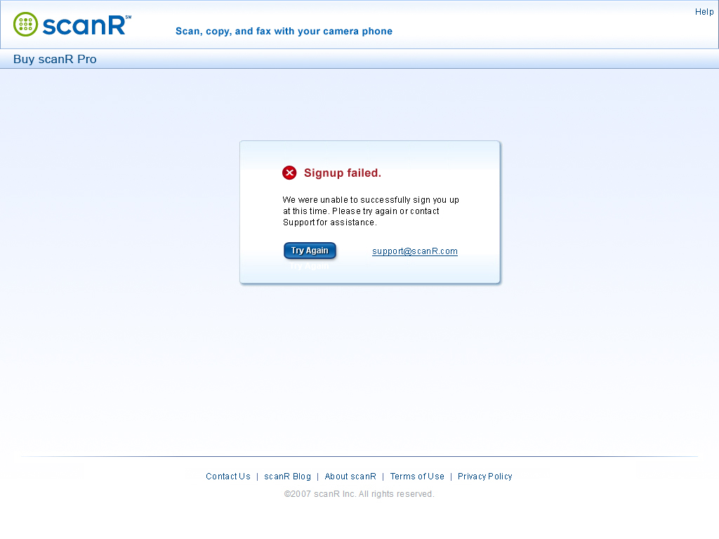
The Signup failed. error message comprises the following elements:
- Message title and error icon: Signup failed. (Note closing period.)
- Message text: We were unable to successfully sign you up at this time. Please try again or contact Support for assistance.
- Try Again button—Clicking Try Again fades out the Signup failed. error message, then, depending on the page on which the user clicked Sign Up, fades in either the Buy scanR Pro / Pricing for scanR Pro page or the Sign Up with scanR page, in its default state.
- [email protected]—A user can click this mailto link to send an email message to scanR Support.
Figure 5-2—Signup failed. error message

5.3 Purchase Successful! Confirmation Message
Once a user successfully purchases scanR Pro, the Purchase successful! confirmation message appears on the Buy scanR Pro / Pricing for scanR Pro page, as shown in Figure 5-3, indicating the user has successfully completed the purchase.
Figure 5-3—Purchase successful! confirmation message

The Purchase successful! confirmation message comprises the following elements:
- Message title and confirmation check mark icon: Purchase successful!
- Message text: You have successfully signed up for a scanR account and completed your purchase of [a monthly/an annual] subscription to scanR Pro and are now signed in.
- OK button—Clicking OK displays the My Scans page.
Since the user is now signed in, change the linkbars in the page header and footer to their signed-in states, as shown in Figure 5-3.
5.4 Purchase Not Completed Error Message
If a user is unable to purchase scanR Pro successfully, the Purchase not completed. error message appears on the Buy scanR Pro / Pricing for scanR Pro page, as shown in Figure 5-4, indicating the user has not successfully completed the purchase.
Figure 5-4—Purchase not completed. error message

The Purchase not completed. error message comprises the following elements:
- Message title and error icon: Purchase not completed. (Note closing period.)
- Message text: We were unable to successfully complete your purchase of scanR Pro at this time. So, we have signed you up for a free subscription, and you are now signed in.
- Try Again button—Clicking Try Again displays the Subscription tab on the My Account page.
- Contact Support button—Clicking this button displays the Contact Support page.
Since the user is now signed in, change the linkbars in the page header and footer to their signed-in states, as shown in Figure 5-4.


