Top

Evaluating the Usability of Search Forms Using Eyetracking: A Practical Approach

January 23, 2006

In this article, I’ll present findings from eyetracking tests we did to evaluate the best solutions for label placement in Web forms. Today, forms are the primary—often the only—way users have of sending data to Web sites. Web 2.0 makes extensive use of forms. For example, on Flickr™, Del.icio.us, and Writeboard™—which, by the way, I used when writing this article—users provide all of their tags, comments, and other information using forms. Users submit queries to search engines using forms. Ecommerce sites also rely heavily on forms that let visitors find and purchase products. (I’ve never browsed for books on Amazon®. I always search for them.)

So, the usability of forms is often massively important to the overall usability of a Web site. That’s why we decided to subject some of these forms to a quick round of eyetracking tests and have analyzed the resulting data to better understand what makes Web forms usable—or unusable.

We conducted these evaluations in the Consultechnology eyetracking lab. Magda Giacintucci assisted me in conducting the tests and setting up the lab. Three different groups of users participated in the tests. We classified the users by their level of expertise using the Internet—rookie, intermediate, and pro. In the pro group, I included people from my team—from both the programming and user experience groups. I’d like to stress the fact that it was our aim to do these tests quickly and simply, in order to gain practical knowledge that would help us improve the design of forms rather than to do scientific analysis for an academic paper.

Champion Advertisement
Continue Reading…

Testing Search Forms

We began our tests by observing and analyzing users’ behavior when using search on these popular sites:

Google

As I mentioned previously, we used Google during our training tests. This training test ensured that users could complete the subsequent tasks without any hesitation because of confusion about the task itself. During this very first test, the pattern I described previously first arose, highlighting the way rookie users interact with search: continually jumping from the input field to the submit button, as many as three times. There really are no intermediate users of Google, but the behavior of all pro users was characteristic of the way they’d interact with a well-known form. They just took one look to acquire the visual target—the search input field—typed the search string, then pressed Enter to submit the search—almost without looking at the submit button.

How We Tested

We held three different rounds of test sessions. In the sessions, each individual user evaluated the user interfaces we were testing in random order. During the first round of testing, we tested the usability of search forms. Each session started with a training task, through which our testers demonstrated the task that the user would repeat throughout the test session, using a form that was well known to all the users: Google™ search. Then, the user used other search forms to perform this task: locate the search box, then search for eye. The task ended when the user clicked the submit button.

Patterns in the Test Results

Even though some unanticipated results came to our attention during the tests, strong patterns emerged in the test results. These patterns arose from the way users’ different levels of expertise affect the way they look at forms. While rookies repeatedly scanned the form—both up and down and left to right, the pro users looked directly at what they knew were the tools they needed to complete their task.

Gaze plots showed the very different behaviors of rookies and pros when using search forms, as follows:

  • As shown in Figure 1, the rookie user looked at the input field, then the submit button, then the label; then looked again at the input field, the submit button, and the label. Looping repeatedly through this pattern, even when typing the search string, she continued to look at all the form elements to assure herself she was doing the right thing.
  • The pro user’s first fixation was directly on the input field. She didn’t look at anything else until she’d typed the text string and was ready to submit the search. Then, a long saccade moved the user’s focus to the submit button—which the user had perceived peripherally, but never looked at before—and, typically, pro users activated the submit button using the Enter key. In one case, we had the longest saccade ever recorded in our tests: nearly 600 pixels wide!
Figure 1—Gaze plot showing the use of Google search by a rookie user
Gaze plot of rookie user looking at Google search interface

Rookies needed reassurance that their actions were correct, so while typing search strings, they continually checked whether the input field they were using was actually the search field. Though we first noticed this pattern while analyzing the use of search forms, we found that this pattern was also characteristic of novice users’ behavior during more complex tasks.

Practical advice to UX designers—Clearly label input fields. Doing so won’t bother pro users, but is a great help to your novice users.

Amazon and eBay

On Amazon.com, in addition to a not-so-great search form design, the presence of the A9 search form distracts users and causes confusion. So, it took a long time—more than 1.6 seconds—for rookies to fully comprehend the search form.

On both Amazon and eBay, there is a drop-down list very near the search input field, which users can use to limit searches to specific categories of items. We found that users always looked at these lists first and for the longest time. Figure 2 is a heat map that shows the amount of time all rookies collectively spent looking at each interface element in the search form on eBay. All users seemed to perceive the list as the most important part of the form—probably because it’s clearly an interactive element that allows a more complex interaction.

Figure 2—Time rookies looked at elements of eBay search form
Cumulative time spent by rookies looking at eBay search interface

When a search form is on a page with a lot of content, as in these cases, a clear and prominent label for the input field helps users to find and recognize the form and reduces the number of repeated fixations they need to reassure themselves that they’re using the correct input field. On eBay, the submit button—which is the element in the search form that is furthest to the right—provides the only label. This obliges users to perform frequent fixations on that area of the screen, then return to the input field, which increases the cognitive workload of performing the task.

Pro users never again looked at either the label or the drop-down list—even though some fixations on this element incremented their cognitive load—but once they had typed the search string, fixated directly on the submit button. Figure 3 is a heat map showing the cumulative time all pros spent looking at each interface element in the search form on Amazon.

Figure 3—Time pros looked at elements of Amazon search form
Cumulative time spent by pros looking at Amazon search interface

Flickr

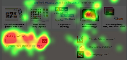
Though the search form is definitely not a prominent feature on the Flickr Web site, I wanted to check how their search form would perform. I thought this form would perform better than the others, because their search form is very compact, with a label just above a narrow input field and a clearly labeled submit button. Figure 4 shows the time all users spent looking for, then focusing on the elements in the search form on Flickr.

Figure 4—Time all users spent looking at Flickr
Heat map of Flickr

In fact, for all three groups of users, this form performed better than any of the other search forms we evaluated during this round of testing. Because of the compactness of the whole form, it took less than one second to visually navigate it. Plus, in looking at the clearly labeled input field, rookie users were reassured of the form’s purpose.

useit.com

Jakob Nielsen has written a lot about form usability—mainly, but not only, in regard to ecommerce sites. So, I thought it would be interesting to test the search form on his useit.com site—which has no label for its input field.

Neither rookie nor intermediate users noticed the form immediately, so we might conclude that the de facto standard of placing a search form at the upper right on a Web page didn’t work well for those test subjects. Also, as shown in Figure 5, the absence of a label forced the rookie users to double-check the input button on the far right, in order to reassure themselves of the form’s purpose. However, pro users, who are probably the target users for Dr. Nielsen’s site, immediately—at their third fixation on the page—noticed the form and typed their search string.

Figure 5—Scan path of rookie’s use of the Useit.com search form
A rookie user’s scanpath on Jakob Nielsen’s site

Guidelines for Search Forms

Though this was not an in-depth study on search form usability, we were able to identify a few interesting design guidelines for search forms:

  • Form labels help rookie and intermediate users, who look for such labels when trying to locate a site’s search interface. These users expect input field labels to be at the left of the search form. Pro users don’t need and won’t use these labels, which are simply invisible to them.
  • Drop-down lists are very eye catching form elements. You should always consider very carefully whether you should include a drop-down list in a search form. Use a drop-down list only if no alternative element would serve its purpose as well. Maintain adequate distance between the drop-down list and other elements in the search form. In general, if you want to create a simple search form that is easy to use for even novice users, avoid using drop-down lists in the form, because they tend to cognitively overload users.
  • Compactness makes search forms easier to peruse. Therefore, make search forms as compact as possible. Most users visually navigate a form broadly before they can understand its scope, so the smaller the area of a page over which they’re forced to navigate, the better. In our tests, the site search form that performed best was that on Flickr. Their search form is very compact, with a label placed over the input field, so users need look at only one place on the page. Thus, our test results suggest that the ideal location for the label of an input field in a search form is left aligned, immediately above the field.
  • Consistent placement of search forms in a standard location on Web pages overcomes some of the problems of unlabeled input fields. If you don’t want to label the input field, at least place your search form in a discrete area of the page where it’s simple for users to understand its purpose. If you do so, your form will serve not only pro users, who usually don’t look at the labels, but also rookies, who rely heavily on such labels to perform their tasks.

In this article, I have just begun my investigation of form usability, an important and interesting area for usability evaluation. To complete my evaluation of form usability, I’m preparing to conduct another series of eyetracking tests, during which I’ll test label placement in forms. What is the best position for labels? What is the most usable alignment? How prominent should form labels be? Stay tuned to UXmatters for the next article in my series of articles on eyetracking, which will cover my analysis of the results of these tests! 

Executive Director, Technology at frog

Milan, Italy

Matteo PenzoAt Consultechnology, an ITC company with offices in Milan and Lamezia Terme, Italy, Matteo conducted research projects that focused on natural interactions between people and computers, automotive applications, and universal design—specifically for the elderly and the disabled. Matteo began his career in information technology working for Anixter International at their Milan and London offices, managing their intranet design and programming team. Then he worked as a project manager for a leading Italian Web agency in Milan, where he managed Internet projects for international Fortune 500 companies. Matteo is a sought after speaker at national and international seminars—including CHI2005, Macromedia, and VNU to mention just a few—and is a professor for the Interaction Design course in the Masters program in Humanistic Computer Studies at Bicocca University, Milan. He has written numerous articles on the subjects of natural interfaces, user experience, and technological innovation. He is also the UXnet Local Ambassador for Milan.  Read More

Other Articles on Eyetracking

New on UXmatters