Top

Using Expression Blend to Explore, Demonstrate, and Document Design Solutions

November 2, 2009

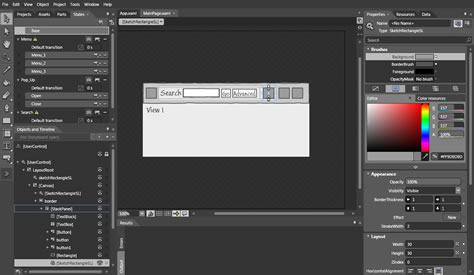
For the last 6 months, I have been using Microsoft Expression Blend as my primary design tool. Blend, shown in Figure 1, is quickly becoming a powerful product. Its new Sketchflow module had me at hello. Like any new tool, Blend requires some ramp up time. Plus, I had to consider how to use Blend within the design and development process where I work, because Blend is much more than a simple prototyping tool. Blend is a GUI development tool that can easily produce deployable code for the Windows Presentation Foundation (WPF) and Silverlight platforms. As an interaction designer, I had to wonder, Do I really want to create production-ready code? There is no simple or correct answer to this question. It depends on your specific situation, the skills you possess, and ultimately, how you view your own role as an interaction designer within your organization.

Champion Advertisement
Continue Reading…
Figure 1—Blend, first and foremost a GUI development tool
Blend

The Sketchflow module adds two panels to Blend, Sketchflow Map and Sketchflow Animation, as shown in Figure 2. Sketchflow Map lets you create and link screens and reusable components. Sketchflow Animation lets you create animations in a storyboard fashion. It is a simplification of functionality that is already in Blend. There are a couple of other slight differences. I’m not sure why it’s even a separate module.
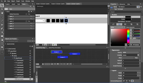
Figure 2—Sketchflow module
Sketchflow module

My experience using Blend has led to me to reevaluate not only how I design, but also what I deliver at the end of the design process. As I began to use Sketchflow, I seriously wondered whether I would ever create a static wireframe again. Why bother when I could quickly create dynamic, digital sketches that become working prototypes with a click of a button? For the first time in a long while, I truly felt connected to the applications I was designing. I wasn’t jumping through hoops to feel the behavior I was designing. I was knee deep in it, shaping and molding it as I iterated through various design problems.

Before my enthusiasm gets the best of me, it is very important to recognize that Blend is only a tool. It can be a powerful addition to an interaction designer’s tool chest. But just as producing wireframes should not be the sole focus of your design process, neither should the creation of deliverables using Blend. Dan Brown, author of Communicating Design and principal at Eight Shapes, recently reminded me that, “At the end of the day, we’re all just making abstractions, representations of things users will ultimately see and touch.” It does not matter which tools we use to create these abstractions. What really matters is our rigorous exploration of design possibilities, effective demonstration of our design intent, and the meaningful documentation of our design solutions.

Exploration of Design Solutions

Design is inherently iterative. In Sketching User Experiences, Bill Buxton describes design as a process of elaboration and reduction, as well as choice. Interaction designers apply their creativity to the design process while “enumerating meaningful, distinct options” and “defining the criteria, or heuristics, according to which you make your choices.” (For an interesting take on defining the criteria, see Luke Wroblewski’s presentation “Parti & the Design Sandwich.”) Thanks to Buxton and many others, sketching has become engrained in the interaction designer’s psyche as the tool of choice for exploration. It is easy to explore a myriad of options with a pencil and some paper.

However, sketching is really a mindset. Sketches do not have to be hand rendered. You can just as easily sketch digitally. I have created lo-fi wireframes, or digital sketches, using Visio or OmniGraffle for years. Regardless of how you create your sketches, they need to be disposable, timely, and plentiful. You have to be willing to throw them away. An advantage to digital sketches is that you can more readily mimic dynamic behavior to see how an interaction feels. Buxton gives numerous examples of how you can easily make a static sketch dynamic in his book. Using Blend, I can easily create dynamic sketches. But at what point does a sketch verge on becoming a prototype?

Buxton makes a succinct distinction between sketching and prototyping. Sketches are noncommittal and tentative. They let you suggest, explore, and question. Conversely, prototypes are specific depictions that allow you to describe, refine, and test your design solutions. So, prototypes are refined demonstrations of your design intent. A prototype can be many things, whether digital or on paper. One thing is for certain, creating a prototype typically requires a much greater time investment than sketching does, because you focus less on exploring options and spend more time refining details.

As you refine the details of a design, you’ll most likely become increasingly married to that design. This is a potential pitfall of using a tool like Blend. You can easily dive too deeply into refining your design when you really should still be sketching. I know this from experience. Blend tries to alleviate this tendency through its Sketchflow module, which offers styles that mimic hand-drawn sketches, including handwritten fonts—one is aptly named Buxton. This helps you to think with a sketching mindset. Peter Parker’s uncle said it best, “With great power, comes great responsibility!”

Demonstration and Documentation

Earlier, I mentioned that prototypes are refined demonstrations of your design intent. I did not mean to imply that demonstration is an outcome of exploration. In fact, demonstration occurs throughout the process of elaboration and reduction. However, while a simple sketch might be a great communication tool for demonstrating your design intent, it is not effective documentation. As I said before, a sketch is meant to be disposable, while documentation should be durable. A sketch does not have to tell the complete design story. It just has to tell enough to capture an idea or facilitate discussion. The same is true of a prototype. But design documentation should tell a complete story, without any outside explanation.

To create an effective demonstration of your design intent, you must consider your audience. I have no problem showing a hand-drawn, static sketch to a design-savvy crowd, who can easily see and understand the invisible behavior with little explanation. However, I am more inclined to show a digital, dynamic sketch or prototype to a mixed room. It is much easier to show rather than explain behavior, so your audience can actually see it—especially when testing your design with users. Liz Bacon, Chief Design Officer at Devise, told me, “Interactive prototypes deliver much more helpful feedback for concept testing and usability testing activities with users who aren’t trained in understanding user interface functionality.” This is also true for stakeholders who lack this training. Liz continued, “Perhaps, if a picture speaks a thousand words, we could say that an interactive picture speaks a thousand sentences!”

I do not create an abundance of documentation any more. Prototypes have become my final deliverable. The primary reason I can do this is that I work closely with the development team, so I am present and available for collaboration and support throughout their development iterations. If I weren’t as connected to the development team or was in a consulting role, I would have to consider creating additional documentation to supplement the prototype. The developers I work with have been pleased to have a prototype as their guide to building a product.

Liz Bacon told me about her experience delivering a prototype to one of her clients, “When I delivered an interactive prototype to St. Jude Medical, it became the go-to point of reference for the development team, so much so that when the final, verified requirements diverged from the prototype over the course of about a year of development, we were still seeing interim product releases that represented the feature as it appeared in the prototype!”

Dave Malouf, Professor of Interaction Design at the Savannah College of Art and Design, questions the viability of delivering a prototype as the final design deliverable. “We have to document. Even if [documentation] is an after-the-fact part of the design process…” Dave points out that various departments within your organization—like quality assurance, legal, or compliance—might need to be able to review the deliverables you create to understand parts of a product.

Dan Brown reminds us that we also have to consider other documentation needs like guidelines, standards, and pattern libraries when creating our final deliverables. The documentation facility within Blend seems limited. Pulling out the appropriate pieces for a pattern library would take some wrangling. Dave thinks tools like Blend and Catalyst need to push more into the area of documentation to be complete tools.

Though Liz and I have had success delivering prototypes to development, a prototype might not always be the appropriate choice. A prototype does not necessarily tell the complete story. I need to spend plenty of time discussing the functionality of my prototypes with my counterparts in development. There tend to be deeper behaviors that are not apparent in a prototype. While this is okay in my situation, it might not be in yours. You have to consider the context of your design effort. Dan summed this up by saying, “Team composition, approval processes, legacy technology, development culture, management structure, and tons of other constraints, both internal and external, help us zero in on the appropriate tool for doing design.”

Conclusion

Blend and other similar tools will become progressively more powerful and easier to use. As you start integrating new tools into your design process, use them to enhance your process of exploration, demonstration, and documentation. Integrating Blend into my design process has been a revelation. Now, I can finally create dynamic sketches and prototypes quickly, easily, and immediately. Here are a few things to remember when using Blend:

  1. Don’t get hung up trying to create reusable, production code while designing. Doing this is detrimental to your exploring different possibilities. Instead, simulate behaviors through animation to get your intent across.
  2. Don’t give up pen and paper. I still do a lot of sketching—either with pen and paper or on a whiteboard—before going to Sketchflow. Even when using Blend, I always keep my sketchbook within reach. Sketching helps me work through design issues.
  3. Don’t get bogged down in details—especially visual design—when you are exploring different design options and possibilities through sketching. Dive down into the details and the visual design, once you are ready to prototype.

Remember, your tools should not drive your design process. First, focus on the design problem at hand, then decide which tools you should use to solve it. 

I would like to thank Liz Bacon, Dan Brown, and David Malouf for taking the time to respond to my questions as I pondered whether static wireframes are dead and considered the usefulness of tools like Blend and Catalyst. I am especially indebted to Dan Brown who challenged my initial premise, subsequently making me rethink the focus this article. I also want to thank Sarah Summers and Jared Bienz of Microsoft. Early on in my experience with Blend, I had a conversation with them about how to integrate using Blend into the design and development process.

Product Manager, IDEXX Neo, at IDEXX

Portland, Maine, USA

Kevin SilverKevin is an empathetic champion of users and a strong proponent of user-centered design. He strives to design digital products that are simple, elegant, and easy to use. Involved in desktop application design and development since 1995, he started tinkering with HTML in the late 90s—just in time for the flurry of growth on the Web before the big .com bust. Kevin has worked on a diverse range of projects, including designing applications for Indian Health Services (a federal agency), Envision Utility Software, University of New Mexico, Anchor Computer, the United States Air Force, and Web sites for Norwegian Cruise Lines, Dr. Martens, Buck Knives, Museum of the African Diaspora, and Adobe, to name a few. One thing Kevin has learned through all of these engagements is that satisfying the needs and goals of users is central to a successful experience. He is a member of IXDA, IAI, and ASIS&T and has presented at the IA Summit.  Read More

Other Articles on Product Reviews

New on UXmatters