Top

Conference Review: IA Summit 2011: Part I

April 18, 2011

Organized by ASIS&T and a dedicated cadre of volunteers, the 12th annual IA Summit took place at the Hyatt Regency in Denver, Colorado, March 30 through April 3, 2011. The theme of the conference was Asking better questions. Figure 1 shows the Colorado Convention Center across the street from the Hyatt.

Organization
Content
Presenters
Proceedings
Venue
Hospitality
Community

The IA Summit 2011 home page makes this statement: “The Summit is the premier gathering place for people and ideas in information architecture.” I’m sure that’s true, but that wasn’t the conference I experienced. In my role as Principal UX Architect, information architecture is just a very small part of my professional practice, and I didn’t attend a single session that focused solely on information architecture. Instead, I experienced this conference as the premier gathering place for people and ideas in user experience, and this IA Summit was one of the best UX conferences I’ve so far attended. That’s saying quite a lot, because I’ve attended some great conferences.

Champion Advertisement
Continue Reading…
Figure 1—The Colorado Convention Center’s blue bear
The Colorado Convention Center’s blue bear

The IA Summit community is amazing and comprises UX professionals working in many different aspects of user experience. If you want to attend a UX conference that is both intellectually edifying and fun, the IA Summit is a great choice.

Organization

Overall, IA Summit 2011 was a very well-organized conference. Co-chairs Jess McMullin and Samantha Starmer did a great job. During the main conference, everyone in attendance gathered for Nate Silver’s keynote, daily closing addresses—by Jared Spool and Lou Rosenfeld—and Cennydd Bowles’s closing plenary. Having these special talks cap off each day really helped keep the momentum of the conference going from day to day and brought the community together for the conference’s evening activities.

For the remainder of each day, three scheduled tracks of sessions ran in parallel. Though there were still no themed conference tracks, the organizers did a good job of scheduling sessions, avoiding obvious scheduling conflicts for people interested in particular topics. So I was able to attend most of the sessions I especially wanted to attend and found something of interest to me throughout most of each day. The organizers generally did a great job of anticipating interest in particular sessions and assigned the rooms accordingly, so crowding in too-small rooms rarely prevented people from attending sessions. There was adequate break time between sessions to allow people to meet up with their friends and get to their next session in plenty of time.

In addition to the three main tracks, there was also a flex track comprising repeats of some of the crowd’s favorite sessions, as in years past. But they weren’t well publicized and the room in which they occurred was off the well-beaten path, so I didn’t stumble upon any or hear about them till after the fact. There was no schedule showing each day’s entire flex track outside the room where those sessions occurred. I wish I’d been able to catch a few sessions I missed because of conflicts in reruns on the flex track.

In fact, I wish there were a formal process for requesting additions to the flex track. To vote to get repeats of favorite sessions onto the flex track, perhaps attendees could receive a few stickers—one color for sessions they particularly enjoyed and want to recommend to others; another for sessions they missed and really wanted to attend—and place them on a large poster showing the schedule for the entire event. The ideal place for such a schedule would be near the registration desk and in proximity to the area in which people gathered at breaks.

Content & Presenters

This year at the IA Summit, the content of the workshops and conference sessions was even more diverse than at past Summits I’ve attended. In my mind, that was a good thing. Overall, the quality of the presentations and the delivery of the presenters was excellent. Whether attendees were interested in UX strategy, information architecture, UX design, user research, or content strategy, there was plenty of great content to meet their needs. In fact, I often had to make tough choices about which session to attend at any given hour.

The Pre-Conference Workshops

IA Summit 2011 kicked off with two days of pre-conference workshops. Some leading thinkers in user experience presented nine half-day and eight full-day workshops—which at $375 and $625, respectively, are quite expensive in comparison to workshops at other conferences. A few of their presentations are now available on SlideShare. These workshops covered diverse topics:

  • UX strategy:
    • “Critical Thinking for UX Designers (or Anyone),” by Stephen P. Anderson and Russ Unger
    • “The Engagement Experience: Examining Meeting Design, Personality Management, and Project Culture,” by Patrick Quattlebaum, Kevin M. Hoffman, and Andrew Hinton
  • user research:
    • “Making Insight: Practical Techniques and Emerging Theories for Data Analysis,” by Matthew Milan and Karl Fast
    • “Observation Techniques for Developing an Experience Strategy: Evaluating the IA Summit,” by Christina York
    • “The Ethnographic Interview,” by David Fiorito
    • “Usability Bootcamp,” by Christine Perfetti
  • information architecture:
    • “Information Architecture: Theory and Practice,” by Donna Spencer
    • “Pervasive Information Architecture,” by Andrea Resmini
    • Ubiquitous Information Architecture,” by Peter Morville
  • content strategy: “How To Do Content Strategy,” by Karen McGrane
  • UX design: “Tapworthy Mobile Design and User Experience,” by Josh Clark
  • service design: “Beyond Digital: Designing for the Cross-Channel Future,” by Samantha Starmer and Jess McMullin
    • working with product teams:
      • “Creating an Agile UX Manifesto,” by Ann Carrier
      • “Working with (and Becoming) a Product Manager,” by Kevin Cheng
    • communicating design:
    • getting a job:Career Workshop,” by Russ Unger and Amanda Schonfeld

Creating an Agile UX Manifesto

Presenter: Ann McMeekin Carrier

This year, I decided to attend the half-day workshop “Creating an Agile UX Manifesto.” Ann McMeekin Carrier, UX Consultant at Lab49 in the UK, led the workshop alone, because work commitments prevented her colleague Mark Plant from attending the Summit. Ann, shown in Figure 2, did a fine job of leading the workshop. Still, I was disappointed that Mark wasn’t attending, because that meant his talk “Wireframes Are Dead: Experiments and Experience from the UX/Agile Divide” was canceled, and I’d been looking forward to his presentation.

Figure 2—Ann Carrier
Ann Carrier

Ann opened the workshop with a brief presentation on the Manifesto for Agile Software Development, which comprises the four simple principles depicted in Figure 3. Then she laid out the groundwork for the workshop, whose purpose was to collaboratively create an Agile UX Manifesto.

Figure 3Manifesto for Agile Software Development
Manifesto for Agile Software Development

Twenty-five people participated in the workshop. First, each of us shared our personal experiences with agile UX with the entire group. It was very interesting to hear about everyone’s challenges and successes with agile UX—and comforting to know that realizing agile UX was still a work in progress for all of the participants. Then, we worked in small teams, as you can see in Figure 4, to discuss what we thought were some important principles of agile UX, writing each principle on a Post-it note.
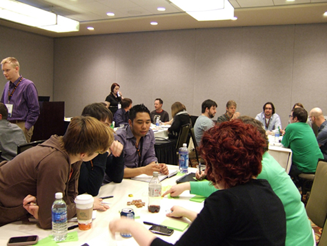
Figure 4—Workshop in progress
Workshop in progress

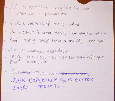
In turn, each team posted their principles on the wall, attempting to cluster them into groups of similar principles, as Figure 5 shows. We then discussed the principles as a group, refining and clarifying them, and Ann captured the principles on which we gained consensus, shown in Figures 6 and 7.
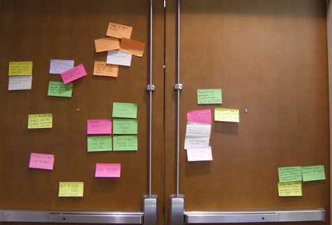
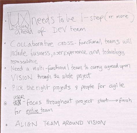
Figure 5—Post-its with principles of agile UX
Post-its with principles of agile UX
Figure 6—Principles of agile UX
Principles of agile UX
Figure 7—More principles of agile UX
More principles of agile UX

Next, we clustered our principles into value sets, then discussed and captured what we considered to be essential values of agile UX, which are shown in Figure 8.
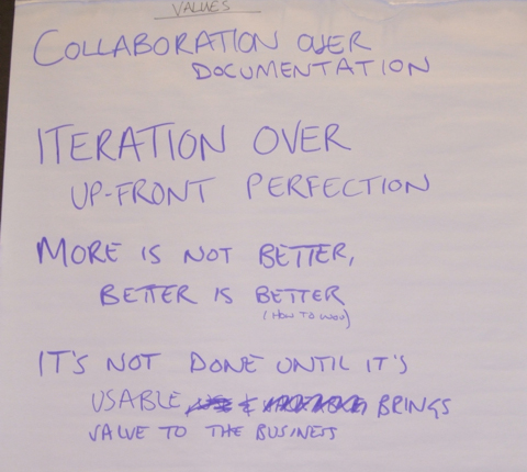
Figure 8—Values of agile UX
Values of agile UX

After the workshop, Ann revised her presentation to include our final agile UX values and principles, shown in Figure 9 and Figure 10, respectively, and sent them to all workshop participants.
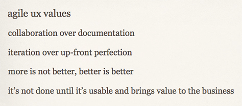
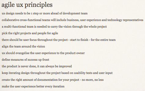
Figure 9—Our final agile UX values
Final agile UX values
Figure 10—Our final agile UX principles
Our final agile UX principles

I enjoyed the workshop, and it was a great way to start off the conference. It was helpful to learn about the experiences of other UX professionals with agile UX and define what the group thought are the essential values and principles of agile UX. However, to ensure agile software development works optimally for multidisciplinary teams, we really need to get the agile software development community to broaden the scope of the Manifesto for Agile Software Development so it better meets the needs of all disciplines and incorporates these values and principles of agile UX.

The Main Conference: More on Agile UX

During the main conference—which began on Friday, April 1st, and comprised three full days of sessions—there were two more excellent sessions on agile UX, which I’ll review here, carrying on the theme for this part of my IA Summit 2011 review.

Letting Go of Perfection: Developing an IA Agility

Presenters: Chris Farnum, Joanna Markel, and Serena Rosenhan

In this session, Chris, Joanna, and Serena, shown in Figure 11, shared their experiences in helping to define and implement an agile development process at ProQuest and their approach to working on an agile UX team. Participants from the workshop “Creating an Agile UX Manifesto” that had occurred the previous day were still hungry for information about practical applications of agile UX and attended this session in force.

Figure 11—The presenters: Serena, Joanna, and Chris
The presenters: Serena, Joanna, and Chris

After briefly describing their work at ProQuest and comparing traditional, waterfall development with agile development, as shown in Figure 12, the presenters led an agile development exercise: making a paper airplane. Figure 13 outlines the requirements for the exercise.

Figure 12—Comparing waterfall and agile development
Comparing waterfall and agile development
Figure 13—Making a paper airplane
Making a paper airplane

Its title notwithstanding, this session focused on their team’s strategies for coping with the need to initially deliver less fully formed designs in order to enable development to begin, without sacrificing quality and usability. Although they build “user experiences in layers, by delivering just enough, just in time,” their ultimate goal is to achieve great UX design. Doing this requires “[letting] go of old ideas of perfection, [rewriting] your value proposition, and [changing] how you think and work.”

In speaking about changing how you think, Joanna described the biggest challenge of agile UX: “You’ve lost your up-front design phase.” But the opportunities agile UX presents include:

  • iterative design
  • the “freedom to make mistakes earlier”
  • early working prototypes for testing

How do you understand the difference between wants and needs? “Prioritize requirements,” continued Joanna. “Go back to your user personas and scenarios. What do users need to accomplish their goals? What’s the simplest thing that could work? Increment your way to perfection. Think just enough, just in time. Start simple. It’s okay to refactor your design.”

Chris spoke about changing how you work: “Put first things first.” To meet business requirements, progress from basic functions to enhancements to embellishments over time, as Figure 14 shows, rather than designing the ultimate solution for a specific requirement all at once.

Figure 14—Changing how you work
Changing how you work

“Good layering [of basic functions, enhancements, and embellishments] creates a fully functional system more quickly,” advised Chris. “Starting basic is also important at the next level of granularity.”

When you’re considering how to produce design deliverables like those shown in Figure 15, “Think lightweight,” continued Chris. “Communicating layered designs is very important. Deliverables should be quick to produce and easy to consume.” Some quotations Chris shared about creating design deliverables for agile projects, shown in Figure 16, demonstrate that figuring out the right amount of design documentation to create is a challenge.

Figure 15—Reconceiving design deliverables
Reconceiving design deliverables
Figure 16—Thoughts on design deliverables
Thoughts on design deliverables

Chris showed us an example of what Eric Reiss calls dirty deliverables—a site map comprising Post-it notes on butcher paper, shown in Figure 17. They’re considered dirty deliverables “not because they’re imprecise or lack detail, but because they can change,” said Chris.

Figure 17—Dirty deliverables
Dirty deliverables

Chris’s additional thoughts on creating lightweight design deliverables include the following:

  • Keep user stories short and precise. Some agile teams define succinct, “bite-sized requirements” on note cards.
  • Use a template to keep requirements consistent. At ProQuest, requirements “start with a user statement.”
  • “Create annotated, low-fi, grayscale wireframes. Using a narrow column for notes helps to keep them brief.”
  • “When modifying screens, try mashing up screenshots with drawings. Modify them and highlight what’s important.”
  • “Don’t keep a master set of wireframes or specs documenting the current system.”

This presentation about the practice of agile UX concluded with these thoughts: “Do you really have to let go of perfection? Not really. Being agile is not about perfect deliverables; it’s about working toward a highly usable product. It’s a goal, not an end-state. It’s a lesson we’re all still learning.” For the full presentation, see Figure 18.

Figure 18—The full presentation on SlideShare

A lively Q&A followed the presentation. Here are some of the questions and answers:

  • How do you incorporate UX into development? “We have cross-functional teams and sit with Development.”
  • Do you do design reviews? “Yes, we do internal reviews within the UX team. We meet once or twice a week to review designs that are about ready to go into development.”
  • Do you do a scrum of scrums with UX people? “We group senior and junior UX people together to keep style and conventions consistent.”
  • How do you determine your audience and requirements? “We do up-front research to figure out the audience, then create personas and define requirements during a pre-planning phase—Sprint 0. We maintain a set of known requirements over multiple releases, and in each release, there are also newly defined requirements. Requirements go through a review cycle with business, during which we can provide feedback and inject our UX perspective.”
  • Do you create style guides in advance? “Our language styles grow incrementally.”
  • What is the role of a Product Owner on your product teams? “Product Owners are accountable for delivering products to the business. They’re also responsible for prioritizing bugs and signing off on showstoppers. We have a conversation about how bugs will impact users. We consider challenges and the level of readiness according to acceptance criteria we’ve defined. UX writes acceptance criteria for developers—what has to get developed—and Quality Assurance tests against our UX deliverables. Product Owners also review our wireframes.”

Lean IA: Getting Out of the Deliverables Business

Presenter: Jeff Gothelf

Inspired by agile development and lean startup approaches, Jeff Gothelf conceived of lean IA or lean UX—which he said “is about putting less emphasis on deliverables, not throwing them out.” Jeff, shown in Figure 19, is Director of User Experience at TheLadders.com, where he has put lean UX into practice. According to the description of this session in the program, the intent of this approach is to overcome the problem of stakeholders’ defining the value of IA or UX according to the quality of design deliverables rather than the success of designed user experiences. A noble intent.

Figure 19—Jeff Gothelf
Jeff Gothelf

While most of this presentation was great, it unfortunately started on an off note, with two false claims:

  1. That “UX began with Information Architecture,” when, in fact, user experience predates information architecture, in the sense in which we use the term today, by several years—more than ten years if one counts Don Norman’s descriptive references to the user’s experience in his 1986 book User Centered System Design: New Perspectives on Human-Computer Interaction.
  2. That “IA evolved and expanded into IxD and her sisters,” though Bill Moggridge and Bill Verplank coined the term interaction design in the late 1980s.

The need for lean UX exists because, while “traditionally, deliverables helped define the practice, … value has ultimately been placed on the deliverable, not on the experience being created,” argues Jeff. He defines lean IA or lean UX as follows: “It’s the practice of bringing the true nature of our work to light faster, with less emphasis on deliverables and greater focus on the actual experience being designed.” Figure 20 depicts the lean UX process for an in-house team.

Figure 20—Lean UX process
Lean UX process

“Sketch it out. Concept it. Prototype it. Get your work out there quickly. Get it out there raw,” recommends Jeff. “It is much easier to take critique on something you worked on for an hour than something you worked on for a month. Iterate quickly and often. Post your work where it can be seen. …

“Constant collaboration is where shared understanding comes from. What tool is the right tool to use now and at what depth? You’re doing just enough work at the right time. …

“This is not design by committee! Even nondesigners provide feedback, but you’re the one who uses that feedback.”

“Lean UX is:

Control—You’re not giving up control of your work. You’re still in charge. You don’t need The Spec to keep control. You’re refining your work, based on feedback, to create the best solution. Less paperwork doesn’t mean you’re doing less work. Minimize waste. Focus on what’s key.”

The slide in Figure 21 makes a very important point about the likely consequences of not validating design concepts early.

Figure 21—Consequences of not validating design concepts early
Consequences of not validating design concepts early

“Designers shouldn’t be expected to get it right the first time,” argues Jeff. “Nobody else has to. Keep getting that feedback. It helps you maintain the vision. You are the keeper of the vision. The greater goal of the design is your responsibility. Everything is focused on that goal.

Momentum—Everyone’s engaged. Everyone’s motivated. Keep everybody moving forward—your clients, stakeholders, your design, and you. There’s a perceived momentum to the project. You’re involving folks in the process.”

Quality—Don’t compromise on quality.” Go for the gold, not the bronze medal, as the slide in Figure 22 aptly describes comprising on quality. “Iterations mean quality continually improves,” as Jeff shows in Figure 23. “Get the idea out there early. Get feedback. Iterate.”

Figure 22—Don’t go for the bronze
Don't go for the bronze
Figure 23—Quality through iterative design
Quality through iterative design

Feasibility—Make sure it can be built—and built well. Prototype it! But not all of it. Pick the core flows and prototype those, not the entire design. Minimize the amount of prototyping you’re doing. No additional deliverables are necessary! An additional benefit of prototyping is that you can do usability testing. Test whatever is ready to go—a sketch or a prototype—with three people for a half day every Friday. Once validated, demo it to the team. People get used to seeing incomplete work. You’re clearing the big boulders from the road. Then show it to your customers.

Fill in the gaps—What did you not think about? The more you talk about it, the more you realize what’s missing. Constant communication and collaboration help you fill in the gaps.”

Next, Jeff described the differences between working with in-house teams and interactive agencies and the difficulty of selling lean UX to the latter. About in-house teams he said, “You are in the problem-solving business, and you don’t solve problems with design documentation. You solve them with elegant, efficient, and sophisticated software. Nothing demotivates a team more than not releasing software.” Figure 24 shows a lean UX process for an interactive agency, which is different from that for an in-house team, shown in Figure 20. Jeff told us, “Agencies are in the deliverables business. They sell Photoshop mockups, design specs, strategy decks, competitive analyses, personas, workflows. Reducing deliverables efforts reduces revenue—in theory,” but as Figure 25 shows, the reality is quite different. “Invest in your client’s success. It shows the confidence you have in your work,” he advised.

Figure 24—Lean UX process for an interactive agency
Lean UX process for interactive agency
Figure 25—Benefits of lean UX to agencies
Benefits of lean UX to agencies

Is lean UX good for every project? Jeff recommended that we “use it where it makes sense. Functional, task-flow projects work well. There’s a clear end goal. Highly experiential marketing projects will suffer. Time to ideate and create options is essential. What about content-heavy experiences? Some up-front planning is necessary. Can distributed teams do lean UX remotely? If they’re [part of your organization], it’s on! If not, not bloody likely. With third-party, offshore vendors, this may not work.

“How do you get started? Get everyone involved early—talking, sketching, figuring out solutions to problems together, doing design exercises.” Figure 26 shows the output of a collaborative design session.

Figure 26—A wall of sketches created collaboratively
Wall of sketches created collaboratively

Who created all of these sketches? Jeff’s entire cross-functional product team, collaborating in a design studio, as described in Figure 27.

Figure 27—A design studio
A design studio

Jeff suggested that we start small, working with a small team on three or four small design projects, then tackle something big. Define the problem space before you kick the process off. Then, during the design studio, capture “six of your best ideas as fast as possible. Refine them to three or four better ideas and add detail. Then, do one final, detailed design. Let your one best idea shine.

“Designers are used to being heroes, but this process is distinctly anti-hero,” he observed. “It is a team-based process. Agencies push the hero model. But the more collaborative the process, the fewer change requests there are.”

This approach to collaborative design is very much in line with the way I work with product teams, so I can assure you that it is a very effective way of working.

Jeff concluded with this rallying cry: “Lean UX is an evolution, not a revolution. Evolve to stay relevant. Let’s get back to the experience design business.”

For Jeff’s full presentation, see Figure 28.

Figure 28—The full presentation on SlideShare

In the next installment of my IA Summit 2011 review, I’ll cover the keynote address and more conference sessions. 

Read more:

Principal Consultant at Strategic UX

Founder, Publisher, and Editor in Chief of UXmatters

Silicon Valley, California, USA

Pabini Gabriel-PetitWith more than 20 years working in User Experience at companies such as Google, Cisco, WebEx, Apple, and many startups, Pabini now provides UX strategy and design consulting services through her Silicon Valley company, Strategic UX. Her past UX leadership roles include Head of UX for Sales & Marketing IT at Intel, Senior Director of UX and Design at Apttus, Principal UX Architect at BMC Software, VP of User Experience at scanR, and Manager of User Experience at WebEx. Pabini has led UX strategy, design, and user research for Web, mobile, and desktop applications for consumers, small businesses, and enterprises, in diverse product domains. Working collaboratively with business executives, multidisciplinary product teams, and UX teams, she has envisioned and realized holistic UX design solutions for innovative, award-winning products that delighted users, achieved success in the marketplace, and delivered business value. As a UX leader, she has facilitated conceptual modeling and ideation sessions; written user stories; prioritized product and usability requirements; established corporate design frameworks, standards, and guidelines; and integrated lean UX activities into agile development processes. Pabini is a strategic thinker, and the diversity of her experience enables her to synthesize innovative solutions for challenging strategy and design problems. She is passionate about creating great user experiences that meet users’ needs and get business results. A thought leader in the UX community, Pabini was a Founding Director of the Interaction Design Association (IxDA).  Read More

Other Columns by Pabini Gabriel-Petit

Other Articles on Conference Reviews

New on UXmatters