Top

Product Review: Prototyping with Axure

Innovating UX Practice

Inspirations from software engineering

A column by Peter Hornsby
June 24, 2011

“I’ve been amazed at how often those outside the discipline of design assume that what designers do is decoration. Good design is problem solving.”—Jeffery Veen

I’m a big fan of prototyping. While it’s always good to have a defined set of requirements, I really get a feel for what I’m designing only when I can start to pull my ideas together and see how they work. Prototyping lets me visualize how something will work and identify problems and opportunities early in the design process. More important, it lets clients see how a design is progressing early in the process, enabling them to give feedback, and lets us test the design with users. And, as with any aspect of software development, the earlier in a development cycle you can make any necessary changes, the less it costs to implement them.

I used to use Visio or pencil-and-paper sketches to create my designs. While these still have their place—particularly for ad hoc explorations of design ideas—I’m now an Axure convert. In this review, I’ll explore what Axure can do and how it can contribute to an effective UX design process. I should add one caveat: I’ve used Axure primarily to prototype Web sites rather than applications, so that will be my focus in this review.

Champion Advertisement
Continue Reading…

Creating a Page

The Axure user interface, shown in Figure 1, is pretty straightforward: a large central area for designing the individual pages of a site; a sitemap, widgets, and masters on the left; and notes below. Other child windows are available—more about those later.
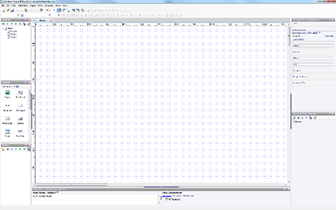
Figure 1—Axure user interface
Axure user interface

You can create a simple page by dragging and dropping the basic building blocks, or widgets, onto the page, much as in Visio. The standard, 22-item widget set is fairly comprehensive, including widgets for creating text, images, and forms, but other widget sets are available, and users can create their own. This approach gives Axure a shallow learning curve: it’s easy to get up to speed and start creating simple pages. You can manage pages via the site map, which lets you create page hierarchies. For large sites or applications, being able to hide lower levels of the hierarchy makes it easier to manage the workload and retain a bird’s-eye view of the structure. With Axure, you can import image assets, so a prototype can have as little or as much visual impact as you want.

So far, so Visio. Having created your pages, you can then start to add interactivity. It’s important to be clear about this: Axure does not provide the sort of rich interaction you can achieve through conventional Web coding. What is does well, however, is giving you about 80% of what you’d want with a fraction of the effort of Web coding. A user’s interacting with a widget can trigger various actions—for example, when a user clicks a widget, moves the insertion point away from a widget, or selects an option in a drop-down list. There are a lot of actions available, as well as links that open in the current or a new window. You can create dynamic panels that you can show, hide, move around, or change between states. Using dynamic panels is generally a fall-back position for illustrating more complex functionality. With some thought regarding how to use these panels, they can be an effective solution.

All of this interactivity is useful in only some cases. Sometimes, a quick clickthrough is all you need to move your project on, and Axure works fine for that. But being able to include some interactivity quickly and easily adds a huge amount of value for UX designers, enabling clients and users to provide feedback early on in the design process.

Reusability and Masters

Axure succeeds in making reuse very straightforward. While many standard, predefined elements such as buttons, form elements, and images are available as widgets, you can also create your own master elements. For instance, you can create a page header as a master and use it in your mockups of every page of a Web site or application. If a site’s header changes—perhaps because you need to add a link—all you need to do is change the master to change every instance of that header in the mockups for that site. Masters can include more complex items such as dynamic panels that have complex behavior. You can also modify existing widgets and create text styles using the Style Editor.

Being able to reuse design artifacts like this makes the process of developing prototypes much closer to software engineering. By putting in a little extra effort, you can create a prototype in a way that makes it easy to change later on, bringing huge time-saving benefits if changes are necessary later in the development process. For instance, say a client has decided they want to change the header font. If you’ve set things up properly with the Style Editor, that single change appears throughout your entire prototype. If not, be prepared to make a lot of time-consuming changes manually. It doesn’t take too many of these types of change requests before most Axure users realize that a little extra effort at the start of the work can save a lot of time later!

Working with Developers and Testers

Developers and testers generally require not only screen images, showing how a design solution looks, but also documentation that captures the behaviors of widgets and form-field sizes and behaviors. As you create your design in Axure, you can associate annotations and interactions with items on a screen. These can be user defined—either by typing descriptions in free-text fields or by selecting items in a drop-down list—so the tool has made the process of describing interactions as painless as possible. Consequently, it’s much more likely that designers will document their work—often the least enjoyable aspect of the job! Axure can generate reports, showing screen images with their associated annotations and interactions, which you can use in your project documentation—another huge time-saver for UX designers.

At the beginning of the development process, it makes sense to sit down with developers and testers to agree on what you’ll document and how. Regardless of the scale of a project, testers benefit hugely by having an interactive prototype available to do a side-by-side comparison with what the development team delivers. No matter how comprehensive and effective design documentation is, it can’t compare to having a prototype with onscreen annotations at hand.

Weaknesses of Axure

For all of its strengths, Axure does retain some odd quirks. For instance, it’s not possible to create a block of text with embedded hyperlinks. This is a common feature of Web pages, so this lack is baffling.

The main issues with using Axure are not technical, but human. Clients seeing prototypes and designers creating prototypes both need to be mindful that a prototype is just a prototype—that is, disposable and subject to change. There is a risk that a client may think a site is ready for deployment after seeing a prototype. (You can ameliorate this risk by using wireframe designs rather than rich visuals.) Worse, developers may expect that a UX designer can supply the code. On at least two occasions, I’ve been asked to “just send over the code you demonstrated.”

More insidious, but no less risky, is the risk of a designer’s becoming too attached to a prototype they’ve spent time lovingly crafting. Designers may go through three stages:

  1. Initially, everything about the tool is new, and there’s the risk of being distracted by yet another feature.
  2. Having learned more about using the tool, designers learn about reusability and spend time optimizing their prototypes to make them more easily reusable. Counterintuitively, designers now run the risk of becoming too attached to a design and, thus, unwilling to make changes. After all, they’ve invested so much time in producing it!
  3. Finally, designers become fully familiar with the tool and learn to treat it as just one of many tools available to them.

Conclusion

Axure is well-thought-through software that supports UX designers’ work throughout the development process—enabling them to create interactive prototypes quickly and easily. It has a fairly easy learning curve that lets designers accomplish everything they could do in Visio quickly. They can then go on to create fully interactive prototypes that their team can use for gathering feedback and that they can amend easily, and finally, move on to development and testing.

Designed to support both UX designers and other participants in the development process, Axure makes the process of documenting a design as painless as possible. Although Axure is a relatively expensive application, at $589 for a single-user license, the efficiency the effective use of the software lets you achieve means it will quickly pay for itself in time saved. 

Director at Edgerton Riley

Reading, Berkshire, UK

Peter HornsbyPeter has been actively involved in Web design and development since 1993, working in the defense and telecommunications industries; designing a number of interactive, Web-based systems; and advising on usability. He has also worked in education, in both industry and academia, designing and delivering both classroom-based and online training. Peter is a Director at Edgerton Riley, which provides UX consultancy and research to technology firms. Peter has a PhD in software component reuse and a Bachelors degree in human factors, both from Loughborough University, in Leicestershire, UK. He has presented at international conferences and written about reuse, eLearning, and organizational design.  Read More

Other Columns by Peter Hornsby

Other Articles on Product Reviews

New on UXmatters