Top

Categories, Facets—and Browsable Facets?

August 23, 2011

In my explorations of taxonomies—especially taxonomies for ecommerce sites—the case I find the most frustrating is what I, for lack of a better term, have christened the browsable facet. All UX professionals likely know the following generalizations about faceted navigation:

  • Hierarchical category trees are good for making fundamental decisions—for example, choosing camera or camcorder.
  • Facets are good for deciding details and narrowing or broadening the scope of available options—for example: What resolution? Which brand? Users have become accustomed to using facets, which are usually to the left of or above products.

Champion Advertisement
Continue Reading…

As in all things, though, there are some interesting situational gray areas—such as the following two cases:

  • facets that could alternatively be subcategories or vice versa—This decision is sometimes a toss-up. Thankfully, in such cases, either choice is usually satisfactory.
  • facets that users might want to drill into instead of using a category tree, then pivot to a category filtered by that facet—This is the frustrating one—a chimeric facet of sorts, the browsable facet.

Unfortunately, many sites miss the mark in trying to address the second of these two cases. One example could be a high-end ecommerce site where a shopper might want to start from brand—It has to be Versace!—but has no idea yet whether he wants to shop for sunglasses or a shirt. Another might be a gift site where a shopper would perhaps want to start from price—then decide between a watch or a baseball bat. Similarly, if a site has a Sale section, a shopper might want to start by seeing everything that’s currently on sale, but if there are more than a few pages of sale items, would also want to use a category taxonomy to refine and explore those items. From there, the shopper should be able to see items in that category that are not on sale without hindrance.

In other words, some facets are useful in fundamental decision making. These browsable facets should enable their selection in the absence—and instead—of a category, then once selected, intersect with other facets using the same category taxonomy the rest of the Web site uses. Some Web sites get this wrong by not allowing pivoting to categories at all. Others try to simulate this functionality by creating a separate category taxonomy for each brand—and they fail.

Browsing by Brand: The Seminal Case

Here’s a typical browsable-facet scenario: Marty’s father always bought Sony products, and Marty gets a warm feeling when he recalls Sony’s It’s a Sony branding from their 1980s packaging. When Marty enters a home-theater retailer and asks the salesman to see Sony electronics, the salesman asks him how he’s looking to enhance his home theater—with a new TV or a new sound system—and what his budget is.

To solve the Web-based analogue of this problem, vendors often create a totally different tree comprising brands as categories at an upper level, with subcategories of that brand underneath, all under a root node called By Brand—what I’ll call a brand/category tree. It sort of works, but I consider this a workaround because there are a couple of caveats to its use:

  1. Doing this requires substantial extra work because this solution does not use the same category taxonomy data. It instead uses a distinct root-level brand/category tree.
  2. More important, this approach does not let users explore another brand—ever, unless they start over and navigate another way.

Marty might also want to explore the products of another brand he remembers fondly—Panasonic. Maybe there’s a sale on a great Panasonic television with stellar reviews. Or perhaps he just wants to look at some competitors’ products to verify that buying a Sony would cost him only a small, but acceptable premium. Unfortunately, the brand/category-tree workaround uses a hierarchy, and in this hierarchy, every selection must narrow the set of products. This means products under Sony—that is, Home > By Brand > Sony—can be only Sony products. Plus, duplicating this category taxonomy data creates multiple category keys for the same products, and this is another reason it is impossible to relate Home > By Brand > Sony > TVs to Home > Electronics > Video > TVs and filter TVs by the facet Sony.

It’s as if the salesman were to say, “Do you want to see the Panasonic salesman?” upon any inquiry about Panasonic. The conversation must start over, and Marty must again inform a different salesman regarding all of his preferences. More likely than not, Marty leaves without purchasing a new TV from the Web site. He is very frustrated. Nobody is happy. The site has lost a sale. With the brand/category-tree model, this is exactly what occurs if Marty wants to explore and expand his brand options.

Note—The brand/category-tree workaround can actually provide more flexibility if it’s necessary to fine-tune a taxonomy for each brand. If a particular brand has less breadth in product categories, it could optimally use a different, shallower and wider taxonomy. For example, if a brand manufactures only video equipment, it’s possible to eliminate the Video-level of the Electronics tree. However, in my opinion, the disadvantage of users’ not being able to pivot from Sony Cameras to Panasonic Cameras nullifies that advantage. With the browsable facet approach, it is possible to auto-drill past levels in a tree if there is only one applicable value, nullifying some of the advantages of the brand/category-tree.

Similarly, if the Sale section were actually a Home > Sale sale/category tree, shoppers could not pivot to Category: TVs, then remove Sale to see TVs that were not on sale and determine whether there were a preferable product—perhaps a bigger, fancier TV. As a retailer, you might ask yourself: Isn’t that the point? Walmart has built an empire on rollbacks. If an online store’s functionality prevents this kind of exploration, it is as if the store has put all sale items in one physical corner, completely separate from regularly priced items, preventing up-selling or cross-selling higher-priced items! If Marty were instead able to start from a Sale facet, he could drill into a category, then easily explore the regularly priced items by removing the Sale facet.

The key capability of browsable facets is to let the values of certain facets act as alternative starting points—surrogate categories—allowing users to filter by other facets or pivot into categories from there.

While Marty may intend to buy a Sony TV or a product on sale, he may instead buy something else. It’s not that we want to encourage bait-and-switch scenarios by enabling this sort of capability in navigation, but preventing pivoting is disarming.

B&H Versus J&R

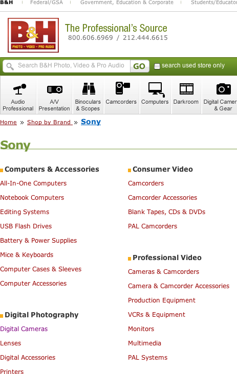
I realize that the difference between the functionality browsable facets provide and that of the alternative approach may be a bit difficult to appreciate in the abstract. Fortunately, the B&H and J&R sites make it easy to understand the advantages of the browsable-facet approach. B&H uses the brand/category tree workaround, while J&R uses the browsable-facet approach.

On B&H, a shopper cannot do the following:

  1. Start from Sony, as shown in Figure 1.
  2. Find Digital Cameras, as shown in Figure 2.
  3. Then, expand or switch his brand options to include Casio. (This is simply impossible.)
Figure 1—Starting from Sony on B&H
Starting from Sony on B&H

Note—In Figure 2, there is no Brand facet because it would reflect only one value—Sony.

Figure 2—Finding Digital Cameras on B&H
Finding Digital Cameras on B&H

In comparison, on J&R, a shopper can do the following:

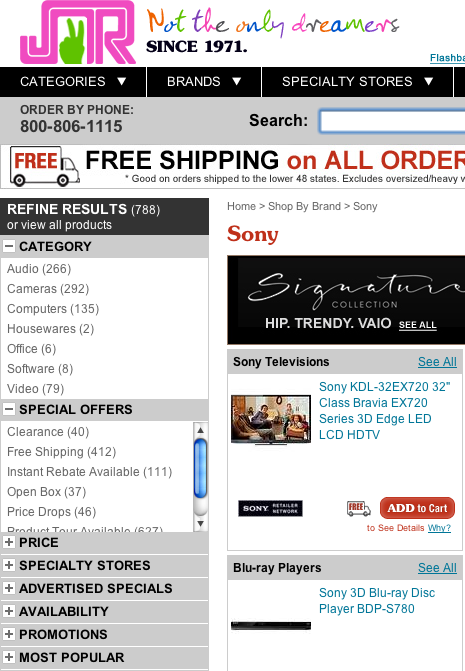
  1. Start from Sony, as shown in Figure 3.
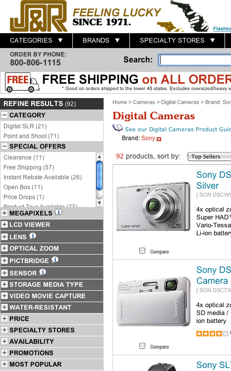
  2. Find Digital Cameras within Cameras, as shown in Figures 4 and 5.
  3. Then, switch his brand option to Casio, as shown in Figure 6.
Figure 3—Starting from Sony on J&R
Starting from Sony on J&R
Figure 4—Finding Cameras on J&R
Finding Cameras on J&R
Figure 5—Finding Digital Cameras within Cameras on J&R
Finding Digital Cameras within Cameras on J&R
Figure 6—Switching to Casio on J&R
Switching to Casio on J&R

Notice that J&R does not allow multiple selection. If they did allow it, this would also let shoppers expand, instead of switch, their options to include Casio.

It is possible that the use of this approach is deliberate on the part of B&H—as I mentioned earlier, it does allow for more tuning of the category tree—but it could also be that it is the vestige of a legacy Web site that used the brands/category tree workaround approach.

Browsable facets perform admirably on J&R. They act as surrogate categories until a user drills into a category. Better still, they automatically intersect with a site’s category taxonomy without any extra data management. Like categories, browsable facets should preferably support only a single selection for simplicity. However, this is not a requirement unless they are also hierarchical. (For more about that topic, read my article “Tweaking Your Facets, Part I: Supporting Hierarchy with Multiple Selection” on UXmatters.

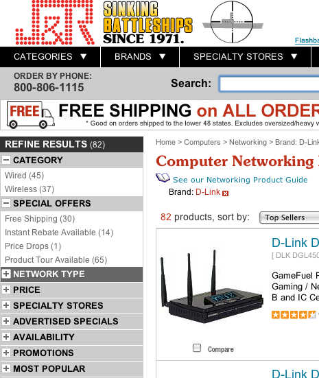
When a site does browsable facets right, users can explore categories via facets. For example, filtering for Brand: Buffalo on J&R, as in Figure 7, shows that Buffalo offers only products that are in both the Drives and Networking categories, and a shopper can find other networking products via this brand. Once a user has drilled into Networking from the browsable facet Brand, he can remove the filter for Buffalo and instead filter on another brand such as D-Link, as shown in Figure 8. In this case, a multiple-selection user interface would excel.

Figure 7—Filtering for Brand: Buffalo on J&R
Filtering for Brand: Buffalo on J&R
Figure 8—Filtering for a different Networking brand on J&R
Filtering for a different Networking brand on J&R

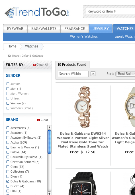
On Trend To Go’s Web site, one can observe browsable facets in the context of a multiple-selection user interface. A shopper can select the browsable facet Brand and the value Dolce & Gabbana, as shown in Figure 9, then decide to visit their Watch products as shown in Figure 10, and finally, expand to another brand, Activa, as shown in Figure 11.

Figure 9—Filtering for Brand: Dolce & Gabbana on Trend To Go
Filtering for Brand: Dolce & Gabbana on Trend To Go
Figure 10—Visiting Watches: Dolce & Gabbana on Trend To Go
Visiting Watches: Dolce & Gabbana on Trend To Go
Figure 11—Expanding to Watches: (Dolce & Gabbana or Activa) on Trend To Go
Expanding to Watches: (Dolce & Gabbana or Activa) on Trend To Go

In Figure 10, observe that a user can choose Beauty & Fragrance instead of Watches, and the user interface leverages the same category tree that is used throughout the Web site. Also observe that a user would get an identical and equivalent product results page if he reversed the steps shown in Figures 11 and 10.

Browsable Facets Work, So Why Stop at Brands?

We can generalize the browsable-brand concept and apply it to many other facets, in addition to brand. As a rule of thumb, a browsable facet should be a facet that both

  • applies to the majority of your products
  • represents a defining or important attribute in the shopping process

Brand satisfies both of these rules if brand loyalty is a factor. If most products have a color attribute, color satisfies the first rule. However, to satisfy the second rule, color must also be a defining attribute of the products on a site—and this is not always the case.

Let’s end with a different example—metal on a jewelry Web site. Joe Q. Customer, a faithful, loving husband has spent many long nights, working at the office on a business deal. After sleeping on the office couch a few times, he decides he must buy a gift of jewelry to make it up to his wife, Joann. He has no idea whether he wants to purchase a pendant, a ring, or a bracelet for her, just that it should be platinum. If he walked into Tiffany & Co. in New York City, he might say: “I want something in platinum for my wife, but I’m not sure what. Can you help me?”

On the Web, even if a jewelry site’s navigation does support filtering by a Metal facet, it should not require that a shopper first indicate which category he desires—pendant, ring, bracelet, or another type of jewelry. If it did, Joe would have no idea what to do. In this case, categories do not model the customer’s thought process at all. So, Joe gives up and spends another night on the couch. The Web site doesn’t make a sale. Nobody is happy.

The perfect Web site would allow Joe to indicate that he wants something in platinum first, then display all products in platinum, and finally allow for refinement with other facets and pivoting to categories from there. After realizing that palladium costs substantially less, he might want to see if he could get something in palladium with a set of matching diamond earrings.

If a site takes a metal/category tree workaround approach, it locks Joe into platinum—and this causes a similar problem for Joe as it did for Marty. By contrast, with browsable facets, Joe is able to shop using his natural thought process. Once he’s browsed through a few pages of platinum jewelry, he can jump to Home > Rings, switch to Palladium, then find a ring with matching earrings that he thinks Joann would love. He was able to get there—despite his meandering thought process—with the assistance of the browsable facet approach.

So Why Aren’t Browsable Facets Everywhere?

Good question! I recently asked Pete Bell and John Andrews of Endeca this question. I also inquired whether they had given this type of facet a special name—perhaps a better name than mine. Pete told me: “The distinction between facets for categories and [facet] details is strictly editorial—which is to say, the data model and navigation work identically in either case, but the user experience is different. It is a material difference though, so it’s important for the interaction designer to recognize that.”

Pete speaks as a consummate computer scientist. One could indeed consider category just another facet—a hierarchical one. It is also possible for a Web site to have other hierarchical facets in addition to category. Counting multiple hierarchies presents a few algorithmic challenges and some extra overhead, but these challenges can be overcome. Unfortunately, hierarchies also present usability challenges with in the context of multiple selection. Therefore, such a user interface would likely make sense only for data exploration tools—or perhaps very advanced users.

Pete and John also confessed that they have no particular name for this subset of facets. However, when prompted, they did propose an alternative name—navigable facets, but said browsable may describe the concept better. For now, let’s stick with browsable facets. By recognizing the distinct nature of these facets and giving them a name, we’ve taken a first step toward understanding them better.

I’ll take a stab at the reason they have remained nameless and often unimplemented. Most Web developers and UX professionals still see facets as a layered-on enhancement to category-based taxonomies, and therefore, focus on how they work within such a taxonomy. However, since the early days of the Web, the navigation for many ecommerce sites has let shoppers start shopping from brand. Thus, we know that a category-based taxonomy is not the only useful starting point—even without the benefits of facets to filter or the ability to then pivot into a category.

The simple answer is that most developers and UX professionals are stuck in a category-based mindset and, thus, have overlooked the concept of browsable facets—as well as Pete and John’s more abstract observation that everything is a facet. While browsable facets do present some technological challenges, these can be overcome. Some ecommerce sites’ attempts to simulate the behavior of browsable facets with a facet/category tree such as a brand/category tree or metal/category tree—and their limited success in allowing expansion or exploration—underscores the need for browsable facets.

One thing is clear: almost every Web site operating within some sort of niche could benefit from the alternative form of navigation that browsable facets provide. Yet most do not support browsable facets—or at least, do not support them properly. This is a bit of a mystery, and unfortunately, the shoppers of the world are thus suffering needless frustration. 

New Book: Designing Search: UX Strategies for eCommerce Success

Jaimie Sirovich contributed a perspective to Greg Nudelman’s book Designing Search: UX Strategies for eCommerce Success. For a 40% discount on the print version of this book, purchase it on Wiley.com by September 30, 2011, using the discount code: UXDS1.

President at SEO Egghead Inc.

Pelham, New York, USA

Jaimie SirovichJaimie Sirovich is a search marketing consultant at SEO Egghead. Officially, he is a computer programmer, but he enjoys search marketing and user experience even more. At present, Jaimie is focused on helping clients sell everywhere and achieve multichannel integration with major Web sites such as eBay, Amazon, and even Craigslist. He is the author of Search Engine Optimization With PHP.  Read More

Other Articles on UX Design

New on UXmatters