Top

Bootstrapping UX: A Case Study

September 7, 2011

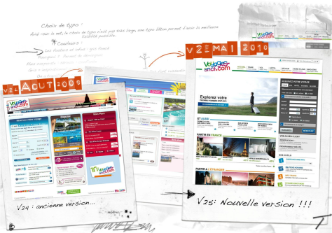
It’s not easy to apply new methods, especially when there are old habits in place, making each stage in a process a novelty for stakeholders. Some people like novelty; some don’t. But everyone has to get on board for a new approach to work. Here’s an analysis of how we bootstrapped UX in my company. Figure 1 shows our progression from the old page to the wireframe that we tested to the new page.

Champion Advertisement
Continue Reading…
Figure 1—The evolution of our user experience
The evolution of our user experience

Recently, I was recruited to set up a UX team for a major French ecommerce Web site. Before my arrival, User Experience had been a loosely knit committee of the willing. The team comprised project managers, functional and technical specification writers, and a freelance graphic designer who was a self-labeled ergonomics expert. When this committee was unable to reach a consensus on a final design, they put some decisions to a vote, while they accepted others by default because there was no more time to iterate before the development timetable ran out. No established process or plan existed for user-centered design—or iterative testing and design.

User experience is a discipline that is applicable anywhere. But for user experience to gain enough traction for an organization to have a respected UX team, you’ll first you need to overcome some issues. It would be incorrect to say that, before the creation of a UX management role in an organization, no UX work has occurred in house. However, the work was probably disparate and lacking in focus. Bringing together a UX team, establishing team spirit, and making this the focal point of the team requires a slow and steady approach. You can’t just jump in and expect things to work well immediately.

With the establishment of a UX team, some people might expect that, somehow, all the answers they had been looking for would magically be provided. Adopting user experience is not just about getting the answers; it is rather more about proposing methods and creating structures for a better design workflow. So, to begin with, I listened a lot, sitting in meetings about the upcoming build releases and working with the incumbent graphic designer.

It’s important to identify who is holding the strings when it comes to making design decisions—and who is plucking them most often. It’s also key that you get to know the target market, the hidden obstacles that prevent certain recommendations being economically feasible—and note those you need to overcome—and in the midterm, to work with the IT or Software Architecture team.

Being in these meetings and listening a lot meant I could write scenarios. I did a lot of followup with teams close to UX, especially Product Marketing and front-end developers—owners of all things HTML, JavaScript, and CSS. As I gradually worked out who was already doing work related to user experience, I managed to move an in-house ergonomics consultant who specialized in eyetracking and usability studies from a project team to my team, as well as an intern from Marketing who was working on benchmarking user-interface (UI) best practices. With these resources on the UX team, we began to gain some traction and were able to handle more requests for UX research and design services and begin to centralize our design process.

Pillars of User Experience

For ecommerce, there are three pillars for an operational UX team: information architecture, ergonomics, and graphic design. I now had two of these roles covered and set about justifying the recruitment of an information architect. I created a slide deck showing how my team could improve our design process and workflow by adding this role. By using a set of marketing requirements that defined editorial, images, and priorities for each piece of information as our inputs, information architecture would let us deliver wireframes of pages and specify their content zones. Then ergonomics would do usability studies, enabling us to make recommendations for improving interactions. Finally, our graphic designer would deliver final mockups. Once I hired our information architect, I had the chain of design roles that I needed.

Next, I needed to focus on communicating and activating the new UX methodology I wanted to implement. I made some simple calculations and put forward a case for recruiting an in-house graphic designer, in place of a big freelance budget. We were paying a freelance designer for almost full-time work anyway, but weren’t getting much face time together. This meant our approaches to presenting our findings could get unsynchronized with our objectives. A strong, in-house graphic designer can make a big difference to a UX team’s reputation, because the final output we produce needs to be absolutely in line with corporate identity and the UX ethos.

Culture Change

With our UX team in place, the difficult culture-change process began. We needed to change expectations for what the UX team should deliver at each stage of a project. When I arrived at the company, the lines between UX roles were blurred, and any one person on the team might be expected to fulfill all the roles. Designers had always delivered initial page mockups that had a finished look, “because that’s the only way we can react to your work.”

I know it’s hard for many people without design experience to react to unfinished sketches and wireframes, but I began to sell the value of these draft working documents as a means of completing initial design iterations without extraneous considerations like color schemes—which are always touchy—the precise placement of elements on a page, and finished graphic elements. It helped to explain that validating wireframes doesn’t equate to final design approval, because ultimately, prototypes and wireframes do not elicit the full range of reactions a finished mockup would. They’re more about helping people—including users who are participants in usability testing—to react to the major issues, as well as starting to provide real content before representing pages in a graphic format that takes our limited resource—the graphic designer—more time to change.

The core change is a shift from a focus on graphic design alone to a UX methodology. A lot of French agencies have an excellent reputation for and history of wonderful creative design. Luxury products and high fashion have a stunning visual ethic and high-quality visuals are prevalent. Converting that tradition to usable Web sites is, in my opinion, a separate métier.

Navigation design needs to put usability and function before form; complex content needs to draw on desktop-publishing skills and a deep understanding of the constraints of the Web medium. In the end, it is far easier to create fluid layouts, a solid information architecture, and navigation storyboards before adding graphic-design touches. Agencies traditionally sell a visual concept first, onto which it can be surprisingly difficult to retrofit a good user experience, in spite of a stunning graphic look. Of course, the underlying debate of form over function reaches far wider than the Web. (We can all draw from industrial design, especially embedded system user interfaces and, of course, the classic models of remote controls, front-panel layouts for consumer hardware, and car dashboards.)

Iterative Testing and Design

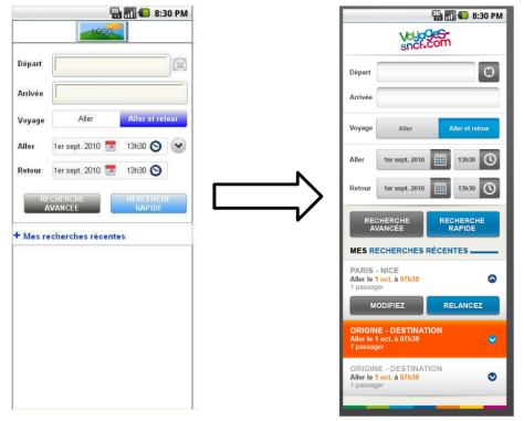
With wireframes, you are not so much a slave to pixel-perfect, full-color screens, as Figure 2 illustrates. They don’t look finished, and this is part of their advantage. Having set up some usability tests with wireframes, we have been able to identify potential hurdles and pitfalls in designs before investing a lot of time in front of Photoshop. Previous to my arrival, the company had typically considered usability testing to be the penultimate step before the final design implementation, which was useful in validating user-interface design concepts and a site’s overall look and feel. I pushed to move usability testing earlier in the process. In fact, I believe usability testing has a far greater role in telling you what doesn’t work rather than what does. Therefore, testing at the end of a development cycle is very likely to bring bad news and put everyone in a panic.

Figure 2—From wireframe to final design
From wireframe to final design

To get the best value from usability tests—though any testing is usually better than none—you need to test not only early, but often. Flexible design tools that allow rapid changes facilitate frequent testing. We use Axure, which a lot of our colleagues also have, so it can fulfill other useful functions as well, especially at the specification stage. On some successful projects, we have been able to use Axure to validate a number of hypotheses through usability testing and, therefore, to spend more time on the final design, without vacillating between different interaction models.

We even managed to change interaction models and modify design elements that clearly didn’t work well after testing a model with only two users—just before a third user came in for a test session. You can tell when something really is causing a roadblock in a purchase process if your first two users become confused and stop at the same place on a screen, saying similar things about it—usually along the lines of “I don’t understand. I’m not sure what I need to do to complete this step.”

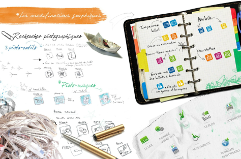
Identifying who the high-level decision makers really were regarding design issues and having them wait to intervene until a little later in the design process helped, too. Too much feedback on minor details in the early stages can really weigh down the design process and increases costs. For example having too much text on a page might get a response like “We can create lots of icons.” Icon design is specialized work and doing it right takes a lot of time—particularly because every single icon you produce must pass through the validation chain and should be tested for user comprehension at a minimum. Designing good icons is like a black art. What you are essentially trying to do is to create a small pictographic representation of something and get close to universal consensus on what it means, as Figure 3 shows. The higher in the hierarchy an opinion comes from, the harder it is not to add that opinion to a list of variants that you must test.

Figure 3—Designing icons
Designing icons

Consolidating and Rationalizing

With a few small victories—creating colorized wireframes, making careful use of paperboard sketches, and working further up the design chain while Product Management was still drafting requirements—we managed gradually to gain ground regarding project timelines. It is essential that UX be consulted early in a project. Otherwise, you may inherit poor design decisions or even full-fledged mockups that others have created and be asked just to sign off on them. Sometimes, colleagues in other disciplines present design work that is close to perfect. But, at the other extreme, people don’t like your telling them that nothing much in their design is right—even when you refer them to graphic design guidelines and user-interface design best practices. We’ve started documenting those, and they do help you explain flaws in a navigation model or show an existing model that would work at least as well and would be consistent with other pages. (Unfortunately, people do like to reinvent the wheel.)

Early on, you’ll probably have to let some low-value projects go live with minimal involvement of the UX team and instead focus your energy on the next iteration, as well as consolidating the overall coherence of site elements. For example, depending on where users were on our site, there were forms with different designs, asking for the same information. Field order was different, typographic rules and alignments were all over the place. In a summary of order items that persisted across various pages, the display of information was different for similar products. New styling from more recent projects was juxtaposed with old styling on the site. We consolidated this information and proposed a model that would work everywhere, could evolve across the entire site at the same time, and would provide a seamless user experience for customers as they navigated to different pages, depending on their current task at hand.

Style Guidelines

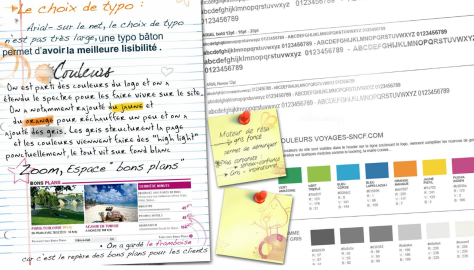
As we began to rationalize certain user-interface design practices, a big project came up: redesigning the look of the entire site. This opened up an opportunity to work on style guidelines and corporate identity—with regard to the Web site styles in particular. You could dedicate a hefty budget to have a design agency create a corporate identity, but it is rare that such design documents—which distill the essence of a brand and are a tough undertaking, hence their cost—cover all aspects of a Web site. We had already created some reference materials, rationalizing user interface elements as a set of design patterns. Using the new corporate identity, we extended this design documentation to user-interface design patterns and included hexadecimal color references, as shown in Figure 4, template references, and icon sets.

Figure 4—Creating a color palette
Creating a color palette

A separate document that we created in conjunction with the UI Development team covered more technical aspects, including a FAQ about accessibility and our official design guidelines. User Experience must consider people accessing pages from different terminals, including Braille and screen readers. It’s important to support Web accessibility as early as possible, and accessibility guidelines should become a subset of your UX best practices. Creating this document meant we could reply to more and more questions by providing a link to a wiki page with this reference material. We had covered enough ground on style guidelines to be able to explain why we had made certain design decisions to an ever-widening audience. This allowed gradual evangelism of our UX methodology—especially incorporating design thinking and the User Experience team as early as possible in new project meetings.

The UX team is a focal point for the core competence of UX design, but we don’t have a monopoly on design thinking. Everybody needs to think in terms of user experience, and I have invited others to use our materials and run with them. As long as there is a clear final approval on anything that departs from our UX guidelines, no one sees us as a production bottleneck for the live site.

Renaming the Team for France

Since terms like information architecture and user experience don’t always mean a lot to other teams in a company, my team is now called UX and Design. I don’t think it’s useful to separate the two, and design is a well-established word that people generally understand better. In the US, there are well-known VPs of User Experience—for example, Marissa Mayer of Google and Margret Schmidt of TiVO. VP-level management jobs in User Experience are becoming prevalent, and CXO (Chief Experience Officer) positions are becoming more common. In the UK, Site Manager and now User Experience and Site Optimization are important roles, and these areas of responsibility often exist as separate departments. I previously worked within the Travelocity group as French Site Manager for lastminute.com and, therefore, worked within the US/UK business model where the Web is perhaps the most mature.

In the French market where now I work, it is a challenge to evangelize user experience. As I have alluded to previously, design culture is not the issue, but the market as a whole is a little behind the curve in formalizing design for the Web through UX methods. That’s why it’s been a real pleasure to have the opportunity to work with voyages-sncf.com—a great brand with an ostensibly simple, but really incredibly complex product to sell online—and to evangelize user experience, letting their incredible depth of industry inside knowledge and product offerings shine online. 

Independent Consultant, UX Strategy & Delivery

Paris, France

Simon WhiteBorn and raised in the UK, Simon has worked, since 1998, in many areas of Internet infrastructure, including Webmastering, server administration, and CMS implementation. He saw the Internet bubble burst in Morocco, where he worked in a Web consultancy and evangelized Internet development, with missions in Tunisia, Malawi, and Haiti. Since 2003, Simon has done site management, user-centered design, UX evangelism, and multivariate testing in the French online travel market with brands like lastminute.com, voyages-sncf.com, and tgv-europe.com. He believes in strong management and a multidisciplinary approach to Web site management.  Read More

Other Articles on Design Process

New on UXmatters