The practice of information architecture is most relevant within the context of user experience design for digitally mediated user interfaces. If we refer to the DSIA Research Initiative’s UX Design Practice Verticals,![]() the top three tiers
the top three tiers![]() of tactical activities within the information architecture practice vertical show the work products of information architecture. These tactical activities focus on navigation, content organization, and the facilitation of information relationships. Any thoughtful information architecture solution must consider these three tactical IA concerns.
of tactical activities within the information architecture practice vertical show the work products of information architecture. These tactical activities focus on navigation, content organization, and the facilitation of information relationships. Any thoughtful information architecture solution must consider these three tactical IA concerns.
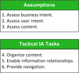
In this column, I’ll demonstrate a basic approach to creating a Web-site information architecture.![]() This six-step method includes an assessment of three core assumptions and the three tactical activities of IA practice. Figure 1 represents this sequence of steps for producing a Web-site information architecture.
This six-step method includes an assessment of three core assumptions and the three tactical activities of IA practice. Figure 1 represents this sequence of steps for producing a Web-site information architecture.

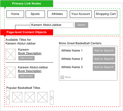
Contrary to popular belief, a Web site’s information architecture is not a mysterious, esoteric force that manifests itself during the UX design lifecycle. Users actually do interact with aspects of a site’s information architecture. For example, when users move from link node to link node, they are engaging with what the DSIA Research Initiative calls the physical construct![]() of a site’s information architecture.
of a site’s information architecture.
Next, I’ll demonstrate the role of these assumptions and IA tactics in creating a Web-site information architecture through the case study of a small online book retailer.
Case Study: An Online Book Retailer
Fictitious client—AthleteStories.com
Market niche—Sells only books about famous athletes
Although this project could have started similarly to most engagements with enthusiastic clients who just want to know when they can see a design, it didn’t. Instead, it started off with a seemingly more sophisticated client who asked, “When can we see wireframes?” For many seasoned IA practitioners, hearing an anxious client utter this phrase is like hearing fingernails run across a chalkboard.
Defining Basic Assumptions
Granted, it is possible to envision visual and interaction design solutions before getting into the weeds of reality. However, at some point, once the visioning is complete and it’s time to capture details, the creation of a Web-site information architecture must include the synthesis of basic assumptions to support the desired functionality and user experience.
In larger development organizations, specialists in the areas of business requirements gathering, UX architecture or strategy, user research, or content strategy define these assumptions. However, depending on the size and scope of a project, IA practitioners are sometimes responsible for defining these assumptions. This is commonly the case when there are resource and budgetary constraints—or simply because the level of effort doesn’t warrant hiring an expert in requirements gathering.
So, let’s first run through the assumptions that came into play when an IA practitioner created a Web-site information architecture for AthleteStories.com.
Assumption 1: Assess business intent.
Accountable information architecture requires accountable business strategy.
Because business clients expect sound solutions from anyone selling Web-site information architecture services, your information architecture solution should map to sound business goals. Therefore, an information architect must acquire the following information at a minimum:
- client’s business model
- immediate business objectives
- performance measures of success
First, having access to and understanding your client’s business model is foundational. Since creating a Web-site information architecture is essentially an operational function of a client’s business, it is important to make sure your information architecture is in alignment with their business model.
From a business model come objectives. In the case of AthleteStories.com, the retailer’s core business objective was to sell books. That’s easy! As a measure of success, the retailer wants users, on average, to purchase more than one book. I’m amazed at how often clients neglect to adequately review questions as fundamental as this at the beginning of their projects. When a team fails to answer such questions in the beginning, they usually confront them much later during a project, when a crisis of confusion prompts someone to ask, “Do we know what the goal is for this site?”
If you do not know the business objectives and measures of success before you begin tactical IA tasks, it compromises both your process and your final IA solution.
Assumption 2: Assess user intent.
A Web site that understands nothing about its users will have users who understand nothing about the site.
While you can do usability testing and user research quite inexpensively, time or cost constraints may prevent your gaining user insights through such direct means. In such a case, ensure that you define at least some provisional assumptions using alternative methods to help you anticipate the behavior and needs of users. For example, secondary research and the knowledge of your client’s subject-matter experts on the targeted demographic can inform the creation of provisional personas. Whether you’ve gained insights from first-hand observation or synthesized them from various sources, make sure that you can at least make the following assumptions about Web-site users:
- their context of need
- their information-retrieval behavior
- their digital literacy
When you’re exploring contexts of need, the user scenarios that surface may provide guidance on how users would want to navigate through a user interface. For example, research on the user intent of the target audience for AthleteStories.com showed that one of the following usually triggers their desire to purchase a book
- discussing sports with other enthusiasts in a social setting
- watching a sporting event on TV
Research findings also suggested that mobile engagement would be convenient in more social settings, while a desktop or tablet user interface would be ideal when watching sports at home or engaging in a fantasy-league game.
Note—Knowing that customers may use both desktop and mobile devices to engage with AthleteStories.com informed the strategies for navigation and information relationships that would dynamically deliver the appropriate content for each device.
To retrieve a book about an athlete, a user would most likely start by searching for the athlete’s name or the sport or position they played. As regards digital literacy, the audience is fairly comfortable with any device, but prefers simple account features and interactions.
Note—Understanding the retrieval behavior and digital literacy of users helps inform how to group content, how much information to display at any given point, and gives users the ability to manage the information to which you provide access.
Assumption 3: Assess content.
If there is no meaning to your content, it will mean nothing to your users.
When exploring a Web site’s communications and content strategy, ensure that you gain at least a minimal understanding of these three aspects of site content:
- content types
- language
- volume
It is critical that you know a Web site’s content just as well as the people who created it. While content owners and authors are most interested in the meaning and effective communication of the content, an IA practitioner’s foremost interest is in the patterns and unique entities that make up a given content domain—for example, how to expose categories of documents and file types or unique sets of topics and concepts and their potential semantic relationships.
Language plays a crucial role in the creation of a Web-site information architecture. You use language to label and describe the unique content types that appear on a Web site. While an IA practitioner can recommend formal vocabulary and phrasing, it is helpful to understand that authority for and insight into language should come from two places: content owners (SMEs) and users. Both perspectives are equally important in developing a sound Web-site information architecture.
For AthleteStories.com, a content audit revealed that the retailer offered more than 2,500 book titles. Knowing the size of a content domain helps you to plan an information architecture that scales. For example, it’s important to know whether a company expects to add more book titles in the future and how many. It’s also important to establish the current and future sizes of any content types that you define. In essence, every tactical artifact of a Web-site information architecture should be scalable.
Note—Anticipate the future scope of content types and their thresholds to promote the longevity of a Web-site information architecture.


