Criteria for Evaluating Prototyping Tools
The criteria that I’ve defined for evaluating prototyping tools comprise three subsets:
- disposability criteria—This first set of criteria concerns the disposability of the prototypes that the tools produce. In other words, how much of a prototype can you use in the actual software implementation.
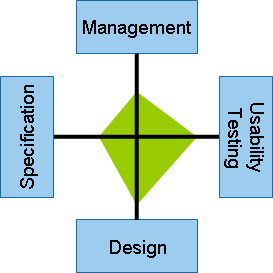
- management, usability testing, design, and specification criteria—This second set of criteria, which I call MUDS criteria, concerns the degree to which the tools support the key elements of the prototyping activity.
- benefits, limitations, and usages criteria—This third and final set of criteria, which I call BLU criteria, summarizes the key benefits and limitations of the prototyping tools, along with their most appropriate usages.
The MUDS Criteria: Evaluating Tools’ Support for Specific Prototyping Activities
Let’s look at the individual MUDS criteria in more detail. You should assess these criteria as follows:
- management criteria—How well does a tool support collaborative work on prototypes and revision control? Does it provide facilities for distributing prototypes and gaining feedback from stakeholders?
- usability testing criteria—How easy is it to conduct usability tests on prototypes? Does a tool offer any features whose specific purpose is to aid usability testing?
- design criteria—How complex and sophisticated can a prototype be—that is, to what degree can it be interactive and how rich can its functionality be? Can a tool produce high-fidelity—even pixel perfect—designs of screens?
- specification criteria—How well does a tool support the documentation of a prototype’s functionality for development purposes—that is, the software product’s architecture and coding and the functional testing of the final implementation?
Note—Although it may be tempting to think that, as the software development industry generally moves away from waterfall development methods and toward agile methods, specifications are becoming redundant, this is not the case! Agile methods seek to reduce the amount of documentation, not to eliminate it altogether. Developers still need a lot of information—in addition to prototypes that show what screens look like—to define the goals for an agile sprint. For example, they might need the hex values for colors and the contents of drop-down lists.
However, agile methods do qualitatively change the nature of design documentation for software development projects. Rather than thick, beautifully presented requirements and specifications documents, which can be very time-consuming to create and update, development teams need just enough information to get their job done. A UX designer needs to be able to quickly and easily create and iterate a design and update its documentation.
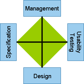
In evaluating prototyping tools against the MUDS criteria, it is useful to think in terms of a simple four-way radar diagram like that in Figure 1, which shows this set of criteria in balance in a perfect prototyping tool.
Four Generations of Prototyping Tools
Now, let’s use these criteria to better understand the four generations of prototyping tools and their associated prototyping methods.
The First Generation
Contrary to what some may believe, prototyping software is not a particularly new idea. Almost from the beginning, software product teams wanted to know what the screens of the applications they wanted to develop would look like. They soon learned that if they passed a load of diagrams and text to computer programmers in a requirements document and just let them get on with it, the screens that got developed were often very different from what the stakeholders had envisioned!
As a consequence, some enlightened teams concluded that it would be a good idea to plan what screens would look like before actually building the working software, so they looked for some suitable tools with which to do this. Fortunately, there was a pretty good one that was literally available off the shelf and at a low cost: pen and paper.
Not long after, software designers came up with some formal methods of paper prototyping. In particular, Belcore gave us the Plastic Interface for Collaborative Technology Initiative Through Video Exploration, or PICTIVE for short. [1] We also got a C.A.R.D. game for participatory task analysis and redesign to go with PICTIVE. [2]
So how does paper prototyping stack up against our evaluation criteria?
Disposability Criteria
This is easy. Paper prototypes are 100% disposable! Ultimately, you have to communicate everything in the system design documentation in some way.
MUDS Criteria
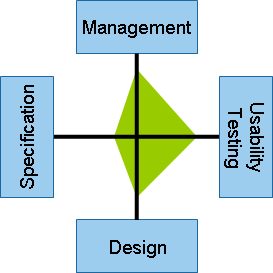
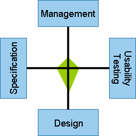
Let’s evaluate paper prototyping using the MUDS criteria. As Figure 2 and the following show, paper prototyping is very weak in this regard:
- management—Paper prototyping is difficult to manage. For example, if using PICTIVE, facilitating sessions is challenging because it’s all about managing people—who are far more complex than any computer! Likewise, documenting the process and organizing its output is not easy, because you are dealing with lots of quite unstructured paper documents.
- usability testing—An experienced usability test facilitator can get some very useful findings when testing with paper prototypes. However, there is, of course, no interactivity, which presents some significant limitations.
- design—You are basically restricted to conceptual design work.
- specification—The best you can realistically do is to scan your paper prototypes, then copy them into an application for annotation.
BLU Criteria
Now, let’s look at the benefits, limitations, and usages of paper prototypes.
Benefits
The following benefits of paper prototyping are easy to understand:
- Creating paper prototypes is cheap and fast.
- The process of creating them is highly interactive and collaborative—as long as everyone is in the same room, of course.
- Iterating design concepts is quick and easy.
- Making group decisions can happen very quickly.
A fundamental feature of real user-centered design—which, in my experience, is not commonly realized—is that it is multidisciplinary. Indeed, UCD seeks to engage all project stakeholders at an early stage, including users, customers, domain experts, and project owners or sponsors. Within the context of UCD, paper prototyping has the important benefit that it reduces the dominance of software development professionals—including UX designers—over other stakeholders who are involved during the early parts of a design process when key decisions get made.
Limitations
The MUDS criteria tell us that paper prototyping has the following serious limitations:
- It’s difficult to prototype large or complex systems.
- Specifying designs—even capturing basic designs and the design process that led to them—can be challenging.
- The prototypes have no interactivity.
Usage
Paper prototyping has served us well and continues to do so. I always kick off my ideation and conceptual design work with a PICTIVE session, and I encourage everyone to participate. Indeed, I see it as an integral and necessary activity of real user-centered design.
The Second Generation
The serious limitations of paper prototyping soon became a barrier to progress, and it wasn’t long before product teams wanted prototypes that looked more realistic and had greater interactivity. Again, software designers looked for some tools with which to create them, and they were again easy to find. Visual designers—and also some UX designers—used graphic design packages like Photoshop to design screen images. Then, they sliced and diced up the images and added them to HTML pages, using an HTML editor such as Dreamweaver, which provided some interactivity. That’s why I call this the slice-and-dice generation of prototyping tools.
Disposability Criteria
Are slice-and-dice prototypes disposable? This is a complex question. In theory, it is possible to iterate both the screen images and the associated HTML, so the prototype eventually evolves into working front-end code. This is non-disposable prototyping, and examples of this are not uncommon. (I’ve done this several times myself.) However, in reality, many slice-and-dice prototypes get completely junked. The following are reasons for this:
- The target development environment might not be HTML—for example, the system a team is developing may be a desktop or mobile application rather than a Web site or application.
- The UX team that produces the prototype might not write the code in a way that the development team considers correct or even requires. Sadly, I’ve often seen technically competent UX designers spend weeks coding their prototypes to a commercial standard and proudly present them as final front-end code, only to have the development manager immediately ask developers to rewrite all of the code—because it wasn’t compliant with the chosen standards or wouldn’t have worked well with the middleware or back-end code libraries they were using in the final implementation.
- Developers generally see front-end coding as their turf and often rewrite a UX designer’s code just on that principle. This is an organizational reality!
In summary, although the slice-and-dice approach has potential for the creation of non-disposable prototypes, in my experience, the reality is that this rarely happens. Such prototypes—and a lot of the images they contain—often get junked at some point in the software development life cycle.
MUDS Criteria
Now, let’s evaluate slice-and-dice prototyping using the following MUDS criteria:
- management—Generally, a problem with slice-and-dice prototyping is that it relies on synchronizing the output from two different types of software: a graphic design application and an HTML editor. What’s more, there are often different people using these applications—possibly even people in different groups within an organization.
- usability testing—Slicing and dicing can produce very functional prototypes. It can also produce very realistic looking high-fidelity or even pixel-perfect prototypes. While this is sometimes very useful, it can also be a double-edged sword! Doing usability testing with screen designs that look like a finished product can unconsciously lead test participants to perceive a prototype as the actual application. In turn, this can make them less forgiving of any problems and limitations of the prototype during testing, distorting the test findings—particularly for satisfaction metrics.
- design—The situation here is similar to that for the usability testing criteria. The high-fidelity prototypes that designers typically produce when using this approach are sometimes very useful. But when senior stakeholders review such prototypes, they often get bogged down in the details of the visual design and forget to focus on more fundamental and, often, more important issues regarding the prototype’s information architecture and interaction design. I’ve seen stakeholders spend entire review sessions of quite early prototypes discussing the color scheme or criticizing the photos a designer has incorporated in a page.
This is one reason why designers sometimes reduce the fidelity of early prototypes that they’ve produced using a slice-and-dice approach before subjecting them to usability testing and stakeholder review. For example, they might convert them to grayscale or even rough them up a bit—perhaps by using sketchy fonts—to make them look less finished.
- specification—If a designer is really using a slice-and-dice approach to produce a non-disposable prototype, this massively reduces the need for specification data, and, of course, that’s great. However, as I pointed out earlier, this is rarely the case; so a UX design team often must still specify their design. Unfortunately, since neither graphic design packages nor HTML editors include specification features, creating and maintaining specifications can be particularly problematic when taking a slice-and-dice approach to prototyping.
Because second-generation prototyping tools don’t support specification, designers typically capture screen images, then insert them into specification documents that they create using applications like PowerPoint, Microsoft Word, or Visio—either simply adding annotations to the images or writing detailed specifications. This process turns into a nightmare because, not only is it very laborious, the designer must update the specification document every time the design prototype changes—which, with the iterative nature of user-centered design, is a common occurrence.
Indeed, this can be such a nightmare that I have known major corporations who use slice-and-dice prototyping to shy away from making sensible changes to a design—simply because updating the documentation would have been so time consuming! Of course, working in an agile development environment magnifies this problem. For each of an agile development cycle’s many rapid iterations, a designer must quickly iterate the prototype, capture new screen images, and revise the specifications.
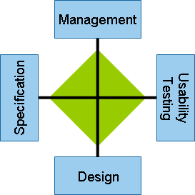
Figure 3 shows the degree to which slice-and-dice prototyping tools satisfy the MUDS criteria.
BLU Criteria
Next, let’s look at the benefits, limitations, and usages of slice-and-dice prototypes.
Benefits
The following benefits of slice-and-dice prototyping are easy to understand:
- This approach has been around for a long time now, and you can generally muddle through with it.
- Most software development organizations already have the necessary software and the skills to work with it.
- You can produce prototypes that look like the finished product—assuming that would be helpful for the particular context or stage of prototyping.
Limitations
When assessing slice-and-dice prototyping using the MUDS criteria, I highlighted some serious problems with this approach. However, in my experience, there are much bigger problems. Slice-and-dice prototyping generally begins with images a designer has produced in a graphic design package such as Photoshop or Illustrator. As a consequence, visual designers often drive the whole prototyping process. This occurs not least because operating a graphic design application takes considerable expertise—skills that visual designers possess almost exclusively. So, this is where, when, and why many interface design problems occur!
Of course, there are some well-rounded UX designers who also possess these visual design skills, along with an excellent understanding of other aspects of UX design such as interaction design, information architecture, and usability engineering. However, in my experience, this is not generally the case. Many visual designers—despite their claims to the contrary—have little experience, expertise, or even interest in these other aspects of UX design, so they focus mainly on visual design.
Usage
As a consultant, I often go into organizations to advise them on prototyping matters, and I tell them that slice-and-dice prototyping is now out dated! The simple fact is that there are now much better ways of doing prototyping. We should return Photoshop to its intended use—manipulating photographic images. The clue is in the name guys! Web developers should use HTML editors to write working HTML—and play only a minor role in modern UX design.


