Sketching
It would be difficult to overemphasize the importance of sketching ideas early on, during wireframing and even afterward. Sketching should be your go-to tool anytime you’re discussing or iterating on ideas. As long as you’re designing something that people will use on a screen, the way you communicate your design should use a visual medium.
Too often, I see UX designers skip sketching and jump into their wireframing tool of choice right away. Some of the justifications I hear are these:
- “Because I’m so proficient with this tool, I can ideate in the tool and more quickly achieve my goal of delivering wireframes once we solidify our ideas.”
- “My sketching ability is poor, so I wouldn’t be able to communicate the ideas I’m trying to convey.” (The issue is valid, but the end result isn’t. This means you need more practice at sketching!)
- “My client wants to look at something more polished than sketches and doesn’t understand my sketches.”
By blasting past sketching, UX designers miss out on the opportunity to
- rapidly generate ideas without the constraints of a wireframing tool
- reflect on their understanding of the problem space
- communicate visually to solve problems
- share and refine ideas before sinking time into wireframing
- and most important, boil a problem down to its core
If you’re the kind of person who jumps right into your wireframing tool of choice, you’re not yet convinced that sketching is a necessity—and that needs to change. Jared Spool, Bill Buxton, Peiter Buick, and Dennis Kardy have already made compelling arguments for sketching. Remember, sketching is a skill and requires practice to get better! Once you’ve established sketching as part of your UX workflow, you can move on to wireframing.
Wireframing Is Not a Magical Deliverable
Ideation and sketching should never stop, but at some point, you’ll need to share your ideas with another designer or a developer, and wireframes are a good medium for that. The goal of wireframing is to communicate an idea quickly. The faster you can create and distribute your wireframes for review, the more time you have to think, sketch, and revise your work.
Without diving too deeply into either the purpose of wireframes or what the appropriate fidelity is for wireframes, I’ll summarize my philosophy: wireframe with just enough detail to communicate your ideas to your intended audience—and never more than that. With each client, this process should mimic a dance where you show them low fidelity, they come back asking for higher fidelity, then you translate and distill their requests into a revised wireframe. But don’t go higher fidelity just because they ask you to, it’s your job to decide whether that’s appropriate.
Wireframing Tools
You might use Keynote, Visio, Axure, HTML/CSS, Creative Suite, or one of the many Web applications for wireframing—such as Fieldtestapp, Proto.io, or Fluid.ui—and your tool of choice is probably fairly entrenched. Lots of tools are very capable, but if you’re looking for speed, simplicity, and low-to-medium fidelity, there may be a better alternative.
My Choice Is OmniGraffle
I am a huge fan of OmniGraffle because it best meets my needs and supports my goals. OmniGraffle has made my workflow more efficient. The best way to decide whether OmniGraffle might be right for you would be to use it and nothing else for a sprint or project. You’d need to use stencils and templates to fully benefit from using OmniGraffle, but even without them, you would likely see your workflow speed up. However, if you don’t use stencils and templates with OmniGraffle, you’ll be slowing yourself down unnecessarily.
Almost all tools offer libraries, stencils, and some form of object management, and you’d have to put effort into becoming familiar with these tools. However, with OmniGraffle’s Graffletopia, you’re sure to find something that you can use to save yourself time when wireframing. Even Google makes their Android design widgets available for OmniGraffle!
OmniGraffle provides the fastest approach to wireframing your ideas, at a fidelity level that should keep your clients focused on ideas, not pixels.
Managing Wireframe Fidelity
When you’re wireframing at low or medium fidelity, as shown in Figure 1, OmniGraffle shines. It isn’t built to represent pixel-perfect designs. I see its lack of features that other, more powerful applications offer as a strength. There’s less clutter to slow me down. More important, OmniGraffle has kept me from focusing on pixels too much. This is a benefit even though I’m prototyping native applications for mobile devices, on which real estate is at a premium.
For example, if early during your ideation process, you show clients or stakeholders highly polished wireframes with colors, company branding, and typography, chances are they might get hung up on fine details rather than focusing on the big picture—for example, mental models or affordances on which you’re trying to get feedback. Even grayscale wireframes can be so pixel perfect that stakeholders miss your concepts and focus on granular details instead. So create a low-fidelity stencil and save yourself a lot of headaches. I suggest you avoid the sketchy stencil fad, too.

Stencils
My top reason for choosing OmniGraffle is its great flexibility in terms of the available stencils and how fast they make wireframing. While the stencil concept is familiar, various tools do stencils in many different ways. OmniGraffle handles stencils fairly simply: you just group objects together and save them as a stencil. That’s it.
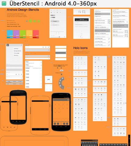
The strongest part of how OmniGraffle does stencils is the way it handles viewing them, as shown in Figure 2. You can get an overview of a stencil from a 10,000-foot view or focus on individual objects. Thumbnails actually scale based on the size of an object, and you can drag and drop objects onto a wireframe. Contrast this approach with Creative Suite libraries, in which thumbnails don’t scale and there is no high-level view. With Graffletopia’s strong community and its library of shared stencils, which you can now search from within OmniGraffle, there is a pretty good case for using OmniGraffle.

Templates
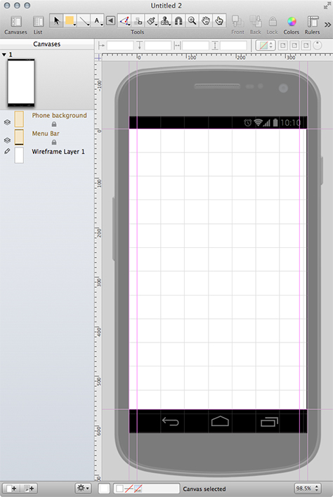
Stencils save me the most work, but templates are a close second when it comes to time savings. If I go from a project where I’m working on an iPhone app to one where I’m designing for multiple platforms—say iPad, iPhone, and Android Phone—templates like that shown in Figure 3 minimize my ramp-up time. I don’t have to do any research to find out the latest screen sizes and resolutions or spend time making custom elements match current design guidelines. Instead, I just open up our latest in-house template folder and pick the platforms that I need.

Template sharing isn’t as simple or as common as stencil sharing, so you may have to create your own templates, but the investment is worth it. Just a few settings templates keep me from having to configure settings each time I create a wireframe, including settings for canvas size, major and minor grid spacing, page orientation, units, snap to grid, device status bar, and guides.
Lastly, the greatest benefit of templates is consistency across different people’s designs. So, if people go on vacation and someone else needs to make changes to their OmniGraffle documents, diving in is much less complicated when everyone is working within a familiar template.

