Top

Mobile Input Methods

Mobile Matters

Designing for every screen

A column by Steven Hoober
November 2, 2012

I often say that desktop computing—and especially the desktop Web—made the practice of interaction design lazy, by promulgating assumptions that are not always true outside of this narrow domain. With the massive scale of mobile device usage, most of these assumptions are becoming a bit of a problem.

One key area that surprises a lot of designers and developers that I have worked with is input methods. Yes, they know that users don’t have a mouse, but there’s still an unstated assumption that all desktop Web input widgets will work. Perhaps more troubling is that their personal preferences and rumors sometimes supplant data regarding the kinds of actual experiences that exist out in the world.

I’m referring to the presumption that everyone has a touch-screen smartphone. [1] On development discussion forums, some developers say they’ve “never owned anything other than a touch-screen phone”—and of course, all of their friends have touch-screen smartphones, too. But anecdotes, fanaticism, or even conspiracy theories about why your favorite platform is the best really do not help. [2]

Champion Advertisement
Continue Reading…

Bad Experiences

Almost every mobile app that I use—and this applies to a lesser degree to the mobile Web—fails me in a few common, often-repeated ways. Many apps don’t rotate, so work in only one orientation, at least on some screens. For example, when I want to browse a list of movies on my DVR, I must first type a search string. But the app insists that I view the search results in a vertical list. This doesn’t make a lot of sense for the slide-out keyboard I want to use. And as many as half of Android devices, like the Samsung Galaxy S shown in Figure 1, have a hardware keyboard.
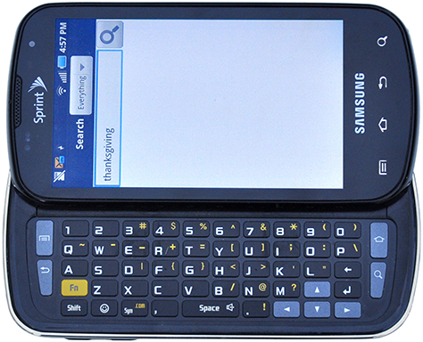
Figure 1—Samsung Galaxy S, with a slide-out keyboard
Samsung Galaxy S, with a slide-out keyboard

Or, apps don’t automatically switch to the proper input mode, as in the example shown in Figure 2. In this case, although flight number is always a number, the developers forgot to tell the field that, so on a touch-screen device that has a virtual keyboard, the keyboard always opens in the default, alphabetic entry mode, requiring me to manually switch to numeric entry, every time.

Figure 2—Alphabetic entry mode is all too often the default for a numeric field
Alphabetic entry mode is all too often the default for a numeric field

Many Different Types of Keyboards

First, all of you iOS fans must recognize that not all of your customers have an iPhone, and you must respect their choice. Often, rather than a touch-screen keyboard, other mobile devices have different types of keyboards for data entry. [3] While statistics on mobile devices are closely held, it seems that around half of all Android devices—for which there are relatively broad form-factor choices—have a physical keyboard of some sort. [4,5] Surveys indicate that users have a significant preference for hardware keyboards. Over half of the user population may prefer hardware input. [6]

No matter what you think the trends may be in the future, devices have a lifespan of several years. You should update your Web site quarterly; your app, at least twice a year. (You wouldn’t want to leave half or more of your users open to being snapped up by the competition.)

But, there’s a lot to accommodating different types of keyboards—even if you want to assume that every high-value customer you have will use some mythical high-end device. For virtual keyboards, there are entry modes that my experience indicates some designers may not consider, and there are new types of user interfaces coming out all the time, each with its own distinct challenges. [7] So first, let’s review the available input methods.

Touch Screens and Virtual Data Entry

By default, the data-entry method on an iPhone is a touch-screen, virtual keyboard. Virtual keyboards are really interesting because they are so flexible. Input settings for each field can change the layout of the keyboard, as well as the keys it includes. On-screen keyboards can employ interesting user interfaces that range from gestural typing to virtual thumbwheels that let users provide constrained values such as dates and times.
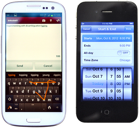
Figure 3—Two on-screen entry methods: gestural typing and virtual thumbwheels
Two on-screen entry methods: gestural typing and virtual thumbwheels

Virtual Input: Keyboards and Keypads

Keyboards are for typing words, and keypads are for numbers and symbols. More or less. While, for virtual keyboards, the boundary between their function can get fuzzy, recognizing that there are differences between them is important.

Mode switches are really interesting. When you switch modes, the keycaps, or labels, for each key, as well as the position and shape of keys can change. This means you can effectively have an unlimited number of modes. For example, an email address field would display a keyboard that includes an @ symbol key and a .com shortcut key, and eliminate characters, like commas, that would be invalid in an email address, while retaining the rest of the keyboard layout.

Numeric data entry is one of the most interesting input modes. For example, the layout of a phone dialpad is different from that of a numeric keypad, and in some cases, numbers are arrayed across the top row of keys of an alphanumeric keyboard, as on a computer keyboard.

Gestural data entry using a virtual keyboard—as with Swype, by Nuance, shown in Figure 4—allows speedier typing. A user can type using a single gesture that stops or changes direction at each character the user wants to type. This is just an optional entry mode—a user can still type by tapping individual keys on the keyboard—and doesn’t affect the appearance of the keyboard.

Figure 4An explanation of gestural entry using Swype

Virtual Input: Constrained Data Entry

My favorite virtual keyboards, however, aren’t keyboards at all. Date and time pickers and other single-purpose selection mechanisms allow a user interface design to imply arbitrary value entry, and each provides a special data-entry method rather than a keyboard.

Look closely at the design of these pickers in iOS. They are in the same frame as a keyboard or keypad, with Next, Back, and Done buttons. But each is a variation on this general type of entry method.

Figure 5—Form navigation buttons inside the virtual keyboard in iOS
Form navigation buttons inside the virtual keyboard in iOS

Some of these data-entry methods—such as the date and time picker wheel on Android—allow users to enter values directly, in addition to allowing gestural selection. Tapping a value opens a virtual keyboard or keypad below the field to allow typing.

Virtual Input: Pens

A pen, or if you prefer, stylus, provides another means of entering data. Depending on your viewpoint, pen-based systems are either having a resurgence or simply will not die. It’s best to think of pen input as analogous to a virtual keyboard. For data-entry purposes—rather than special drawing or note applications—pen input is usually a mode, and users can easily switch back to a keyboard or keypad.

Pen input may be by character or by word, also with a mode switch. A device converts what a user writes to candidate characters or words, with options for the user to either pick from other candidates or re-enter the data. (I wrote at least 10% of a long book using a pen interface.) The accuracy of pen input varies widely. It can be very good  but can also make it almost impossible to enter data with special formats such as URLs.

Supporting pen input is especially useful for low-literacy populations, some unusual character sets, and allowing text entry while standing or when vibration or movement is likely. It also allows those suffering from repetitive-stress injuries to continue working. And at least a small subset of the population simply prefers this mode of data entry.

Virtual Input: Voice

I’m not talking about assistance applications like Apple’s Siri here, but voice-entry modes. [8] Such speech-to-text systems have been part of Android for a couple of years and iOS more recently. Like pen input, they have varying degrees of utility and generally provide similar methods of proposing candidate translations, which the system automatically accepts. The user may then select from among alternatives, edit values directly, or try again.

Voice entry is useful for hands-free input or whenever it would be inconvenient or dangerous to directly manipulate an input device.

Hardware Data Entry

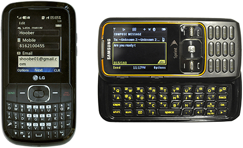
For about 140 years, pressing physical keys has been almost the only method of creating text aside from handwriting. Even for mobile devices, data entry using a hardware keyboard or keypad reigns supreme. Half of all mobile devices in the U.S. are still feature phones similar to that shown in Figure 6. These devices encourage heavy use of SMS, email, and some activities on the Web.

Figure 6—Two typical message phone–style feature phones, with hardware keyboards
Two typical message phone-style feature phones, with hardware keyboards

Hardware QWERTY Keyboards

QWERTY keyboard seems to have become the standard nomenclature for hardware keyboards on mobile devices that let users type words. Yes, for English and many other languages, virtual keyboards also use the QWERTY layout. But the term QWERTY keyboard is what we most commonly use when referring this type of hardware keyboard.

Keyboards on mobile devices can be either fixed, as on a traditional BlackBerry, or sliding. Other types of keyboards are very uncommon today. Overall, the percentage of mobile devices with hardware QWERTY keyboards is very high. Some reliable, though vague data indicates that half of all Android devices may have a hardware keyboard, and multiple preference surveys have confirmed this level of usage. [9]

A user can type by pressing keys, each of which has a fixed, printed label as on a computer keyboard. The keyboard supports shift and shift-lock modes—in some cases, locking a mode requires double-tapping the mode key—as well as function or other keys that provide access to numbers or special characters, depending on a keyboard’s layout.

Key labels, which are called keycaps, usually include any alternative symbol or function. For example, a device’s E key might also include a yellow 4 and a smaller blue $ to indicate the key’s several functions. Of course, the colors of such labels vary by device.

You can lock the entry fields in a user interface to allow only certain characters such as numbers, just as with as a virtual keyboard. But of course, the layout and labels of the keys on a hardware keyboard cannot change.

Hardware 10-Key Keypads

Some people call these input devices by other names—for example, numeric keypad or 12-key. While there are actually twelve keys, I always use the traditional term from the world of data entry: 10-key.

Using these keypads for numeric data entry is obvious; if a user needs to type a number or dial a phone number, they work as advertised. But look closely at the alternative labels on keypads. There are three letters on most of the keys

Note—Letter assignments are unique to the countries using the North American Numbering Plan, so vary a lot in the rest of the world. [10]

Text-entry fields can be constrained to certain data-entry modes, and users can choose to switch their modes. In text-entry mode, each key can type a specific sequence of letters, numbers, and symbols—usually not labeled. For example, the labeling on a key might indicate that it can type A, B, C, and 2, so you know it types those. Thus, in a text field, pressing the 2 key once types an A, pressing it twice in quick succession types a B, and pressing it three times types a C. This is called triple tap because the maximum number of alphabetic characters on any key is three. Pressing the key a fourth time would type a 2. Thus, pressing the 2 key repeatedly, in quick succession, would type the sequence of characters A B C 2 / @ and ?, then back around to A.

Almost all keypads, even many virtual implementations on remote or touch-screen devices, support disambiguated entry—invented by Tegic and now marketed as Nuance T9 and in related products. [11] In this case, a user presses a key only once for each character he wants to type, and an algorithm matches the most likely character to the keypresses a user had made. With this type of data entry, as a user types 2 2 8, the text entry field displays A, then Ba, then Cat, the word the user wanted. [12]

The device presents character options as a list of candidates, much as for pen- and voice-entry modes. However, this user interface is not always clear on small-screen devices. People, almost universally, have mistakenly called this approach predictive typing. But if you look up that term, it’s actually something else.

Scroll-and-Select Data Entry

Most often, the term scroll-and-select refers to a method of selecting items on the page when using a mobile device with no touch screen. Here, I am referring to the five-way control with Up, Down, Left, Right, and Select buttons that lets a user do data entry by scrolling through a grid of characters. This mode of data entry is common on all sorts of devices, including printers, GPS units, cameras, and other consumer electronics products.

For full-text data entry, a virtual keyboard appears on the screen, and the user must scroll until the desired character is in focus, then select it. This type of data entry is very slow.

On many devices, some form of scroll-and-select data entry serves as an adjunct to a keyboard. Its most common use is for the selection of any extended characters—such as symbols or accented characters—on devices with hardware keyboards. Though touch-screen devices sometimes employ a similar user interface. Scroll-and-select data entry is very common on devices that rarely require text entry, so have no keyboard or keypad at all, and no touch screen.

Remote Data Entry

Think about what your poor TV remote control must do as our devices get smarter and more connected. Selection and even text-entry methods are becoming quite common. Input devices for remote data entry are usually based on one of those that I’ve already covered, such as:

  • scroll-and-select data entry—This usually takes the form of a virtual keyboard.
  • 10-key, triple-tap data entry—More rarely, this type of data entry employs a disambiguation system.
  • mixed input data-entry methods—These are virtual keyboards with fewer keys and disambiguation systems.
  • a combination of data-entry methods—For example, the remote keypad shown in Figure 7 provides 10-key, triple-tap data entry, and a 5-way selector that supports a scroll-and-select virtual keyboard.

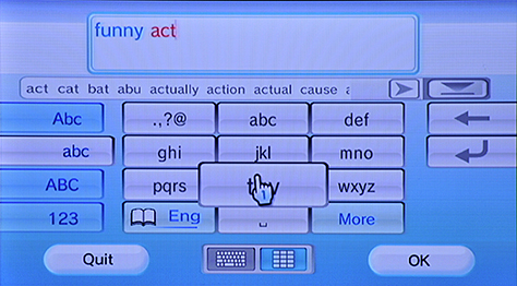
The Nintendo Wii is a device that requires fairly heavy use of on-screen keyboards or keypads. Users control them by pointing its remote at the screen. In Figure 7, the remote’s data entry is set to a disambiguation mode.

Figure 7—Nintendo Wii remote in disambiguation mode
Nintendo Wii remote in disambiguation mode

Some remote devices use relatively unusual methods of selection—for example, the Nintendo Wii’s combination of a virtual keyboard with device gestures. Don’t forget that many remote devices have Web browsers, and applications for these devices are beginning to be a big enough market that browser usage on them is being tracked. You may be designing for 10-foot UIs—that is, user interfaces for large devices like televisions that people sit about 10 feet away from—sooner than you think. [13]

Designing for Users and Their Devices

Among some mobile UX designers, it has recently become fashionable to consider that mobile context is only the purpose and environment in which people use their mobile devices. But it’s still equally important to consider device characteristics and how people interact with their mobile devices. So, while we must, of course, be mindful of users’ motivations, needs, and environments, we must also be aware of the characteristics of different mobile devices, and design our Web sites and apps to work well on all of them. As I have made clear in this column, there is more to device diversity than what operating system a mobile phone or tablet uses or what screen size it has. We must also consider what input methods a device supports and the user expectations that arise from the type of mobile device they use.

Next month, I’ll discuss how you can use this information about input methods for mobile devices to make your mobile user experience as good as possible. Until then, start noticing all of the different types of mobile devices around you—or gathering statistics on your users’ devices—and think about how you might need to change the user interfaces that you design to support them. 

Notes

[1] Some developers assume that all mobile devices are touch-screen smartphones. Here’s a quotation from one developer, “I might add that I never had a phone with keyboard hardware.” Though, when challenged, he is reconsidering his position. On the Game Maker Community, another developer asked, “Android—Do you want hardware keyboard support? Retrieved October 9, 2012.

[2] My remark on “conspiracy theories” is in reference to several conversations I have had with designers or developers who essentially insist that anyone who buys an Android phone really wanted an iPhone, doesn’t know better, or was tricked by a salesman, who get larger commissions on Android devices. “AT&T Allegedly Instructs Retail Staff To Sell Anything But the iPhone,” on iPhone Hacks, August 1, 2012. Retrieved October 9, 2012.

[3] A MobilityNigeria report from 2010 includes highlights such as that 22.4% of mobile devices are QWERTY keyboard phones, while only 16.8% are touch-screen phones. Of course, in other regions, the percentages are different, but in Africa, the 10-key device still rules. From Mobility, “MobilityNigeria State of the Mobile Web Report – October 2010.” Mobility, October 2010. Retrieved October 9, 2012.

[4] A mid-2012 Nokia survey indicated that far over half the user population still wants a hardware keyboard. However, some distrusted this company-funded survey, because Nokia had traditionally made huge number of smartphones with hardware keyboards. However, they’re now making touch-screen phones as well. From Lucian Armasu’sNokia Poll Says QWERTY Keyboards Still Rule,” on Android Authority, August 11, 2012. Retrieved October 9, 2012.

[5] I learned from Google that they don’t release their data as complete reports on demand, However, Admob occasionally gives out nuggets of information and, for some years, has said that about half of Android hits on their network are from mobile devices that have a virtual keyboard. From “Motorola Droid Still Leading the Android Pack,” on DMSS.com, April 20, 2012. Retrieved October 9, 2012.

[6] A Sprint press release from August 15, 2012, titled “Kyocera Rise Brings Affordable QWERTY with Android 4.0, Ice Cream Sandwich, to Sprint and Virgin Mobile USA,” stated, “A survey by industry analyst firm Yankee Group earlier this year revealed that 69 percent of consumers called a QWERTY keypad a ‘must have’ or ‘nice to have’ feature on their mobile devices.” Retrieved October 9, 2012.

[7] “Nothing New Under the Thumb is a lengthy article on various input methods that focuses on some unusual methods that either have never made it to mass production or have not achieved widespread adoption. Just imagine how much more complex the world could be. From Designer Software, Inc., June 2008. Retrieved October 9, 2012.

[8] Most publications on speech systems are very dense and academic. On the blog VUI Design, Speech Recognition Apps & All That, which is very readable and even uses pop culture references to make their points, Maria Aretoulaki posted “The Voice-Activated Lift Won’t Do Scottish! on July 29, 2012. Retrieved October 9, 2012.

[9] Tomi Ahonen’s “Some Thoughts on QWERTY vs Touch, T9 and Voice Inputs,” on Communities Dominate Brands, August 14, 2012, provides a lengthy analysis and discussion of input method preferences that was spurred by the Nokia survey. Retrieved October 9, 2012.

[10] There’s a brief description of the keypad layout on handsets in the NANP region on Wikipedia:“North American Numbering Plan.” Retrieved October 9, 2012.

[11] There is an excellent, long article about the development and history of T9, “T9: Text on Nine Keys,” on Valid Concept, February 26, 2009. Retrieved October 9, 2012.

[12] Shumin Zhai and Per Ola Kristensson recently provided an academic overview of the method by which disambiguation keyboards like the T9 work, “The Word-Gesture Keyboard: Reimagining Keyboard Interaction,” Communications of the ACM, Volume 55, Number 9. Retrieved October 9, 2012.

[13] As I stated in this column, you might think that smart TV is coming, but it’s already here. Samsung has already sold millions of apps for their smart TVs through their dedicated app store, according to IT Pro Portal in “Samsung Serves Five Million Internet TV Apps,” May 23, 2011. Retrieved October 9, 2012.

President of 4ourth Mobile

Mission, Kansas, USA

Steven HooberFor his entire 15-year design career, Steven has been documenting design process. He started designing for mobile full time in 2007 when he joined Little Springs Design. Steven’s publications include Designing by Drawing: A Practical Guide to Creating Usable Interactive Design, the O’Reilly book Designing Mobile Interfaces, and an extensive Web site providing mobile design resources to support his book. Steven has led projects on security, account management, content distribution, and communications services for numerous products, in domains ranging from construction supplies to hospital record-keeping. His mobile work has included the design of browsers, ereaders, search, Near Field Communication (NFC), mobile banking, data communications, location services, and operating system overlays. Steven spent eight years with the US mobile operator Sprint and has also worked with AT&T, Qualcomm, Samsung, Skyfire, Bitstream, VivoTech, The Weather Channel, Bank Midwest, IGLTA, Lowe’s, and Hallmark Cards. He runs his own interactive design studio at 4ourth Mobile.  Read More

Other Columns by Steven Hoober

Other Articles on Mobile UX Design

New on UXmatters