Top

Conference Review: UX STRAT 2013, Part 2: Day 1

February 11, 2014

The first day of the main conference at the inaugural UX STRAT took place on September 10, 2013. UX STRAT was a single-track conference, so all attendees shared the same conference experience. The day kicked off at 9am and closed at 5:30pm. Paul Bryan’s welcome and opening remarks and closing comments bookended the day. Morning, lunch, and afternoon breaks gave attendees opportunities to network.

Keynote: What Does It Mean to Be Strategic?

Reviewer: Pabini Gabriel-Petit

Presenter: Nathan Shedroff

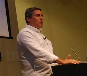
Day 1 of the conference opened strongly with an excellent keynote address by Nathan Shedroff, shown in Figure 1, who is Chair, MBA in Design Strategy, at California College of the Arts, author of several books on business and user experience, and has spoken at many international conferences.

Champion Advertisement
Continue Reading…
Figure 1—Nathan Shedroff
Nathan Shedroff

Setting the context for his talk and the entire conference, Nathan first defined strategy, borrowing Wikipedia’s definition:

“A high level plan to achieve one or more goals under conditions of uncertainty. Strategy is also about attaining and maintaining a position of advantage over adversaries through the successive exploitation of known or emergent possibilities rather than committing to any specific fixed plan designed at the outset.”

Nathan looked at strategy from several different perspectives. He quoted Henry Mintzberg of McGill University who defines strategy as “a pattern in a stream of decisions.” He also described the role of strategic management in business as follows, highlighting some key phrases:

“Strategic management analyzes the major initiative taken by a company’s top management on behalf of owners, involving resources and performance in internal and external environments. It entails specifying the organization’s mission, vision, and objectives; developing policies and plans, often in terms of projects and programs, which are designed to achieve these objectives; and then allocating resources to implement the policies and plans, projects and programs. A balanced scorecard is often used to evaluate the overall performance of the business and its progress towards objectives.”

“When you ask for budget, relate each line item back to a line item in the strategy,” recommended Nathan. “Strategy is worthless unless you can act on it.” He defined strategy as “a high-level plan for action” and noted that Charles Eames defined design as “a plan for action.” Nathan believes, “Strategy is about context; the experience. It’s not about the product. It’s not about the features.”

Next, Nathan spent some time contrasting tactics, which are about “operational effectiveness and productivity,” and strategy, which focuses on “intent, goals, mission, vision, and culture.” Usability is a tactic; an experience realizes a strategy.

  • Tactics—How can we make, deliver, and support the best products possible? What features should we offer?
  • Strategy—“What business should we be in? What should we make or offer? Why?”

“User experience is important to strategy,” stated Nathan, showing several examples of how experience creates value—for example, phones connected to landlines versus mobile phones—a market that has grown exponentially since 2000.

Nathan next spoke about some strategy tools that can help a business get to clarity:

  • SWOT analysis—“This is where you are now. Where you’re strong and others are weak—that’s a strength. Where you’re weak and others are strong—that’s a weakness. Threats and opportunities are the things you should focus on now. Capitalize on your strengths and fix your weaknesses.” Figure 2 shows an example of a SWOT analysis.
  • environmental analysis—This form of strategic analysis looks at
    • social issues—customer needs and wants. Customers seek clarity.
    • political issues—legal, regulations
    • technology issues—technology trends and opportunities. Customers are afraid of technology.
    • economic issues—market trends and opportunities
    • industry-specific issues—whatever they might be
  • competitive analysis—Discover your biggest strengths versus your competitors’ biggest weaknesses and your biggest weaknesses versus your competitors’ biggest strengths.
  • positioning statement—Here is Nathan’s template for a positioning statement:

“For <target customers> that <need / care about>, our <product / service / company> is a solution that <benefit>. Unlike <our competitor>, our <product / service / company> is <unique differentiator>.”
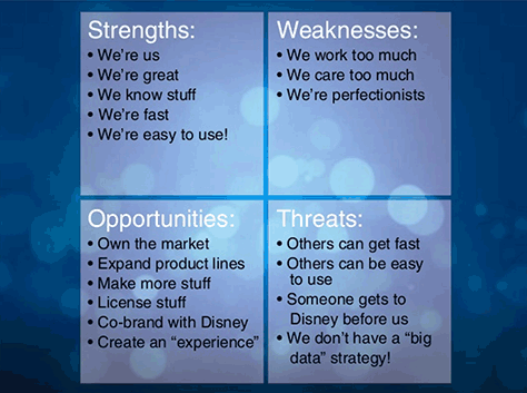
Figure 2—A SWOT analysis
A SWOT analysis

When defining a strategy, where should you start? Nathan offered a series of questions that you can ask to help you determine the right strategy:

  • “Who is your customer really?
  • What is their life like, what do they need, what do they want?
  • What value is being provided to them, and what kind of value can you realistically provide?
  • How can you differentiate yourself based on this value?
  • What’s it going to take to be successful?
  • Are you ready? Is it worth doing?
  • Do you have the right people. Who do you really need? Do you have the right culture?”

“Price and performance are usually what business is taught to focus on, but this isn’t how people choose products,” said Nathan.

In speaking about the relationship of business to strategy, Nathan told us: “Relationships happen in experiences.” Experiences deliver value as follows:

  • "Functional Value +
  • Financial Value +
  • Emotional Value +
  • Identity Value +
  • Meaningful Value =
  • TOTAL VALUE
  • Functional Value +
  • Financial Value =
  • TOTAL QUANTITATIVE VALUE
  • Emotional Value +
  • Identity Value +
  • Meaningful Value =
  • TOTAL QUALITATIVE VALUE

In wrapping up his presentation, shown in Figure 3, “Nathan shared the following takeaways:

  • “Qualitative and quantitative; not qualitative versus quantitative.
  • Strategy is derived from research.
  • UX can—and should—play a role in strategy.
  • Leadership is communicating vision.
  • Relationships and value are built through experience.”
Figure 3—Nathan Shedroff’s presentation on SlideShare

UX STRAT 2013: Nathan Shedroff, “What It Means to be Strategic” on SlideShare

A great Q&A followed Nathan’s presentation. Here are some of Nathan’s responses to the audience’s questions:

  • Regis McKenna published the best article about Crush Marketing in the ’90s.
  • “You need to marry the qualitative with the quantitative. This won’t tell us what to do, but it better informs us so we can decide what to do. We can’t be afraid of data and analysis. We have to use that lens. We can’t be afraid of data, which a lot of designers are.”
  • “The best thing is to tell stories. When you find out something that isn’t part of market research, tell the story. Help them to see the qualitative in their own lives.”
  • “It’s not about cheap. Every time you see a brand, that’s qualitative. Values and identity playing a role in decision making”
  • About SWOT analysis: “The most important thing is to back it up with research data.”
  • “No business person wants to walk away from money.”
  • What companies are using UX strategy? “Apple does no testing or research. Jobs micromanaged everything.” Proctor and Gamble use quantitative data, “but make room for the qualitative. Car companies do this intuitively—design, price points. There aren’t a lot of companies doing this historically. Microsoft does more user research than anyone on the planet, but it doesn’t affect engineering decisions at a high level. Intuit is starting to do it. Maybe Nike. AutoDesk is trying to do it.”
  • Question: “Often, strategy is told in the form of a presentation. What make the best presentations?” Answer: “The best presentations are well-told stories. Most presentations put you to sleep with numbers. They’re poor visually. Telling a story of what’s going on in a company. This is one of our strategic goals and why.”
  • Comment: “I’ve heard that you have to go out and do your own research and should not trust market research.” Response: “You don’t have to have a huge sample. If there’s no research and you can talk to six people, talk to six people. Doing any research is better than doing none. Try the laddering technique.” (Reviewer’s note: See Michael Hawley’s column “Laddering: A Research Interview Technique for Uncovering Core Values,” on UXmatters.) “People don’t know the truth of their own behavior. If we can get marketing to do good marketing research, we can pair it with good qualitative research. Consider other things, not just obvious things. Make the case for getting more research.”

Beyond Wireframes: How UX Methods Can Foster Innovation and Solve Business Problems

Reviewer: Pabini Gabriel-Petit

Presenter: Aline Baeck

Aline Baeck, shown in Figure 4, is currently Lead User Experience Designer, Global Products, at eBay. She gave a great presentation on fostering innovation and solving business problems using UX methods that was based on her work with the Design Innovation Team at Intuit, where she was an Experience Design Architect.
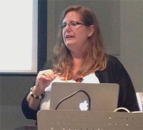
Figure 4—Aline Baeck
Aline Baeck

Aline opened her talk with the rhetorical question: “Why innovation workshops?” and answered her question by sharing a couple of testimonials:

  • “I applied the methods the next day with my team and we’ve redirected our project in a more purposeful manner…. A higher level of success is inevitable.”
  • “Participants are now more effective with their teams…. We now have a shared view of what success looks like.”

The goal of Intuit’s Design Innovation Team was to “Design for delight and get something into users’ hands as quickly as possible,” said Aline, as shown in Figure 5.
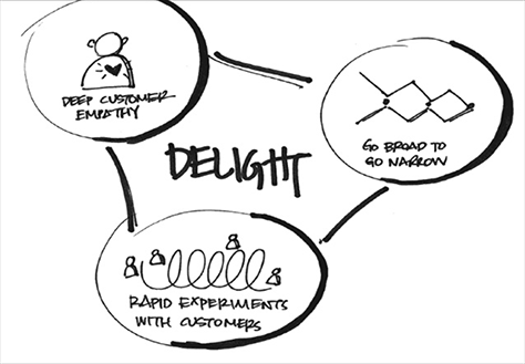
Figure 5—Designing for delight
Designing for delight

Aline told us that the team had a Eureka moment when they realized that they needed to “get design thinking into the strategy of what should be built. Intuit’s products weren’t as innovative as promised during the initial phases [of product development].” The team asked, “What’s happening that crushes innovation? How is success being measured?” Design and development cycles weren’t giving them much time, and the way they were measuring success was not supporting innovation. Product Management drove development, and we realized that “it’s about the quality of the experience.”

“What was pivotal in identifying the work that we needed to do was partnering with the Product Managers (PMs) who define the product that gets built. [With them,] we identified opportunities to increase innovation. We interviewed PMs to find out their challenges, how they felt, and their level of knowledge about design initiatives.”

The outcome was a series of innovation workshops titled “The Innovator’s Toolbox—Everyday D4D (Design for Delight) for the PM community.” The team held these workshops at the beginning of projects to discover how PMs “could leverage the way designers think,” said Aline. There were some “core differences in this workshop from others that we had done.” Our goals were to:

  • Come up with “15 to 20 methods that we could leverage everyday.”
  • “Facilitate the use of these methods on teams … to make decisions by leveraging the way designers think.”

There was “a single PM on a team consisting of [multiple] designers and developers and little opportunity to interact with other PMs.”

Each workshop lasted one and a half days:

  • Day 1—Solving problems with design methods
  • “Day 2—Leading a team using design methods.” A cross-functional team worked together, which was a new experience for them.

During the workshops, participants created four-quadrant empathy maps like that shown in Figure 6, to help them to “think about what we’ve learned when talking with customers and try to understand the emotional aspect of customers.”
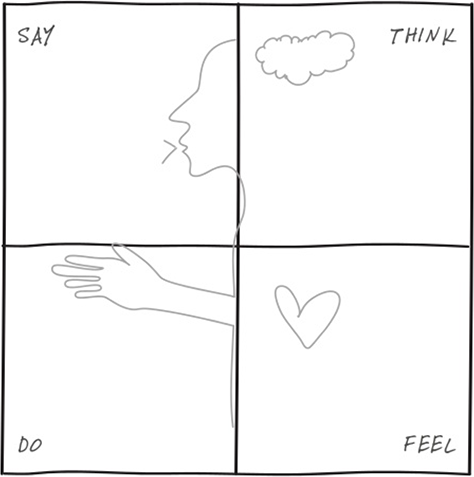
Figure 6Four-quadrant empathy map
Four-quadrant empathy map

In an empathy map, the information on the left side is explicit, while that on the right side is implicit. Teams tend to gather a lot of explicit information when interviewing customers.

Aline recommends incorporating the following core elements that were responsible for the workshops’ success:

  • personalization—Personalize the workshops for each team, providing a unique workshop experience rather than running the same workshop over and over again. “One or two weeks before each workshop, interview the team about their challenges, then customize the workshop’s content to meet those challenges.”
  • solving real problems—“Don’t use sample exercises. Pick problems that would feel relevant to participants—problems that you could at least partially solve by the end of the workshop—so you’re working on things they care about.” Check in with a team before a workshop to ensure that they haven’t already solved a problem. Particular PMs own problems, while others work on solving them. You can involve a client in a workshop to get their real input while working on a problem set.
  • station rotation—Workshops generally include 15 people overall. Get a big room, and divide the workshop into teams of five people, at three stations. Divide the workshop’s day into three time chunks, then rotate people through the stations—except the Product Owner, who is the facilitator and always stays with the same team. Assign a problem to each team. The advantage of this approach is that participants get to experience different facilitators’ approaches to using different methods. Participants move fairly frequently between different problems. For example, a participant might spend two hours at one station, then go to a new station, where he’d get a briefing from the Product Owner on the problem the team is solving, what has transpired so far, and the methods they’re using to solve the problem. If you encounter any difficulty working with a team, it’s comforting to know that you’ll soon be rotated away from that team.
  • flexible content—Based on what you’ve learned from the interviews, you’ll start Day 1 with methods that your team’s facilitator thinks appropriate, then play it by ear from there. A facilitator can use the think-aloud protocol to verbalize the decisions that he or she is making, creating a more open dialogue. This exposes participants to the underlying thinking of the facilitator and helps them to understand and learn various methods. Use methods only as long as they’re useful. If desired, you can transition methods that you’ve already picked up on Day 1 to Day 2. At the end of the first day, discuss which methods you’ve found most useful and want to take forward to Day 2—and which you want to discard or should enhance for use on Day 2. As a group, decide what the content of Day 2 should be. Day 2 is only a half day, so you should restrict the number of methods to only three or four.
  • longitudinal support—If you want to facilitate ongoing change after the workshop, assign one of workshop facilitators to support the team on an ongoing basis. When teams encounter resistance or time pressures, they may revert back to their usual ways of doing things. At Intuit, the teams created sketches on method cards that showed how the workshop had progressed, what methods they had actually used, and what the workshop had covered, similar to that shown in Figure 7. This helped them to review the workshop and build good habits. Longitudinal support really made a difference.
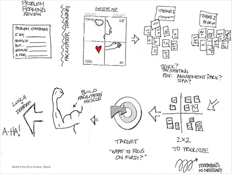
Figure 7—The Innovator’s Toolbox—Everyday D4D for the PM community
The Innovator's Toolbox - Everyday D4D  for the PM community

There were also some challenges that the Design Innovation Team encountered—but these things got better over time as they did more workshops. Deciding who they should convince to do these workshops was initially a huge barrier. They first reached out to management and got a positive response, but no workshops got scheduled. They reached out to their peers—people who were having problems and feeling the pain. Leaders knew about the pain, but weren’t actually feeling it. They reached out to product management. Personal relationships helped them to get people interested. It was also helpful to think about who would benefit from the workshops. Once the Design Innovation Team had held a few workshops, people started reaching out to them.

Aline shared the Diagnosis Tool that the team used to evaluate projects, shown in Figure 8. Taking five minutes to get people’s gut reaction to how they were doing on these scales raised issues that they might not otherwise have thought about.
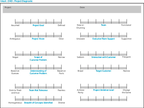
Figure 8—Diagnosis Tool
Diagnosis Tool

Check out Aline’s presentation in Figure 9. I love the sketches that she included in her presentation.

Figure 9—Aline Baeck’s presentation on SlideShare

UX STRAT 2013: Aline Baeck, “Beyond Wireframes: How User Experience Methods Can Foster Innovation and Solve Business Problems” on SlideShare

During the very lively Q&A that followed Aline’s presentation, she gave the following responses to the audience’s questions:

  • A team should include a maximum of 20 people; a minimum of eight people. There should be at least two stations.
  • On the first day, people on the Design Innovation Team led the stations; on the second day, product managers.
  • Don’t evangelize your workshops just by talking. “Show what you can do”; how you helped teams to meet their numbers.
  • “While many people don’t have good facilitation skills, many designers do.”
  • To measure our success, we “established self-review questions that we asked right after a workshop, then two weeks later.” We used Net Promoter Score (NPS) metrics.
  • “You want workshops to contribute to the quality of what comes out.”
  • “We collected stories about what we’d done and documented them.”
  • To get better at facilitation, “practice and get honest feedback. Assess each other as innovation catalysts by critiquing.”
  • “When facilitating, push back to get people to leave behind their preconceptions and entrenched positions. When people hadn’t been working on a problem, this was easier than if they had.”
  • “Design thinking is a way of approaching problems—the way designers think”—whether tackling tactical or strategic problems.
  • “Breaking down barriers hurts.”
  • “Lean UX focuses on work that gets done. Workshops broaden perceptions of the role designers can play.”

The Marriage of Corporate Strategy and UX Strategy: A Case Study

Reviewer: Pabini Gabriel-Petit

Presenter: Leah Buley

Leah Buley, shown in Figure 10, is a Design Strategist at Intuit. She gave a very fast-paced, high-energy talk on her experiences at Intuit, where she’s responsible for design strategy for small-business and personal-finance applications. Leah told us: “Intuit’s mission is to improve people’s financial lives.”

Figure 10—Leah Buley
Leah Buley

“Intuit has an interesting ambition: to be an innovative, growth company,” Leah said. The company has a 10%-time policy, which allows employees to devote 10% of their time to innovation. They can spend this time on whatever they think is interesting. Intuit uses Horizon Planning to think about its product strategy, using three innovation horizons:

  • Horizon 1—incremental innovations that serve existing markets
  • Horizon 2—innovating next-generation products that serve existing or adjacent markets
  • Horizon 3—breakthrough, or disruptive, innovations that create new markets. Leah described the need for Horizon 3 innovations—experimental products that haven’t yet proven their viability in the marketplace—to focus on “love metrics” rather than monetary or other traditional metrics.

Innovation initiatives at Intuit include D4D (Design for Delight) and IAT (Innovation and Advanced Technology). D4D focuses on design and design strategy. IAT is a centralized group whose mission, according to Leah, is to “accelerate Intuit’s journey to be a premier innovative-growth company through game-changing design, technology, and new ways to work.” IAT sponsors two types of innovation projects:

  • partnering with business units on complex, legacy products
  • reimagining the future of their core products

Leah surveyed some of Intuit’s recent product innovations and their impacts on people. Then, she described how, in cognitive science, anchoring biases people toward their recent impressions, so familiarity with existing products anchors them. Intuit wants to put new anchors in place—aspirational anchors; not create incremental improvements, but disruptions. Leah shared this definition of strategy:

strategy (noun): an adaptation that serves an important function in achieving evolutionary success

Intuit partnered with IDEO in assessing its business goals, asking, “Who is our customer? Us→Business Unit→End User. Who in the business would be most impacted by the project? Who are our core partners?” “Surprise! It’s corporate strategy,” exclaimed Leah. “In parallel, we were working on the same goal: how to increase revenue from payments by envisioning the customer experience in five years. The CEO sponsored the Corporate Strategy effort with the goal of tripling revenues. The business units sponsored UX Strategy.”

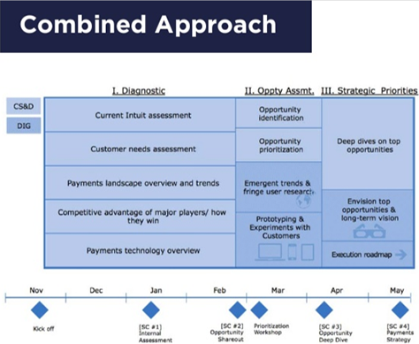
Leah contrasted UX Strategy’s “generative approach,” which Figure 11 shows, with Corporate Strategy’s “reductive approach,” shown in Figure 12. The focus of UX Strategy was on generating multiple hypotheses and product concepts. But the way Corporate Strategy approached project work was very different. They more quickly identified a small set of opportunities where Intuit would have competitive advantage, then did deep dives on them. The two teams were planning to do a lot of the same things, and leadership thought it was imperative that they work together. “Business has better business-intelligence data, but we kill it when it comes to understanding the user,” said Leah. While Intuit’s first attempt to unify the two different approaches “wasn’t very unified,” they finally came up with the combined approach shown in Figure 13.
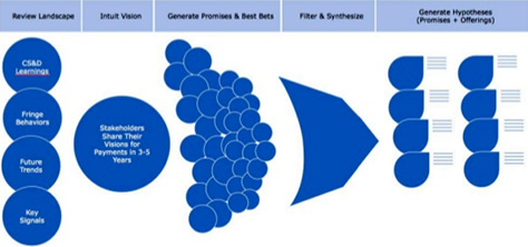
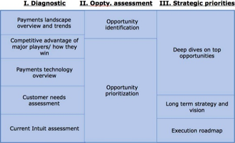
Figure 11—UX Strategy’s generative approach
UX Strategy's generative approach
Figure 12—Corporate Strategy’s approach
Corporate Strategy's approach
Figure 13—UX Strategy and Corporate Strategy’s combined approach
UX Strategy and Corporate Strategy’s combined approach

To enable the two teams to work in concert on the project, they established the following "Terms of Engagement:

  • Run as separate teams
  • Appoint a liaison
  • Weekly team meetings
  • Share material back and forth
  • Involve each other in key sessions”

They also assessed what things Corporate Strategy is good at versus what UX Strategy is good at, as summarized in Figure 14, and each team focused on what it did best. “Corporate Strategy is really great at understanding the competitive landscape,” said Leah. “They have great models for understanding the overall market and spotting market opportunities. They look at case-study analyses for predictive planning. They can answer questions like How long does it take to achieve what we say we want to achieve. In a sense, Corporate Strategy thus created the guardrails of the area for UX Strategy to play within. UX strategy’s strengths are seeing into people’s lives, trendspotting what is happening design-wise now—interaction paradigms, brand experiences, aesthetics—envisioning and validating new experiences and bringing them to life, and identifying customer insights.” Corporate Strategy looks at how Intuit is going to make money in the future; UX Strategy, what the money-making products of the future will look like.
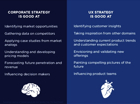
Figure 14—Corporate Strategy’s and UX Strategy’s strengths
Corporate Strategy's and UX Strategy's strengths

As a consequence of working with Corporate Strategy and sitting in on its meetings, UX Strategy finally gained access to the CEO and got a seat at the corporate-leadership table.

UX Strategy gained interesting insights by doing iterative research probes, unfocus groups, and field research, then communicated the customer insights, design principles, and experience opportunities that they had identified. They created paper prototypes, then held an internal “science fair” where people provided feedback on them. The print deliverables that they created had very high production values. These included a concept cookbook that comprised an opportunity framework, five concepts, and notional product ideas; and small flipbooks, showing their design concepts. They created a walk-through exhibit for senior leaders, showing how the company would make three times as much money from payments. They created vision videos on product strategy. Finally, they led a roadmapping session, and the company adopted three core points of their UX strategy, which led to a corporate reorganization.

Leah concluded her talk by outlining the lessons UX Strategy learned from their experience “partnering with Corporate Strategy:

  • You stand for the customer
  • Look to their data for focus
  • Be a friendly gadfly
  • Make it vivid and sensory”

UX Strategy brought knowledge of the customer to the project and leaned heavily on Corporate Strategy’s rich business data. Together, they achieved success through building relationships and creating synergies between the two teams.

Clearly, user experience and innovation are important to Intuit, and they invest heavily in both. Intuit provides a shining example of what great companies that truly get the value user experience can accomplish and has a culture that many UX professionals would envy.

This was one of my favorite talks at UX STRAT 2013. Take a look at Leah’s beautifully designed presentation, shown in Figure 15. The UX Strategy team’s exquisite deliverables that her presentation depicts are especially interesting.

Figure 15—Leah Buley’s presentation on SlideShare

UX STRAT 2013: Leah Buley, “The Marriage of Corporate & UX Strategy” on SlideShare

Here are some of Leah’s responses to the audience during the Q&A that followed her engaging presentation:

  • When someone asked about the timeline for the collaboration between UX Strategy and Corporate Strategy, Leah told us the project took place over seven months. After taking four months to discover their corporate strategy, it took two months for the company to realign behind it.
  • The internal UX Strategy team comprised Leah and a Research Lead.
  • Working with IDEO was really expensive—$500K for four people.
  • Regardless of the size of a team, “it’s all about relationships and building trust; senior people having the conversations they need to have. In a smaller organization, figure out who makes corporate strategy decisions and who advocates for user experience.”
  • “Definitions of the customer across UX Strategy and the business were a source of tension early on.” Corporate Strategy did not initially trust what UX Strategy thought were legitimate customers, so they took their framing from Corporate Strategy.
  • Through user research, they needed to find people who could tell them what the future was going to be.

Redesigning Business Culture and Thinking Around the Customer

Reviewer: Margie Coles

Presenter: Tim Loo

For those of us who missed Tim Loo’s workshop on Monday, it was great to have an opportunity to hear him speak Tuesday morning. Tim Loo, shown in Figure 16, is Strategy Director at Foolproof, a UK experience design firm that focuses on finding “the most valuable solution between what clients want and what customers want from each other: the win/win.” In this impressive, though brief, 30-minute presentation, Tim managed to be both entertaining and instructively insightful.

Figure 16—Tim Loo
Tim Loo

What is business culture, and why should we care? Tim defined culture for us, as follows: “Culture tells us how to behave when no one is telling us exactly what to do—it’s part coordination and part conscience. It determines how people interact with each other, including customers and stakeholders.”

And why should we be interested in culture? To illustrate, Tim showed us the results of a survey in which he asked 100 UX leaders in the UK for the top three things that stopped them from being effective. Their collective answer: culture, politics, and organizational silos. Thus, culture is the primary barrier to creating and achieving great user experiences. Figure 17 shows a broader spectrum of the responses from this survey. We need to care about culture because it is either the primary enabler or barrier to delivering great user experiences. In one of the most tweeted quotes from the conference, Tim concluded, “Culture eats strategy for lunch.”
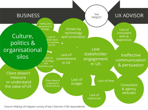
Figure 17—Results of the survey showing 100 UX leaders’ key barriers to success
Results of the survey showing 100 UX leaders' key barriers to success

So, what type of culture is characteristic of big companies? Business leaders might say, “Our purpose is to make money.” Many big companies have become insular and narrow minded. Typical goals of IT- or Engineering-driven companies are to minimize costs or suppress change. This has spawned process-driven systems at the expense of innovation—as well as us-versus-them silos. The attitude that “for me to win, you have to lose” abounds. Many UX professionals conclude that it’s “me versus the matrix.”

But just as changing one’s personality is possible, though incredibly difficult, and turning a large ship takes time, big companies resist change and change slowly. They aren’t organized in a way that naturally enables them to deliver great user experiences, and culture change is hard. The best way to effect change in a business culture, explained Tim, is to reverse the way in which we tend to view influencing relationships—from changing thinking to changing behaviors, as shown in Figure 18.
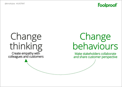
Figure 18—Instead of focusing on changing business thinking, focus on changing business behaviors
Instead of focusing on changing business thinking, focus on changing business behaviors

Tim proposes that, to change a corporate culture, we should purposely focus on affecting four business behaviors. At Foolproof, UX strategy means striving to make these four statements about behavior a reality.

  1. “We can all visualize what it’s like to be a customer dealing with us today.”—This is especially true for a large company. Create visuals showing all channels and painpoints, highlighting customers’ cumulative experience of chaos. Creating easily consumable stories or videos are highly successful means of capturing and communicating customer impacts on an emotional level.
  2. “We know and regularly communicate what [a] good experience looks like.”—Since most organizations can’t tell you what a good experience might be, you can help to articulate an operational definition of good, or what it means to customers for the company to live up to its brand promise. Create stories that show what will happen to customers when the company lives up to its principles.
  3. “We physically get together to make hard decisions and [make] trade-offs to deliver the right experience.”—Force people to get in same room. Companies often try to do too many things and must make trade-offs, choosing what they will and won’t do. Face-to-face collaboration is key to building empathy between colleagues, as well as with customers.
  4. “We measure and report on things [that] are meaningful for us and the customer.”—Before making any changes, measure how the customers feel about things. Surveys can help here. Doing this helps stakeholders to care about numbers that link customer outcomes to value.

The underlying principle of UX strategy is finding a win/win solution at the intersection of what the business wants and what customers want, as shown in Figure 19, thereby ensuring the profitability of the business.
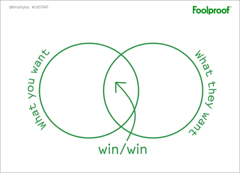
Figure 19—Win/win, or finding the intersection between what the business and customers want
Win/win, or finding the intersection between what the business and customers want

By encouraging stakeholders to collaborate, we can change behaviors tangibly. Behavioral changes will, in turn, drive changes in thinking. In Tim’s parting words, he offered this advice: “Some of us will need to take a central role in effecting cultural change.” Indeed! I’m on board.

Take a look at Tim’s fabulous presentation in Figure 20.

Figure 20—Tim Loo’s presentation on SlideShare

UX STRAT 2013: Tim Loo, “Redesigning Business Culture and Thinking Around the Customer” on SlideShare

Lean UX Strategy and Processes

Reviewer: Pabini Gabriel-Petit

Presenter: Josh Seiden

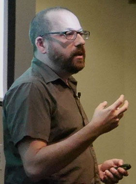
Josh Seiden, shown in Figure 21, is Managing Director at Neo, a consultancy in New York City, and editor of Jeff Gothelf’s book Lean UX: Applying Lean Principles to Improve User Experience.

Figure 21—Josh Seiden
Josh Seiden

If the preconference workshop schedule had permitted it, I would have liked to attend all four of the workshops. They all sounded great. But I had to choose just two, so since I’d already read Lean UX and several other books on the topic, I decided to skip Josh’s workshop. I’m glad I had the opportunity to hear what Josh had to say about lean UX during the main conference. Some friends who did attend Josh’s workshop told me that this presentation very effectively summarized what he had covered during his workshop. I enjoyed Josh’s talk.

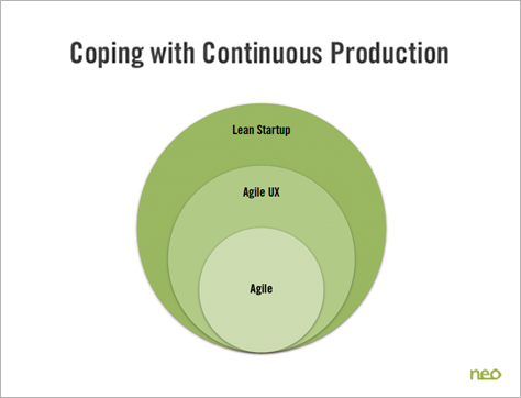
“At the beginning of design, the focus was on deliverables. This worked well for the domain of print design. The project model came from engineering where you figure everything out first,” said Josh. Lean UX has come from the need to cope with continuous production, as shown in Figure 22. “Every 11.6 seconds, Amazon makes new software live. We are no longer bound to a manufacturing process. Software enables continuous change. We have removed the manufacturing step because we are not pushing out discrete things. Instead we are making monolithic systems that are constantly undergoing evolution. Software today involves continuous change to a continuously evolving medium.”

Figure 22—Lean UX arose from the need to cope with continuous production
Lean UX arose from the need to cope with continuous production

“The agile model came from developers who first bumped into this reality; from coping its repercussions. Then along came agile UX in reaction to agile. Now the question is: How to collaborate with business? This became the Lean Startup movement. Their motto became GOOB, or Get out of the building. Like they invented it. But they got the need for dealing with continuous change.”

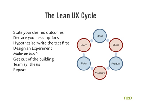
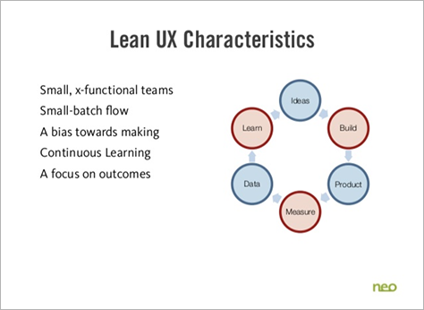
“Lean UX defines value in user-centered terms,” said Josh. The steps in the Lean UX cycle, shown in Figure 23, are Build, Measure, and Learn. Figure 24 shows the characteristics of Lean UX.

Figure 23—The Lean UX cycle
The Lean UX cycle
Figure 24—Lean UX characteristics
Lean UX characteristics

Josh outlined the process of Lean UX, as follows:

  1. continuous learning—“Agile is a method of doing, but it doesn’t help you to figure out what to do. Lead with vision. You’ve got to know where you’re going. Test ruthlessly in the market. How do you know you’re making progress? You’ve got to constantly test against the market. Reduce risk by testing your assumptions early on. Build it, then figure out if it works.” As an example, Josh showed a multichannel UX strategy.
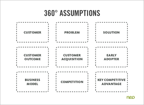
  2. assumptions and hypotheses—“Every project starts with assumptions.” You can use the 360° assumptions diagram shown in Figure 25 to identify your assumptions. Write the test for your hypothesis first: “We’ll know this is true when we see a qualitative outcome and/or a quantitative outcome that improves this KPI,” or Key Performance Indicator. A hypothesis is a statement of belief: “We believe that doing this for these people will achieve this strategic outcome. We’ll know this is true when we see this market feedback.”
  3. test hypotheses by making—In Lean UX, there is “a bias toward making. Making is a way to take control of strategy.” “A minimum viable product (MVP) is the smallest thing you can make to test your hypothesis. Does the solution work?” “Don’t design a product, design an experiment.” Josh quoted Jeff Patton: “Culture is what you do.”
  4. manage outcomes—“Outputs are the software we build; the materials we produce. Output is easy to trace. Outcomes are changes in the world after we deliver outputs. Outcomes are harder to trace. Impacts are the changes we see over time; the sum of all outputs. They’re very hard to trace. Don’t manage output. Instead, focus on outcomes. Don’t make teams responsible for impact.”
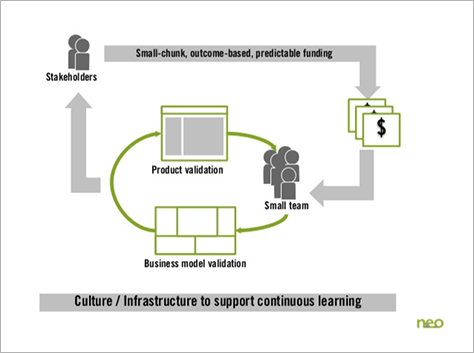
  5. a new organization—“What does organizational adoption of Lean UX look like?” As shown in Figure 26, “stakeholders give small teams outcome-based funding.” Adopting Lean UX requires “culture change that tolerates the continuous experimentation that fosters learning.”
Figure 25—360° assumptions
360° assumptions
Figure 26—Culture of continuous learning
Culture of continuous learning

View Josh’s presentation in its entirety in Figure 27.

Figure 27—Josh Seiden’s presentation on SlideShare

UX STRAT 2013: Josh Seiden, “Lean UX + UX STRAT” on SlideShare

Implementing Lean UX Across PayPal: Lessons Learned

Reviewer: Margie Coles

Presenter: Karen Pascoe

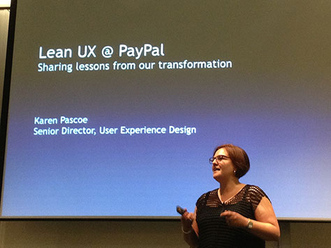
Karen Pascoe, Senior Director of User Experience Design at PayPal—who is shown in Figure 28—opened her presentation by saying, “A lot of what we are talking about today is cultural change.” Her presentation was no exception. In the brief 30 minutes that the packed schedule of Day 1 of UX STRAT allocated to her talk, Karen delivered a thorough and clear overview of the cultural shift that took place at PayPal because of its adoption of Lean UX. For me, this presentation experience was one of inspiration. The audience perhaps drew a collective breath of fresh air to counteract our daily struggles to bring UX sensibilities into our organizations’ product-development culture.

Figure 28—Karen Pascoe
Karen Pascoe

Karen began by describing how PayPal’s days as a startup and disruptor had evaporated after 14 years in business. She explained that, at a growth rate of 25% each year, “we grew so fast that things got too complicated; we got tremendously slow and complex.” By this point, PayPal employed 130 UX professionals—some of whom were dedicated exclusively to research, visual design, or other specialties. Even though the company exists in a hyper-competitive landscape, it was taking six to twelve months to deliver new features and up to 18 months to deliver new products.

PayPal had become bogged down by its processes, yet previous attempts to introduce less process-oriented systems had failed. Confidence in affecting positive change was low. The catalyst for successful change materialized in two ways:

  1. A leadership change—The company’s new president came from a small startup that PayPal had acquired, and he had no patience for ineffective processes. He launched a major initiative to restore the culture to much of its original start-up mentality, encouraging people to rally around him.
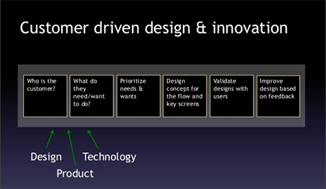
  2. A return to customer-centered product design—“This had really eroded during our waterfall years.” In lieu of extensive up-front research and perfectionist mockups, UX designers began working side-by-side, in close collaboration with front-end developers and product managers during the design phase, as shown in Figure 29.
Figure 29—Collaborative, customer-driven product design and innovation
Collaborative, customer-driven product design and innovation

“The UX team considered several different design methodologies before choosing to adopt Lean UX. They were drawn to Lean UX because it is an iterative, customer-focused approach that breaks down the process of UX design to its essentials.”

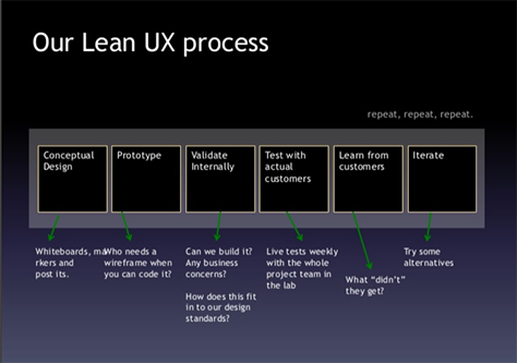
So what does the Lean UX process involve? As shown in Figure 30, Karen described the following six steps of a Lean UX iteration:

  1. Conceptual design—Collaboration using whiteboards, markers, and Post-its.
  2. Prototype—Karen emphasized the need to get out of the business of creating design artifacts. “Who needs a wireframe when you can code it?”
  3. Validate internally—Validation included meetings with one or two stakeholders—sometimes “in secret”—to explore feasibility. “Can we build it? Any business concerns? How does this fit in to our design standards?”
  4. Test with actual customers—Conducting live tests weekly, with the whole product team in the lab.
  5. Learn from customers—Reviewing the findings from testing. “What didn’t they get?”
  6. Iterate—Try some alternatives. Repeat again and again, as necessary.
Figure 30—An overview of the Lean UX process at PayPal
An overview of the Lean UX process at PayPal

Following a successful pilot project, the next challenge was scaling. First, the UX team held workshops to build excitement and let people know there was real commitment to working lean. They wanted both people in the company and the company’s partners to become comfortable with this new way of working. Next, they built up confidence in Lean UX by applying the approach on projects with three additional teams. This assisted them in solidifying the company’s belief in Lean UX and the momentum behind this new approach to product design.

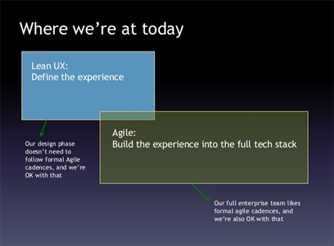
Now, Karen reported, the new Lean UX process is in flight worldwide. Although it took six to nine months to convince other groups that this was a good way to go, after a year and a half, great progress is evident. As Figure 31 shows, they’ve interwoven Lean UX with the formal, agile cadence of their new, leaner development process at PayPal. During each design cycle, or sprint 0, they follow a Lean UX approach in defining the user experience. “Our full enterprise team likes the formal agile cadences, and we are okay with that. Our design phase doesn’t need to follow formal agile cadences.” Karen noted that, during the next year, the UX and Engineering teams at PayPal will continue their exploration of lean UX and agile. A hybrid process may evolve over time.

Figure 31—Lean UX interwoven with formal agile engineering cadences
Lean UX interwoven with formal agile engineering cadences

Karen summed up the major barriers to success in implementing Lean UX for her team, as follows:

  • colocation—“Can’t turn it on a dime.” Finding ways to put teams physically in the same locale is a tough barrier to overcome. “We all need to be in one place.”
  • getting rid of design artifacts—This was an issue not only for UX designers, but also for company partners who, in some cases, required the artifacts as part of their process.
  • balancing UX resources/teams—Because the UX team is now feeding multiple Scrum teams, meeting the demand is stressing their resources.

For UX designers, there are other implications. “Designers tend to be perfectionists—and Lean UX isn’t about perfection.” Patterns can help because they drive consistency. Designers need to recognize that there will be lots of design iterations during which they can continuously improve their designs.

Karen concluded by describing the most important outcome of all. PayPal is now delivering viable products to market quickly. Happily, the pain of implementing this huge cultural change has been accompanied by huge benefits.

I’ve always liked PayPal. Now I have an insider’s peak into why I do.

Check out Karen’s excellent presentation in Figure 32.

Figure 32—Karen Pascoe’s presentation on SlideShare

“UX STRAT 2013: Karen Pascoe, Implementing Lean UX Across PayPal: Lessons Learned” on SlideShare

Panel: Lean UX vs UX Strategy

Reviewer: Margie Coles

Moderator: Pabini Gabriel-Petit

Panelists: Shane McWhorter, Karen Pascoe, Mark Schraad, and Josh Seiden

As conceived by Paul Bryan, the initial premise of this panel was to discuss ways in which Lean UX might be antithetical to UX strategy. However, in introducing the panel’s topic, moderator Pabini Gabriel-Petit, shown in Figure 33, stated, “In our discussions leading up to the panel, we concluded that Lean UX and UX strategy are actually complementary to one another.”

Figure 33—Moderator Pabini Gabriel-Petit, Publisher and Editor in Chief of UXmatters
Moderator Pabini Gabriel-Petit, Publisher and Editor in Chief of UXmatters

Shane McWhorter captured the mood of the panel by calling for better clarity on the vocabulary that formed the basis of the panel’s premise. He said that, as a panel, “We violently agreed on the need for user experience to be strategic.”

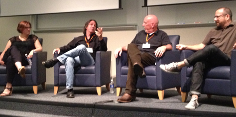
A thoughtful discussion unfolded about the challenges the panelists, shown in Figure 34, see in moving UX strategy forward as an influencer of sound business and product development strategy—regardless of whether the methodology is officially Lean. Aside from some technical glitches with microphones, it was a delight to listen in on this conversation.

Figure 34—Panelists, from left to right, Karen Pascoe, Shane McWhorter, Mark Schraad, and Josh Seiden
Panelists, from left to right, Karen Pascoe, Shane McWhorter, Mark Schraad, and Josh Seiden

Karen Pascoe spoke about her experience at PayPal, saying, “What we are trying to do with Lean [at PayPal] is not be designers on an island, but be designers in concert, in deep partnership, with the business. Where they’re engaging and seeing the customer, feeling the richness of the process, and really understanding who we are building the product for.

“But we’re swimming upstream to have more relevance in terms of driving decisions in the organization, and we have to foster that relationship in order to not be a service bureau,” Karen continued. At PayPal, the goal of User Experience is to have more relevance in the organization as a strategic partner rather than serving as a service provider. Referring to Leah Buley’s UX STRAT 2013 talk, Karen said, “Leah’s presentation was probably the pinnacle of seeing where we want to get to.” Karen concluded by telling us that Lean UX is a great vehicle on which to build such visions.

Mark Schraad described how large conservative corporations, which are tough to change, adopt what he calls an “informed waterfall.” Product definition and design get done up front, then, at some point, the engineers take over using an agile methodology. “The hurdles in such a culture are about managing the expectations of the people at the top.” The decision makers leading an organization want well-defined project parameters: how much something is going to cost, how long it’s going to take, and what resource allocations will be necessary. As the pull increases to pay attention to the people lower in the organization who know the customer best, the tension driving change increases. But the trust issues of the people at the top remain a problem.

Making an important point, Josh Seiden spoke about how a Lean methodology can build trust. “When you have a high-functioning agile team, you get a kind of transparency with stakeholders—between all the participants on a project. Everyone can see the designs that are being pushed out daily; everyone can see the code being built daily, everybody can look at the backlog. You get radical transparency.” Because of the large number of people involved in bringing a product to market, the challenge is extending that transparency across a large organization to build that trust.

Shane countered that, in waterfall, transparency is great when you have honest developers. He also pointed out that iterative approaches are not always low cost. “Sometimes there is a higher cost. You don’t want to build an aircraft carrier with a Lean methodology. There are situations where Lean perhaps can’t be done. There is the question of scale.” In one disastrous situation, Shane’s team was given six months to build a complex product. Then, when they were finished, the leadership decided to give them six more months “to improve the product.” But the architectural and development decisions that had been made to deliver the product in six months prohibited their making these improvements in that timeframe. In this case, unwittingly taking an iterative approach failed to deliver a wise solution.

Discussion next ensued about the often-heard need of developers to “lock down requirements” before beginning development, acknowledging that a more rational approach would be to lock down use cases—not requirements—as a way to focus the product concepts before designing the product. It’s easier to refactor the small details of a software model. When it is impossible to know all of the use cases, adopt the stance of being a “learning organization,” so you can learn about new use cases along the way.

A major part of the panel discussion focused on the difficulties of moving from doing big, up-front, design in waterfall to a more collaborative and iterative development process. Clearly, there are pitfalls, as well as advantages, in leaving behind big-design research and artifacts. But it’s important to note that the movement toward Lean is not an all-or-nothing proposition. I really wouldn’t want to see a heart implant being built using Lean methodology. Would you?

Some additional takeaways:

  • “Most senior-level executives are risk averse.” Lean methodology reduces the risk of spending great sums to build a product that no one wants. On the other hand, there is always perceived risk in changing our way of doing things.
  • Expectations can be out of alignment regardless of the development methodology. It’s difficult, but important to align the expectations of stakeholders.
  • Lean UX is one way to get teams to work crossfunctionally.
  • Colocation is important in building relationships and trust among team members. It’s important for those who must work remotely to travel, so they can be on site frequently enough to regularly re-establish their relationships with the team.
  • Team composition should also include content folks—content strategists, writers, curriculum experts, and any necessary customer representatives.
  • In Lean UX, teams need to be smart enough to interpret users’ immediate feedback. This is a shift from older methodologies that allowed six months of customer use before any product evaluation took place.

Summing up, perhaps the best title for this panel would have been “Lean UX and UX Strategy.” Lean UX simply asks us to engage in a more pragmatic, business-savvy, product-development approach. We test our assumptions, determine success based on outcomes instead of output, and keep ourselves closely connected with customers. Lean UX embraces these principles. Perhaps the best UX strategy of all in 2013 and beyond would be to bring more of that Lean mindset and skillset into our roles as UX designers—wherever we are. And, hopefully, the growing tendency of UX professionals toward strategic thinking will help us to establish connections with those in the boardroom.

UX Strategy for the BlueZones Project: A Case Study

Reviewer: Margie Coles

Presenter: Colt Whittall and Greg Stielstra

Colt Whittall, VP at Roundarch Isobar, and Greg Stielstra, Engagement Strategist at Healthways, presented a case study on their BlueZones project. The term BlueZones refers to locations around the globe where people live longer. Colt explained that past research on BlueZones had identified several shared lifestyle characteristics that help to explain longevity:

  • importance of family—putting family ahead of other concerns
  • no smoking—few people smoke
  • unavoidable physical activity—moderate physical activity is an inseparable part of life
  • eating wisely—the diet includes more vegetables and legumes and less processed food; and people eat only until they’re 80% full
  • a sense of belonging—people of all ages have a healthy social network

The shared lifestyle characteristics of BlueZones, shown in Figure 35, inspired the question: “Is it possible to artificially manufacture BlueZones?” In other words, could health and longevity be deliberately increased in a community through a public-health campaign?

Figure 35—Common lifestyle characteristics of BlueZones that contribute to longevity
Common lifestyle characteristics of BlueZones that contribute to longevity

Diagram from Quest Network

An initial program in Albert Lee, Minnesota, focused on encouraging the lifestyle characteristics of BlueZones and had promising results. A pilot study in California beach cities offered further evidence that this approach could produce great results, resulting in a 14% drop in obesity and a 30% reduction in smoking. The next step was to solidify the program for widespread roll-out and implementation. It was at this point that they decided to apply UX methods to maximize their success in making changes within a community and in the daily lives of individuals—methods that encompassed discovery, teamwork, and strategy.

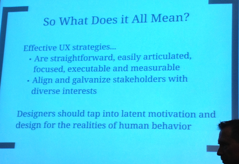
Greg highlighted the qualities of effective UX strategies, as shown in Figure 36. Essentially, “effective UX strategies are straightforward, easily articulated, focused, executable, and measurable. [They should] align and galvanize stakeholders with diverse interests.” He also emphasized the importance of tapping into latent human motivations to “design for the realities of human behavior.”

Figure 36—Qualities of effective UX strategies
Qualities of effective UX strategies

This presentation offered food for thought about using UX methods to achieve results that are dependent solely on motivating human behavioral change. Though the relationship of the case study to UX strategy was perhaps a bit thin for me to follow, I thoroughly enjoyed learning about the background of the BlueZones research and the efforts of the BlueZones project to cultivate healthy behavior. 

Implementing Pillars of Cool for March Madness

Reviewer: Margie Coles

Presenter: Klemens Wengert

Klemens Wengert, Senior UX Architect at Turner Broadcasting, shown in Figure 37, presented a case study about the overhaul of both the business strategy and the UX strategy for an online application for sports enthusiasts with the goal of engaging them in the NCAA March Madness.

Figure 37—Klemens Wengert
Klemens Wengert

When Klemens started on the project, the application had been in development for about two years and everyone was unhappy: the design team, developers, product management, and customers. It quickly became clear that the only way forward would be to first rebuild trust. He brought everyone together to create new business goals and UX goals and “design on the fly,” with everyone in the same room. This was not the fastest way of proceeding, Klemens stated, but “this was about building trust.”

The focus of the UX strategy and the goal in determining the application’s feature set was to build an application that was cool. Their definition of cool design had its basis in a paper about contextual design by Karen Holtzblatt that outlined the components of joy:

  • accomplishment—designing to support life
  • connection—designing to help people maintain relationships with the people they care about
  • identity—designing to enable people to express their identity—how they want the world to see them
  • sensation—designing for immersion in sensory experiences

In the same paper, Karen defined the triangle of design, which lets you determine whether a customer will engage and comprises the following:

  • direct into action
  • the hassle factor
  • the delta

This essentially involves contrasting the ease with which a customer can move directly toward an intended action with the hassles of doing so. The delta between these two forces determines the customer’s joy in use.

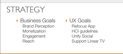
As shown in Figure 38, the UX goals for the project—the “pillars of cool” to which the title of the presentation referred—were to refocus the application on users’ joy, adhere to HCI guidelines, unify customers’ social experience, and support linear viewing. The business goals included improving brand perception, ensuring monetization, expanding engagement, and extending reach.

Figure 38—Business goals and UX goals as the overall strategy for March Madness Live
Business goals and UX goals as the overall strategy for March Madness Live

Klemens presented a quick walkthrough of some of the challenges and design decisions of the project. For example, the application needed to work well across smartphones, tablets, and the desktop. With clear goals for both UX and the business, the results were spectacular once the application went live. Comments from users included a range of accolades from “[This is] the best invention ever” to “The March Madness Live app is life changing.”

Figure 39 shows one way of extending the site’s reach through Twitter.

Figure 39—March Madness Live, with an unobtrusive panel on the left for tweets
March Madness Live, with an unobtrusive panel on the left for tweets

Despite my overall lack of interest in basketball—sorry fans!—I enjoyed the presentation, shown in its entirety in Figure 40, and love this quote that I scribbled down: “The primary agent for building anything for UX is trust.” The presentation highlighted what is possible when all stakeholders work together to define clear goals for both the business and UX.

Figure 40—Klemens Wengert’s presentation on SlideShare

UX STRAT 2013: Klemens Wengert, “Implementing The Pillars Of Cool For March Madness Live” on SlideShare

Vignettes

Reviewer: Margie Coles

Wrapping up a long day, 4:45pm brought a blitzkrieg of vignettes—four back-to-back presentations that were packed into just 40 minutes, including transitions and setups. Really! Despite my needing to work hard just to keep my head from exploding under the onslaught, I have to admit that each individual presentation was great—especially considering the limited time the presenters had to present their topics.

Needless to say, with this level of intensity, neither the audience nor the presenters needed any coercion to immediately head to a nearby pub, The Barrelhouse, at the end of the day, for a free pint or two, compliments of UX STRAT 2013. Whew!

How to Conduct a UX/CX Audit

Presenter: Linda Francis

In Linda’s words, “The purpose of a UX/CX audit is to improve or optimize customer experiences, provide catalysts for change, and increase customer empathy.” While this, in itself, does not seem revolutionary or new, Linda was actually proposing that the UX professional’s role shift to one of facilitator and coach, fostering broad cultural shifts within organizations. Linda reviewed the key activities of a UX/CX audit:

  • Clarify the scope for an audit.
  • Identify customer touchpoints and create a customer journey map.
  • Identify measures of experience qualities.
  • Walk about—GOOB, Get Out of the Building—and interview people directly.

Linda recommended that, after doing independent research, UX professionals organize and facilitate a cross functional, interactive workshop in which participants produce something measurable that they can own instead of creating a lengthy document that likely won’t get read. She also suggested that coupling such a workshop with follow-up coaching could increase the likelihood of a real cultural shift within an organization.

Linda’s participatory model for creating a UX/CX audit deliverable echoed similar sentiments that I heard at the conference regarding the need to generate more customer knowledge and empathy throughout the product-development process. Rather than working in isolation, UX professionals should encourage cross-functional collaboration.

Check out Linda’s presentation in Figure 41. (If you’re an animal lover, you’ll love it!)

Figure 41—Linda Francis’s presentation on SlideShare

“UX STRAT 2013: Linda Francis, How to Do a UX / CX Audit” on SlideShare

Crystal Palace: An Innovation Research Case Study

Presenter: Quynh Nguyen

The next presentation was an excellent case study from Quynh Nguyen, Research Manager at Citrix Systems. Quynh described a project whose goal was to develop “cloud-based, multidevice technology to share content and apps,” a highly innovative product idea targeted at people working on multiple mobile devices.

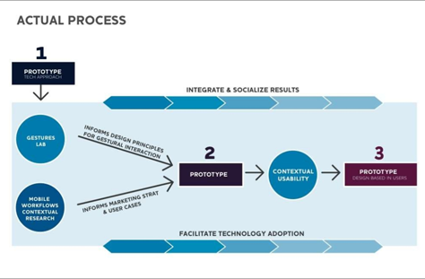
Their UX research team began by studying users’ gestures, using paper prototypes of mobile devices. They quickly realized that their standard design and development process, illustrated in Figure 42, was inadequate, then took a step back to re-examine their overall strategy.

Figure 42—The standard product-development process they followed initially
The standard product-development process they followed initially

In addition to looking at users’ gestures with the goal of defining principles for gestural interaction design, they conducted contextual research to better understand mobile users’ workflows. Their findings informed product strategy, helped to identify the key use cases, and enabled further refinement of their prototypes. Instead of following a standard, linear UX research and design process, they used an iterative research and design process, shown in Figure 43, that let them incorporate new learnings along the way.

Figure 43—Their iterative UX research and design process—learning through prototyping and testing
Their iterative UX research and design process—learning through prototyping and testing

Quynh reflected that they were able to conceive an idea for a truly innovative product before anyone knew why people would use it or what problem it might solve. In this case, it was important to do some research first, then iteratively refine their prototype to more closely approximate what would become a real product. As their prototype progressed, the feedback they got during their usability testing became more focused.

In closing, Quynh suggested some best practices for innovation research:

  • Be open to learning.
  • Be adaptable.
  • Prompt iteration.
  • Be passionate about collaborating.

Figure 44 shows Quynh’s presentation in full.

Figure 44—Quynh Nguyen’s presentation on SlideShare

“UX STRAT 2013: Quynh Nguyen, Crystal Palace: An Innovation Research Case Study” on SlideShare

The Journey to a Customer Experience Map

Presenter: Jill Hewitt

Jill Hewitt, of Catalyst, presented another interesting case study about customer journey mapping. A large entertainment company wanted to refresh its member loyalty plan and member communications. Because of the growing interest in customer journey maps, they chose to use this approach to develop a member communication plan, including email, direct mail, text messages, a mobile app, a Web site, and social media.

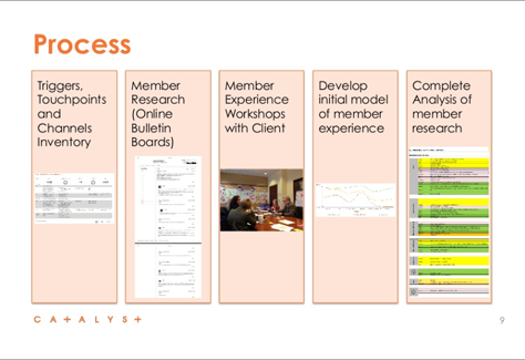
Jill reviewed the steps in their process for creating a customer journey map, shown in Figure 45.

  • Triggers, touchpoints, and channels inventory
  • Member research with all segments—newbies, renewing members, people on-the-fence, and lapsed members
  • Experience workshops with the client—color coding respondents by segment
  • Developing an initial, rough model—including members’ emotional states during the journey
  • Detailed analysis—and the final customer journey map
Figure 45—Steps in their customer journey–mapping process
Steps in their customer journey-mapping process

Finally, Jill shared some of the learnings they acquired during their customer journey–mapping project:

  • Ask questions in the right way. In research, questions should encourage storytelling, so you can gather data that’s rich in detail.
  • Understand your audience segments. By color-coding respondent segments, you can more easily identify trends.
  • Use your clients’ time wisely. Assume that they are strapped for time. Present interesting and vocal clients to them, so they can get a taste of both the highs and lows of the customer experience.
  • Put emotions on your customer journey map. This will help you to think about how to customize your messaging for happy, indifferent, and unhappy customers at each phase.

Take a look at Jill’s presentation, shown in Figure 46.

Figure 46—Jill Hewitt’s presentation on SlideShare

UX STRAT 2013: Jill Hewitt, “Journey to a Customer Experience Map” on SlideShare

Service Blueprinting for Convergent Channel Experiences

Presenter: Dan Saltzman

Dan Saltzman, Director of User Experience at Effective UI, opened his presentation with the provocative statement, “There is no such thing as starting from scratch.” He went on to explain that, for every service-related business, looking at the current state of their disparate channel experiences is a good place to start an engagement. Create a low-fidelity, visual map illustrating the current state. Build this map collaboratively with the client.

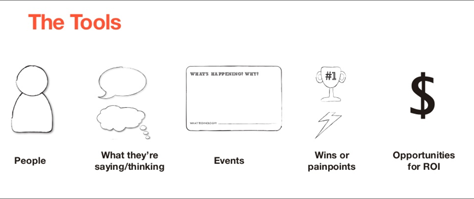
“What kind of map?” Dan asked rhetorically. “A timeline,” he suggested, using the simple framework of who, what, when, where, how, and why for guidance. Dan offered some simple tools for creating a low-fidelity timeline, shown in Figure 47. I particularly liked his proposed collection of callouts for communicating a timeline. They were simple, yet powerfully elegant in their simplicity.

Figure 47—Simple, yet elegant tools for annotating an experience map
Simple, yet elegant tools for annotating an experience map

Dan explained that it is always important to retain the customer viewpoint when delivering cross-channel experiences. In conjunction with identifying customer painpoints, identify the points at which the system is breaking down and what you need to do to fix it. Doing this enables you to find the greatest opportunities for increasing customer satisfaction while minimizing your investment.

Dan briefly shared two case studies—one with a specialized cancer treatment hospital; the second with a major retail bank. Both customer experiences comprised very complicated, disparate channels.

Although Dan had ostensibly tailored his presentation to service-related customer experiences, there were interesting implications for those of us who are engaged in product development. Much of the UX research and design work that we do on software projects we do not do “from scratch.” By focusing on existing painpoints rather than simply touchpoints, this approach really focuses on what is not working and why. This service blueprinting approach really resonated with me as an effective strategy for increasing customer satisfaction and return on investment (ROI) whenever we’re not working from scratch.

You’ll find Dan’s entire presentation in Figure 48.

Figure 48—Dan Saltzman’s presentation on SlideShare

UX STRAT 2013: Dan Saltzman, “Service Blueprinting for Convergent Channel Experiences” on SlideShare

In Conclusion

As you can tell from the length of this review, Day 1 of the main conference at UX STRAT 2013 was packed with great content.  

Previous installments in our series of reviews on UX STRAT 2013:

Look for the final installment in this series of reviews, which will cover Day 2 of the main conference, in an upcoming issue of UXmatters.

Many thanks to Laurie Lamar for sharing her notes with us and to Pat Lang for contributing his photos.

Senior Business Analyst at pointb

Seattle, Washington, USA

Margie ColesMargie is an independent consultant with 20 years of experience simplifying and streamlining systems involving content, enterprise data, customer interactions, and workflows. She has worked with Microsoft, the Gates Foundation, Office Depot, Laplink.com, the Seattle Times, and numerous smaller companies in the Seattle area. Her current passion is combining the business sensibility of Lean Startup with sensible UX to promote software development and business cultures that are realistic, pragmatic, customer-empathetic, and profitable. She especially enjoys simplifying the complex and studying complicated systems to envision simpler design patterns for them. Margie holds a Certificate in Software Product Management from the University of Washington, a Master’s degree in Speech-Language-Communications from the University of Minnesota, and a Bachelor’s degree in Cognitive Psychology from the University of California, Santa Cruz.  Read More

Principal Consultant at Strategic UX

Founder, Publisher, and Editor in Chief of UXmatters

Silicon Valley, California, USA

Pabini Gabriel-PetitWith more than 20 years working in User Experience at companies such as Google, Cisco, WebEx, Apple, and many startups, Pabini now provides UX strategy and design consulting services through her Silicon Valley company, Strategic UX. Her past UX leadership roles include Head of UX for Sales & Marketing IT at Intel, Senior Director of UX and Design at Apttus, Principal UX Architect at BMC Software, VP of User Experience at scanR, and Manager of User Experience at WebEx. Pabini has led UX strategy, design, and user research for Web, mobile, and desktop applications for consumers, small businesses, and enterprises, in diverse product domains. Working collaboratively with business executives, multidisciplinary product teams, and UX teams, she has envisioned and realized holistic UX design solutions for innovative, award-winning products that delighted users, achieved success in the marketplace, and delivered business value. As a UX leader, she has facilitated conceptual modeling and ideation sessions; written user stories; prioritized product and usability requirements; established corporate design frameworks, standards, and guidelines; and integrated lean UX activities into agile development processes. Pabini is a strategic thinker, and the diversity of her experience enables her to synthesize innovative solutions for challenging strategy and design problems. She is passionate about creating great user experiences that meet users’ needs and get business results. A thought leader in the UX community, Pabini was a Founding Director of the Interaction Design Association (IxDA).  Read More

Other Columns by Pabini Gabriel-Petit

Other Articles on Conference Reviews

New on UXmatters