Top

Information Wayfinding, Part 3: Designing for Wayfinding

March 10, 2014

How can we make ever-growing volumes of information accessible and useful to people without overwhelming them?

That is the question I want to consider in this third and final installment of my series on information wayfinding. In Part 1, I argued that we must move beyond thinking of information architecture as designing wayfinding for a book of pages and, instead, think in terms of a spatial environment. In Part 2, I compared interacting with information to the process of finding one’s way through a city, then defined three elements of the information environment, shown in Figure 1: districts, layers, and nodes.

Champion Advertisement
Continue Reading…
Figure 1—Three elements of the information environment: districts, layers, and nodes
Three elements of the information environment: districts, layers, and nodes

In this article, I’ll first look at how people move through such information environments—the behavior of wayfinding. Then I’ll outline a set of guidelines for building Web sites and applications that enable people to make sense of continually expanding volumes of information without their becoming overwhelmed.

Wayfinding Behavior

Information wayfinding provides a valuable lens for viewing people’s interactions with information. The term wayfinding refers to the cognitive process of spatial problem solving that people use to navigate physical environments. [1] Information wayfinding, then, is the collection of cognitive processes that people use to navigate information environments. People most often exhibit information-wayfinding behavior in one of three different modes: locate, explore, and meander.

Locate

People operate in the locate mode of wayfinding when they know precisely what they’re looking for, but need help discovering where to look. Queries that are characteristic of the locate mode are sometimes called lookup queries. There is typically one right answer to a question. A few examples of people’s needs to locate information might be:

  • Who was the director of the film The Third Man?
  • What is the population of London?
  • When are expense filings due?
  • Where is Jimmy’s Pizza?

Explore

Exploring is much more open-ended than locating is. When people explore, the journey is as important as getting to the destination. As people encounter new information, their information needs evolve, making exploring an iterative, on-going process.

Marcia Bates has described this process as berrypicking—in which people move from one source to another, picking up nuggets of information along the way, as shown in Figure 2. [2] Peter Pirolli and Stuart Card describe the process as information foraging, in which people follow information scent along the way. [3] Both of these models depict information seeking in spatial terms and, thus, reinforce the concept of information wayfinding.

Figure 2—Marcia Bates’ berrypicking model depicts how people explore an information environment
Marcia Bates’ berrypicking model depicts how people explore an information environment

People might initiate exploratory wayfinding by asking questions such as:

  • What kind of car should I buy?
  • Where should I go on holiday?
  • What film should I watch this evening?

Meander

While a particular information need prompts both locating and exploring, there is a third category of wayfinding that does not start with asking a specific question: meandering. People aren’t always looking for something in particular. They may have other motives such as having fun or killing time. [4] Checking your email or social networks while waiting for your bus to arrive are examples of meandering behavior.

These three modes of wayfinding—locate, explore, and meander—are not new concepts; they draw from the work of Gary Marchionini, [5] David Elsweiler, [4] and others. But they come to life and gain new meaning when we consider them in the context of information wayfinding.

Guidelines for Optimizing Wayfinding

Once we start thinking of information as an environment and wayfinding as the means by which people interact with that environment, the obvious next question is: How can I apply these ideas to the information environments that I create? There are six principles that should guide the way we construct information environments:

  • structured districts
  • flexible layers
  • positional cues
  • survey knowledge
  • clear paths
  • coherent interactions

To make each of these principles more tangible, I’ve built an example using the Twigkit search application framework, which I’ve played a part in creating, and the Google Search Appliance. (I even recorded a 5-minute video of its making that you can watch on Vimeo.) This example uses a collection of films to demonstrate what an information-wayfinding experience could look like.

1. Structured Districts

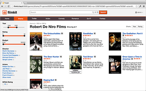
Structured districts are the main categories into which we can divide an environment. Logical, clear districts are important to helping users understand an information environment at its most basic level. Districts should correspond to the user’s own mental model. When people think about films, for instance, they think in terms in genres—for example, an action film, a drama, a comedy, or a thriller. Virtually every information domain has some dominant organizational scheme that should form the districts of its information environment.

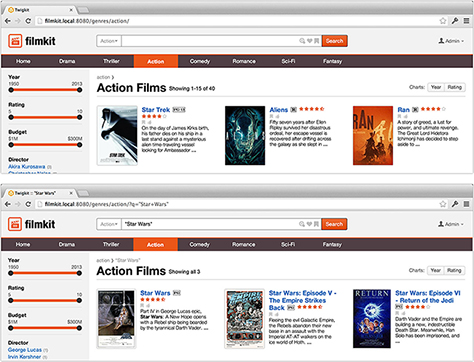
It’s essential to clearly present districts to users—perhaps in a form that resembles traditional Web navigation systems. Likewise, we should also base URL schemes on districts. In the example shown in Figure 3, genre is the source of the districts that drive both the primary navigation and the URL structure.
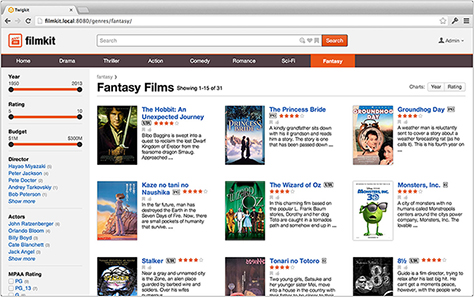
Figure 3—Using genre to drive the primary navigation and URL structure
Using genre to drive the primary navigation and URL structure

2. Flexible Layers

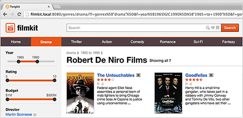
In addition to using districts—which serve as the primary organizational scheme—we should also enable users to filter by secondary criteria, or layers of the information environment. The flexibility of layers provides a vital contrast to the rigid hierarchy of districts, so the two operate best in tandem, as Figure 4 shows.

Figure 4—Filtering in layers works in conjunction with districts
Filtering in layers works in conjunction with districts

3. Positional Cues

Like a You are here marker on a map, positional cues help users to orient themselves within an information environment. They typically take the form of breadcrumbs that indicate the district in which a user is browsing, what layers he has applied, and what search terms he has used. These positional cues give users a sense of security and avert any feelings of being lost.

Figure 5—Using positional cues such as breadcrumbs give users a sense of place
Using positional cues such as breadcrumbs to give users a sense of place

4. Survey Knowledge

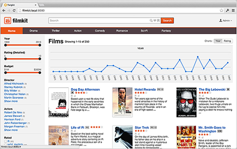
Helping users to gain survey knowledge is a second means of enhancing their sense of orientation. While positional cues more often depict where users have been, survey knowledge helps users to ascertain where they should go next. Similar to studying a map or looking at the surrounding landscape from the top of a mountain, survey knowledge gives users an overview of their information environment. Data visualizations—from subtle indicators to full-fledged charts and graphs—are excellent tools for enhancing survey knowledge, as shown in Figure 6.

Figure 6—Enhancing people’s survey knowledge through data visualization
Enhancing people’s survey knowledge through data visualization

5. Clear Paths

In a physical environment, having a clear line of sight to your destination greatly simplifies the act of getting there. Similarly, in information environments, providing clear paths ensures that users always have a clear way forward.

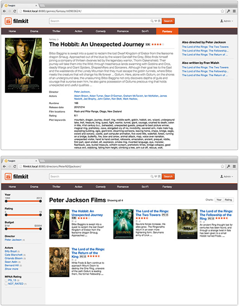
A good example of applying this principle is providing links to related content. When users view an information node—for a film, for instance—or what we often call a detail page, it might offer them clear paths to similar films, films by the same director, films starring the same actors, and so forth, giving users a number of possible paths forward.

Figure 7—Providing links to related content always provides options for proceeding
Providing links to related content always provides options for proceeding

6. Coherent Interactions

It is essential that interacting with districts and layers and performing keyword searches should provide a single, seamless experience. Layers, or filters, should not appear solely in search mode, as is far too often the case; and it is vital that we not divorce keyword searches from districts. Instead, allow users to navigate to districts, apply layers, and perform keyword searches iteratively, using these interactions in conjunction with one another.

Figure 8—Fusing searching and browsing into a single, streamlined experience
Fusing searching and browsing into a single, streamlined experience

Conclusion

To make ever-increasing volumes of information accessible and useful to people without overwhelming them, we must move beyond the page metaphor, think of information as an environment, consider how people interact with that environment, and apply design principles that optimize wayfinding.

In fact, if we were to survey the world’s most successful online properties such as Google, Facebook, Amazon, and eBay, we would recognize that they have embraced the principles of information wayfinding. The question is: will you? 

References

[1] Arthur, Paul, and Romedi Passini. Wayfinding: People, Signs, and Architecture. New York: McGraw-Hill Book Co., 1992.

[2] Bates, Marcia J. “The Design of Browsing and Berrypicking Techniques for the Online Search Interface.” Online Information Review, 1989.

[3] Pirolli, Peter. Information Foraging Theory: Adaptive Interaction with Information. Oxford, England: Oxford University Press, 2007.

[4] Elsweiler, David, Wilson, L. Max, and Kirkegaard-Lunn. “Understanding Casual-Leisure Information Behaviour.” In Amanda Spink and Jannica Heinstrom, eds. New Directions in Information Behaviour. Bingley, England: Emerald Group Publishing Limited, 2011.

[5] Marchionini, Gary. “Exploratory Search: From Finding to Understanding.” Communications of the ACM, 41, 2006.

Cofounder & CEO at Crema.co

San Francisco, California, USA

Tyler TateTyler leads user experience at TwigKit where he helps government, not-for-profit, and blue-chip organizations build superb search experiences. Tyler organizes the Enterprise Search London Meetup, is the creator of the Semantic Grid System, and has led the design of big Web applications, including Nutshell CRM.  Read More

Other Articles on Information Architecture

New on UXmatters