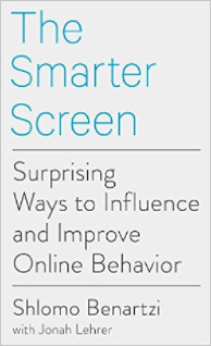
Shlomo gives the example of the widely circulated story about Uber charging Jessica Seinfeld $415 for a crosstown New York City trip during a snowstorm—about eight times the normal charge. As UX designers, it is so important for us to explore and understand the consequences of users’ decisions. We are supposed to make technology easier to use. In this case, Uber’s designers have made it easy for the customer to book a ride. However, the unintended side-effect is that customers sometimes make decisions without realizing their full consequences—the high cost of a ride when surge pricing is in effect. In cases like this one, Shlomo suggests that UX designs call attention to the situation, making the user stop and think: Hey, wait a minute….
The Attention Economy
Today, we can get a great deal of information online—on almost any subject imaginable. Lots and lots of information. Too much information! Shlomo provides the example of planning a trip: Not so long ago, we would have called a travel agent or maybe requested a printed guide from a travel club. That travel agent would have made a commission of about 10% for booking our travel. Fast forward to today, someone gets an idea for a trip and can go straight to the Web and immediately obtain an overwhelming amount of information. In fact, I just received 49,300,000 results when I queried travel to a local destination. At least the search engine delivered the results in a speedy 0.60 seconds. But how useful is this wealth of information?
In the past, we had to work hard to get any information. Now, we just type a few words and get millions of search results in less than one second. However, the information is not always helpful. As Shlomo says, “The abundance becomes a curse.” Many people use online travel agents to narrow down the possibilities and see reviews and other relevant information. Even though computers are now doing much of the work, what percentage of the transactions are the online travel agents receiving in commissions? Much more than the 10% of traditional travel agents. In fact, they typically receive commissions of 20–30%. Wow! These online travel agents do none of the physical work, but receive about 25% of the revenue from these bookings. Why can they charge that much? Because in the overwhelming sea of information overload, the winners are those who keep the attention of customers.
In addition to helping us to handle the abundance of information, well-designed apps consider the fact that users can think about only so many things at once—the author refers to this as the mental screen. This discussion reminded me of a conversation we had in the Ask UXmatters column “User Experience and Accessibility.” As UX designers, we should be committed to helping all users, including those with disabilities. We also need to remember that people don’t use our products just within the confines of an office—like the ones in which products get designed and built. People use mobile apps in messy, real-life situations that are sometimes noisy, distracting, and time pressured.
Since we can think about only so much information at once, the size of our mental screen is limited—sometimes more than we would like to admit. Thus, Shlomo believes that one responsibility of a good mobile app is to narrow down the multitude of choices to a few good ones and offer a reasonable default selection. He recommends using a tournament-style design, in which users repeatedly pick their favorite among four possibilities. Not only are users empowered to pick their favorites, the app also helps them to narrow down the information into reasonably sized chunks. The number of options we give to users should match their mental and emotional capacity to evaluate them. So, as UX designers, we empower users by going beyond showing them every available option to giving them a set of useful options.
 Shlomo Benartzi is a behavioral economist at UCLA who, with Richard Thaler, has created the
