Reasons for the Popularity of Mobile-Banking Apps
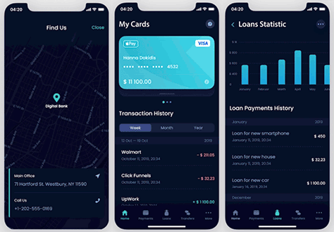
Digital-banking solutions are among the most important and most popular fintech apps. Other such apps include loan, insurance, tax filing and management, personal-finance management, payment processing, and investment apps. Banking apps enable people to control their finances, pay their bills, exchange currencies, pay for services, and transfer money, as Figure 1 shows.

Image source: Andersenlab.com
In 2021, 64% of Americans used banking apps, and the number of people willing to manage their money online is gradually growing. Using the Internet instead of going to a bank’s regular branch office helps customers save time. Digital services are available 24/7, in any corner of the world, which is extremely convenient. You can go on vacation abroad and still be able to pay for your landline, electricity, or other utilities. The COVID-19 pandemic has also affected the growth of online-banking transactions because people want to reduce unnecessary contacts with others. According to the American Bankers Association, 99% of adults are extremely pleased with their digital-banking experience.
Financial companies also profit from banking apps, which allow them to reduce operating costs, get a good return on investment (ROI), enhance the customer experience, and implement a personalized approach to banking.
Four Key Design Features of Successful Mobile-Banking Apps
There are some crucial principles that UX designers and developers should keep in mind when creating banking software. For example, security is a top-priority feature of any fintech app. Financial institutions must protect customers’ data and money.
UX design might seem less important than the functionality that protects users’ data, but it determines whether an app is user friendly and, thus, affects its adoption and popularity. No matter how many functions a banking solution provides, if it is difficult to use, customers will abandon it for a competitor’s app. Let’s consider four key features of a well-thought-out UX design for any fintech app.
- simplicity—Fintech apps handle complex data, but must remain user friendly. An online-banking solution benefits from having a simple, minimalistic design that helps customers to concentrate on the app’s most frequently used functions. Product managers and UX designers should not overload a fintech app’s user interface. It is best to place only essential content on the home screen—for instance, bank cards, operations history, balance information, and transfer/payment options—and hide all secondary features by placing them on other screens. Simplicity also makes an app aesthetically pleasing.
- intuitive design—Avoid putting off customers by making an app overly complex, especially on screens where they’re managing their money. Predictability and clarity help users navigate an app without reading any instructions. Include elements that are in wide use in other applications to create an impression of something familiar. Intuitiveness helps customers to make transfers, pay bills, or exchange currency quickly. Thus, intuitive designs save them time and effort.
- customizability—People who use mobile-banking apps have different needs and preferences. Plus, their aesthetic perceptions may also differ. That is why it is important for customers to be able to customize an app to make it more convenient for them. However, the modifications that customers make could affect both the user experience and the user interface—for example, if they leave only primary functions on the home screen or if a customer changes the background color or picture. To prevent such design issues from occurring, you should preferably provide different variations of the main screen that users can choose rather than allowing fine-grained customizations. Plus, users should be able to keep all the relevant information and functions at hand.
- adaptability—Today, customers access mobile-banking apps not only on their smartphones but also on tablets and smartwatches. Thus, their screen sizes can differ significantly. The amount of information that is convenient to read on a tablet might be next to impossible to take in using a smartwatch. Also, the typical use cases for these users are not the same. Bank customers are highly unlikely to perform complex transactions using their smartwatch. They’d rather use their watch to check their balance when shopping in a department store. Therefore, developers should consider adaptive design and create separate layouts for smartphones, tablets, and smartwatches. But they must still keep the brand style, fonts, colors, and icons to show that it is still the same product, albeit for different devices


