In the user onboarding realm, landing pages are crucial elements of the pre-signup experience and the starting point for most onboarding journeys. Visiting such a landing page is the equivalent of new prospects visiting your shop to see what you offer, how credible you are, and what you can do for them.
However, many startups treat these landing pages as an afterthought. Often, they create templated landing pages or just mimic their competitors, negatively impacting both their acquisition costs and activation metrics, especially if they are investing in driving traffic to these pages.
Creating an effective landing page requires a combination of conversion rate optimization (CRO), optimizing your onboarding user experience, and creating a well-crafted user journey through consistent testing and experimentation.
Champion Advertisement
Continue Reading…
The Problem with A/B Testing
While some might suggest doing A/B testing or usability testing, these methods alone are insufficient. A/B testing two poorly designed pages would result in a final design that is still subpar.
Problems with Relying Solely on Usability Testing
Usability testing also has its limitations. The act of observing users changes the behavior of the users that you’re observing. When people know you’re watching them, they might feel more motivated to complete an action or to find issues, regardless of their actual significance. Plus, usability testing takes only a small percentage of users into account.
Usability testing can give you an indication of user-interface problems and the clarity of a navigation system, but doesn’t usually generate ideas about creating layouts, content, or value propositions that would be more persuasive.
For optimal results, using a more comprehensive approach that integrates various methods and enables continuous improvement is essential.
Problems with Focus Groups
Steve Jobs once remarked in BusinessWeek, “It’s really hard to design products by focus groups. A lot of times, people don’t know what they want until you show it to them.”
This quotation highlights a key point: your customers can’t always articulate what would motivate them. Nor can they tell you which landing-page design would work best for them.
Therefore, let’s explore the intricacies of designing a landing page by considering an example. While I’ll try to provide a cohesive analysis, it’s important to remember that designing a user-onboarding experience is an ongoing process because of the evolving nature of the product, which must accommodate multiple use cases, and users’ changing conceptual models, which users’ experience with other products influence.
Note: My intent in describing the challenges of this redesign is not to criticize the Design team’s work. They undoubtedly possess more in-depth knowledge and data about the product than I have. Instead, these challenges serve as a framework for an outsider’s perspective, for the purpose of educating and generating new ideas. But, in the digital world of design, there is always room for improvement. Therefore, I welcome any feedback or critiques on my contributions as well.
Auditing the Existing User Experience of NeoTaste
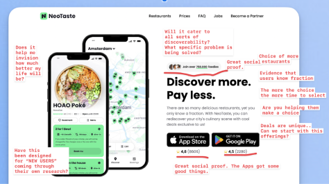
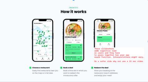
NeoTaste is a mobile app that offers deals to patrons of restaurants. Figure 1 shows my questions and comments on the NeoTaste landing-page user experience. Figure 2 shows another part of their pre-signup user experience, which explains how to use NeoTaste.
Figure 1—NeoTaste landing page Figure 2—How NeoTaste works
Where Branding Begins
How do users discover a brand? In the startup world, especially when a company is trying to impress investors, we might refer to acquisition channels. A landing page is one example of an acquisition channel.
Let’s consider the example of redesigning a landing page. I have chosen NeoTaste’s landing page to demonstrate my approach. When undertaking any landing-page redesign challenge, view it as an opportunity to further optimize your acquisition flow, aligning with the philosophy that everything can be improved!
Users typically discover a brand through the various acquisition channels that startups choose to promote. These channels might include the following:
search engines, including paid ads
social media, including paid ads
referral programs
blogs, articles, and programmatic content
influencer endorsements
app stores for browsers
word of mouth
email marketing
Each of these channels brings in users who have different intentions, or user intents. For example, if a friend recommended NeoTaste to me, my confidence in trying the app would be high, so I would be willing to endure any challenges its onboarding process might present.
Similarly, if I am searching for new restaurant deals and type neotaste review or best restaurant deals as my query, my intent would be to learn more about NeoTaste. Understanding these different user intents is crucial to designing an effective landing page that caters to the diverse ways in which users can engage with your brand.
Designing for Different Types of User Intent
Let’s continue with the previous example and explore different types of user intent. When users discover NeoTaste through a search engine, you can infer their intent from the keywords they use. We’ll focus on just two main types of user intent:
Informational intent—The user wants to learn about a concept or brand. Keywords such as neotaste review or about neotaste would indicate an informational intent.
Transactional intent—The user or a prospective customer intends to make a purchase. Keywords such as deal or cheapest restaurant deals suggest a transactional intent.
Understanding user intents is crucial. Marketing departments often have detailed profiles of customers and their digital behaviors, which could inform the next stage of your design.
Samuel Hulick, founder and activation consultant at UserOnboard, has aptly noted, “When you design for intents, you harness the only source of energy driving a Web experience—the user’s motivation to move forward. You make the pathways, but they’re useless unless the users want to walk down them.”
For each touchpoint, put yourself in the users’ situation. Consider what’s important to them at that moment, what prompted them to start down a pathway, where they hope to head next, and what additional information they might need.
Let’s define a well-informed example profile based on secondary-research data and literature. While this might not be an empirical profile, it can help you create a reasonable picture of NeoTaste’s users. What would you know about the users?
They derive satisfaction from finding the best deals.
Their preference is to spend wisely, but they might have some fear of missing out (FOMO) on deals.
They enjoy the thrill of the hunt.
By understanding these motivations, you can better tailor your design to meet users’ needs and enhance their experience with your brand.
Users’ Behavioral Patterns
NeoTaste’s users exhibit the following behavioral patterns:
frequent browsing
comparison shopping
subscribing to alerts
social sharing
Users’ Psychological Traits
NeoTaste’s users tend to have the following psychological traits:
risk aversion
well-researched decision making
exercising restraint—possibly because they’re waiting for good deals
Users’ Painpoints
Now that you have a better understanding of NeoTaste’s users, let’s delve into some of their painpoints. While the product literature might already cover some of these, immersing yourself in users’ painpoints can provide valuable insights for communications and guidance. NeoTaste’s users experience the following painpoints:
overwhelming choice—The more deals available, the longer the decision-making process, which increases the chance of drop-offs.
limited-time offers—The pressure of scarcity can be stressful.
frustration from missing deals because of delayed notifications—Users can become frustrated if they miss out on deals because they were notified too late.
being unclear about savings—Users might not clearly perceive how much they are saving.
a complicated process—A complex process can deter users.
infrequent updates—A lack of regular updates can lead to user disengagement.
poor user experience—A subpar user experience can drive users away.
Turning Problems into Opportunities
However, NeoTaste could turn these painpoints into opportunities, as follows:
overwhelming choice—Provide tools to help users make decisions.
limited-time offers—Highlight the scarcity to create urgency.
frustration from missing deals because of delayed notifications—Ensure timely notifications to prevent users from missing deals.
being unclear about savings—Clearly show the savings on deals.
a complicated process—Simplify the process and demonstrate how easy it is.
infrequent updates—Provide regular notifications to keep users engaged.
poor user experience—Improve the user experience to retain users. This is where the expertise of a UX designer can make a significant impact.
Designing a Landing Page
Designing and optimizing a landing page for conversions is a continuous process. To create effective content for NeoTaste, start by addressing its painpoints and users’ drivers for using the app.
Version 1: FOMO and Persuasion
Leverage users’ fear of missing out and use persuasive techniques to quickly lead users to their Aha! moment. Highlight the savings they can achieve. This theme can guide the design of the landing page.
Mapping User Intent to Painpoints
By understanding user intent, NeoTaste could design the landing page to address specific painpoints. Insights from interviews with the Sales and Support departments provided the following examples of user intent for search-engine discovery:
Informational intent—Users want to know about NeoTaste. Action: They type neotaste app or neotaste reviews when conducting a Google search.
Transactional intent—Users are looking for the best restaurant deals. Action: They type best restaurant deals nearby when searching on Google.
Addressing Painpoints Through Landing-Page Design
NeoTaste could address these painpoints through their landing-page design, as follows:
overwhelming choice—Help users make informed decisions.
limited-time offers—Emphasize scarcity to create urgency.
frustration from missing deals because of delayed notifications—Ensure timely notifications to prevent users from missing deals.
being unclear about savings—Clearly display the savings.
a complicated process—Demonstrate how easy the app is to use.
infrequent updates—Provide regular notifications to keep users engaged.
poor user experience—Improve the user experience to enhance engagement and retention. 😉
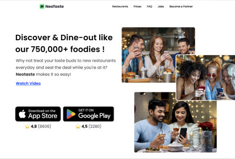
By aligning the landing-page’s design with user intent and addressing its painpoints, NeoTaste could create a more effective and engaging landing page, such as that shown in Figure 3.
Figure 3—Redesigned NeoTaste landing page
The headline focuses on leveraging social proof and a sense of community to harness NeoTaste’s growing popularity and increasing number of subscribers.
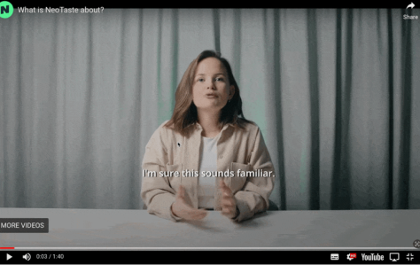
A Watch Video call to action (CTA) opens a new window and provides comprehensive information about NeoTaste, addressing everything a skeptical user might want to know about.
Figure 4—A video about NeoTaste
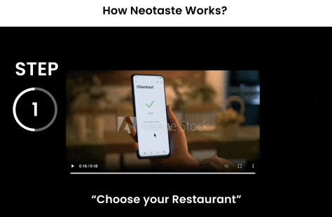
Rather than using a screenshot, provide a video, which can be more effective. A video lets users see the experience in action without having to piece together information from multiple screenshots. Figure 5 shows an example.
Figure 5—A video that shows how NeoTaste works
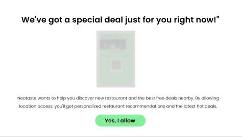
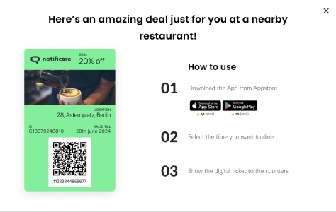
Calls to action can inform users about special deals, as shown in Figures 6 and 7.
Figure 6—A call-to-action page about a particular deal
Immediately after demonstrating how NeoTaste works, give the user a taste of what NeoTaste has to offer. This could trigger their mini Aha! moment, when they get a tangible experience of what you’ve been promoting all along.
Figure 7—Another call to action about a deal
While a free sample is always a great way to show customers what they would get, it also provides an opportunity to acquire new users. This is where you can encourage them to download the app.
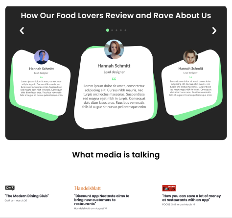
Enhance social proof through testimonials and media coverage, reinforcing that NeoTaste is a popular and trending choice, as shown in Figure 8.
Figure 8—Testimonials on NeoTaste
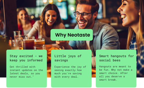
Figure 9 highlights the top three benefits of NeoTaste—in terms of its user experience rather than focusing on its features. Users are interested in improvements that save time, reduce cost, or increase productivity rather than just the features themselves.
Figure 9—A page that tells the story of NeoTaste’s benefits
Figure 10 shows a page that helps users understand the company’s larger vision for the app and its founders, thereby increasing users’ trust.
Figure 10—Building trust in NeoTaste
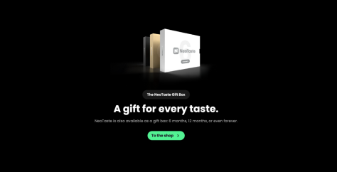
In the original version of NeoTaste, there is a gift box for everyone, as shown in Figure 11. Although this is a great marketing approach, they should not offer the gift box during the discovery phase. Even if cross-selling were the goal, it would be better to take a strategic approach.
Figure 11—NeoTaste’s gift box offering
The Goals of This Redesign
This redesign of NeoTaste achieves the following goals:
maintaining consistent information—Ensure a seamless flow of information.
achieving customers’ Aha! moment quickly—Introduce this moment based on the user’s context.
helping users envision improvements—Show how the app can enhance users’ lives.
optimizing CRO and the user experience—Discuss key points for conversion-rate optimization (CRO) and optimizing the onboarding user experience.
Conclusion
By the end of a design project, you should have a better understanding of how to design your landing pages for conversion, user onboarding, and driving user behaviors. Request no immediate action from visitors.
Please remember, designing a pre-signup user experience is not a one-time task. It is a continuous process of optimization because users’ conceptual models evolve every day.
A seasoned product designer and onboarding UX consultant with more than 12 years of experience crafting easy-to-learn, engaging user-onboarding experiences. He has helped drive user adoption for major brands such as HSBC, Michelin, IBM, and Publicis Sapient and is passionate about unlocking a product’s true potential through best-in-class onboarding practices. Himanshu also holds an MBA in Marketing and International Business. Read More