Top

Conference Review: IA Summit 2007: Part II

April 26, 2007

More session reviews and the conclusion of my conference review.

Finding Innovation in the Five Hundred Pound Gorilla: Or Overcoming Fear, Building Trust, and Making Believers
Presenters: Kevin Cheng and Tom Wailes

Communal Computing and Shared Spaces of Usage: A Study of Internet Cafes in Developing Contexts
Presenter: Jason Hobbs

Startup Case Studies: How Five of Us Started Our Own Businesses
Presenters: Victor Lombardi, Frank Ramirez, Lou Rosenfeld, Gene Smith, and Christina Wodtke

Closing Plenary: Fast, Cheap, and Somewhat in Control: 10 Lessons from the Design of SlideShare
Presenter: Rashmi Sinha

Champion Advertisement
Continue Reading…

Content and Presenters: Highlights

Day 2: Finding Innovation in the Five Hundred Pound Gorilla: Or Overcoming Fear, Building Trust, and Making Believers

Presenters: Kevin Cheng and Tom Wailes

According to Kevin Cheng (shown in Figure 11) and Tom Wailes (shown in Figure 12), finding innovation is not about “justifying design’s role in a project, how to be creative, or THE Innovation Process™.” Their talk described an innovation process that anyone can follow.
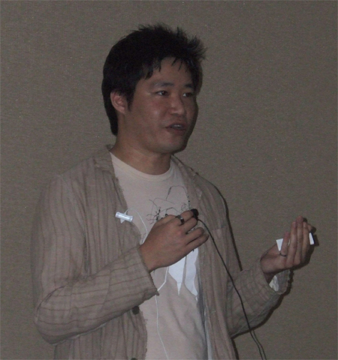
Figure 11—Kevin Cheng
Kevin Cheng

“Creativity is the act of producing new ideas, approaches, or actions, while innovation is the process of both generating and applying such creative ideas to convert them into novel, useful, and viable commercial products, services, and business practices.”—Wikipedia

“Creativity is not sufficient,” said Kevin. Making innovation happen requires “making time to innovate, overcoming fear, communicating ideas and process, building trust, and making believers.”

Innovation requires overcoming fear of “wasted time, high cost, diverted resources, failure, missed opportunities, and the unknown. You need a vision,” Kevin told us.

He suggested “starting small. Doing small things. Saying small things. Staying within your sphere of influence—people who will listen to you and agree with you. Convince someone enough that they’re an advocate for you. If you can’t find a single advocate within your sphere of influence, maybe you need to rethink. You could be wrong. Let others influence for you.”

In summary, Kevin told us, “Overcoming fear” requires that you “recognize the fears, say small things, do small things, let others influence for you, set expectations, and demonstrate success.”
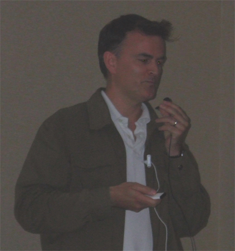
Figure 12—Tom Wailes
Tom Wailes

Tom Wailes spoke eloquently about building trust: “People trust you, because you show mutual respect. People don’t see everything behind the design,” as Figure 13 illustrates. “They haven’t seen how you came up with it. They don’t see why it will take so long. Make design deliverables communicate as clearly as possible to stakeholders. Involve the team cross-functionally. Keep stakeholders informed.”

Figure 13—Design deliverables and design thinking
Design deliverables and design thinking

“A lot of the deliverables [designers] typically spend time on—wireframes and the rest—now, we don’t do that,” said Tom. We communicate design to the team through storyboarding, prototyping, product simulations. Wireframes are not very good at communicating product ideas or design thinking. We needed a clear goal.

“Sprints are not enough. Scrums aren’t great for ideating. Getting as many people involved, as many ideas as possible. Setting expectations. Not, at the end of the month, solving everybody’s problems. Visualize ideas in a really accessible format. Ideas can shine through. We’ve been playing around with different ways to visualize the experience,” as Figure 14 shows.
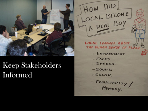
Figure 14—Keep stakeholders informed
Keep stakeholders informed

“Building trust” requires “mutual respect and honesty, a track record of delivery, transparency of process, and clear communication—‘show me’. In this business, you hear way too much of ‘They’re stupid.’ They’re not. They just think differently,” said Tom.

“Innovation must be novel, useful, and viable. … When we hear from the users, then we know we’re onto something. Once they believe, we can actually start doing stuff.”

Kevin and Tom’s presentation is on SlideShare.

Day 2: A Great Session I Missed: Architectures of Participation: What Communities of Practice Can Mean for IA

Presenter: Andrew Hinton

There was excellent buzz about Andrew Hinton’s session “Architectures of Participation.” I was sorry to miss this one, but it conflicted with Kevin Cheng and Tom Wailes’s session on innovation—one of the toughest choices I had to make. Andrew’s presentation is available on his blog, Inkblurt.

Day 3: A Great Session I Missed: Project Touchstones: How to Bridge Competing Viewpoints and Build Vision, Consensus, and Innovation

Presenter: Jess McMullin

Another session I missed and about which there was great buzz was Jess McMullin’s “Project Touchstones.” He spoke about an approach to improving project success. Jess’s presentation is on SlideShare.

Day 3: Communal Computing and Shared Spaces of Usage: A Study of Internet Cafes in Developing Contexts

Presenter: Jason Hobbs

Jason Hobbs presented the results of his study of Web usage in Internet cafes in Johannesburg, South Africa, for which he received a grant from the Information Architecture Institute. In such developing contexts, Internet cafes “are the primary means of Internet connection for many people.” Many people use these cafes for business purposes on a regular basis. They don’t have a private desktop, but instead carry their data with them on flash memory disks. Jason did an excellent job of communicating how vital a role Internet cafes play in these people’s lives.

Day 3: Startup Case Studies: How Five of Us Started Our Own Businesses

Presenters: Victor Lombardi, Frank Ramirez, Lou Rosenfeld, Gene Smith, and Christina Wodtke

Many designers are venturing into entrepreneurship in one way or another. Five designers told us briefly about their startup experiences.

Frank Ramirez gave a great talk on his startup, My Picturebook. He designed the Web site and created storyboards of the picture book, leveraging his “comic book roots,” then hired a company in India to develop it for him.

Victor Lombardi has opened Smart Experience, a new media school that offers Internet, mobile, and software classes for the continuing education of UX professionals. He said, “The Internet industry has grown so fast, it’s hard to keep up.”

Christina Wodtke’s Cucina Media developed PublicSquare, a content-management system for online publications. She spoke about five lies that keep designers from following their startup dreams:

  • “I don’t know anything about business. I'm a designer.”—“Some people know more; others, less. Being an entrepreneur is one of the most humbling things youll ever do in your life. You cant do everything or design as you want. You must launch and make a profit.”
  • “Finally, a chance to do things right.”—“To learn, you have to do things wrong.”
  • “I can do it like 37signals. We should all feel empowered like that.”—“Dont believe the hype. Dont take any one entrepreneur as your guide.”
  • “VCs are evil.”—“Theyre not evil. Theyre capitalists. Venture capitalists have a job to do, which is to get 10x returns on their investments. If you take their money, youre kind of agreeing to follow the path.”
  • “I can’t do it alone.”—“Being an entrepreneur is mind-bogglingly lonely. On the other hand, VCs only care about the team, so you have to have business partners.”

Gene Smith spoke about his UX consultancy, nForm. And Lou Rosenfeld (shown in Figure 15) told us about Rosenfeld Media, his new book publishing company, which specializes in short, practical books about UX topics. He said, “You’re always at risk of becoming commodified. A lot of us have an entrepreneurial bent. We always want to be at the cutting edge. Your personal network is never a commodity, though your job skills may be. To figure out a business when you can look at problems in a unique way is design thinking. People would be happy to give you information if you ask them. Use your network.”
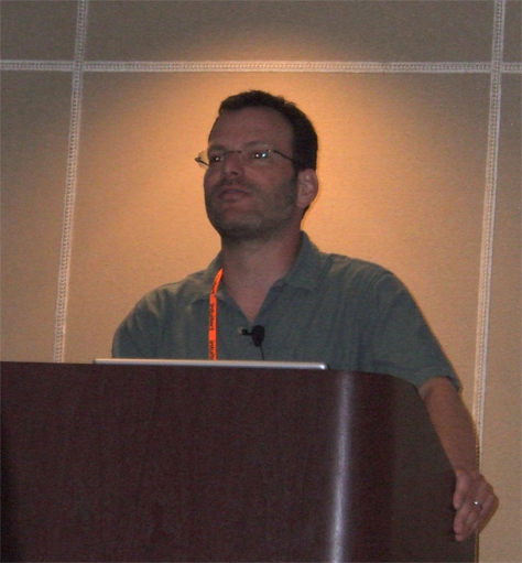
Figure 15—Lou Rosenfeld
Lou Rosenfeld

Here are some choice quotations from their freewheeling discussion:

  • “You need to articulate these ideas in order to understand them.”—Lou Rosenfeld
  • “Stealth deprives you of a lot of good advice. I’m anti-stealth.”—Christina Wodtke
  • “I’d rather develop the next features than do patents.”—Frank Ramirez
  • “I highly recommend Guy Kawasaki’s The Art of the Start.”—Christina Wodtke
  • “One really important thing is not to hire people like you.”—Lou Rosenfeld
  • A good startup idea is at “the intersection between your talent, your passion, and a need in the marketplace.”—Frank Ramirez
  • “One thing that helps: Say publicly you’re going to do something.”—Lou Rosenfeld

This fascinating session provided a great lead-in to Rashmi Sinha’s closing plenary.
Day 3: Closing Plenary: Fast, Cheap, and Somewhat in Control: 10 Lessons from the Design of SlideShare

Presenter: Rashmi Sinha

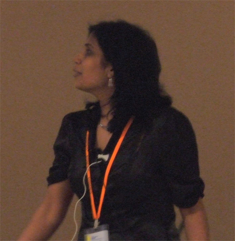
Entrepreneur/Web application designer Rashmi Sinha (shown in Figure 16) gave a wonderful closing plenary address. She opened with a few thoughts on the state of IA—“Rumors of the death of IA have been greatly exaggerated.” Then, she told the story of how Uzanto developed MindCanvas and SlideShare, saying, “Take this story as a metaphor of the contradictions between Web 1.0 and Web 2.0—UX methods or just in time design—fast, agile Web 2.0 development.”

Figure 16—Rashmi Sinha giving her closing plenary
Rashmi Sinha

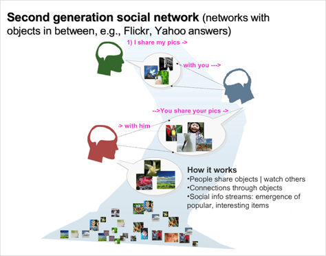
MindCanvas lets you do remote user research, using “game-like elicitation methods.” Uzanto released SlideShare in October 2006, just eleven months after their release of MindCanvas. “Presentations are hard to share [in PowerPoint].” SlideShare offers second-generation social networking features like those shown in Figure 17. “We won’t have as much structure—IA. We’ll let the good content rise to the top. There are multiple models of popularity. Users drive navigation.” SlideShare displays slides as microcontent: There is a URL for every slide and users can comment on individual slides.

Figure 17—Second-generation social networking features
Social networking features

Here are Rashmi’s ten lessons from SlideShare:

  1. The alpha as the first reaction. The beta is the market probe.”—Users should not see the alpha. For the beta, “research is about hypotheticals. Get feedback to the real thing. Whats the risk of failure? When you can bear the risk and the time is short, why not just put it out to the market? How developed should a beta be? It should get the basic concept across and no more. Get reaction to the beta and leave room for flexibility.”
  2. You don’t need personas when you know your users by name.”—“You get so much feedback. They want to visit your offices. They email you every day. Get into a conversation with users. Answer emails personally. Monitor blogs. Subscribe to RSS feeds. Use customer service as user research.”
  3. Launch first, refine later.”—“Don’t over-analyze. Look at best practices and take a guess. Put it out there. Respond immediately if something needs to be changed. Refine. People call SlideShare the MySpace for over-30-year-olds. SlideShare doesn’t support builds yet. It will soon have integrated audio. I think audio is going to be important for us. Some people don’t like their slides to be out there without their talk.”
  4. There is something about social Web sites.”—“Designing social Web sites is extremely different from designing for the individual. MindCanvas as design for the individual” focused on “usability, control, interaction flow, engagement. SlideShare as design for the crowd—people interacting, following each other, the wisdom of crowds. What will go on when a bunch of people interact with one another.”
  5. Get yourself a shadow app.”—“Keep a pulse on the main metrics. It’s simpler than logs, faster than usability testing. I want to know what the system is doing at any given moment. The whole team responds to it. Experiments without A/B setups.”
  6. The designer-developer role is crucial.”—“Easier communication. Reduced design work. We don’t want to get into artifacts.”
  7. Under invest in visual design.”—Let users feel ownership of the space. I don’t believe there’s any point in spending too much time on visual design. An unpolished look is fine.”
  8. Pay attention to technical simplicity.”—“Balance user needs and technical simplicity. We don’t have a big team, so we have to keep things as simple as we can.” Complex applications are “slower, riskier, and harder to maintain.”
  9. The single biggest win: making your app faster.
  10. Designers as entrepreneurs.”—“Build what you’re passionate about. How are you going to get your first few users…, your first 1000 users, or first 100 customers? You have to know. Products come with their own constraints and their own lives. They take over your life. Find yourself a developer partner. You cannot just hire a developer. Focus on execution. One of the weaknesses of designers: We don’t focus on execution and operations. You can’t think about just design. Do we need traditional UCD methods? Yes, when feedback becomes a torrent, you’re hearing the people who speak the loudest. A feedback form is not enough. Feedback is too unstructured. Issues need prioritization. Different users need different features. New team members need summary information. Improvements are beyond low-hanging fruits.”

“We need to initiate. There are so many designers who want to work with startups and startups who want to work with designers. Why aren’t we the ones building mashups?” Of course, Rashmi’s presentation is available on SlideShare.

Proceedings and Other Things

The canvas bag each attendee received, while nice looking, was too tall and narrow, with no bottom, and therefore, forever falling over. The Conference Program was very similar to that from last year—which is to say, rather poor. As I said in my review of last year’s conference, “its form factor, [was] too large; its cover and staple binding, too flimsy; its paper, while nice and thick, too glossy; and there were no pages for notes.” It did feature a useful “Schedule at a Glance,” organized in columns by conference room, which was replicated in a very useful mini-program that fit inside attendees’ badge holders. Attendees wore big badges that let people tag themselves and one another.

While attendees received no proceedings disk, the organizers of the IA Summit do a great job of maintaining their Web site as a resource for the UX community. They’ve made the slides for many of the IA Summit 2007 presentations available on the site and have promised that podcasts of many sessions will be available there soon. Information about all previous Summits remains available on the site.

On the first day of the conference, each attendee got a packet of 16 identical UX Methods Trading Cards and instructions for playing the User Experience Trading Card game. During the conference, attendees traded cards until they had a complete set of all 16 different cards:

  • Alignment Model
  • Card Sort
  • Design the Box
  • Digital Ethnography
  • Facets
  • Kano Analysis
  • Page Description Diagram
  • Personas
  • Process Flow
  • Rapid Facilitation
  • Site Map
  • Swimlanes
  • Tagging
  • Usability Testing
  • Web Analytics
  • Wireframe

The face of each of these beautifully designed trading cards contained its title—the name of a UX method—and a representative image; the back, the definition and purpose of the UX method. Each card belonged to one of three categories—Understand, Solve, or Evaluate—and its category was highlighted on the back of the card. For example, here’s the content from the back of the Page Description Diagram card:

UNDERSTAND » SOLVE » EVALUATE

Page Description Diagram

What

Why

Comprehensive inventory of all design elements, content, and interface components on a page, arranged in three columns of high, medium, and low priority. Each element is described and may include a sketch of design for individual components.

Documents the elements of each page without specifying layout. May be used instead of wireframes or preceding wireframes. Allows greater collaboration between team members responsible for visual design and functional specification.

Everyone who completed their full set of cards registered for prize drawings. The plan had been to award prizes to people throughout the Summit and at the close of the conference. Unfortunately, the list of people who had entered the prize drawing got lost about midway through the conference. We were told to register again, but I was never able to find out where to do that. The list wasn’t where it had originally been. Still, the trading cards themselves are a wonderful memento of the Summit.

Venue

I wasn’t able to stay for most of the 5-minute madness, but heard Lynn Boyden railing against the negatives of the venue. Her words echoed my thoughts. The conference facilities at the Flamingo were the worst imaginable. The conference rooms were spread out over such a great distance that it was difficult to get from one session to another on time—if you could get in at all. Most of the rooms were too small and couldn’t accommodate the number of people who wanted to attend the most popular sessions. The ceilings in the conference rooms were much too low. As a consequence, the screens displaying presentations were too small for many in the room to see them and were hung so low that the heads of people in the audience blocked the lower parts of presenters’ slides. Exacerbating the visibility problem were low-hanging chandeliers and huge pillars that also blocked people’s views.

The Flamingo is one of the older, seedier gambling resorts in Las Vegas. The location of its casino is central, making it hard to avoid. The casino is full of gamblers day and night. There are no restrictions on smoking, and the ventilation in the building is poor, so the smoky air was noticeable throughout the conference facilities. Some people complained of burning eyes and asthma resulting from the smoke, which was particularly bad in the area where morning and afternoon teas were served. Not very appetizing.

The only redeeming feature of the Flamingo was its outdoor Wildlife Habitat (shown in Figure 18), a lovely garden with flamingos (shown in Figure 19), man-made waterfalls, and pools full of swans, many species of ducks, koi, and turtles. It provided a welcome escape.

Figure 18—The Wildlife Habitat at the Flamingo
Wildlife Habitat
Figure 19—Flamingos at the Flamingo
Flamingos

Las Vegas isn’t a very conducive environment for a professional conference. Everything is so spread out, and there are many distractions. The newer parts of Las Vegas are like Disneyland for adults.

Hospitality

Everyone gathered at the opening reception at the Flamingo on Friday evening, where a nice buffet was served. At another reception on Saturday evening, presenters showed 20 posters and a buffet was again served.

The organizers kept the crowd well fed throughout the conference. The IA Summit is one of the few conferences that serves lunch to all attendees daily. This has the great advantage of giving newcomers an opportunity to make new friends over lunch and keeps the entire community together throughout the day. I did hear complaints from coffee drinkers about no coffee being served before the morning sessions. Each day at morning and afternoon teas, beverages, pastries, and fruits were served—though the supply of food at the teas was a bit sparse, and the platters of food disappeared quickly.

Community

The vibrant sense of community at the IA Summit is its greatest strength. In some ways, the IA Summit feels more like an annual reunion of friends than a typical professional conference. While in each successive year, the number of attendees at the IA Summit has increased, the conference has sustained its great sense of community and fellow feeling. This year, over 570 people attended the 8th annual IA Summit. (Figure 20 shows annual attendance at the IA Summit.) With more than half of this number attending the conference for the first time, the conference organizers as usual made a conscious effort to ensure newcomers meet people and feel welcomed into this close-knit community. Throughout the day, there were plenty of opportunities for networking and conversations during breaks and at lunch. The receptions took place early in the conference, again giving newcomers a chance to meet people.

Figure 20—Attendance at the IA Summit
Attendance

Because the IA Summit is so well attended by UX practitioners, it is a great place for members of various international professional associations to get together face to face. On Friday, after the opening reception, a large crowd attended the IxDA dinner, enjoying an excellent meal at Battista’s Hole in the Wall. The Information Architecture Institute had their get-together the same night. Saturday night, UXnet local ambassadors gathered for dinner at Ristorante Giorgio. Sunday night, Yahoo threw a great party at the Harley Davidson Cafe. In keeping with the Las Vegas experience, the party invitations were poker chips. And later that night, Adaptive Path threw a fabulous party at Quark’s Bar at Star Trek: The Experience.

Conclusion

On the whole, IA Summit 2007 was an excellent conference. Though, because of the deficiencies of the venue, it was less successful than last year’s Summit.

Next year’s IA Summit looks promising. It will take place at the Hyatt in Miami, Florida, on April 10–14, 2008. Its theme: Experiencing Information. 

Photographs by Pabini Gabriel-Petit.

Read Part I

Principal Consultant at Strategic UX

Founder, Publisher, and Editor in Chief of UXmatters

Silicon Valley, California, USA

Pabini Gabriel-PetitWith more than 20 years working in User Experience at companies such as Google, Cisco, WebEx, Apple, and many startups, Pabini now provides UX strategy and design consulting services through her Silicon Valley company, Strategic UX. Her past UX leadership roles include Head of UX for Sales & Marketing IT at Intel, Senior Director of UX and Design at Apttus, Principal UX Architect at BMC Software, VP of User Experience at scanR, and Manager of User Experience at WebEx. Pabini has led UX strategy, design, and user research for Web, mobile, and desktop applications for consumers, small businesses, and enterprises, in diverse product domains. Working collaboratively with business executives, multidisciplinary product teams, and UX teams, she has envisioned and realized holistic UX design solutions for innovative, award-winning products that delighted users, achieved success in the marketplace, and delivered business value. As a UX leader, she has facilitated conceptual modeling and ideation sessions; written user stories; prioritized product and usability requirements; established corporate design frameworks, standards, and guidelines; and integrated lean UX activities into agile development processes. Pabini is a strategic thinker, and the diversity of her experience enables her to synthesize innovative solutions for challenging strategy and design problems. She is passionate about creating great user experiences that meet users’ needs and get business results. A thought leader in the UX community, Pabini was a Founding Director of the Interaction Design Association (IxDA).  Read More

Other Columns by Pabini Gabriel-Petit

Other Articles on Conference Reviews

New on UXmatters