Users visit mobile sites not only to consume content, but to get things done. Let’s take air travel as an example: tasks that users often find themselves performing on an airline company’s mobile site include checking flight status, checking in for a particular flight, and searching for and booking a flight. How does mobile user interface design support task completion? What are the optimal ways of communicating and displaying interactions on mobile sites? With the aim of discovering optimal ways of designing simple interactions on mobile devices, I examined the task of checking flight status. I’m hoping that my analysis sheds some light on this topic.
Champion Advertisement
Continue Reading…
The Interaction: Checking Flight Status
Travelers can initiate a status check for a flight by locating the flight using its departure date, plus either the flight number or the departure and arrival city or airport for the flight. Sounds simple enough, right? Analyzing this task, here are the steps that are involved in checking flight status:
Step 1—Decide whether to check flight status using a flight number or departure or arrival cities.
Step 2—If using a flight number, type the flight number; if the departure city and arrival city, type the names of the departure and arrival cities or their airport codes.
Step 3—Type a flight date.
Step 4—Submit the form.
It’s fairly easy to support this task on the Web. Simply present both options on a Web page, and users can proceed according to the information they have about the flight—whether flight number or departure and arrival cities. While it’s easier to type a flight number than city names or airport codes, users tend to remember flight cities better than airport codes or flight numbers. However, there are a few interesting details that you should consider:
Which question should you ask first: flight date or flight number or flight cities?
Which option should you present first: flight number or flight cities?
Should you ask for the flight date twice to ensure a complete workflow regardless of whether a user is checking the status of a flight by flight number or flight cities or airport codes?
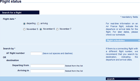
Checking Flight Status on the Web
Different airlines have answered these questions differently. Consequently, their Web pages for checking flight status differ somewhat from one another, as Figures 1 and 2 show. However, these variations don’t have that great an impact on a site’s user experience. Usually, there’s enough space on a page to present all of the options together, allowing users to complete the interaction without confusion.
Figure 1—Checking flight status on United.com
Figure 2—Checking flight status on Airfrance.us
Checking Flight Status on a Mobile Site
However, this easy interaction can get clumsy when using a mobile user interface. Small screen size and awkward input using a touch screen are the main factors that can affect mobile user experience. With companies’ different understandings of these seemingly trivial questions, the mobile user interfaces for such an interaction can turn out very different from one another. And on mobile devices, these differences can impact how easy it is to quickly and successfully check flight status.
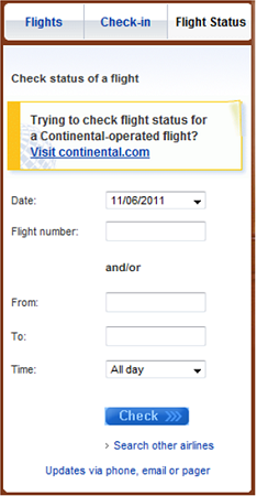
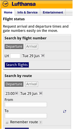
Air France displays the two options—by flight or by city—on the starting screen, requiring users to make a choice to proceed, as shown in Figure 3. This simplifies the user interface, but adds one extra step. Lufthansa displays both options on the starting page, allowing users to input either city name or flight number right there, as shown in Figure 4. The page attempts to provide two complete workflows, duplicating the flight date box and the control button, which increases the page length and pushes the second button below the fold.
Figure 3—Checking flight status on Air France’s mobile site Figure 4—Checking flight status on Lufthansa’s mobile site
The Air France example is a stacked-in-time type of design, while the Lufthansa example uses proximity in space, which I discussed in a previous column on UXmatters, “Designing for the Mobile Web: Special Considerations,” (See also Francisco Inchauste’s article on UX Magazine, “The Dirtiest Word in UX: Complexity.”) If users used the two options—flight departure and destination cities or flight number—equally often, Air France’s stacked-in-time design would work best, resulting in a simple, clean page design. However, as I mentioned earlier, there are a lot more people who use flight departure and destination cities than flight number when checking flight status. So it almost seems unnecessary to present both options. However, these two airlines treat search by flight number as equal to search by flight cities.
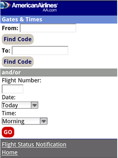
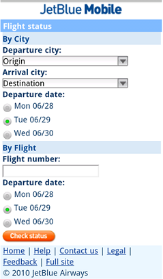
American Airlines tries to blend the two methods together by using and/or between them, as shown in Figure 5. JetBlue duplicates the flight date box for both options, as shown in Figure 6. Notice that both American Airlines and JetBlue present search by city before search by flight number. Therefore, simply because of this one design decision, I think these two designs are superior to those in Figure 3 and 4. While these two airlines still treat the two options as equal, they place a little more emphasis on searching by flight cities.
Figure 5—Checking flight status on American Airline’s mobile site Figure 6—Checking flight status on JetBlue’s mobile site
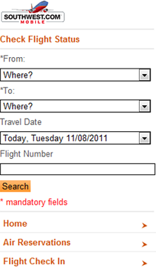
Southwest did several things quite differently from my previous examples, as follows:
They not only make the option of checking flight status by cities more prominent, but also make it required. This solution still allows users to check flight status by flight number, but a user must provide the flight cities to proceed. Perhaps this was a business decision based on analytics data that indicated the percentage of users who use only flight number when checking status.
They ask for the flight date immediately after asking for the flight cities, which intentionally pushes the flight number box to the bottom of the page and makes it easy to ignore that field. On the Southwest site, the focus is on the option of searching by flight cities.
Figure 7—Checking flight status on Southwest’s mobile site
Learnings
The better our understanding of users and their needs, as well as possible interaction models, the better our design solutions. A few thoughts surfaced through my analysis of these sites. I think they might be useful to the mobile design community, especially in regard to the design and display of workflows.
Optimize for more frequent interactions.
The greater the priority we give to more frequently used options, the easier the majority of users would find a design to use. In our example, because the majority of users check flight status by city, it’s best to give this option greater prominence.
Use a short drop-down list instead of radio buttons for presenting options.
Selecting radio buttons is hard when users are operating a device with their fingers. Although both JetBlue and Southwest ask for flight date, JetBlue requires users to use radio buttons to select a specific date from three options, while Southwest uses a short drop-down list, making the interaction easier.
Minimize text and instructions.
Users won’t spend much time reading text when they’re trying to get things done. Instructions might actually impede an interaction. The best approach is to make a design as easy as possible to use, so no instructions are necessary. Note the difference between the Lufthansa and Southwest designs in this regard.
Require only minimal typing.
Instead of asking users to type city names or airport codes, allow them to select them using a drop-down list. Reducing the amount of typing users must do on a mobile device makes data entry easier and also helps to reduce user error. Note the difference between the American Airlines and Southwest designs—the latter requires less typing.
So my questions to you are: What do you think is the best design among the examples I’ve discussed? How do you think design solutions for simple interactions on mobile devices—such as checking flight status—could be improved?
Shanshan has extensive research experience in understanding how human beings organize and find information on the Web and in their own personal computing environment. Her expertise includes designing and conducting user research, handheld device and Web site usability, and user experience consulting. Shanshan received her PhD degree in the area of Human-Computer Interaction from Drexel University. Read More