Top

How Do Users Really Hold Mobile Devices?

Mobile Matters

Designing for every screen

A column by Steven Hoober
February 18, 2013

Editor’s note: Since writing this column, Steven has done additional user research and has updated his design guidelines for mobile phones accordingly. Read his latest column on this topic: “Design for Fingers, Touch, and People, Part 1.”

As UX professionals, we all pay a lot of attention to users’ needs. When designing for mobile devices, we’re aware that there are some additional things that we must consider—such as how the context in which users employ their devices changes their interactions or usage patterns. [1] However, some time ago, I noticed a gap in our understanding: How do people actually carry and hold their mobile devices? These devices are not like computers that sit on people’s tables or desks. Instead, people can use mobile devices when they’re standing, walking, riding a bus, or doing just about anything. Users have to hold a device in a way that lets them view its screen, while providing input.

In the past year or so, there have been many discussions about how users hold their mobile devices—most notably Josh Clark’s. [2] But I suspect that some of what we’ve been reading may not be on track. First, we see a lot of assumptions—for example, that all people hold mobile devices with one hand because they’re the right size for that—well, at least the iPhone is. [3] Many of these discussions have assumed that people are all the same and do not adapt to different situations, which is not my experience in any area involving real people—much less with the unexpected ways in which people use mobile devices.

Champion Advertisement
Continue Reading…

For years, I’ve been referring to my own research and observations on mobile device use, which indicate that people grasp their mobile phones in many ways—not always one handed. But some of my data was getting very old, so included a lot of information about hardware input methods using keyboard- and keypad-driven devices that accommodate the limited reach of fingers or thumbs. These old mobile phones differ greatly from the touchscreen devices that many are now using.

Modern Mobile Phones Are Different

Everything changes with touchscreens. On today’s smartphones, almost the entire front surface is a screen. Users need to be able to see the whole screen, and may also need to touch any part of it to provide input. Since my old data was mostly from observations of users in the lab—using keyboard-centric devices in too many cases—I needed to do some new research on current devices. My data needed to be more unimpeachable, both in terms of its scale and the testing environment of my research.

So, I’ve carried out a fresh study of the way people naturally hold and interact with their mobile devices. For two months, ending on January 8, 2013, I—and a few other researchers—made 1,333 observations of people using mobile devices on the street, in airports, at bus stops, in cafes, on trains and busses—wherever we might see them. Of these people, 780 were touching the screen to scroll or to type, tap, or use other gestures to enter data. The rest were just listening to, looking at, or talking on their mobile devices.

What My Data Does Not Tell You

Before I get too far, I want to emphasize what the data from this study is not. I did not record what individuals were doing because that would have been too intrusive. Similarly, there is no demographic data about the users, and I did not try to identify their devices.

Most important, there is no count of the total number of people that we encountered. Please do not take the total number of our observations and surmise that n% of people are typing on their phone at any one moment. While we can assume that a huge percentage of all people have a mobile device, many of these devices were not visible and people weren’t interacting with them during our observations, so we could not capture this data.

Since we made our observations in public, we encountered very few tablets, so these are not part of the data set. The largest device that we captured in the data set was the Samsung Galaxy Note 2.

What We Do Know

In over 40% of our observations, a user was interacting with a mobile phone without inputting any data via key or screen. Figure 1 provides a visual breakdown of the data from our observations.
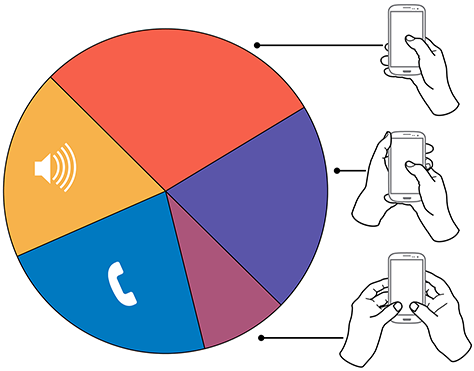
Figure 1—Summary of how people hold and interact with mobile phones
Summary of how people hold and interact with mobile phones

To see the complete data set:

Voice calls occupied 22% of the users, while 18.9% were engaged in passive activities—most listening to audio and some watching a video. We considered interactions to be voice calls only if users were holding their phone to their ear, so we undoubtedly counted some calls as apparent passive use.

The users who we observed touching their phone’s screens or buttons held their phones in three basic ways:

  • one handed—49%
  • cradled—36%
  • two handed—15%

While most of the people that we observed touching their screen used one hand, very large numbers also used other methods. Even the least-used case, two-handed use, is large enough that you should consider it during design.

In the following sections, I’ll describe and show a diagram of each of these methods of holding a mobile phone, along with providing some more detailed data and general observations about why I believe people hold a mobile phone in a particular way.

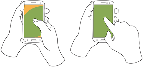
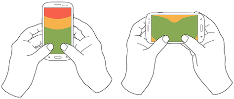
In Figures 2–4, the diagrams that appear on the mobile phones’ screens are approximate reach charts, in which the colors indicate what areas a user can reach with the finger or thumb to interact with the screen. Green indicates the area a user can reach easily; yellow, an area that requires a stretch; and red, an area that requires users to shift the way in which they’re holding a device. Of course, these areas are only approximate and vary for different individuals, as well as according to the specific way in which a user is holding a phone and the phone’s size.

Users Switch How They Hold a Mobile Phone

Before I get to the details, I want to point out one more limitation of the data-gathering method that we used. The way in which users hold their phone is not a static state. Users change the way they’re holding their phone very often—sometimes every few seconds. Users’ changing the way they held their phone seemed to relate to their switching tasks. While I couldn’t always tell exactly what users were doing when they shifted the way they were holding their phone, I sometimes could look over their shoulder or see the types of gestures they were performing. Tapping, scrolling, and typing behaviors look very different from one another, so were easy to differentiate.

I have repeatedly observed cases such as individuals casually scrolling with one hand, then using their other hand to get additional reach, then switching to two-handed use to type, switching back to cradling the phone with two hands—just by not using their left hand to type anymore—tapping a few more keys, then going back to one-handed use and scrolling. Similar interactions are common.

One-Handed Use

While I originally expected holding and using a mobile phone with one hand to be a simple case, the 49% of users who use just one hand typically hold their phone in a variety of positions. Two of these are illustrated in Figure 2, but other positions and ways of holding a mobile phone with one hand are possible. Left-handers do the opposite.
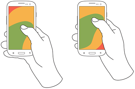
Figure 2—Two methods of holding a touchscreen phone with one hand
Two methods of holding a touchscreen phone with one hand

Note—The thumb joint is higher in the image on the right. Some users seemed to position their hand by considering the reach they would need. For example, they would hold the phone so they could easily reach the top of the screen rather than the bottom.

One-handed use—with the

  • right thumb on the screen—67%
  • left thumb on the screen—33%

I am not sure what to make of these handedness figures. The rate of left-handedness for one-handed use doesn’t seem to correlate with the rate of left-handedness in the general population—about 10%—especially in comparison to the very different left-handed rate for cradling—21%. Other needs such as using the dominant hand—or, more specifically, the right hand—for other tasks may drive handedness. [4]

One-handed use seems to be highly correlated with users’ simultaneously performing other tasks. Many of those using one hand to hold their phone were carrying out other tasks such as carrying bags, steadying themselves when in transit, climbing stairs, opening doors, holding babies, and so on.
Cradling in Two Hands

Cradling is my term for using two hands to hold a mobile phone, but using only one hand to touch the screen or buttons, as shown in Figure 3. The 36% of users who cradle their mobile phone use it in two different ways: with their thumb or finger. Cradling a phone in two hands gives more support than one-handed use and allows users to interact freely with their phone using either their thumb or finger.

Figure 3—The two methods of cradling a mobile phone
The two methods of cradling a mobile phone

Cradling—with a

  • thumb on the screen—72%
  • finger on the screen—28%

With thumb usage, users merely added a hand to stabilize the phone for one-handed use. A smaller percentage of users employed a second type of cradling, in which they held the phone with one hand and used a finger to interact with the screen. This is similar to the way people use pens with their mobile devices. (We observed so few people using pens with their mobile devices—only about six—that I have not included them as a separate category in the data set.)

Cradling—in the

  • left hand—79%
  • right hand—21%

Anecdotally, people often switched between one-handed use and cradling. I believe this was sometimes for situational security—such as while stepping off a curb or when being jostled by passersby—but sometimes to gain extra reach for on-screen controls outside the normal reach.

Two-Handed Use

We traditionally associate two-handed use with typing on the QWERTY thumbboards of devices like the classic Blackberry or on slide-out keyboards. Two-handed use is prevalent among 15% of mobile phone users. In two-handed use, as shown in Figure 4, users cradle their mobile phone in their fingers and use both thumbs to provide input—much as they would on a desktop keyboard.

Two-handed use—when holding a phone

  • vertically, in portrait mode—90%
  • horizontally, in landscape mode—10%
Figure 4—Two-handed use when holding a phone vertically or horizontally
Two-handed use when holding a phone vertically or horizontally

People often switched between two-handed use and cradling, with users typing with both thumbs, then simply no longer using one hand for input and reverting to using just one of the thumbs consistently for interacting with the screen.

However, not all thumb use was for typing. Some users seemed to be adept at tapping the screen with both thumbs or just one thumb. For example, a user might scroll with the right thumb, then tap a link with the left thumb moments later.

Also notable is the overwhelming use of devices in their vertical orientation, or portrait mode—despite theories about the ease of typing with a larger keyboard area. However, a large percentage of slide-out keyboards force landscape use. [5] All ways of holding a phone typically orient the device vertically, but for two-handed use, use of landscape mode was unexpectedly low. Though several of my clients have received numerous customer complaints in app store reviews for not supporting landscape mode.

What Do These Findings Mean?

I expect some to argue that one-handed use is the ideal—and that assuming one-handed use is a safe bet when designing for almost half of all users. But I see more complexity.

Some designers may interpret charts of one-handed use to mean that they should place low-priority or dangerous functions in the hard to reach area in the upper-left corner of the screen. [6] But I wouldn’t recommend that. What if a user sees buttons at the top, so switches to cradling his phone to more easily reach all functionality on the screen—or just prefers holding it that way all the time?

Even if we don’t understand why there are such large percentages for handedness, we cannot assume that people will hold their phone in their right or left hand. When targeting browsers or mobile-device operating systems, I am always uncomfortable ignoring anything with a market share over 5%. That’s a general baseline for me, though I adjust it for individual clients or products. But I would never, ever ignore 20 to 30% of my user base. While I am personally very right handed, now that I have these numbers, I am spending a lot more time paying attention to how interactions might work when using the left hand.

Another factor that I had not adequately considered until putting together these diagrams is how much of the screen a finger may obscure when holding a mobile phone in any of these ways. With the display occupying so much of the device’s surface, this may explain part of the reason for a user’s shifting of his or her grasp. As designers, we should always be aware of what content a person’s fingers might obscure anywhere across the whole screen. Just remembering that a tapping finger or thumb hides a button’s label is not enough.

Now, my inclination to test my user interface designs on devices is stronger than ever. Whether I’ve created a working prototype, screen images, or just a paper prototype that I’ve printed at scale, I put it on a mobile device or an object with similar dimensions and hold it in all of the ways that users would be likely to hold it to ensure that my fingers don’t obscure essential content and that buttons users would need to reach aren’t difficult to reach.

Next Steps

I don’t consider this the ultimate study on how users hold mobile devices, and I would like to see someone do more work on it, even if I’m not the one to carry it out. It would be very helpful to get some solid figures on how much people switch the ways they’re holding their mobile phone—from one-handed use to cradling to two-handed use. Having accurate percentages for how many users prefer each way of holding a phone would be useful. Do all users hold their phones in all three of these ways at different times? This is not entirely clear. It would also be helpful to determine which ways of holding a mobile phone are appropriate for specific tasks. With clear correlations between tasks and ways of holding a phone, we could surmise likely ways of holding devices for particular types of interactions rather than making possibly false assumptions based on our own behavior and preferences. 

Notes

[1] Sottek, T.C. “Transit Wireless to Expand Cell Coverage to 30 NYC Subway Stations by 2013 with Support from T-Mobile and AT&T.” The Verge, November 19, 2012. Retrieved January 18, 2013. “Customers use only 20 percent of voice traffic underground compared to an above-ground cell site, but 5 times more data.”

[2] Clark, Josh. “Designing For Touch.” .net Magazine, February 1, 2012. Retrieved January 18, 2013.

[3] Diaz, Jesus. “This Is Why the iPhone’s Screen Will Always Be 3.5 Inches.” Gizmodo, October 8, 2011. Retrieved January 18, 2013.

[4] Wikipedia. “Handedness.” Wikipedia. Retrieved January 19, 2013.

[5] Hoober, Steven. “Mobile Input Methods.” UXmatters, November 1, 2012. Retrieved January 18, 2013.

[6] Wroblewski, Luke. “Responsive Navigation: Optimizing for Touch Across Devices.” LukeW Ideation + Design, November 2, 2012. Retrieved January 18, 2013.

President of 4ourth Mobile

Mission, Kansas, USA

Steven HooberFor his entire 15-year design career, Steven has been documenting design process. He started designing for mobile full time in 2007 when he joined Little Springs Design. Steven’s publications include Designing by Drawing: A Practical Guide to Creating Usable Interactive Design, the O’Reilly book Designing Mobile Interfaces, and an extensive Web site providing mobile design resources to support his book. Steven has led projects on security, account management, content distribution, and communications services for numerous products, in domains ranging from construction supplies to hospital record-keeping. His mobile work has included the design of browsers, ereaders, search, Near Field Communication (NFC), mobile banking, data communications, location services, and operating system overlays. Steven spent eight years with the US mobile operator Sprint and has also worked with AT&T, Qualcomm, Samsung, Skyfire, Bitstream, VivoTech, The Weather Channel, Bank Midwest, IGLTA, Lowe’s, and Hallmark Cards. He runs his own interactive design studio at 4ourth Mobile.  Read More

Other Columns by Steven Hoober

Other Articles on Mobile UX Design

New on UXmatters